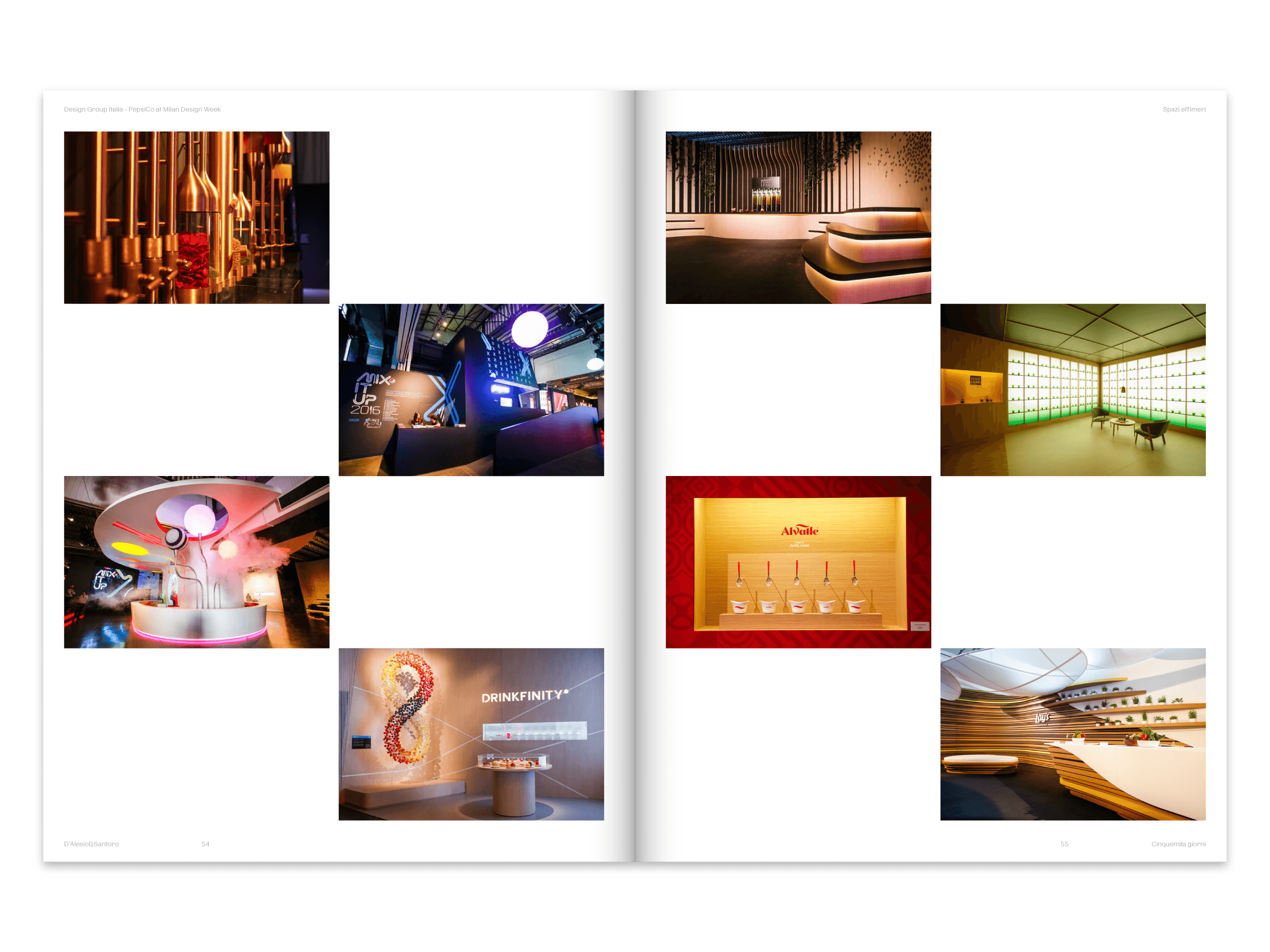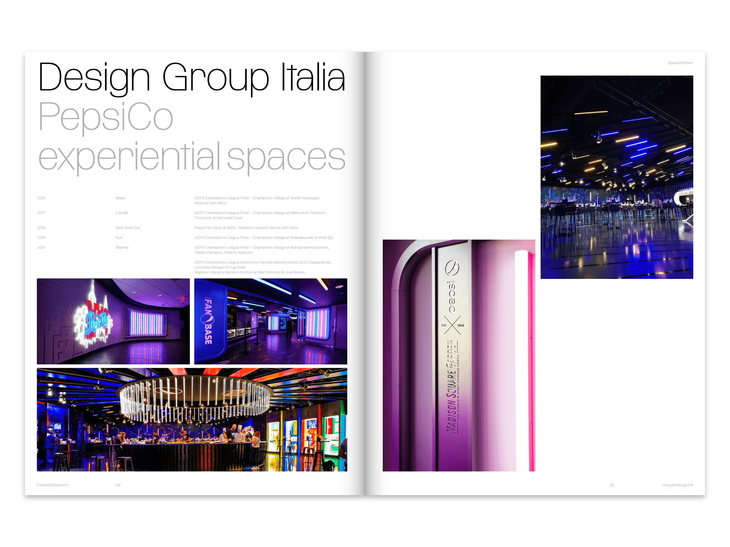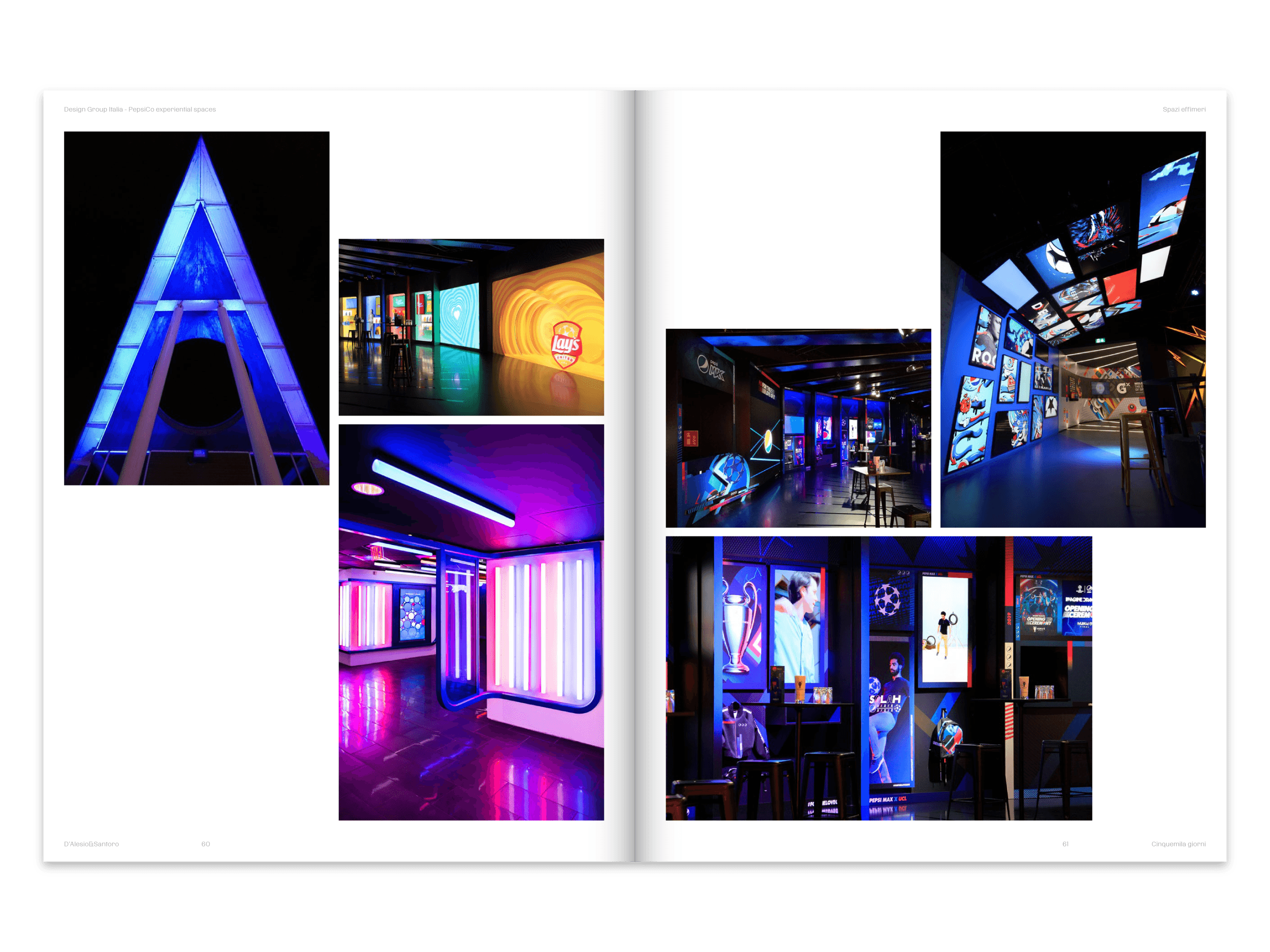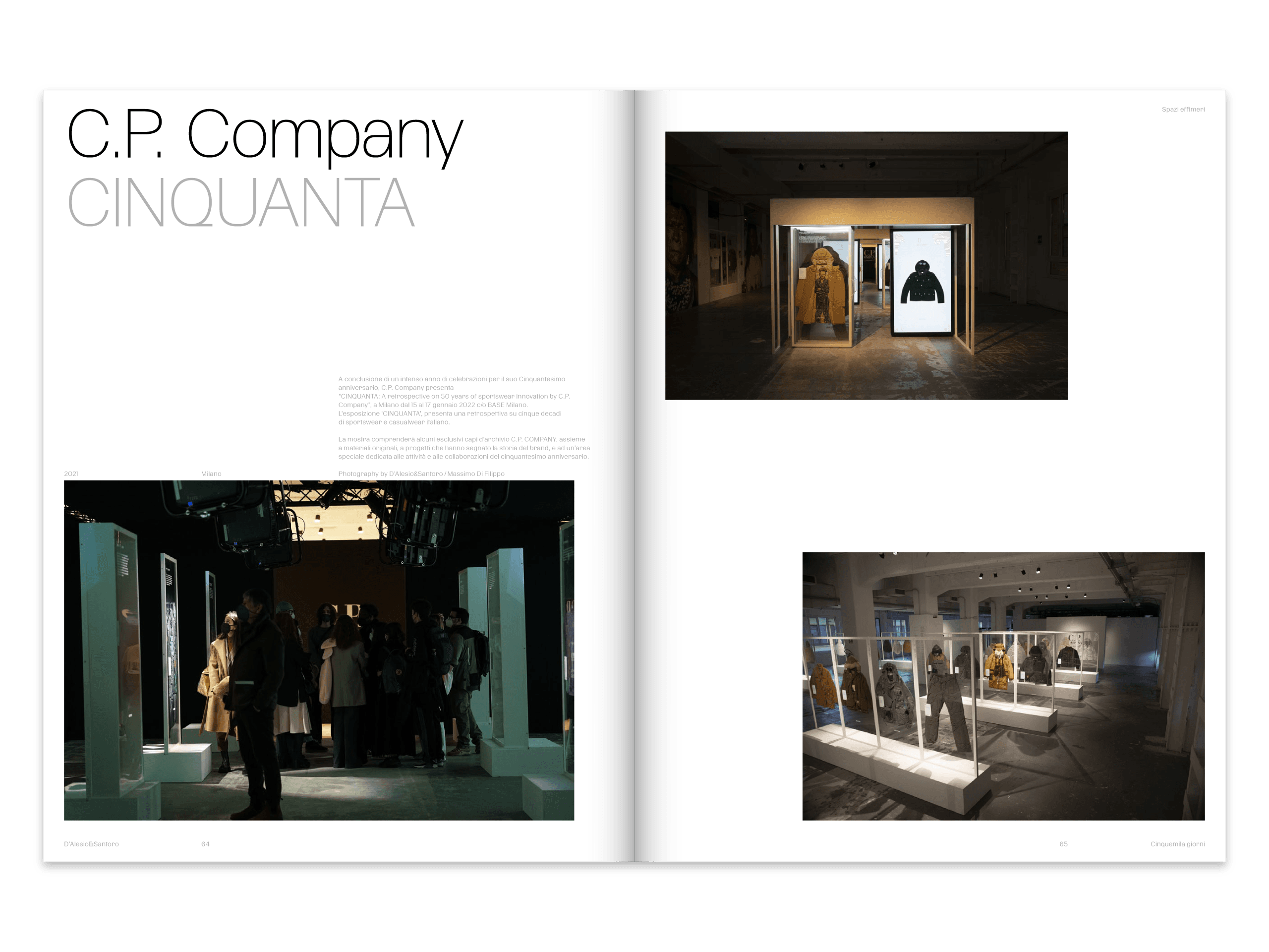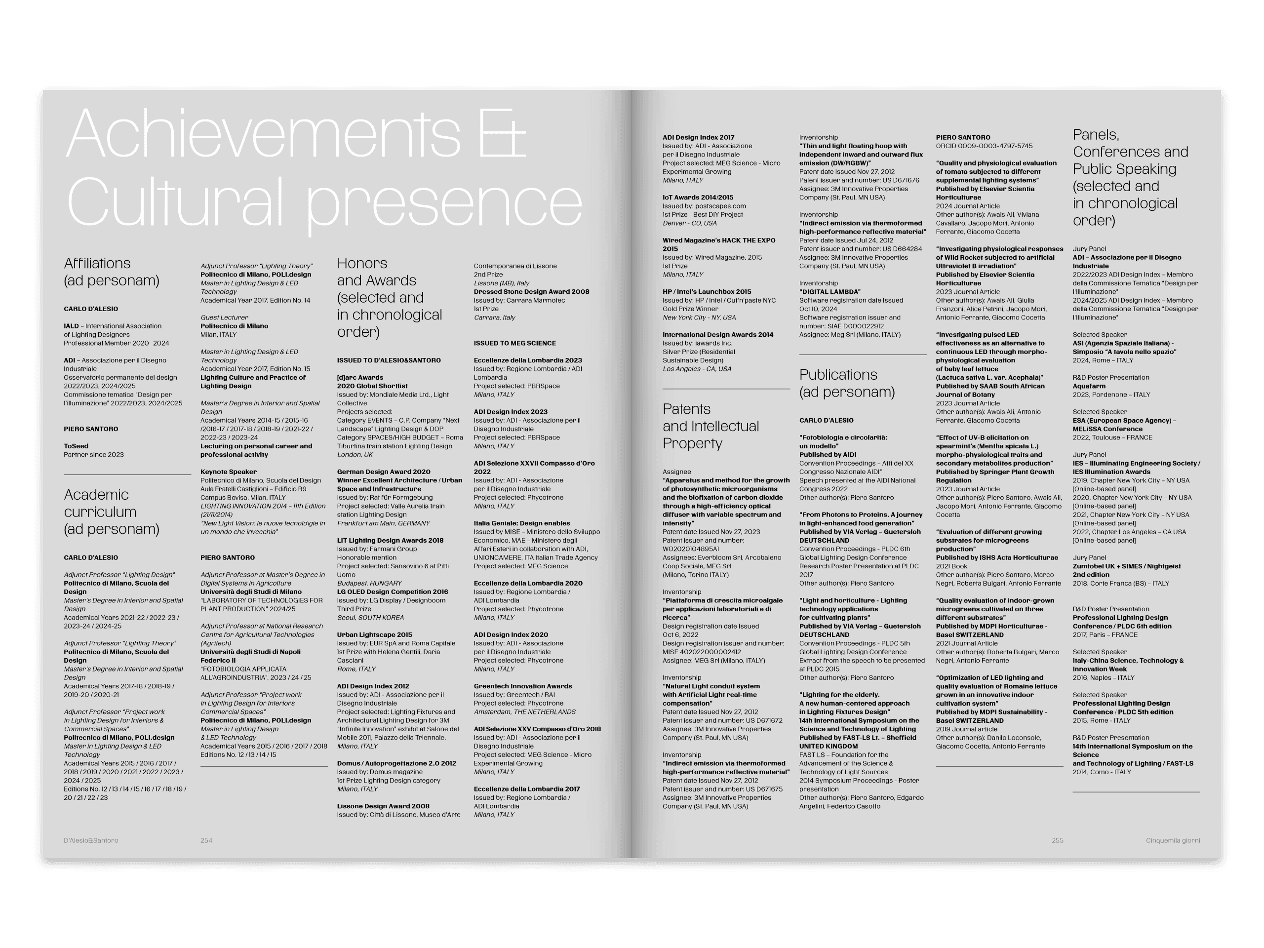
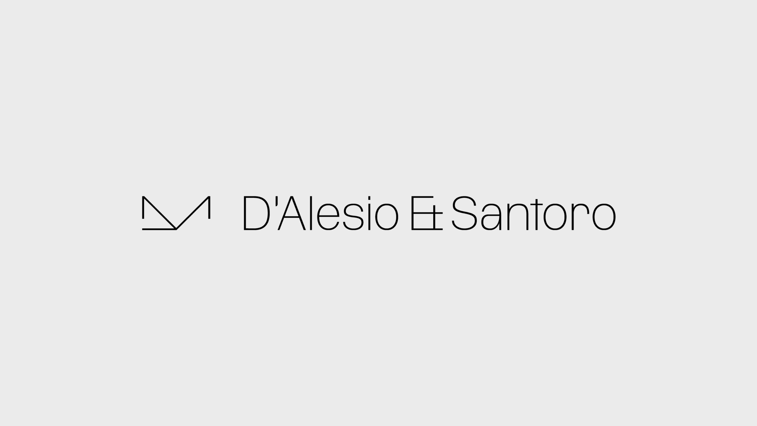
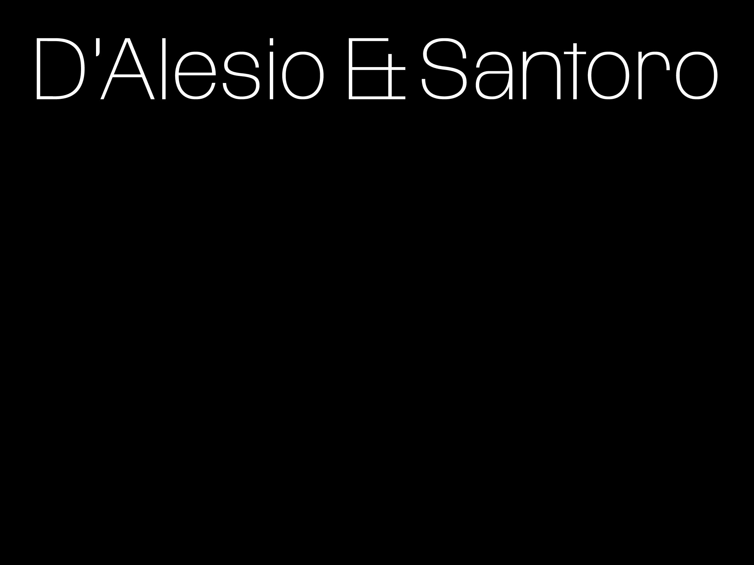
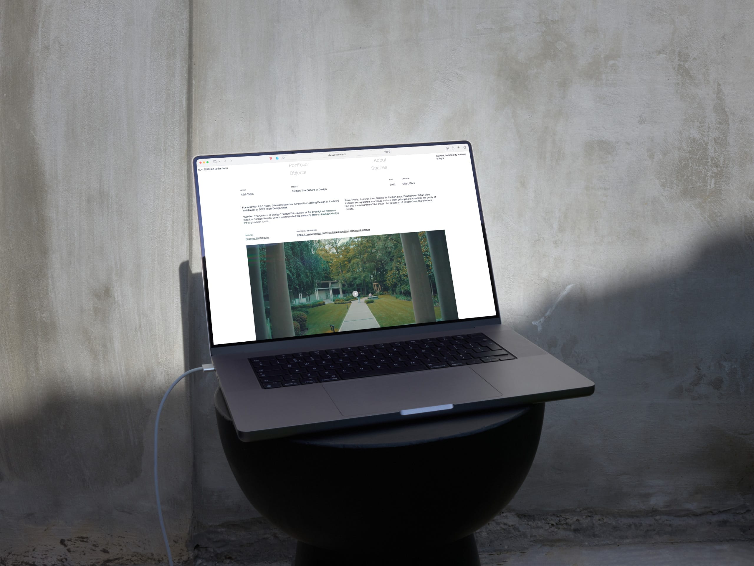
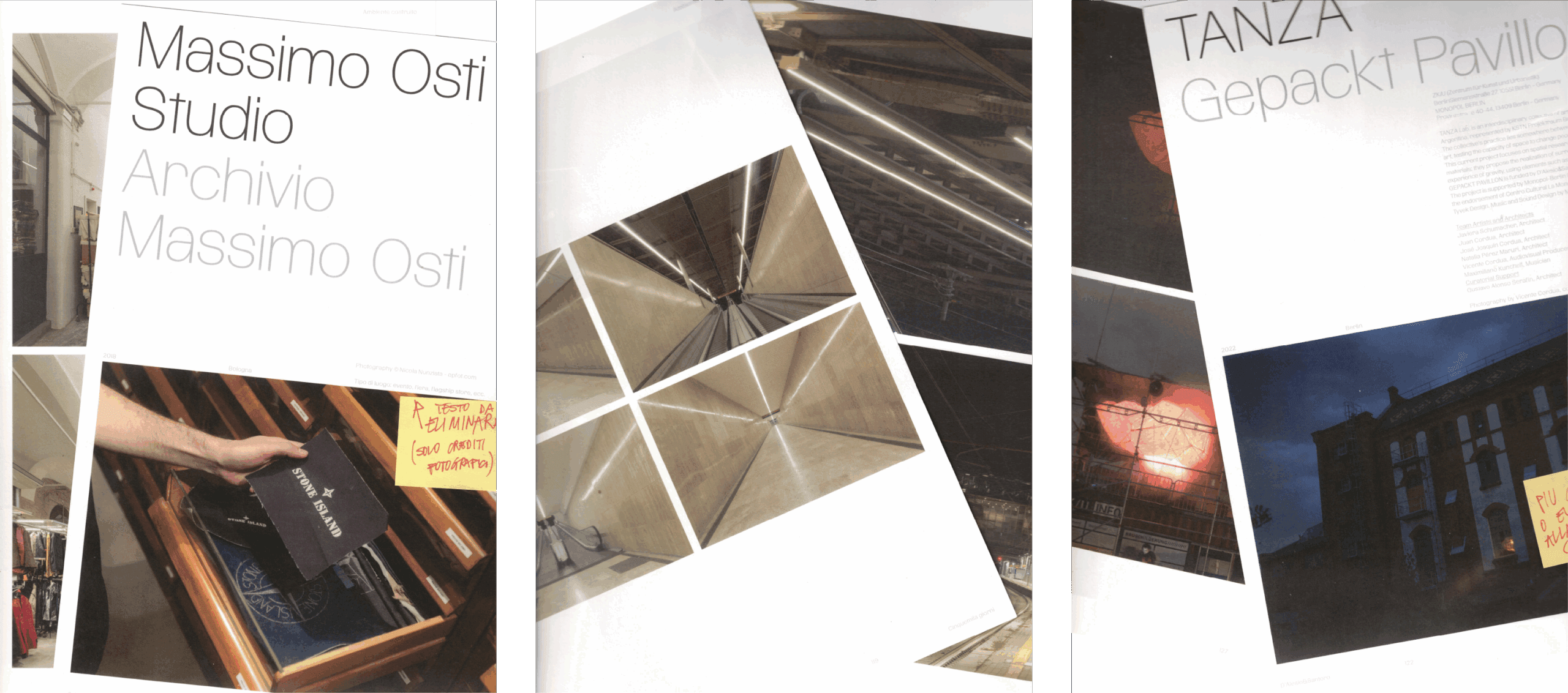
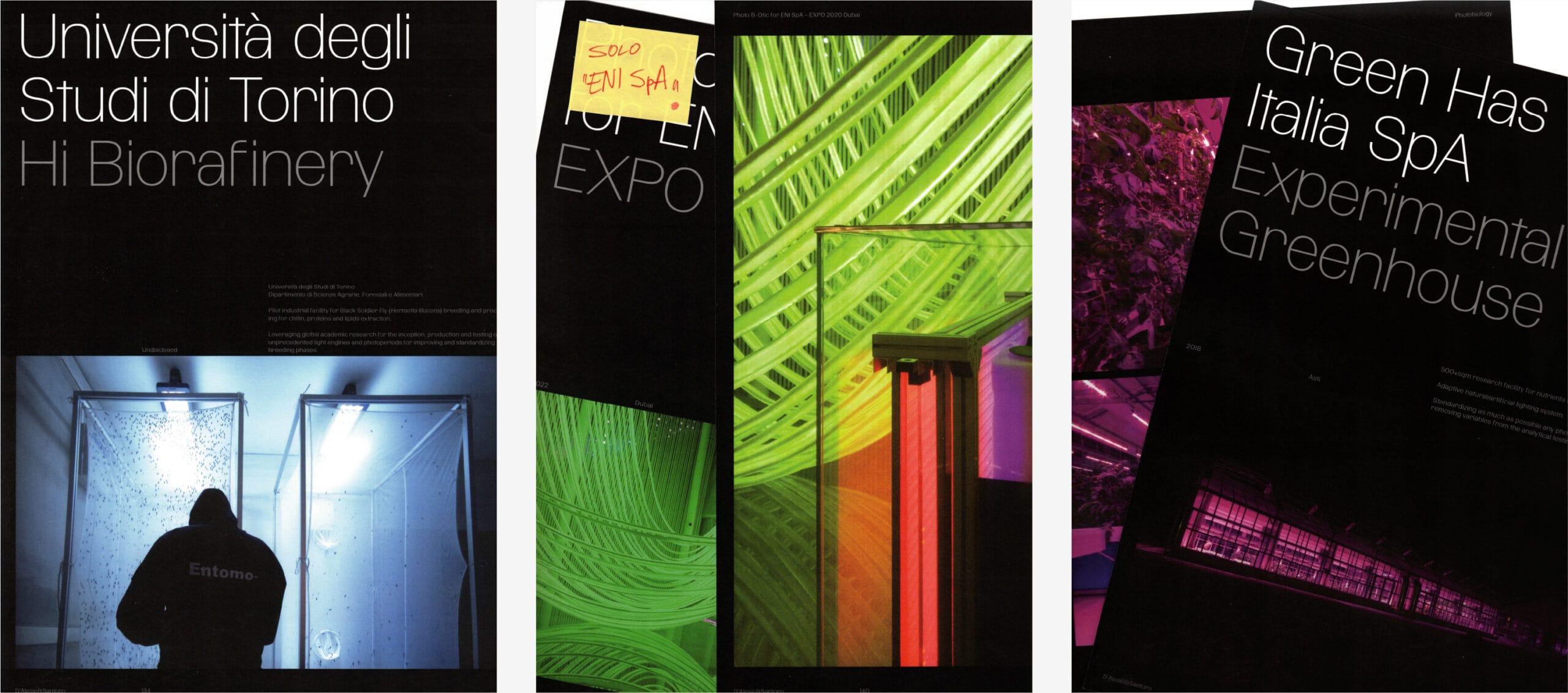
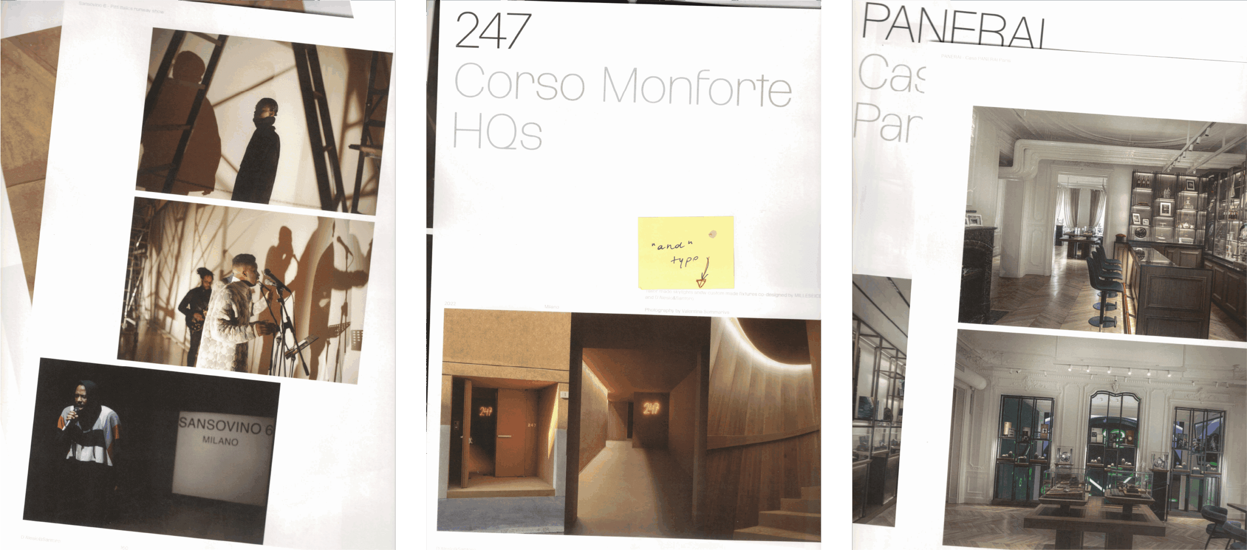
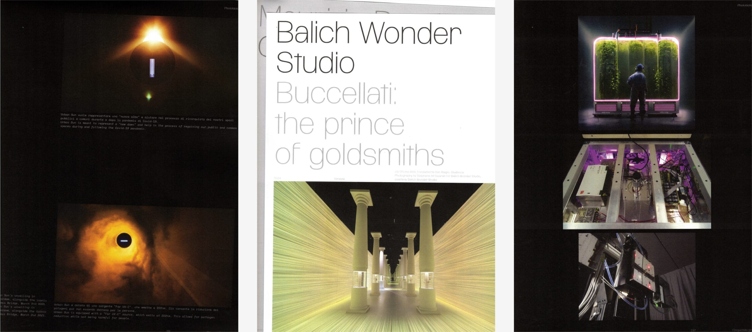
D’Alesio&Santoro
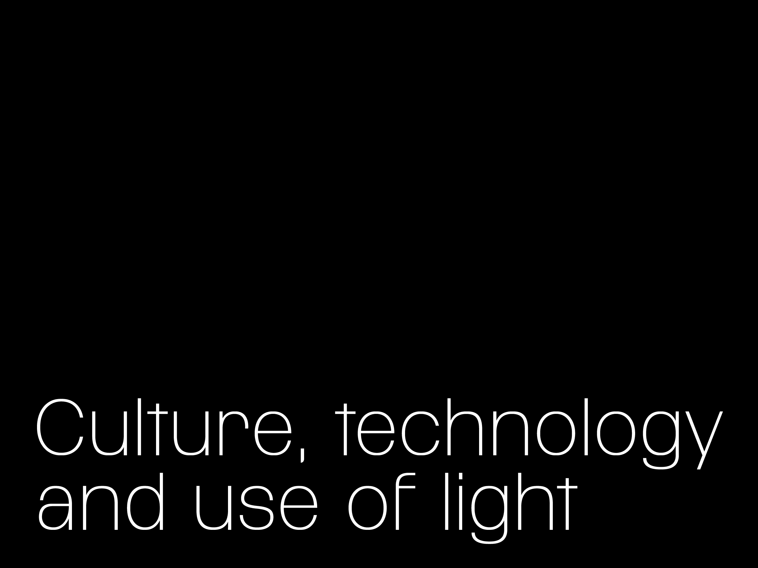
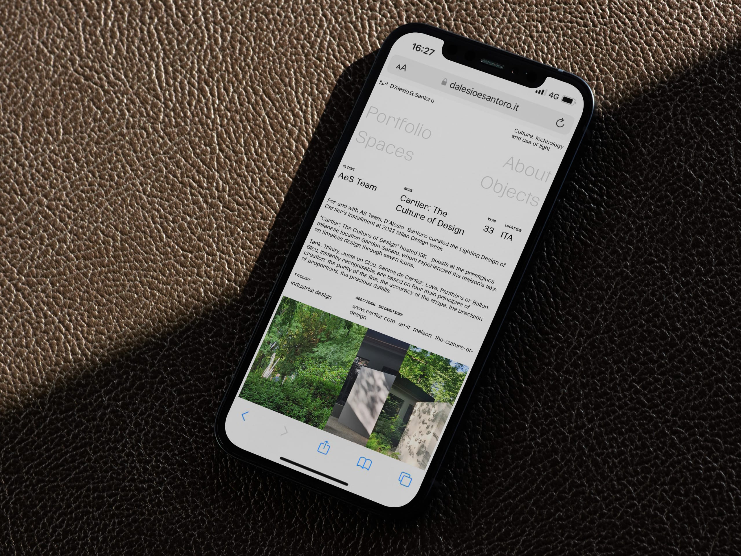
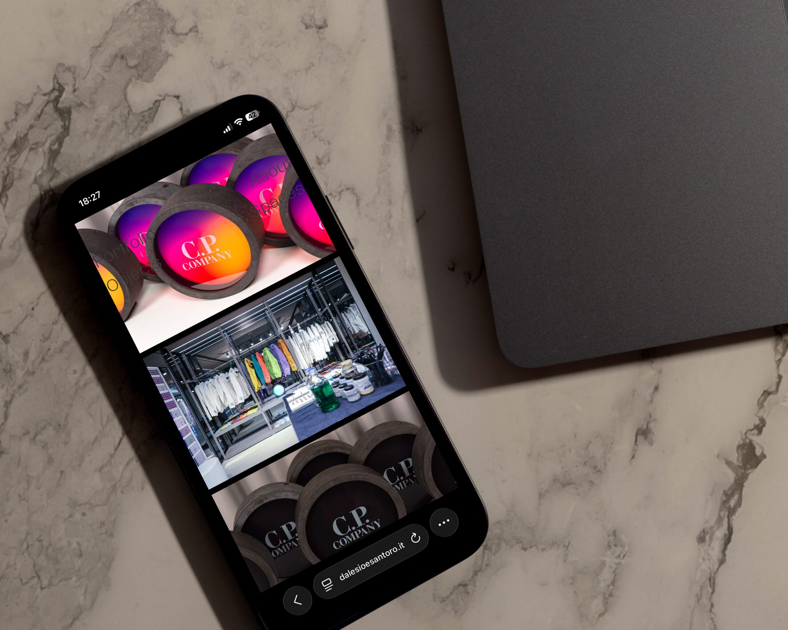
Culture, technology and use of light
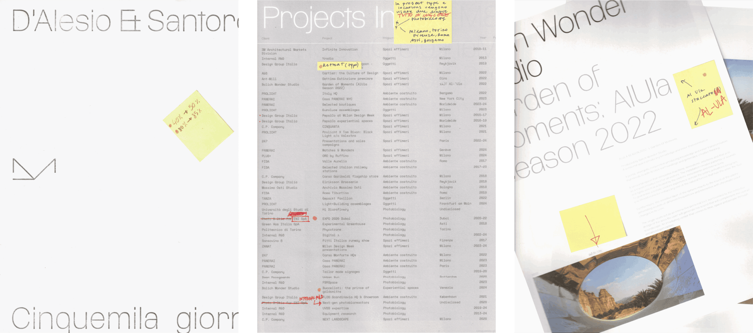
The rebranding accompanies Carlo and Piero through a very important milestone for them—the celebration of their first five thousand days of activity—reflecting their practice and design approach through an essential and contemporary visual language.
Our reasoning started from the fundamental pillars of their work: culture, technology, and the use of light.

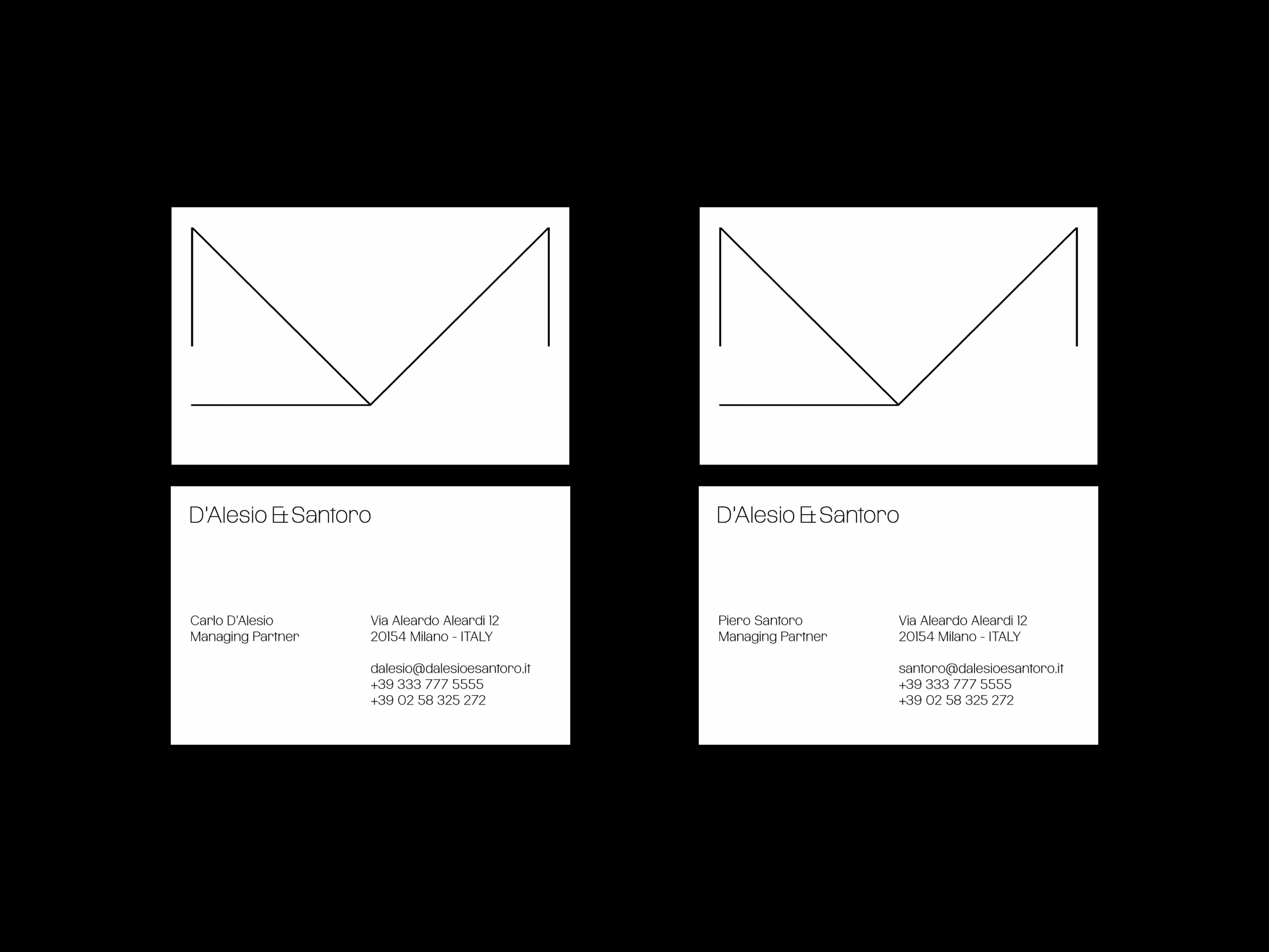
The symbol and logotype were redesigned to engage with the cultural context in which Carlo and Piero operate: a rigorous, precise, and sophisticated universe.
We therefore worked through synthesis, making the mark essential—so as to convey solidity, precision, and control—and adopting a light weight in which elements such as light and space, central to their practice, find their fullest expression.

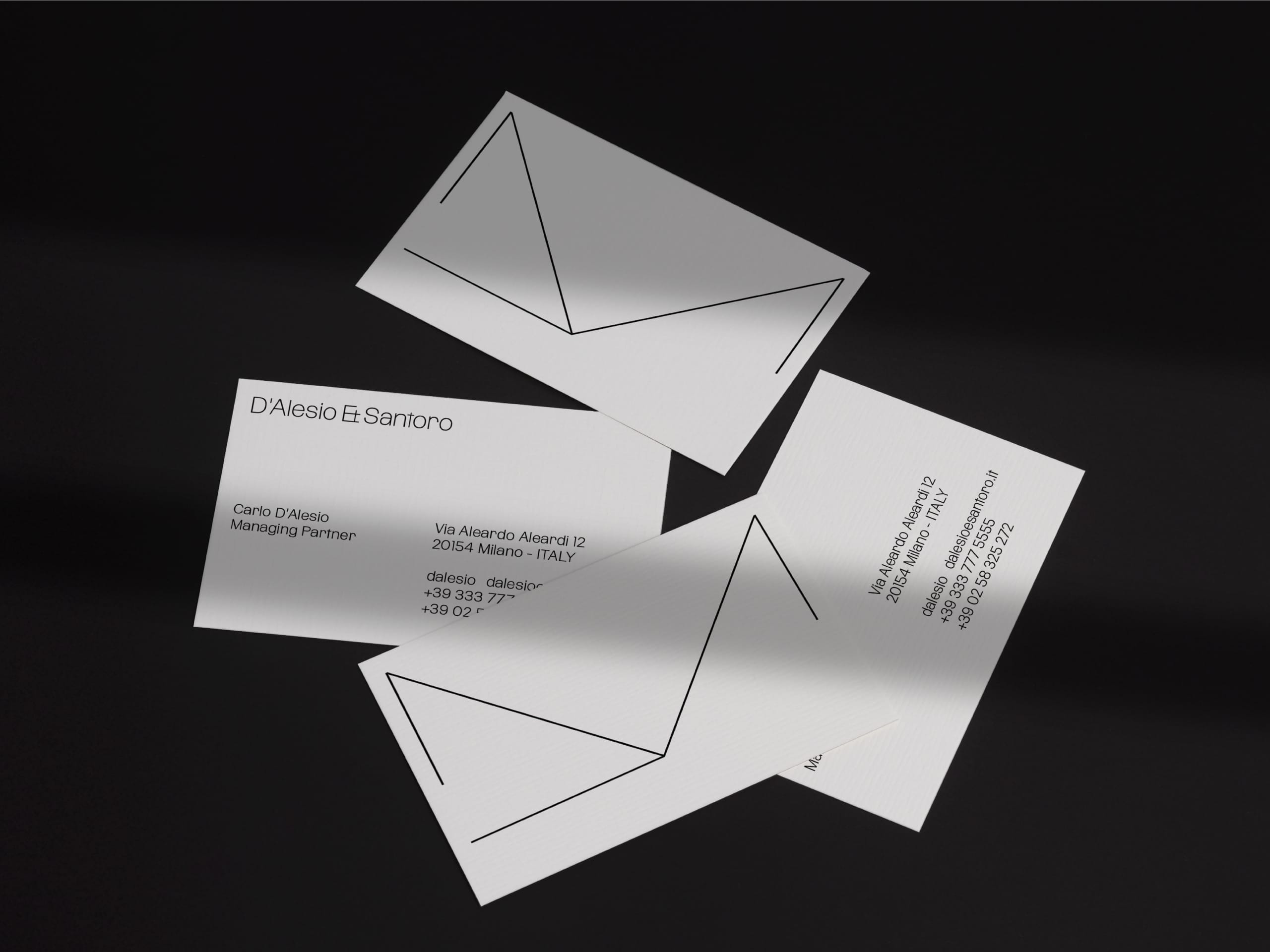
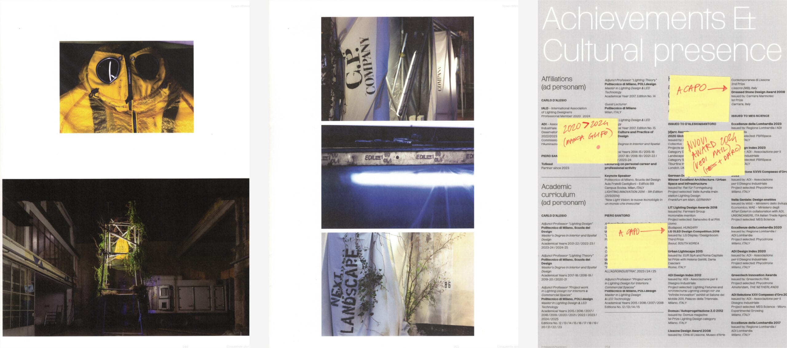
In continuity with this approach, the identity develops entirely in black and white: a choice that reflects the duality of light/dark, on/off.
This sharp contrast becomes the visual foundation of the system, allowing the brand to maintain a strong and recognizable character without relying on graphic artifices.
What is strict at the corporate level is then articulated across the applications of the visual identity through printing techniques, material choices, and graphic treatments where black and white give way to a scale of greys that, tone on tone, play with perception and readability.
The final pillar of the brand identity—though no less important—is typography.
When we were commissioned to redesign the identity, we were developing a typeface with our digital foundry, TYPE FIRM, called Dritto, which had not yet been released.
The typeface has a brutalist character, both structurally (the letters maintain the same aperture across all weights, and the ratio between uppercase and lowercase is extremely reduced) and technically, with the removal of overshoots (optical corrections) in curves crossing the vertical metrics. For this reason, it felt perfectly suited to give form to the work we were developing.
Typography, like light, operates implicitly, accompanying the subject with transformative qualities.
The typeface therefore defines the entire visual communication, creating a direct link between the project and typographic research, making the identity not only a representation, but also an expression of the method.