An-Icon
Iconology of an academic publication
The Department of Philosophy “Piero Martinetti” of the University of Milan, directed by Prof. Andrea Pinotti and winner of the prestigious ERC (European Research Council) Advanced Grant, asked us to develop the corporate image of the project “An-Iconology: History, Theory, and Practices of Environmental Images”, transdisciplinary reflection on some of the most relevant issues of contemporary aesthetics and visual culture, including, specifically, the question of virtuality. The main output of the project is the publication of a scientific journal on a six-monthly basis and is spread over two websites: one dedicated to the journal – from consultation to the management of submissions and call for papers – and the other acting as a portal to promote and narrate the many activities gravitating around the project.
Every academic project is based on concepts such as accessibility, deepening, sharing. The process of researching, creating and distributing a scientific paper – which guarantees the quality of publications through peer review – the impact of new technologies on social dynamics and its ‘incremental’ structure (whereby each new scientific paper can be used as a starting point for the creation of new ones) made us think, by analogy, of the blockchain: a decentralised, shared and immutable register whose entries are grouped into ‘blocks’ concatenated in chronological order. A process that creates a publicly accessible structure, the validation of which takes place through a pool of qualified users and whose integrity is guaranteed by the use of cryptography. We have therefore tried to translate this model into graphical elements useful for the construction of the identity.
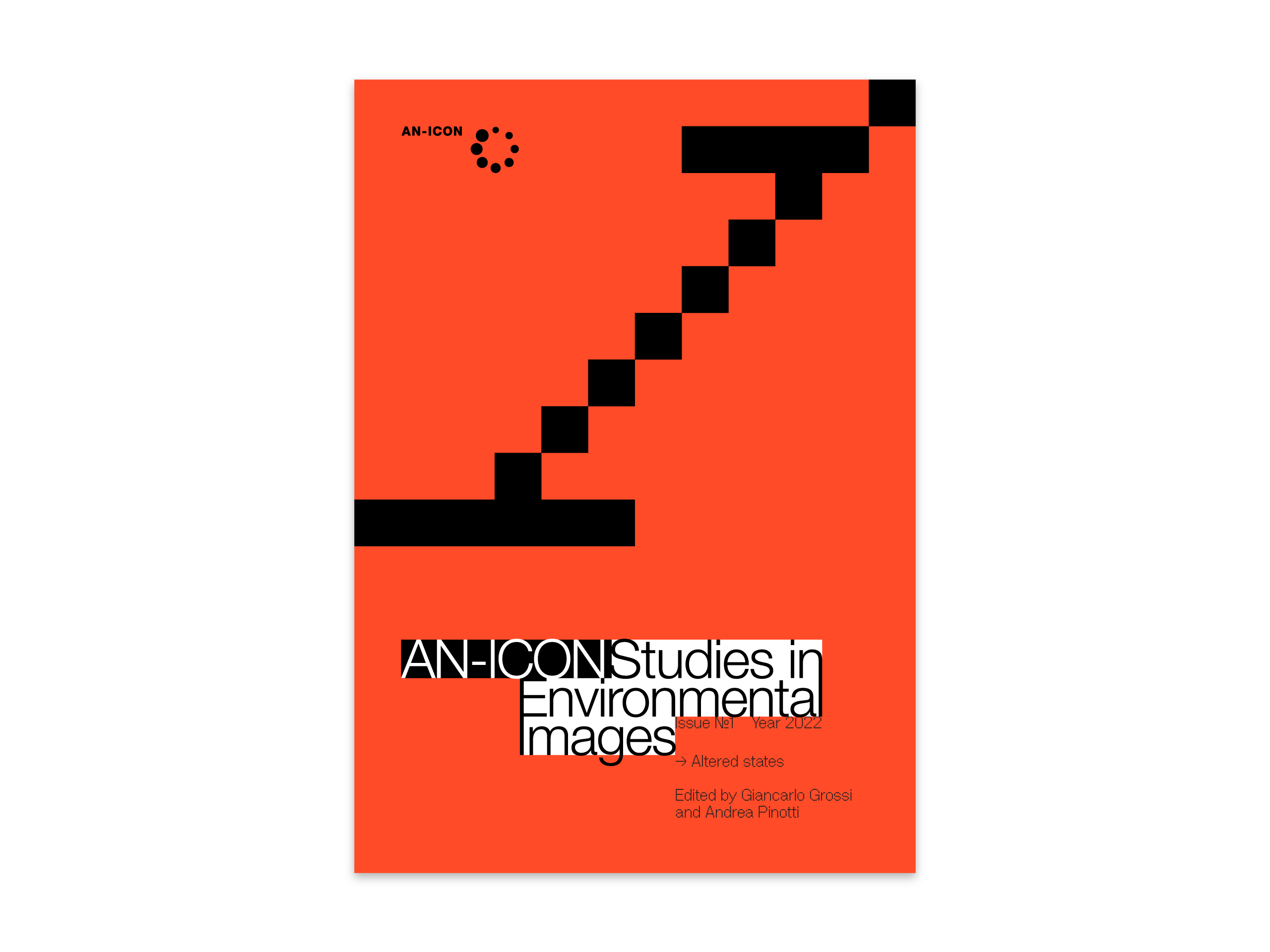
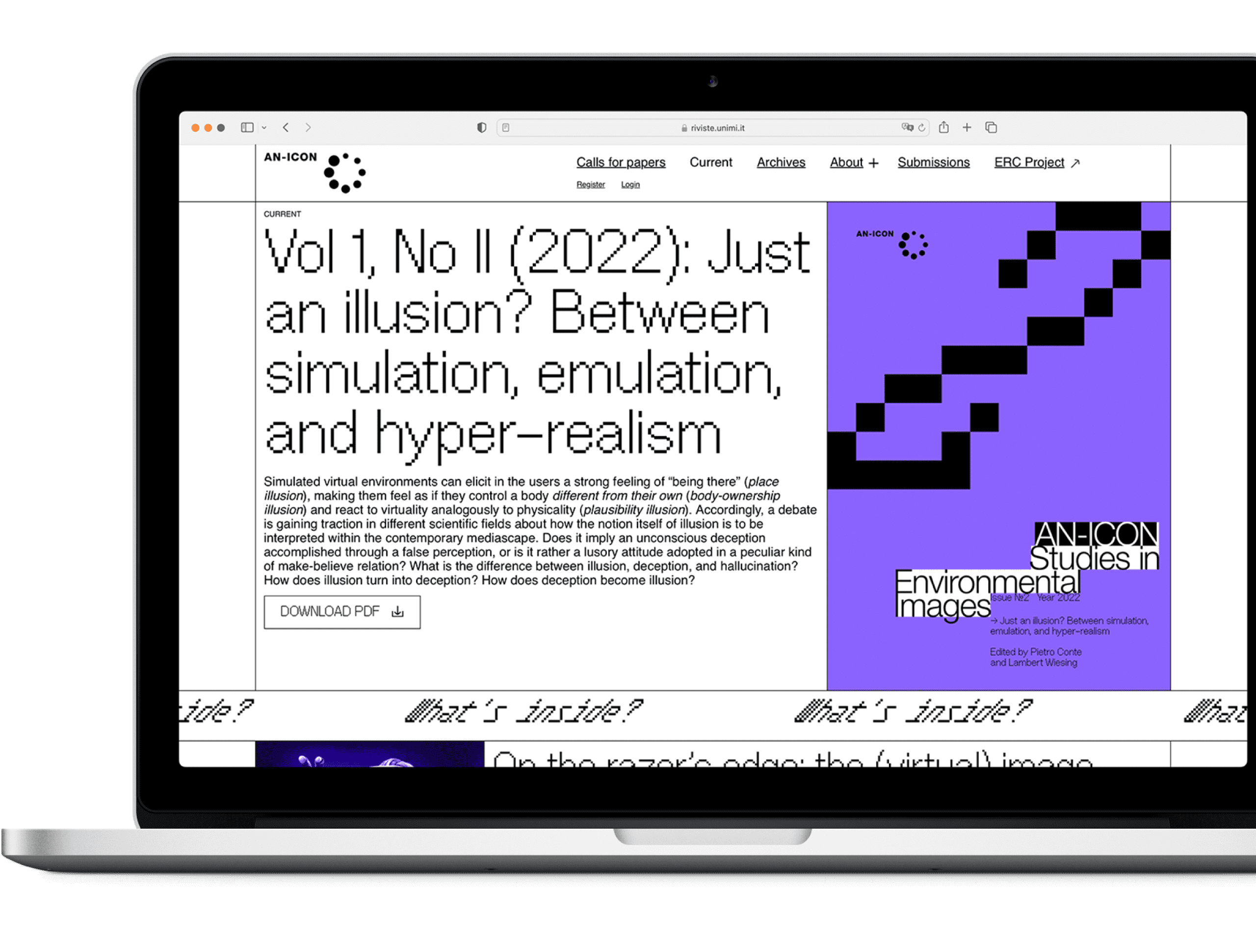
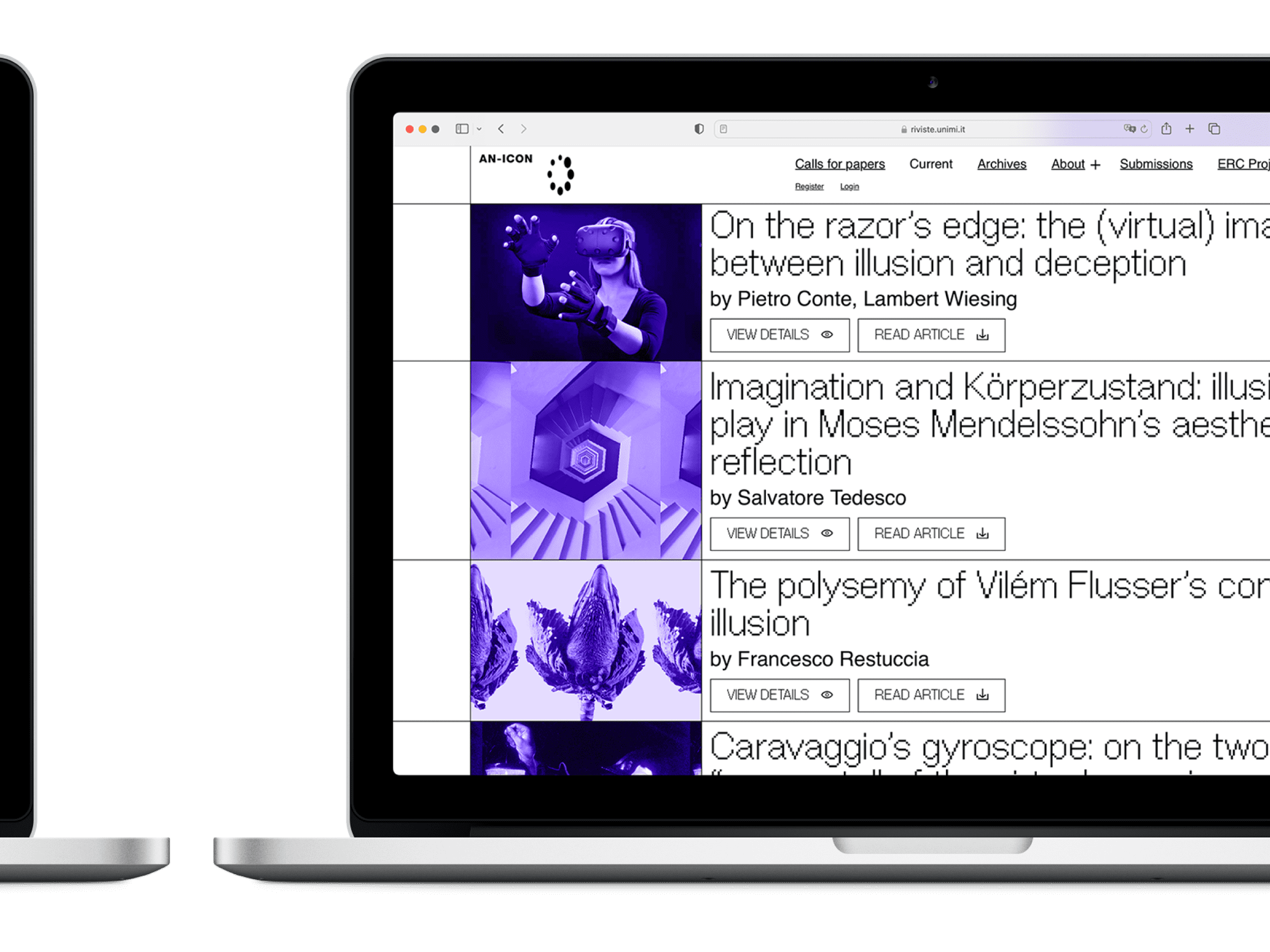
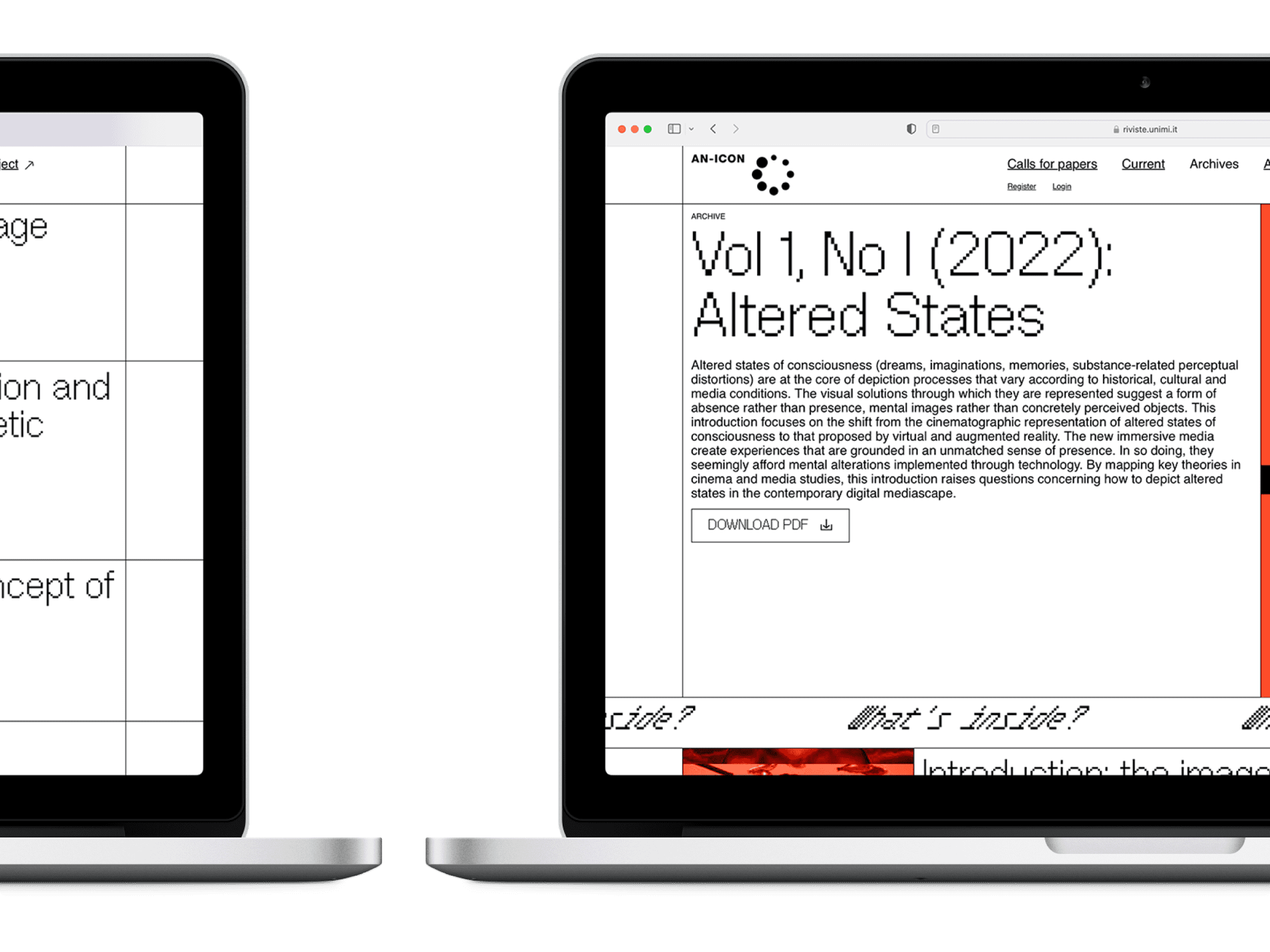
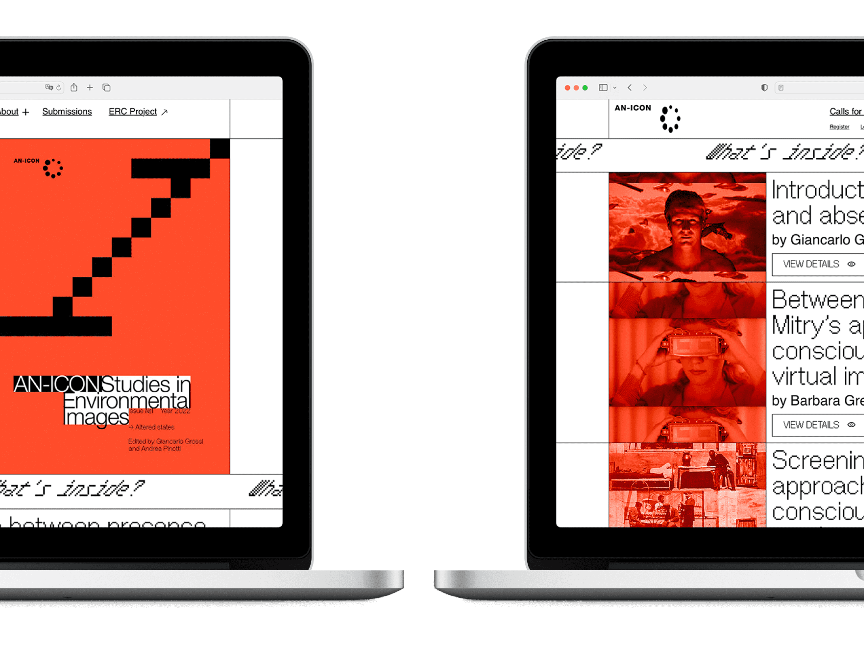
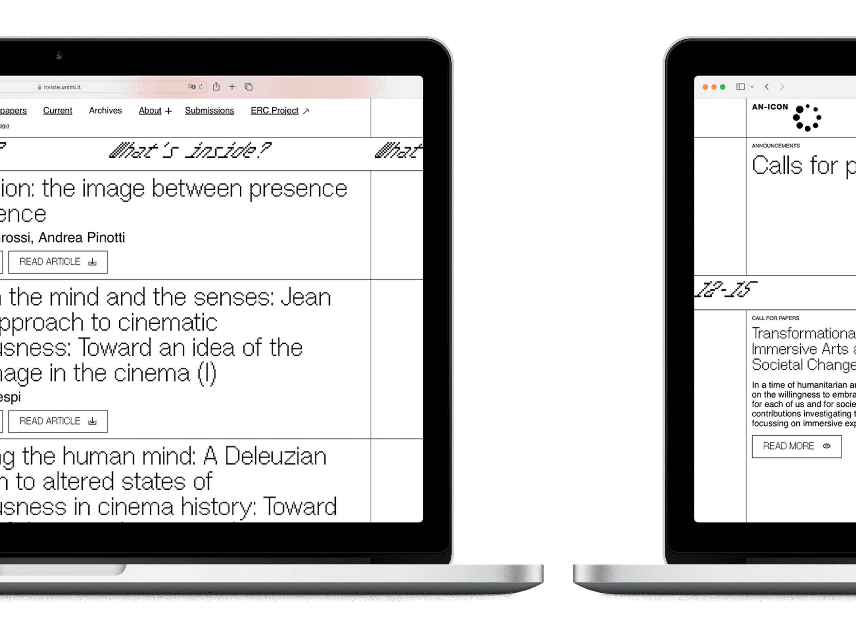
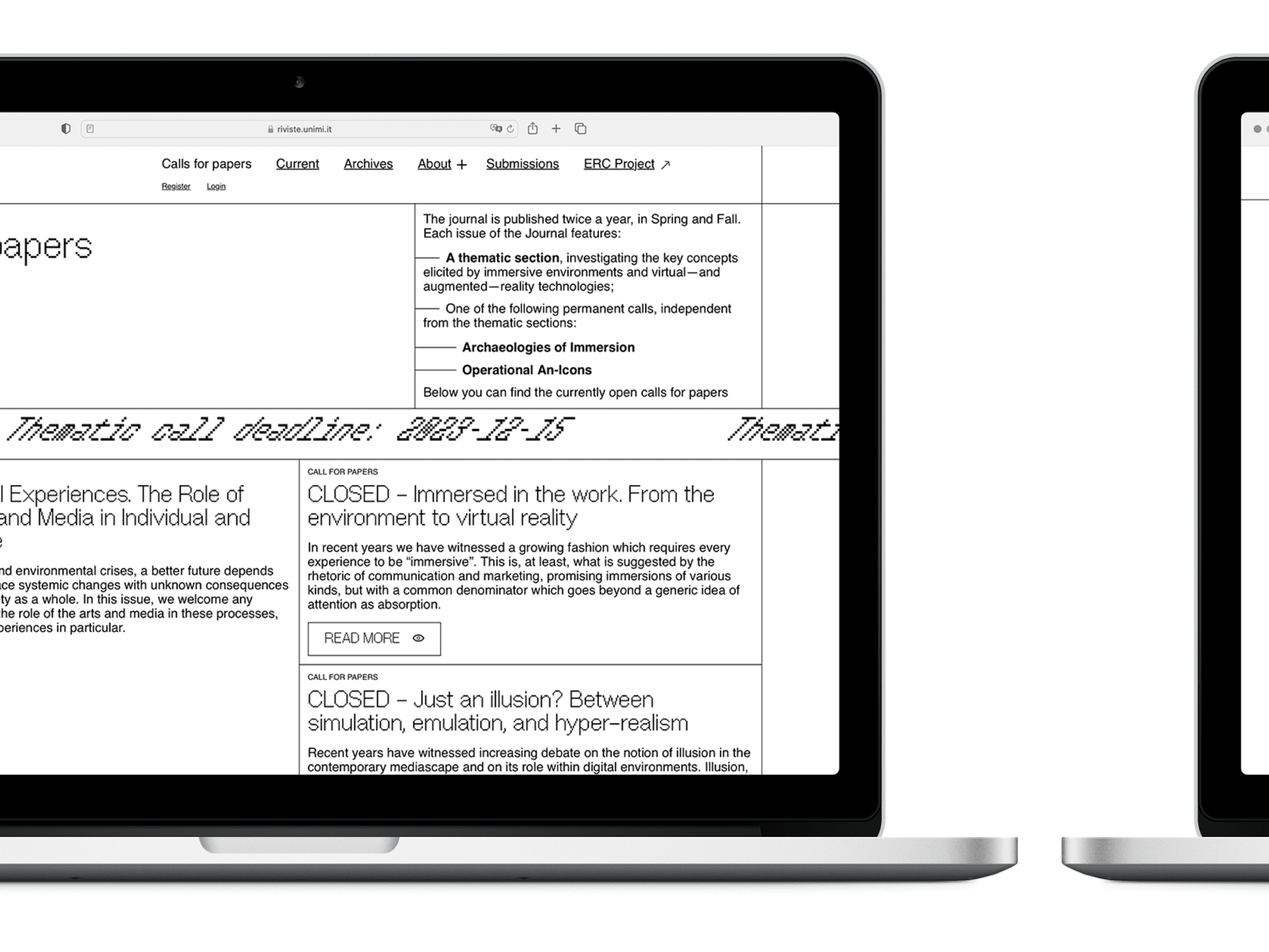
Starting from the logo provided to us by the university, we developed a clean, rigorous visual imagery that refers to digital automation processes. The pixel, the smallest visual element of the digital era, is enlarged to become a container or, if necessary, a module for the creation of the typography used in titling. The grouping into blocks of texts, images and captions – staggered on the vertical and horizontal planes – distributes the elements in an apparently free grid layout, which groups together contents of different natures (images, texts, titles) with a hierarchy that remains evident thanks to the typographical differences of bodies and styles: the objective is to leave expressive space for the images while maintaining a good fruition of the textual contents. The result is an image characterised by high contrasts and a brutalist flavour but strongly recognisable and comprehensible.