Marka Packaging
A packaging system for professionals
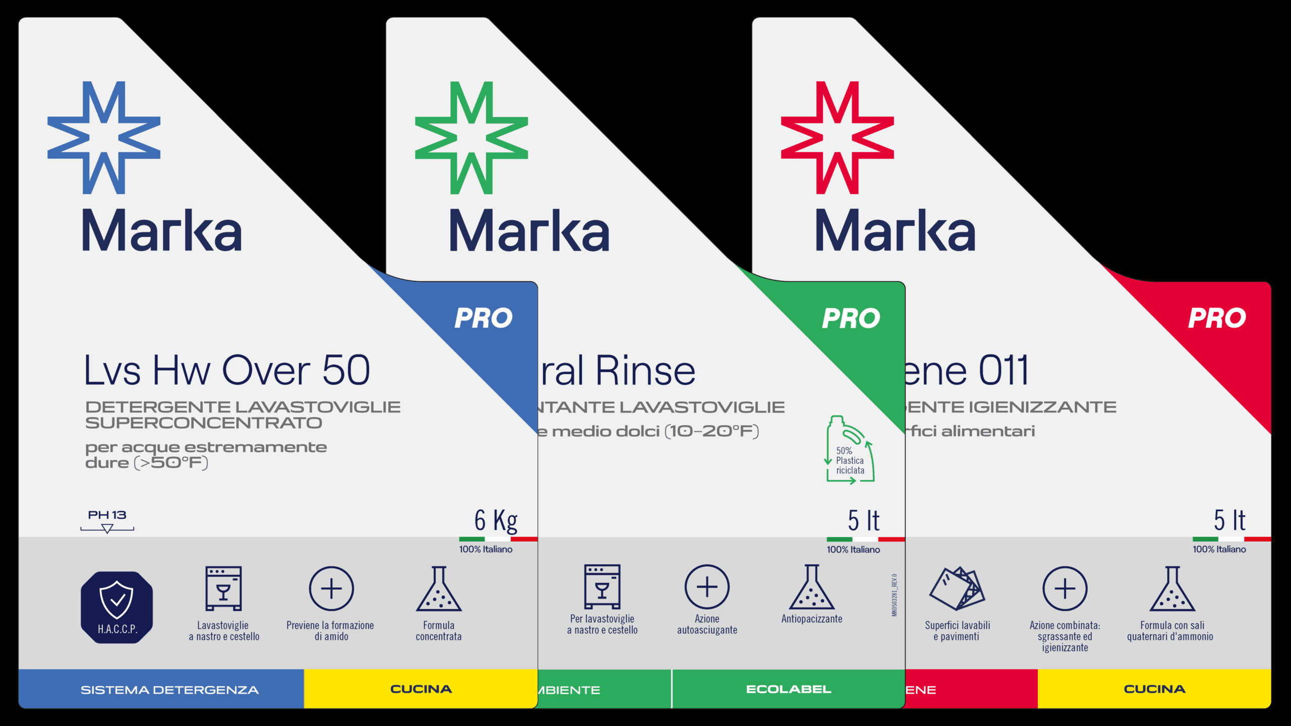
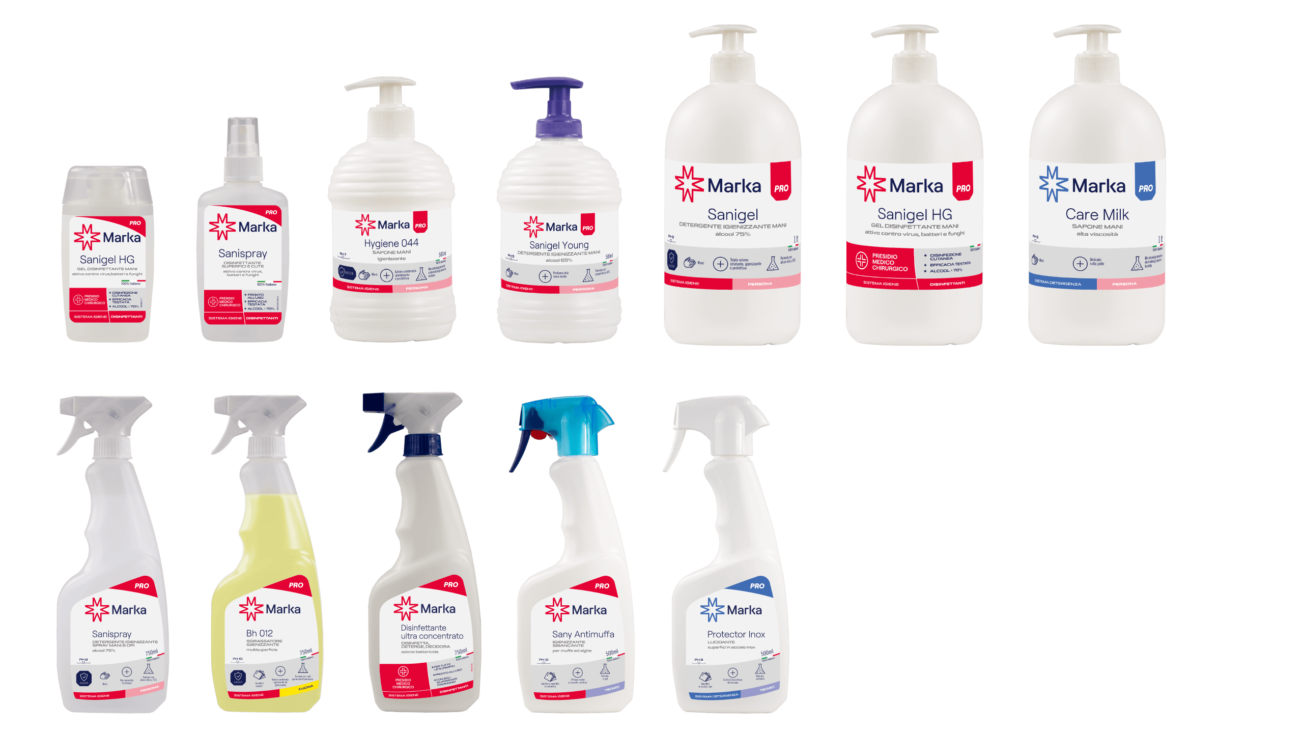
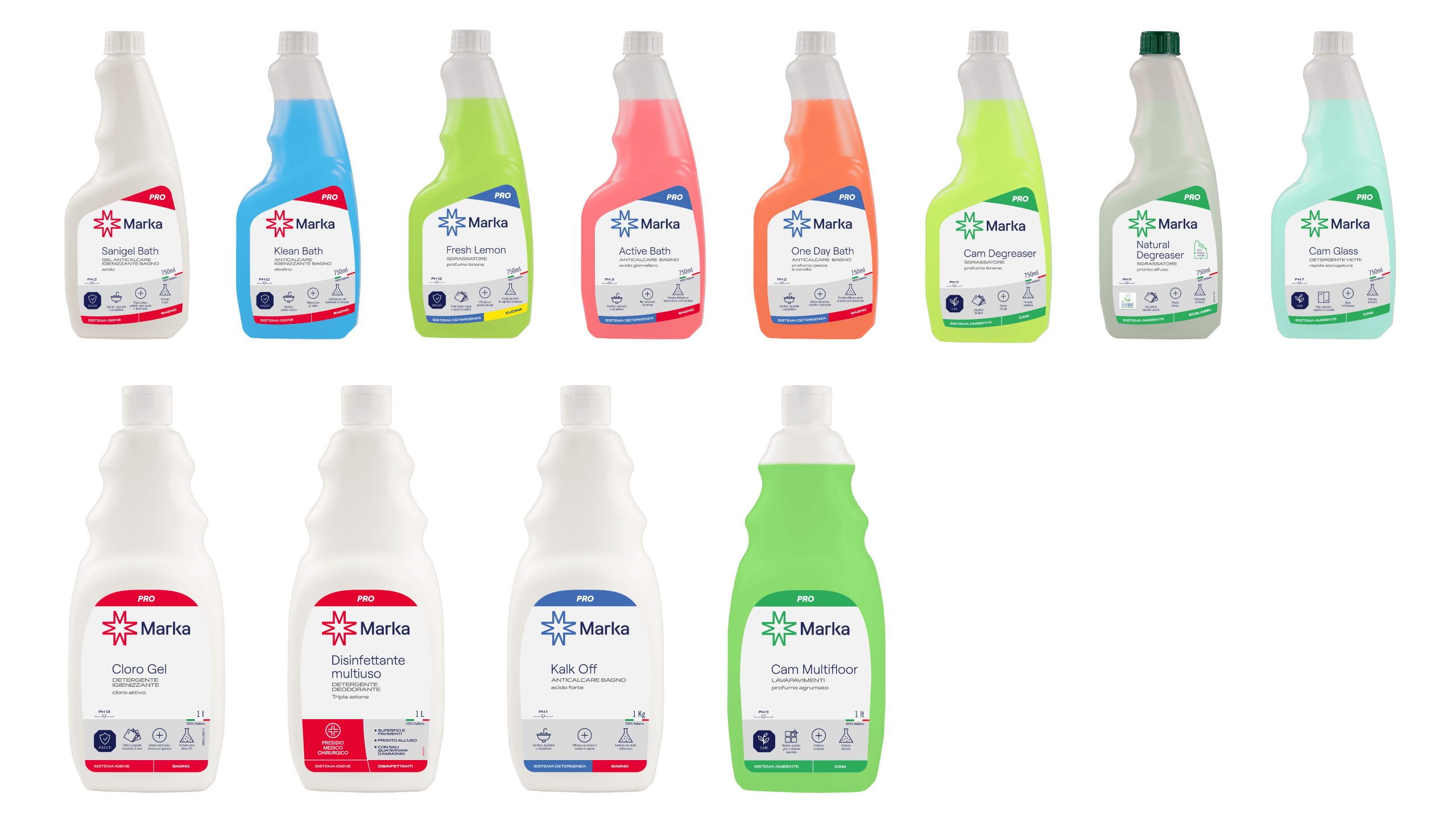
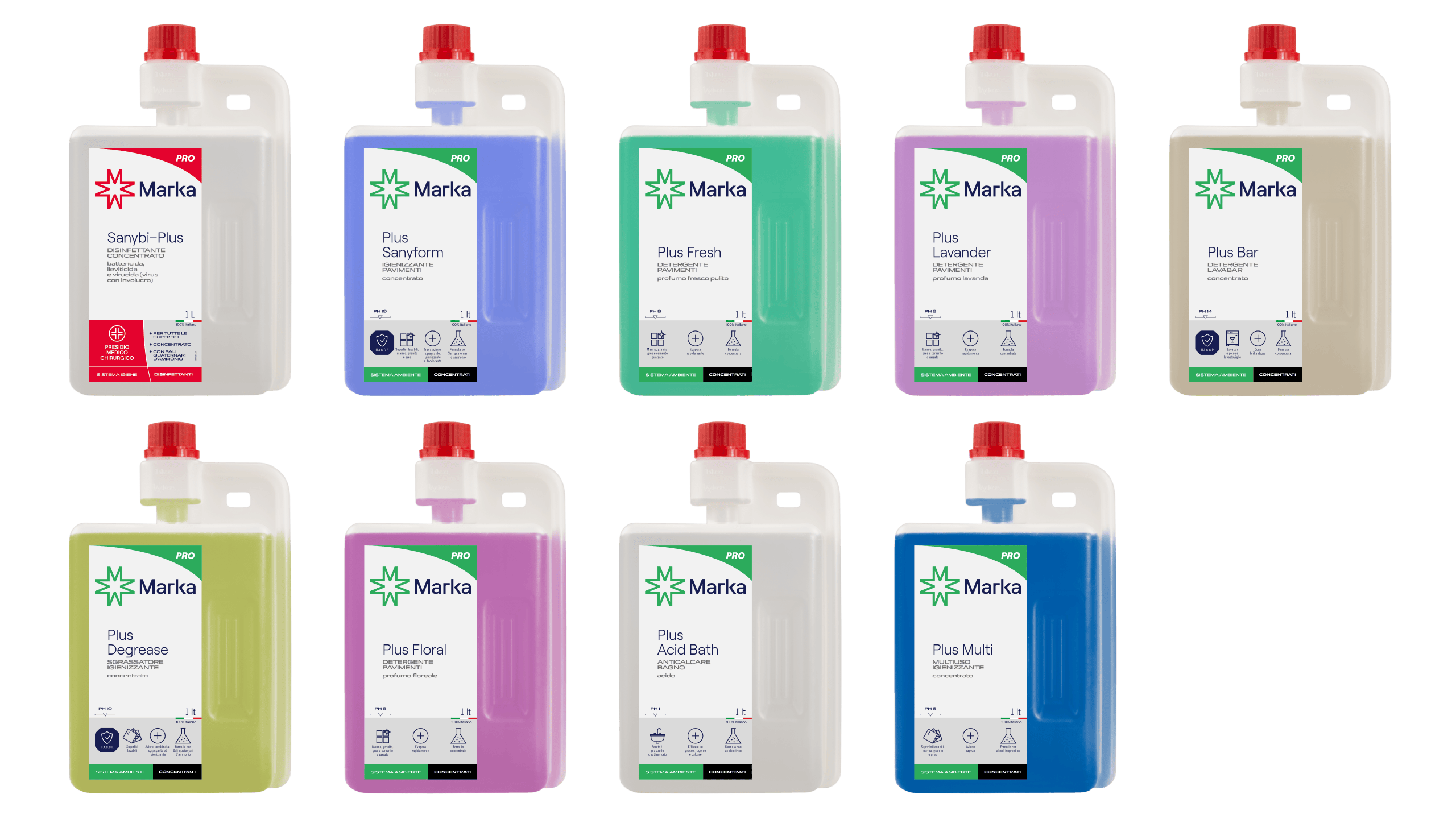
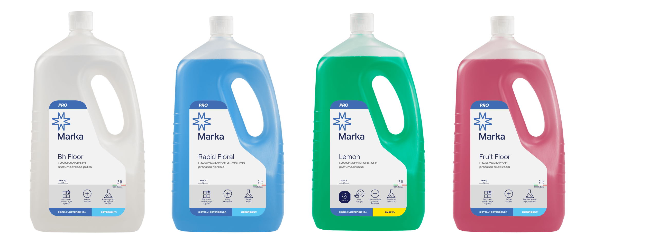
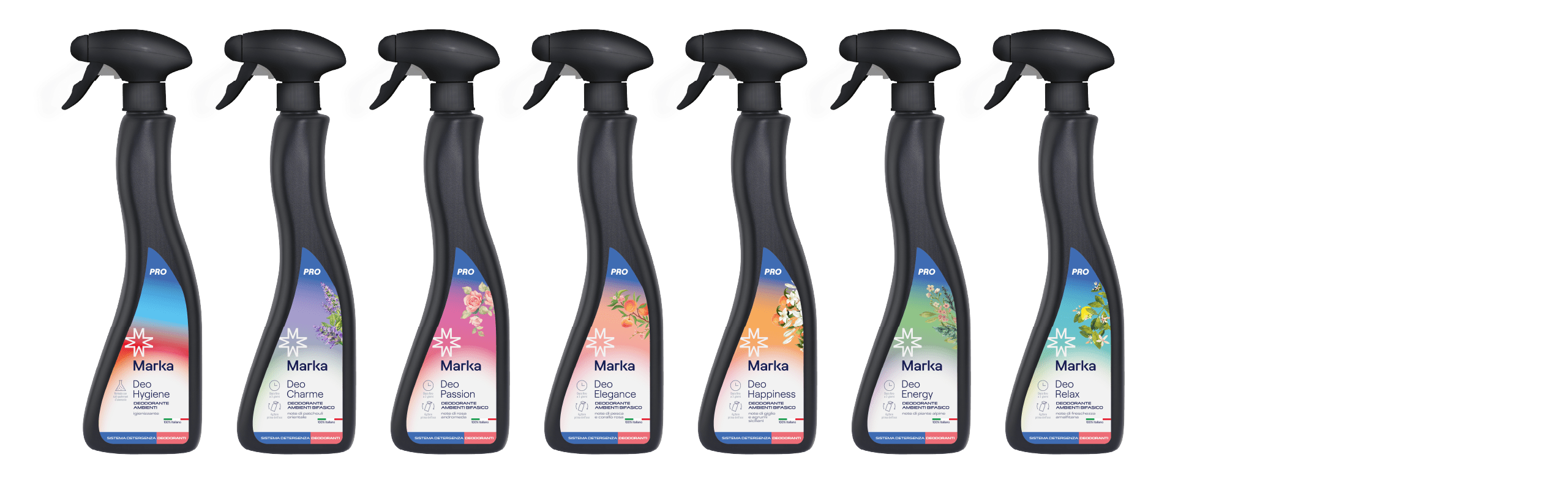
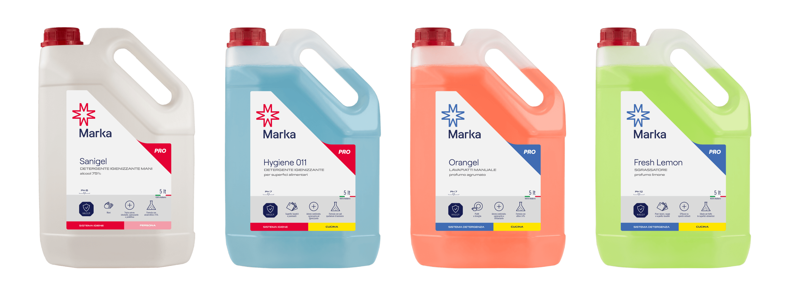
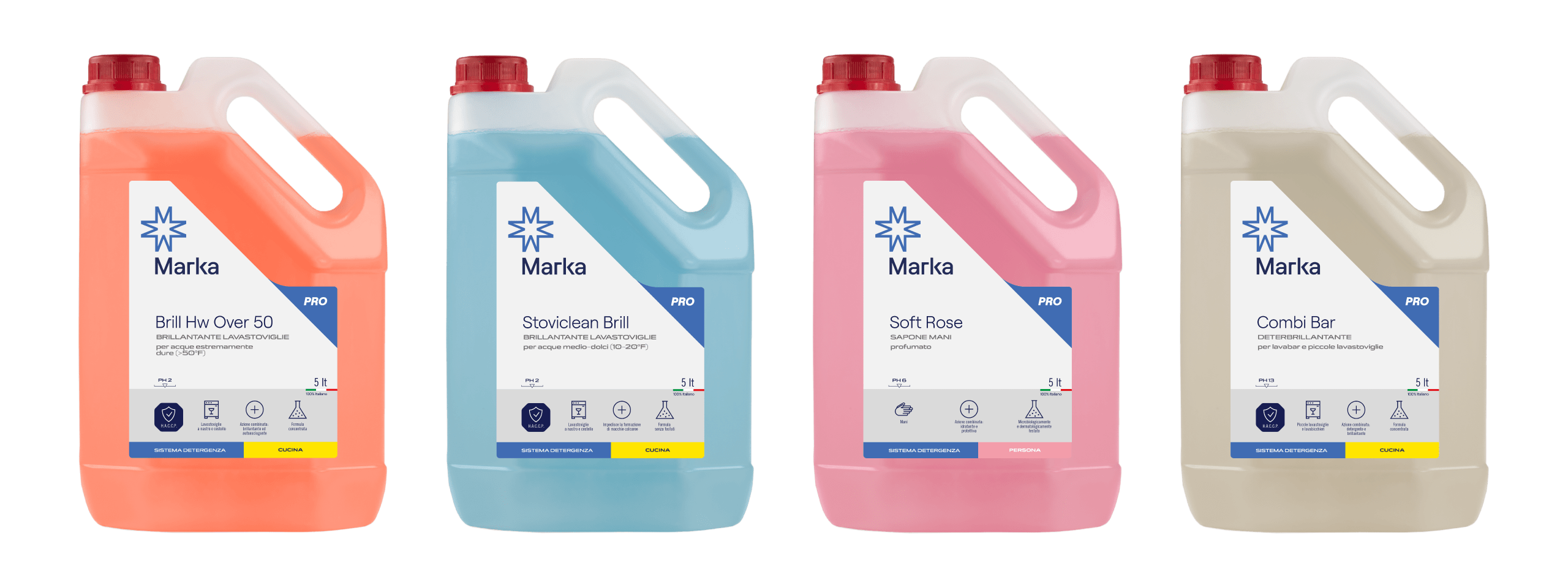
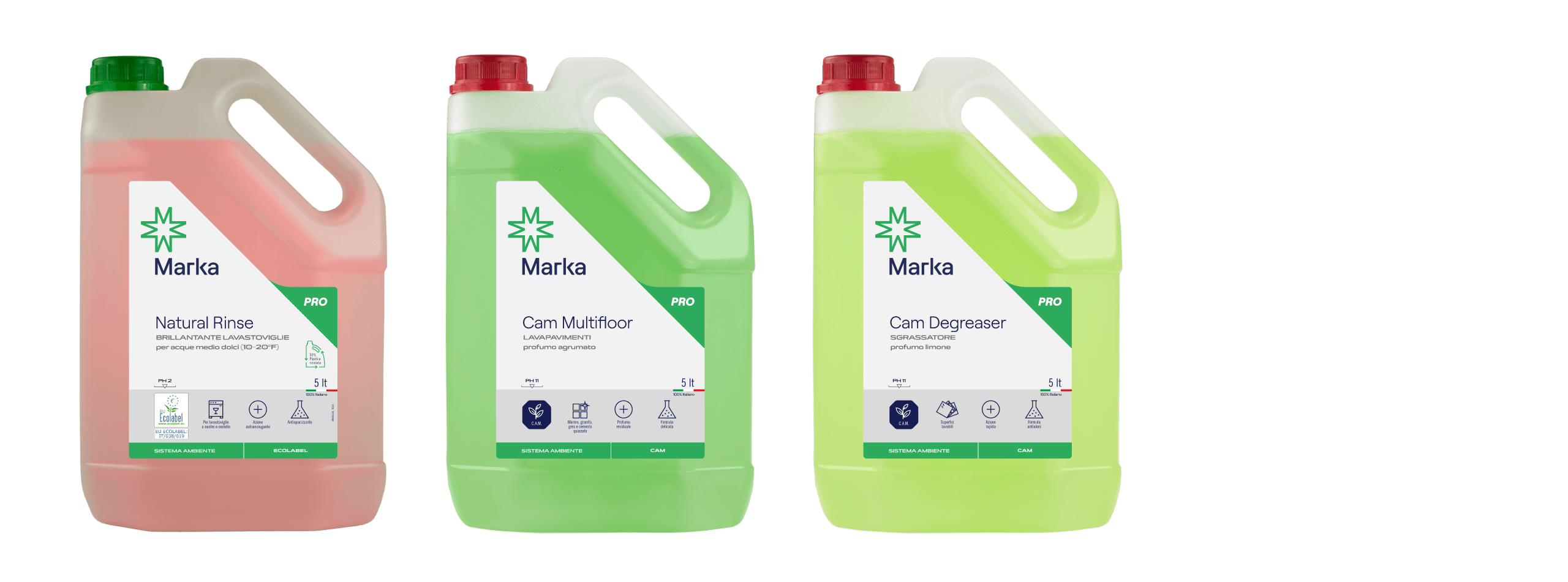
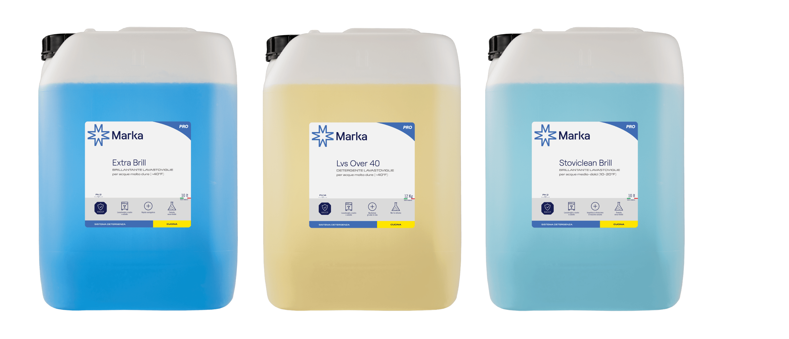
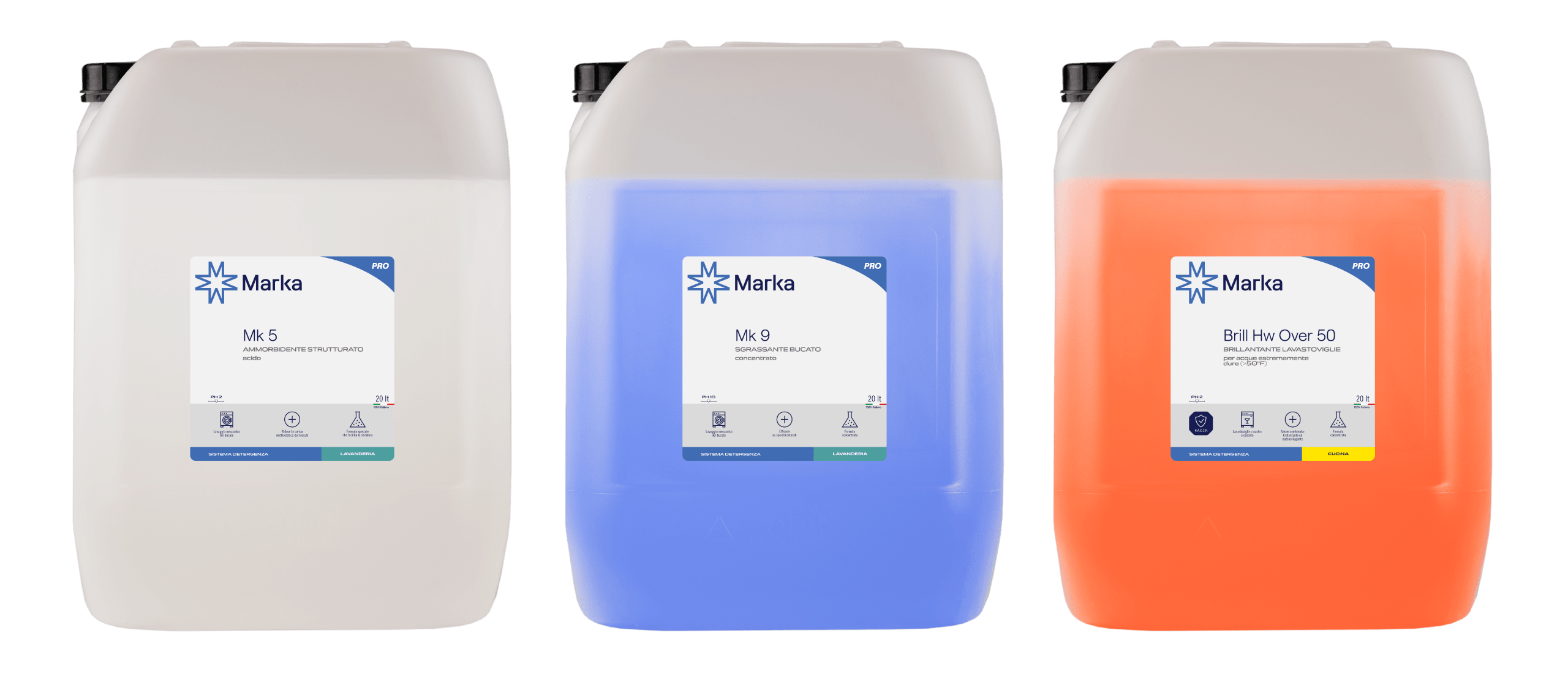
After redefining the visual identity of MK Group and its main brand, Marka, we were asked to design a packaging system able to accommodate the wide range of products in the catalog. The new design was created to make each product clear, easy to understand, and instantly recognisable. Information has been reorganised with a straightforward hierarchy and a clean visual language that conveys professionalism at a glance.
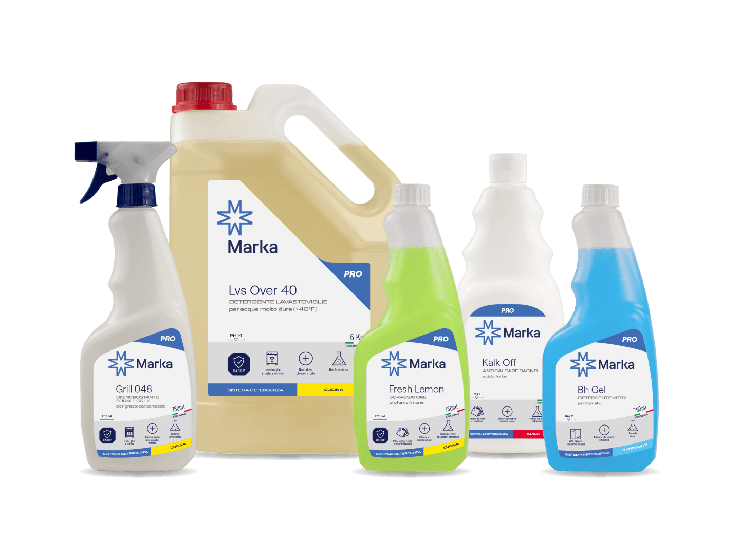
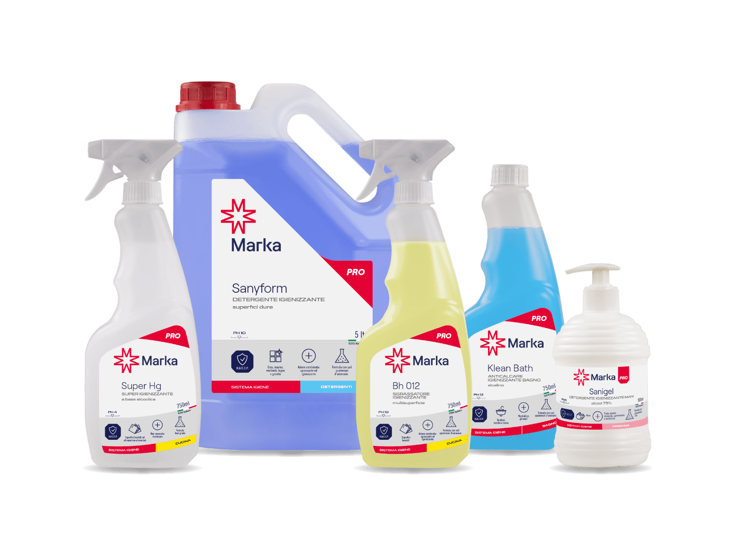
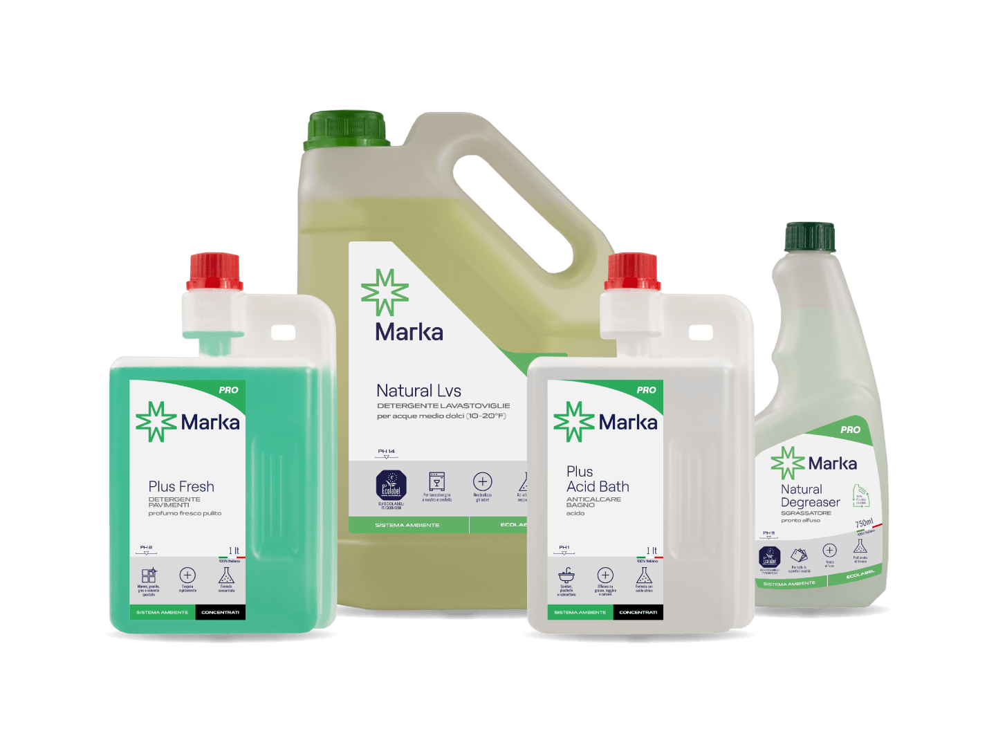
The typography and color choices build on Marka’s visual identity, but have been refined to create a strong and consistent family feeling. Each product maintains its individuality while remaining part of a cohesive whole. Color plays a central role: every line is assigned a distinct shade, ensuring immediate differentiation and making it simple to identify the right product quickly—an essential factor in professional environments where clarity and speed are key.
Functionality was a priority throughout the project. Labels feature clear text, intuitive icons, and well-structured layouts, improving usability and reinforcing perceptions of quality and reliability. More than a simple graphic refresh, this restyling acts as a strategic tool to communicate efficiency and trust. The result is a packaging system that looks modern and organised, enhances the brand, and speaks directly to the needs of the professional cleaning market.