Paranorma
Our typeface for all things fast
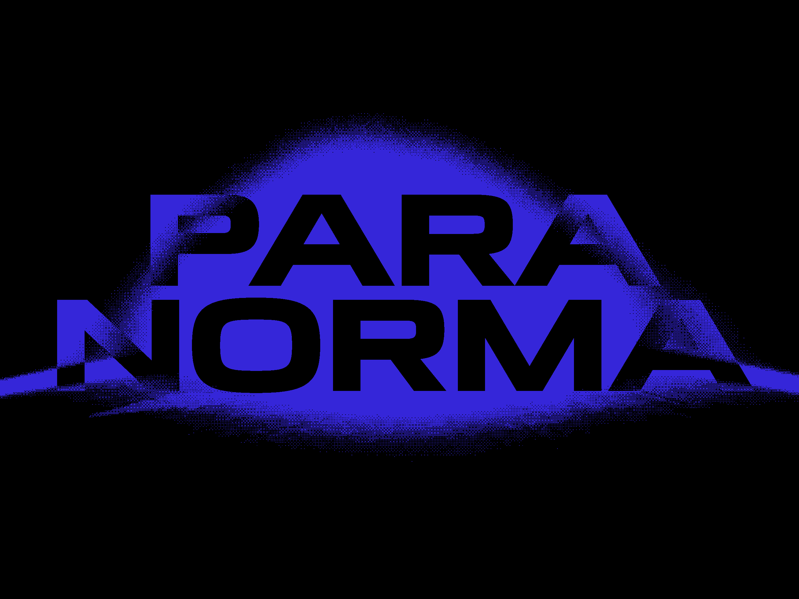
Paranorma was conceived as part of a superfamily in three different styles. It is a highly versatile font that is at its best in the most varied sectors: from fashion to music, cinema, or the automobile industry.
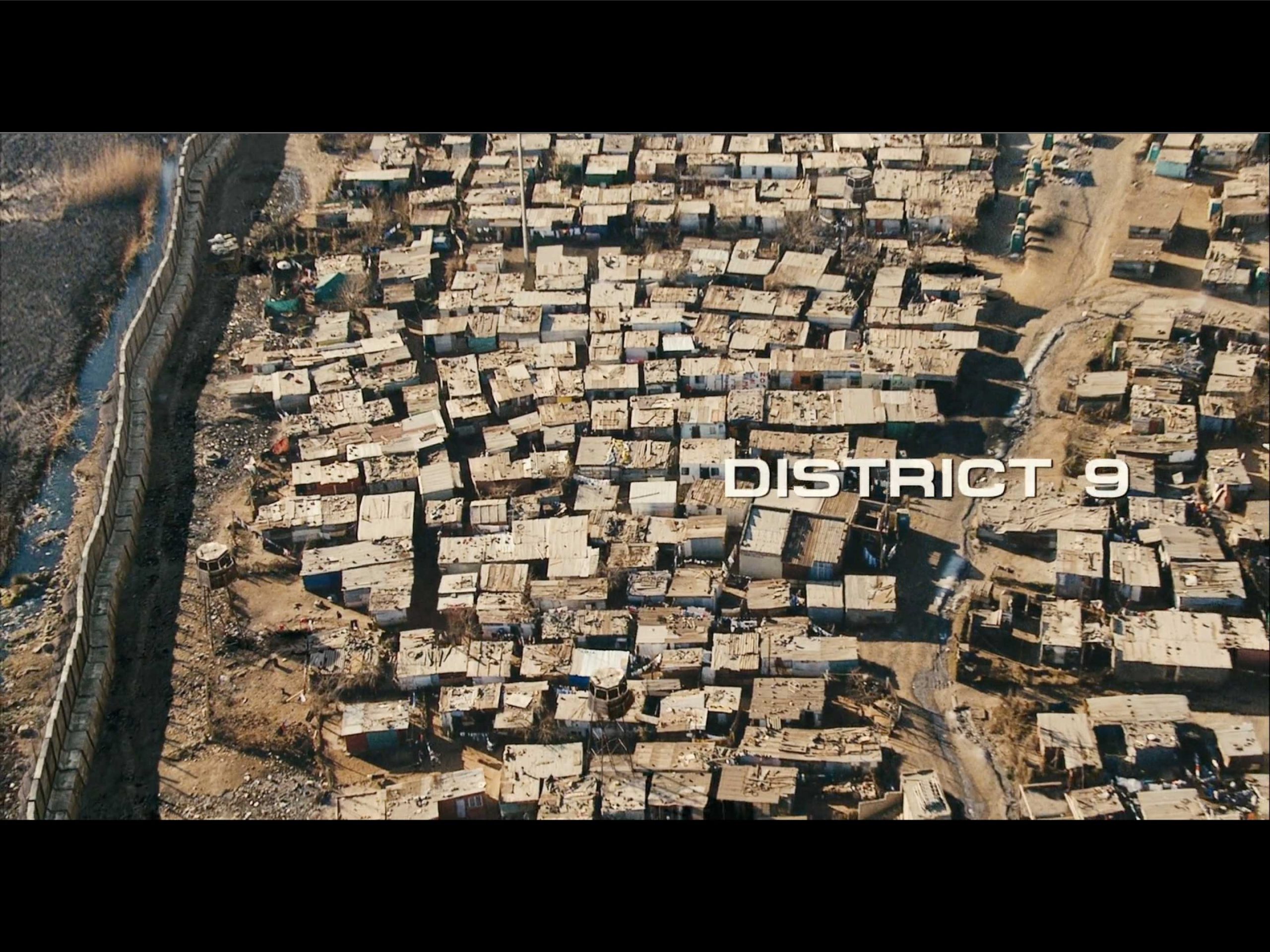
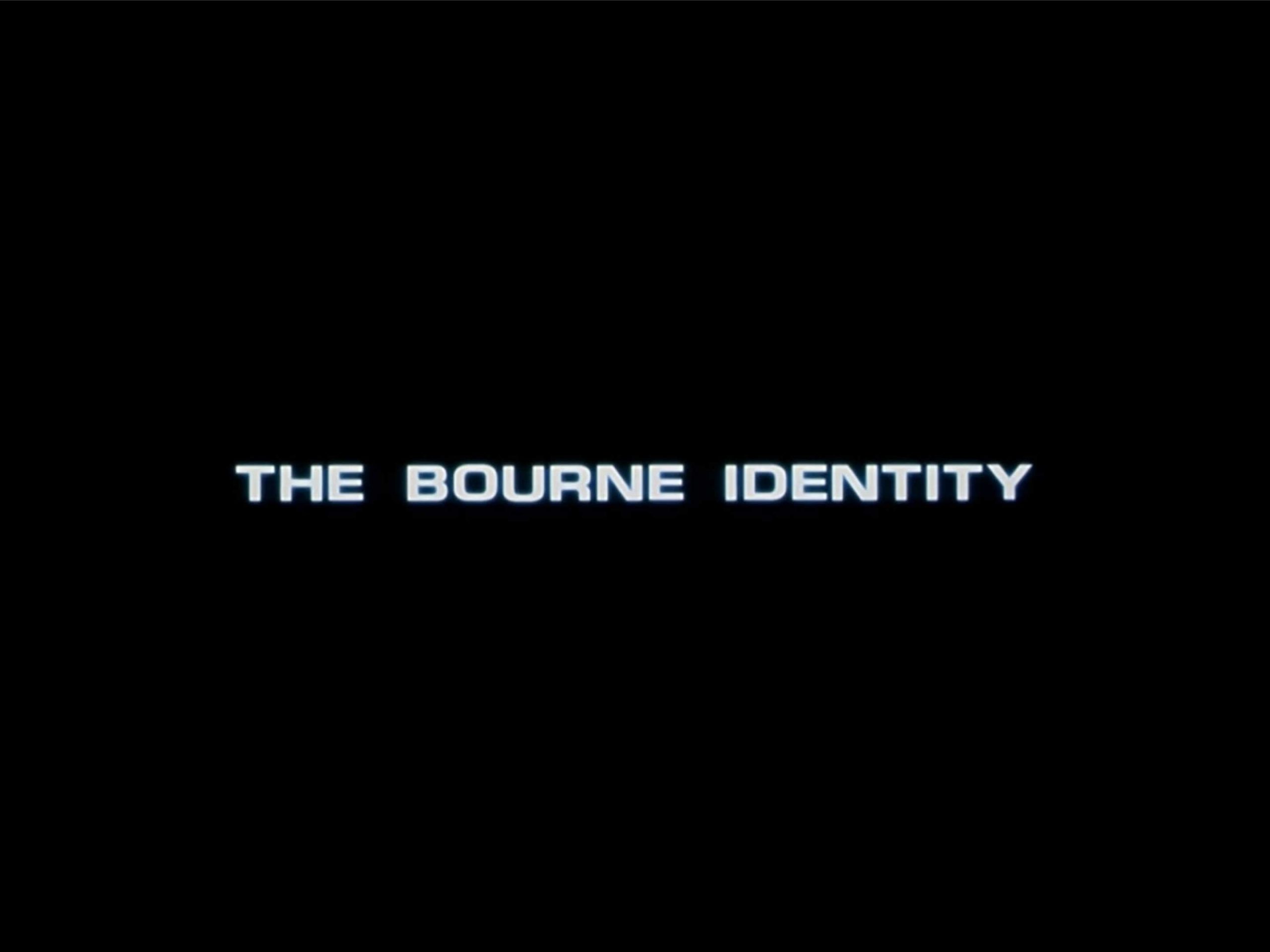
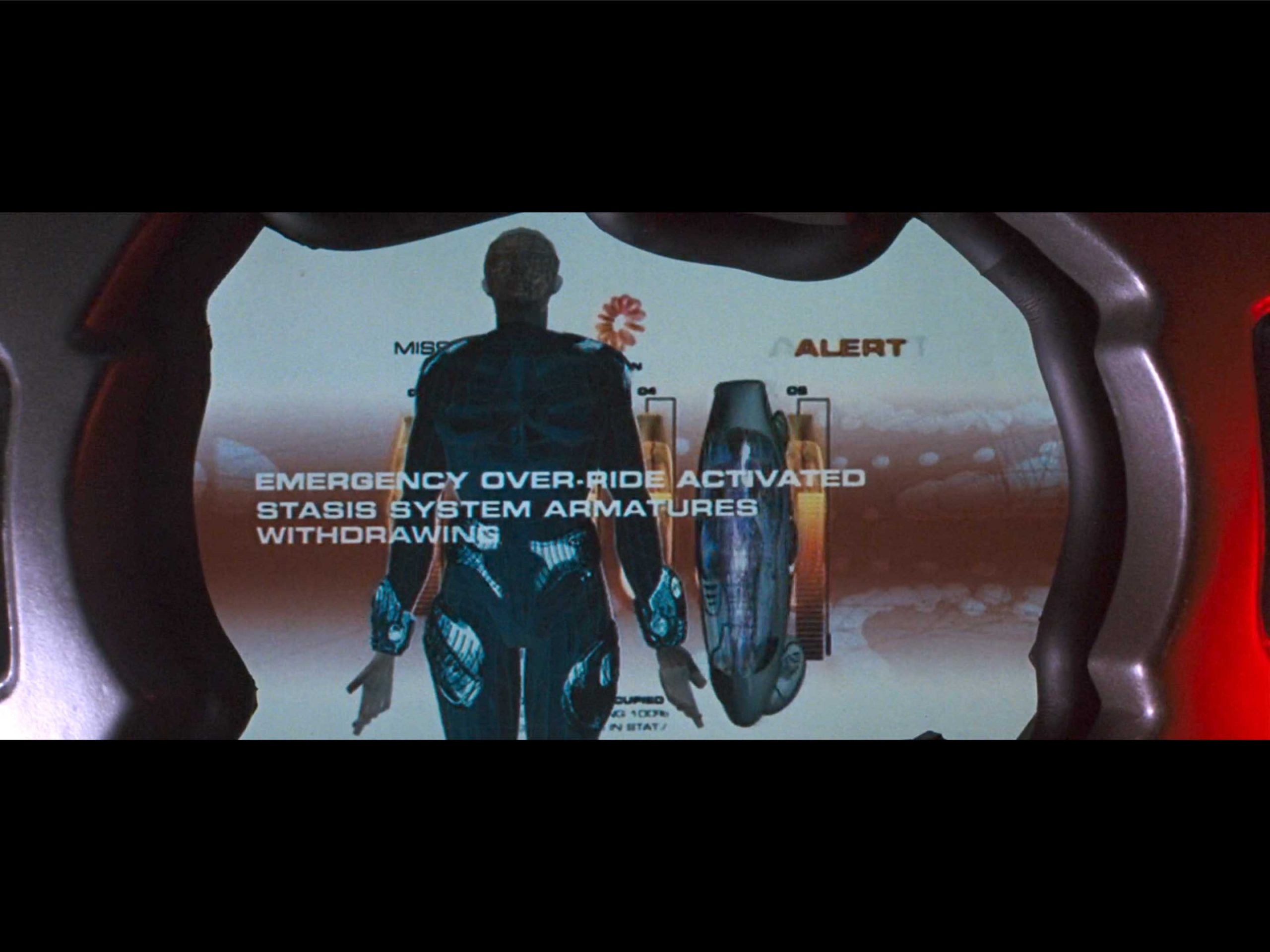
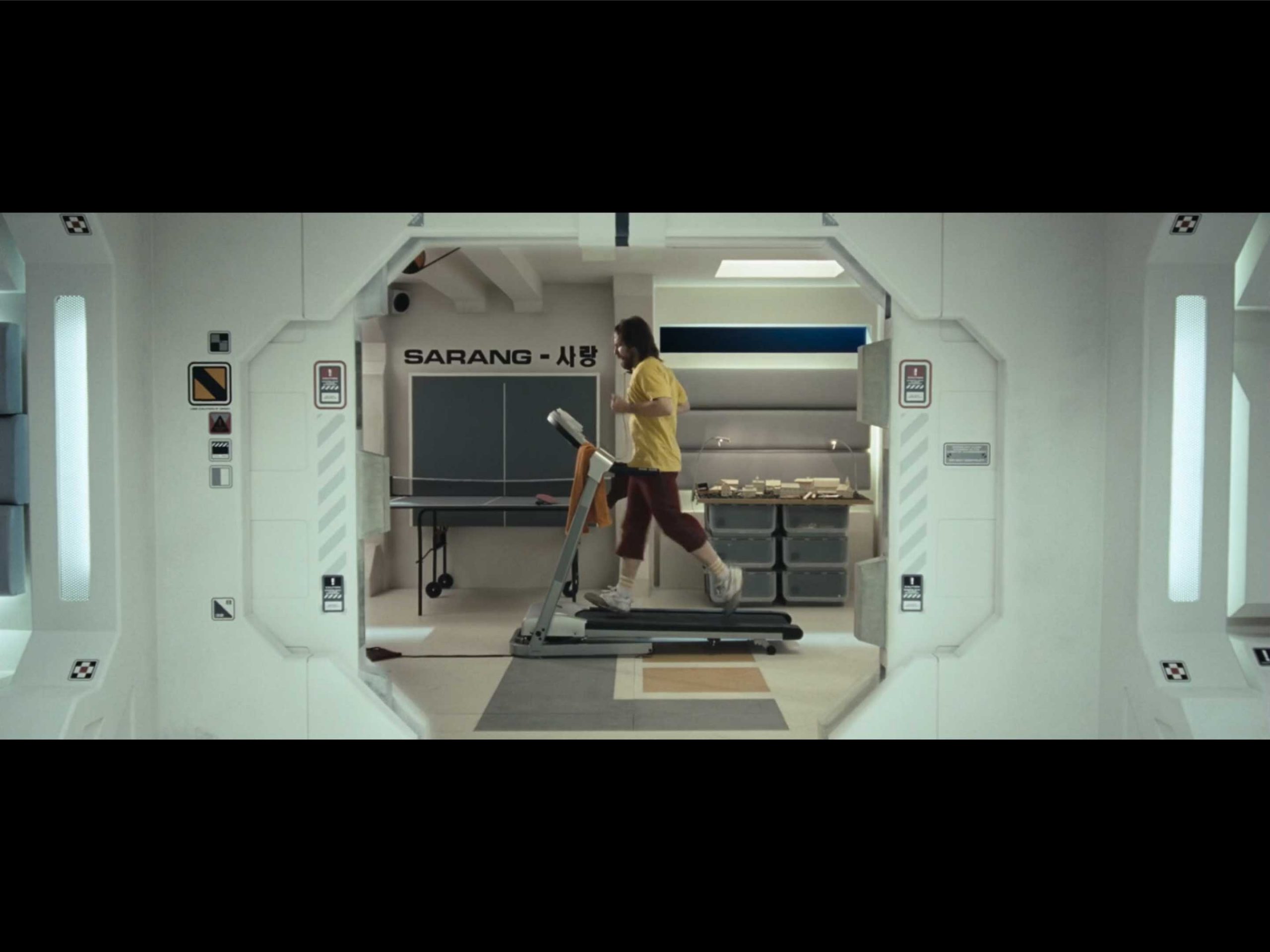
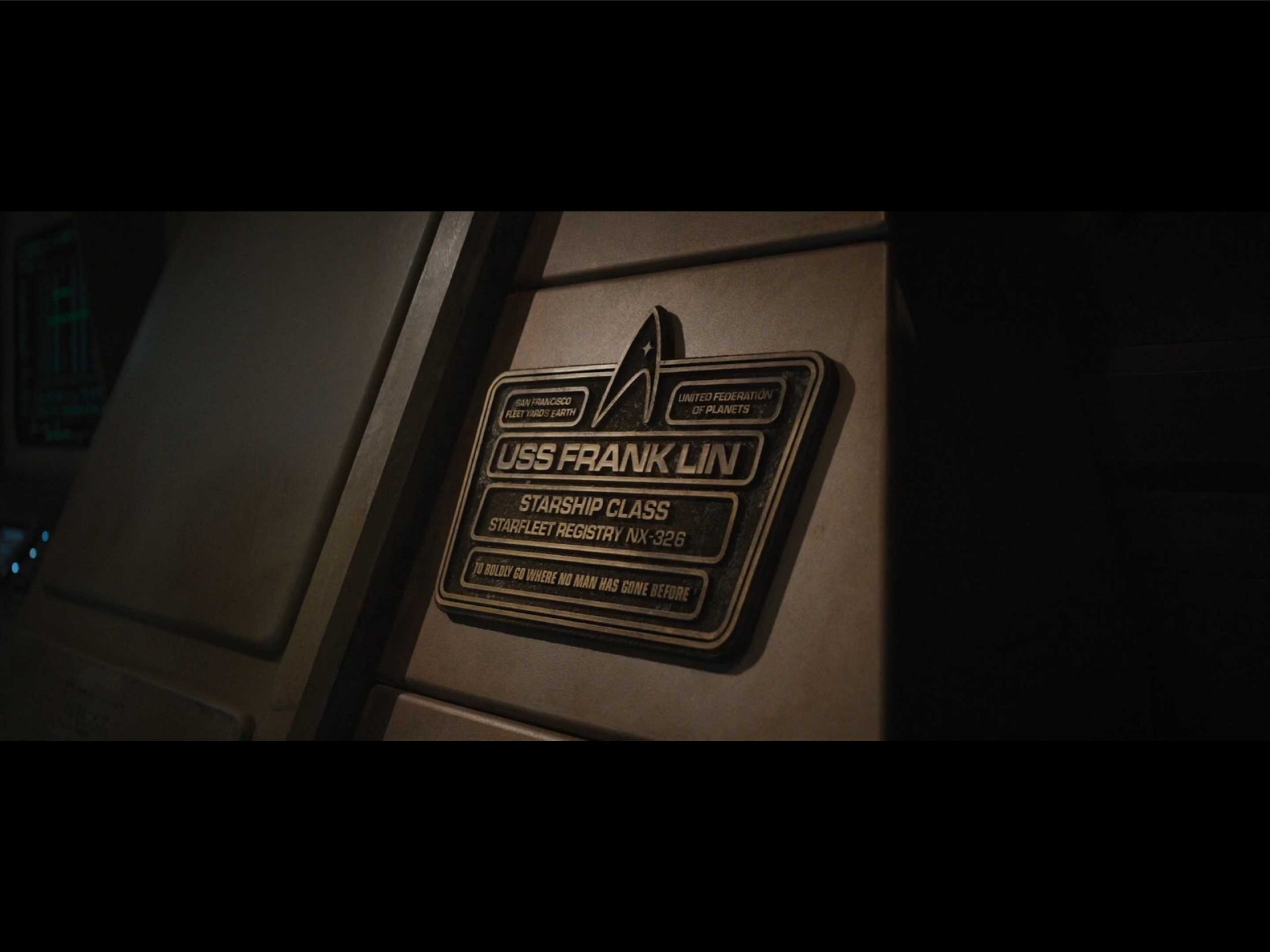
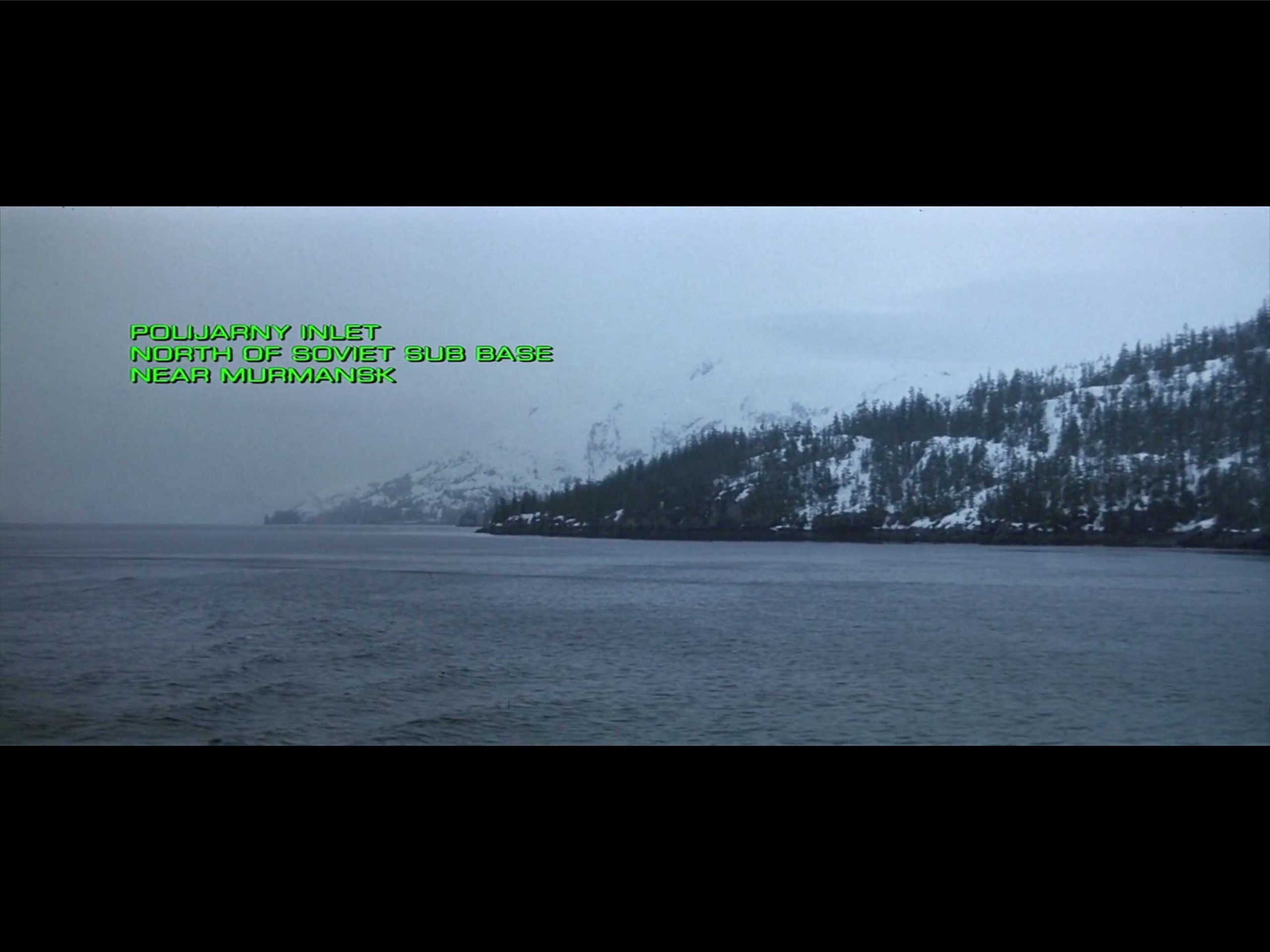
MOVIE IMAGES: typesetinthefuture.com


1 / 7
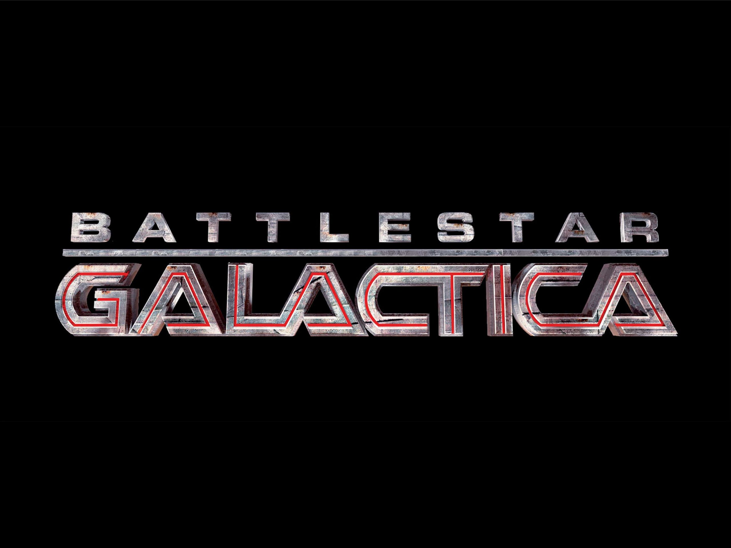
The iconic Eurostile Bold Extended captivated an entire generation and played a significant role in defining the future in the collective imagination. Intrigued by the timeless nature of the font, we wondered whether it still had that futuristic feel, given that we are currently living in the future imagined in the 1970s. We created our own font with the aim of rejuvenating the graphic design of that retro Eurostile look, marking a new beginning for the language of sci-fi.
1 / 7
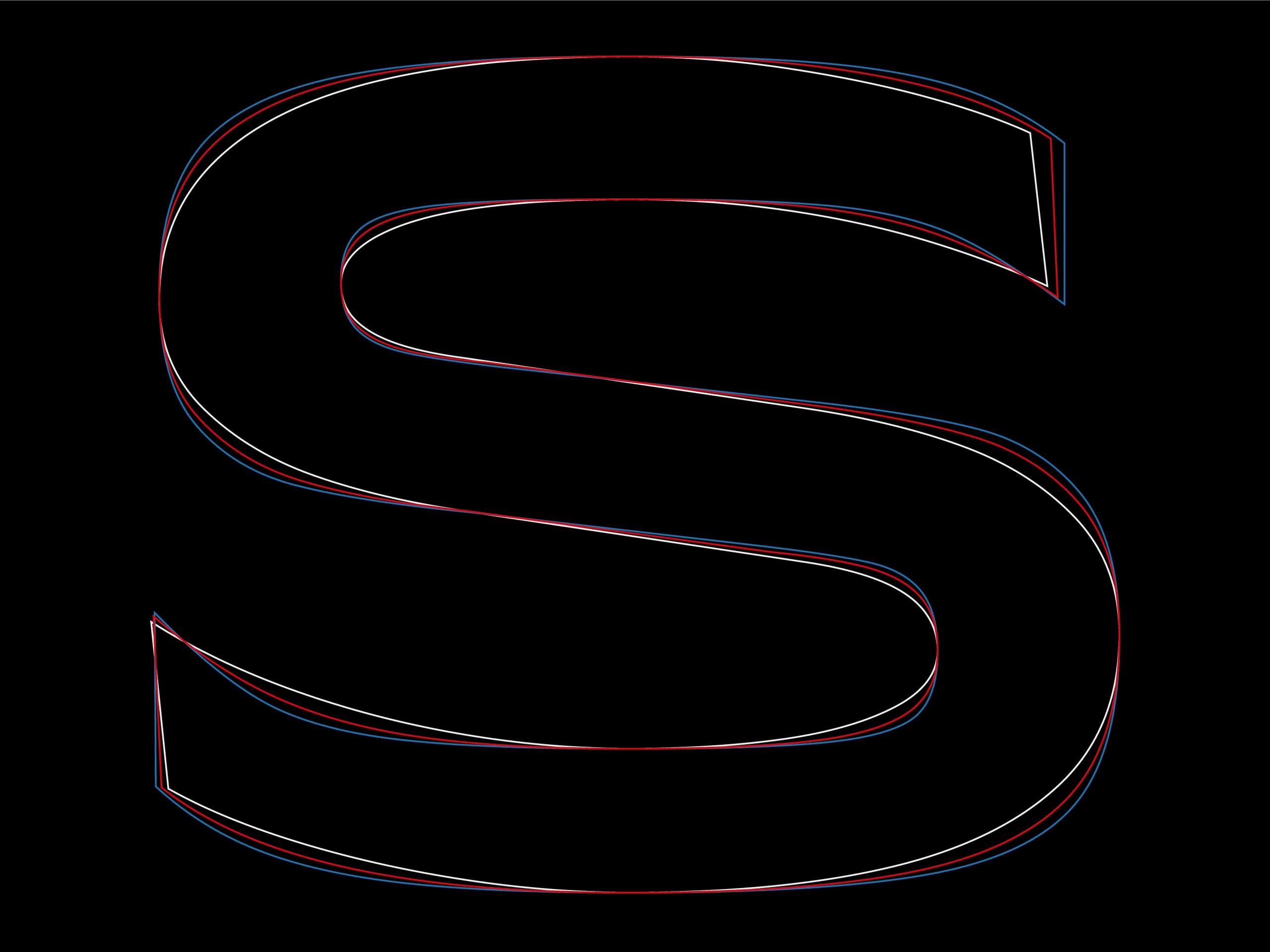
Over the years, as we developed Paranorma, we observed significant interest in extended Grotesque fonts. We took this on board and adopted a less radical approach, settling for less distinctive glyphs in order to increase the lifetime of our font, ensuring greater legibility without losing the regular rhythm that characterizes this type of typefaces.
In our opinion, the limit of Eurostile is also its strength: an alphabet that is extremely characterized, iconic, but not very versatile. Other worlds, such as fashion or entertainment, require softer shapes to accompany diverse and predominant styles. To that point, Paranorma RND works very well as a secondary font.
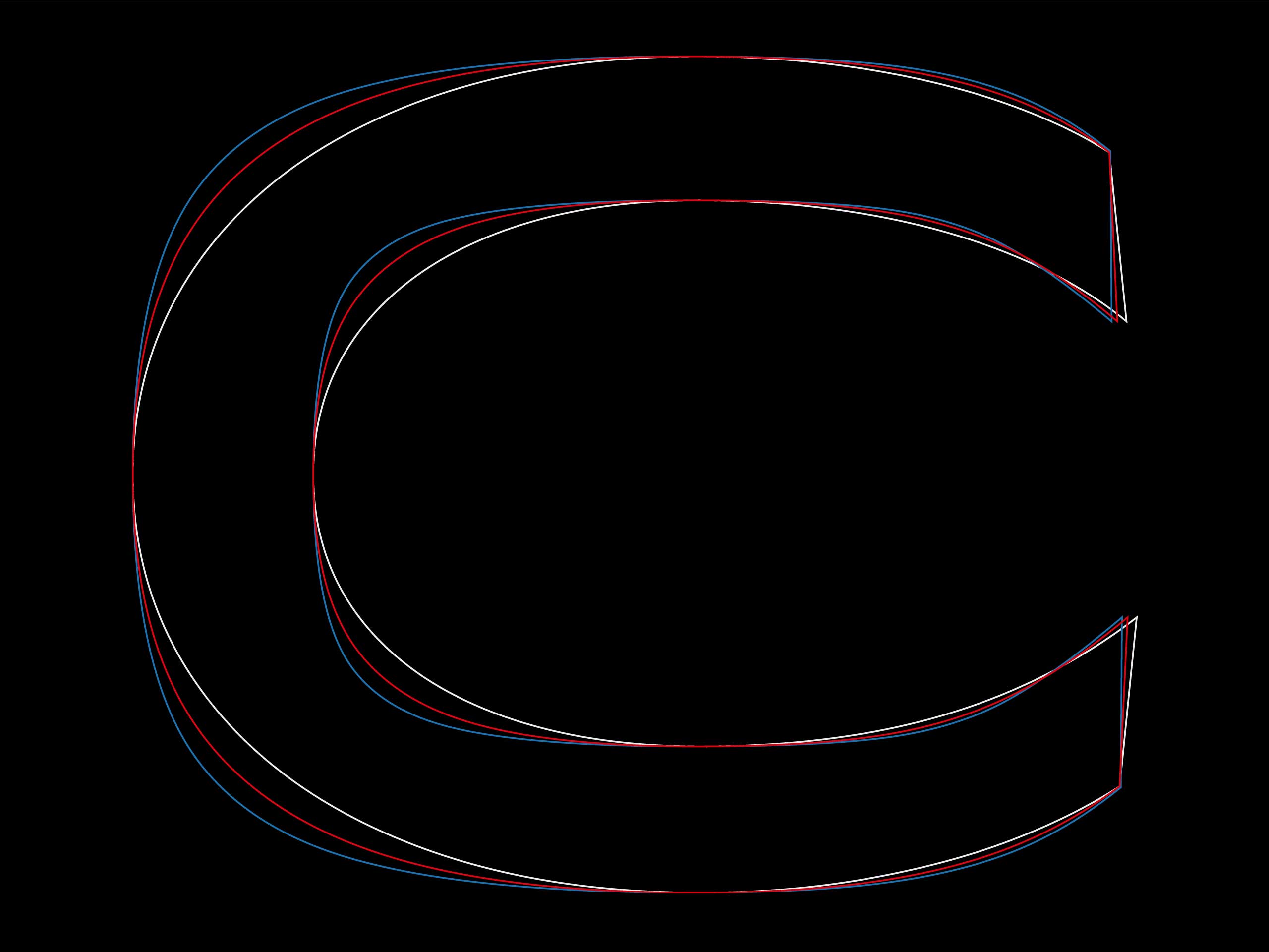
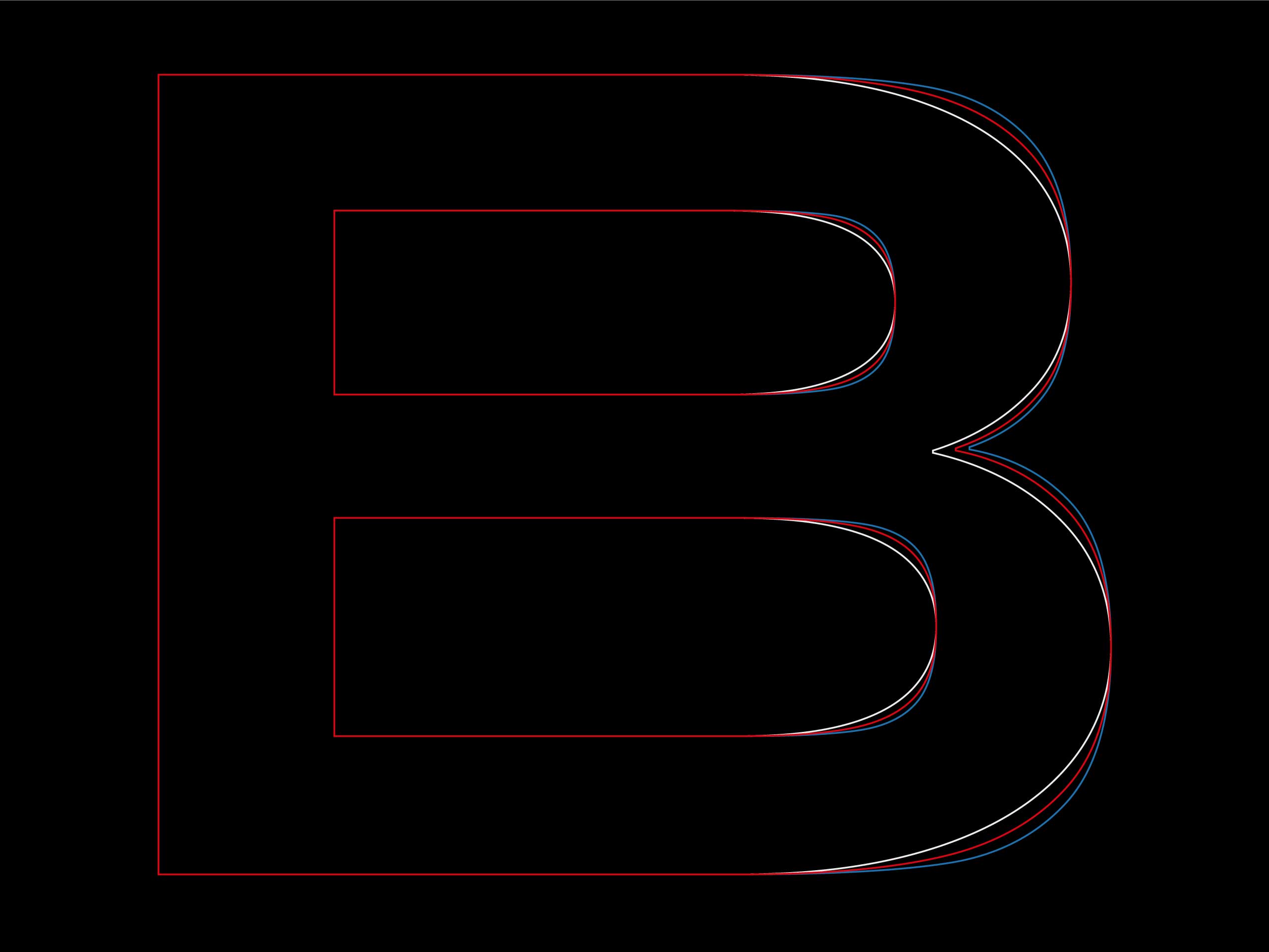
The variable version of Paranorma is developed on two axes: the first interpolates between weight variations whilst the second axis changes the roundness of the curves, going from a more rounded and smooth shape to a more square and technical one. This allows for different personalities to be expressed within the same typographic hierarchy in a layout, without changes in the structure of the font.
1 / 3