Materia
Printable redefines its form. Welcome, Materia
Printable was a company specialized in large-scale graphics, architectural wrapping and advertising installations. Over the years, it had evolved its client portfolio, working with fashion and luxury brands, while market perception remained tied to a purely technical role.
They asked us to lead a radical rebranding process: changing the company’s name, redefining its positioning, and building an identity capable of expressing its true evolution. No longer just a supplier, but a strategic partner supporting clients from the initial vision to the final installation through a tailor-made service that combines creative thinking, production and implementation.


We started with strategy, defining a new direction: Moto Perpetuo (Perpetual Motion). Materia became an ever-evolving organization— a tireless partner capable of managing complex processes with a pragmatic and collaborative approach. This led to the transition from Printable to Materia, shifting the focus from printing to substance, from surfaces to transformation.
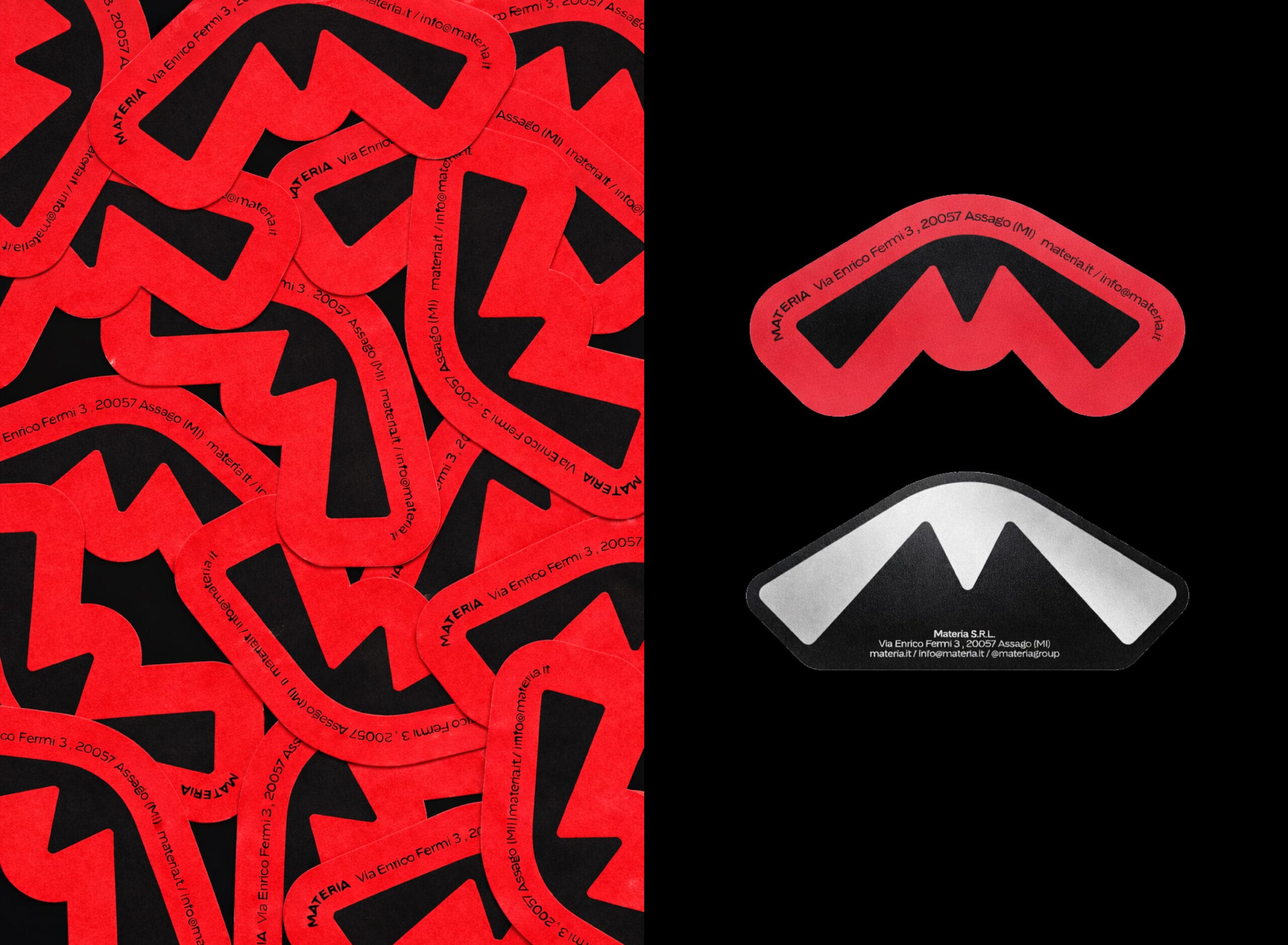
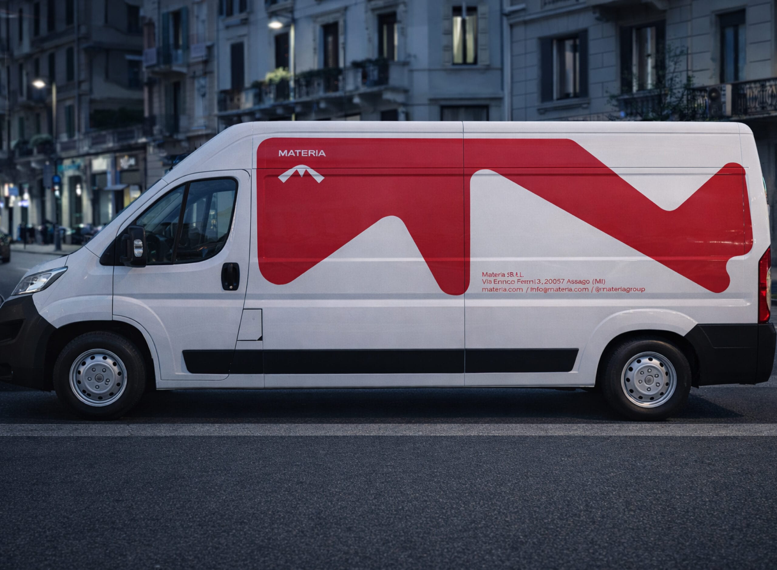
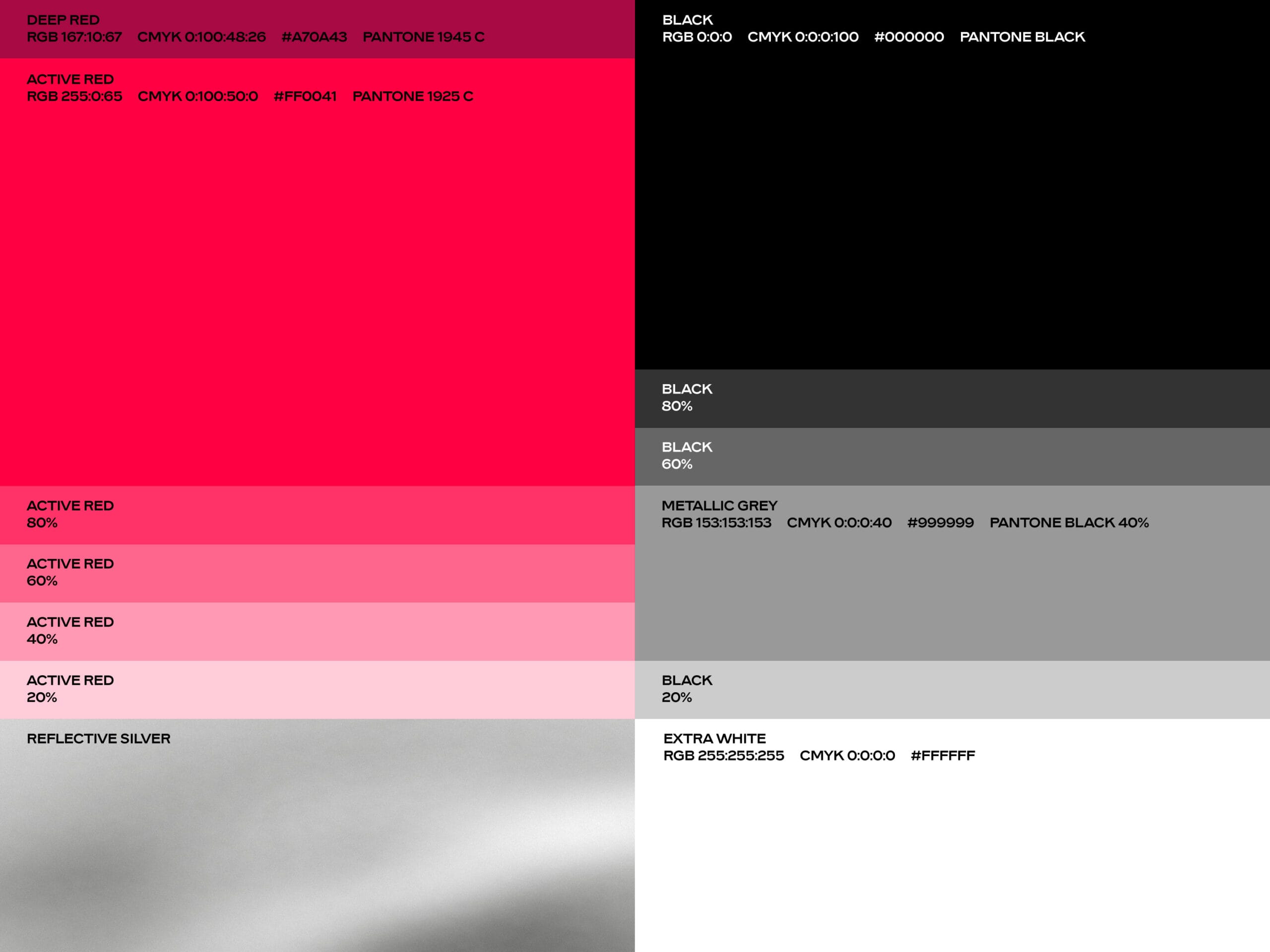
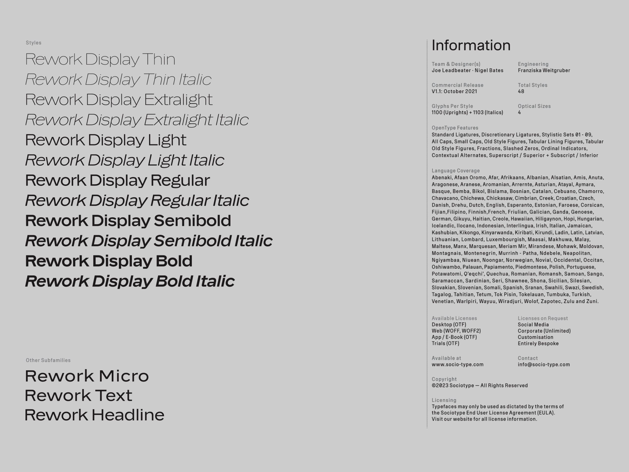
From there, we developed the positioning, brand architecture, verbal identity and a visual system built around the values that emerged from the strategy: determination, resilience, ambition and optimism. The identity was designed to live naturally across every key touchpoint, from installers’ workwear to branded vans and trucks, as well as stationery and digital and out-of-home campaigns.
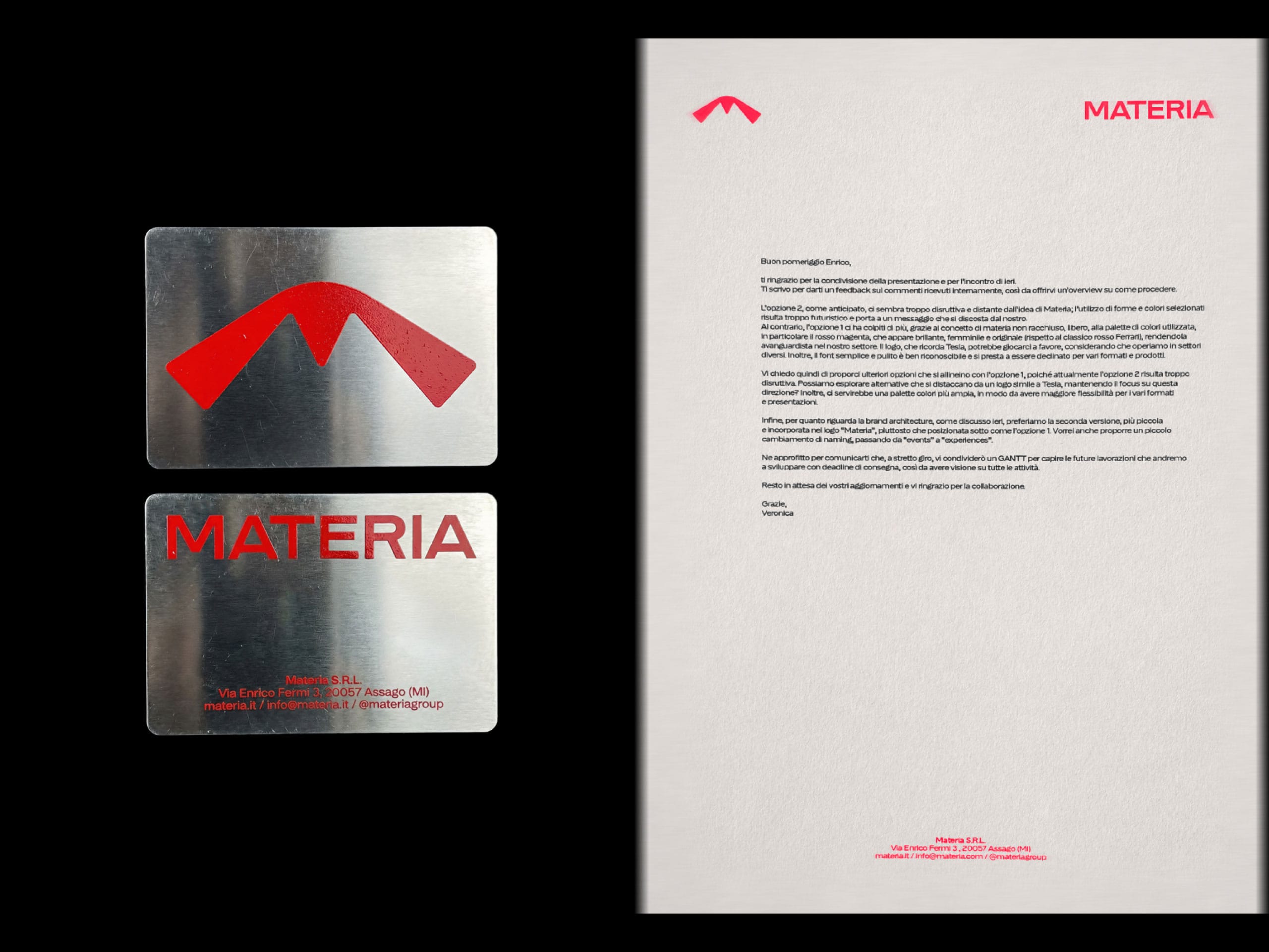
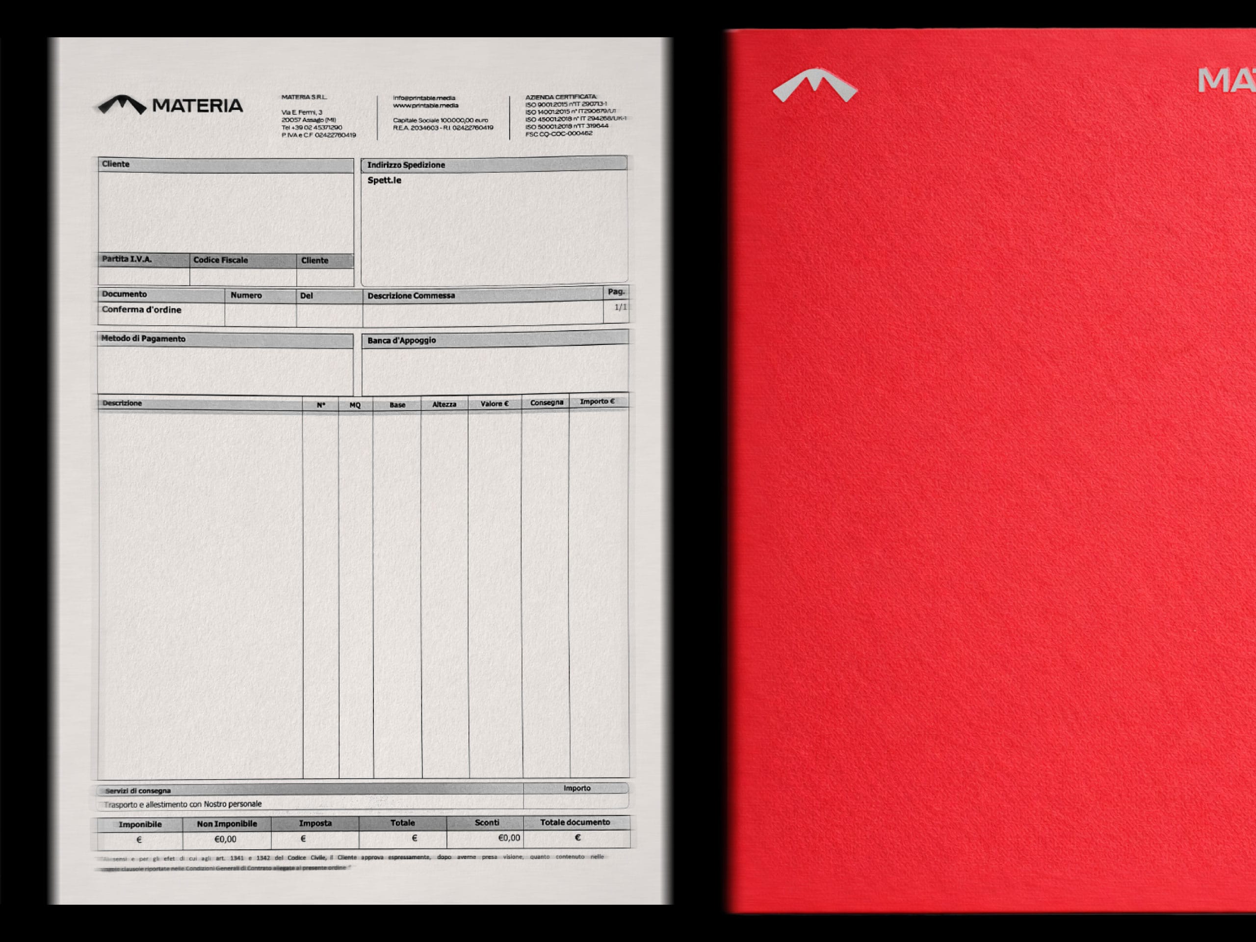
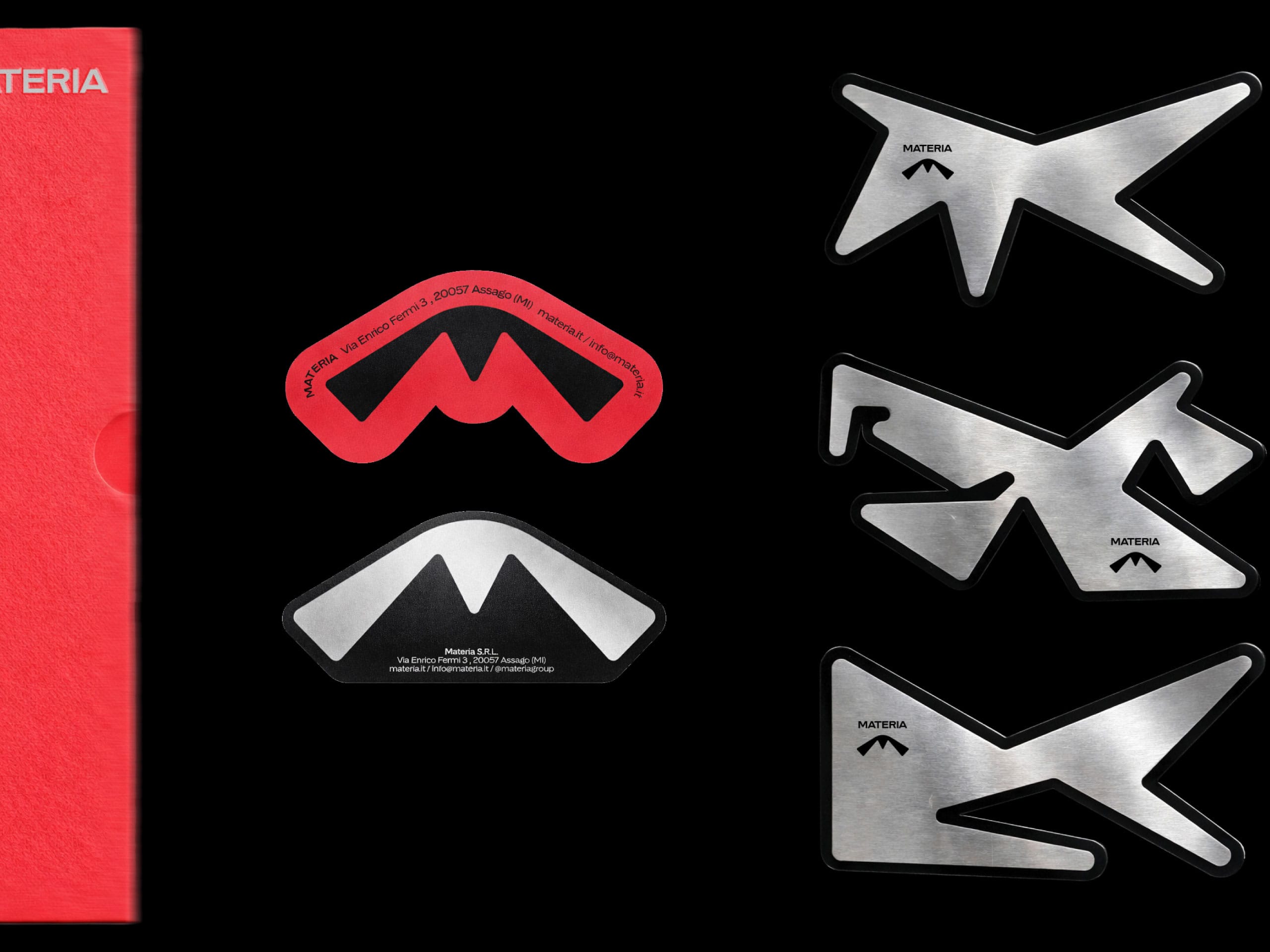
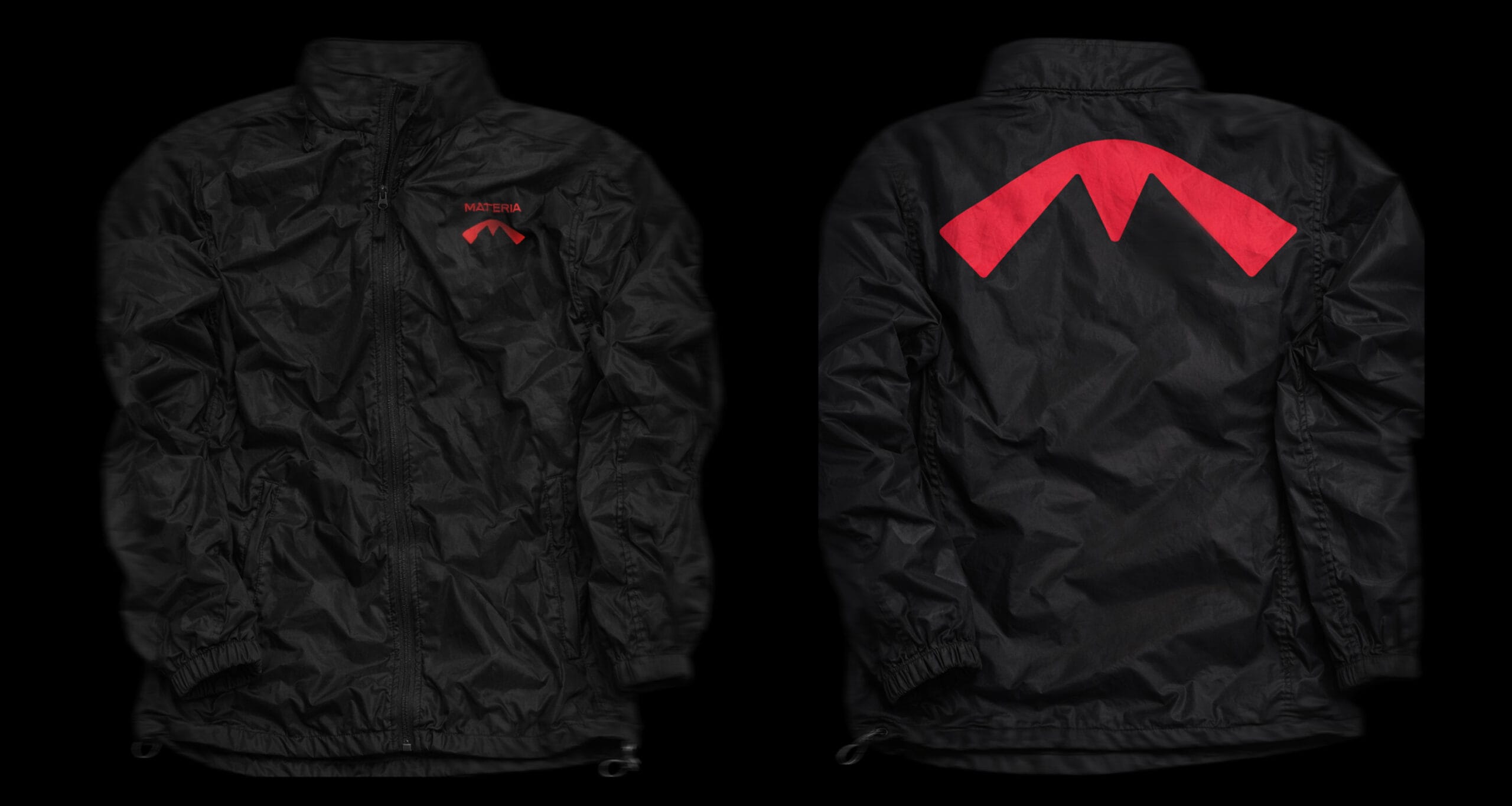
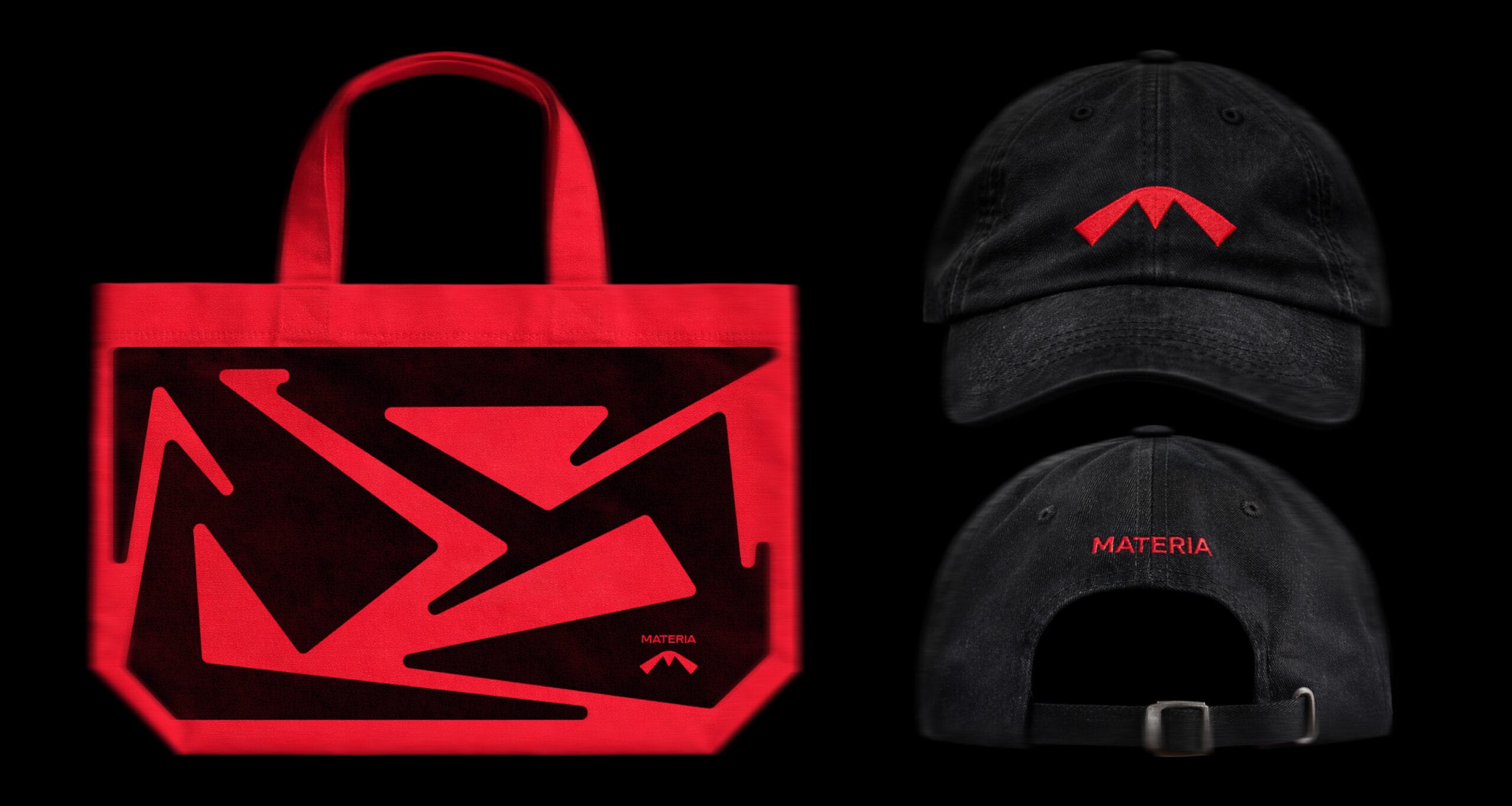
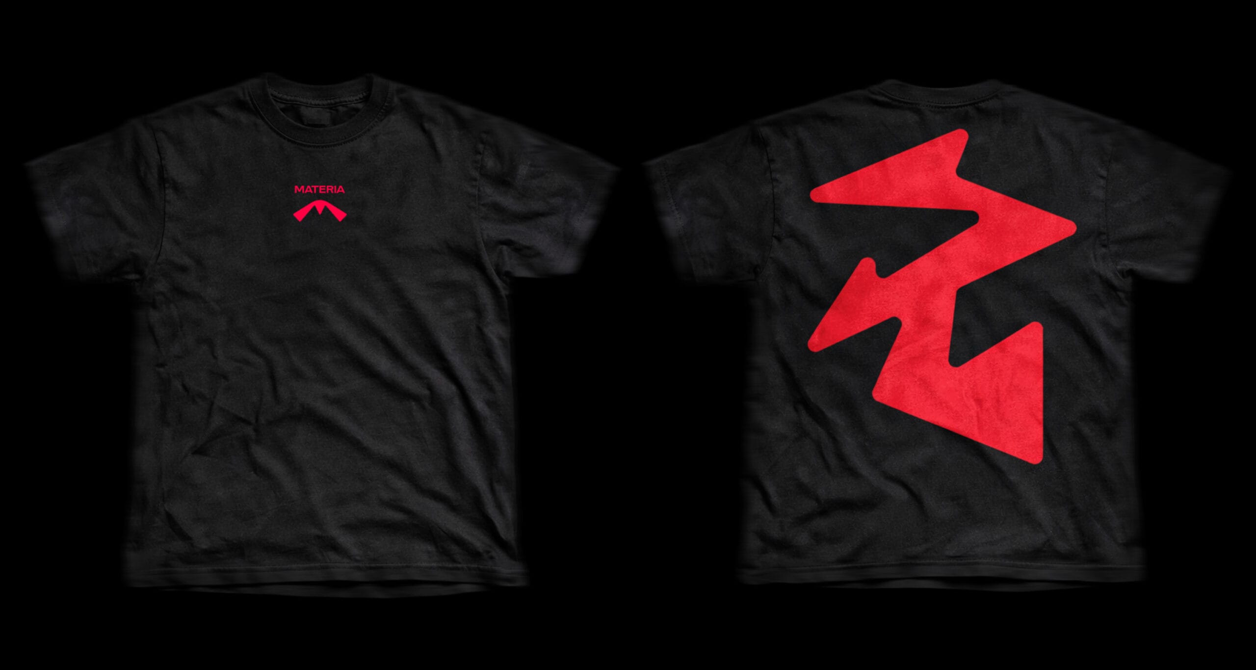
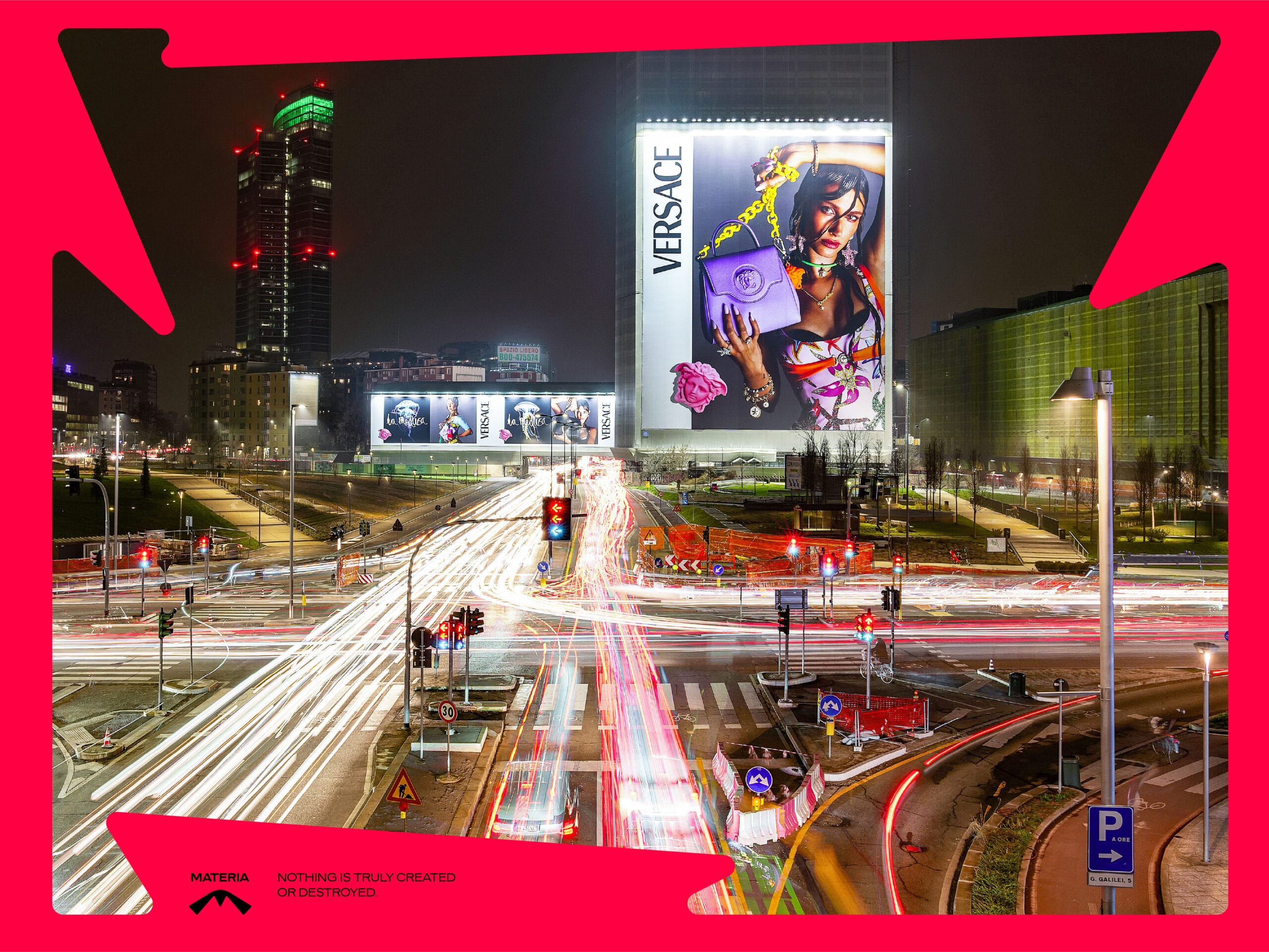
At the core of the project is the idea of movement. The logo and graphic language are never static: they expand, adapt and evolve while remaining instantly recognizable. An identity designed to move, just like the company it represents.
Materia is no longer just about execution. It is energy taking shape.