Fiscozen
The future of freelance professionals has a new identity
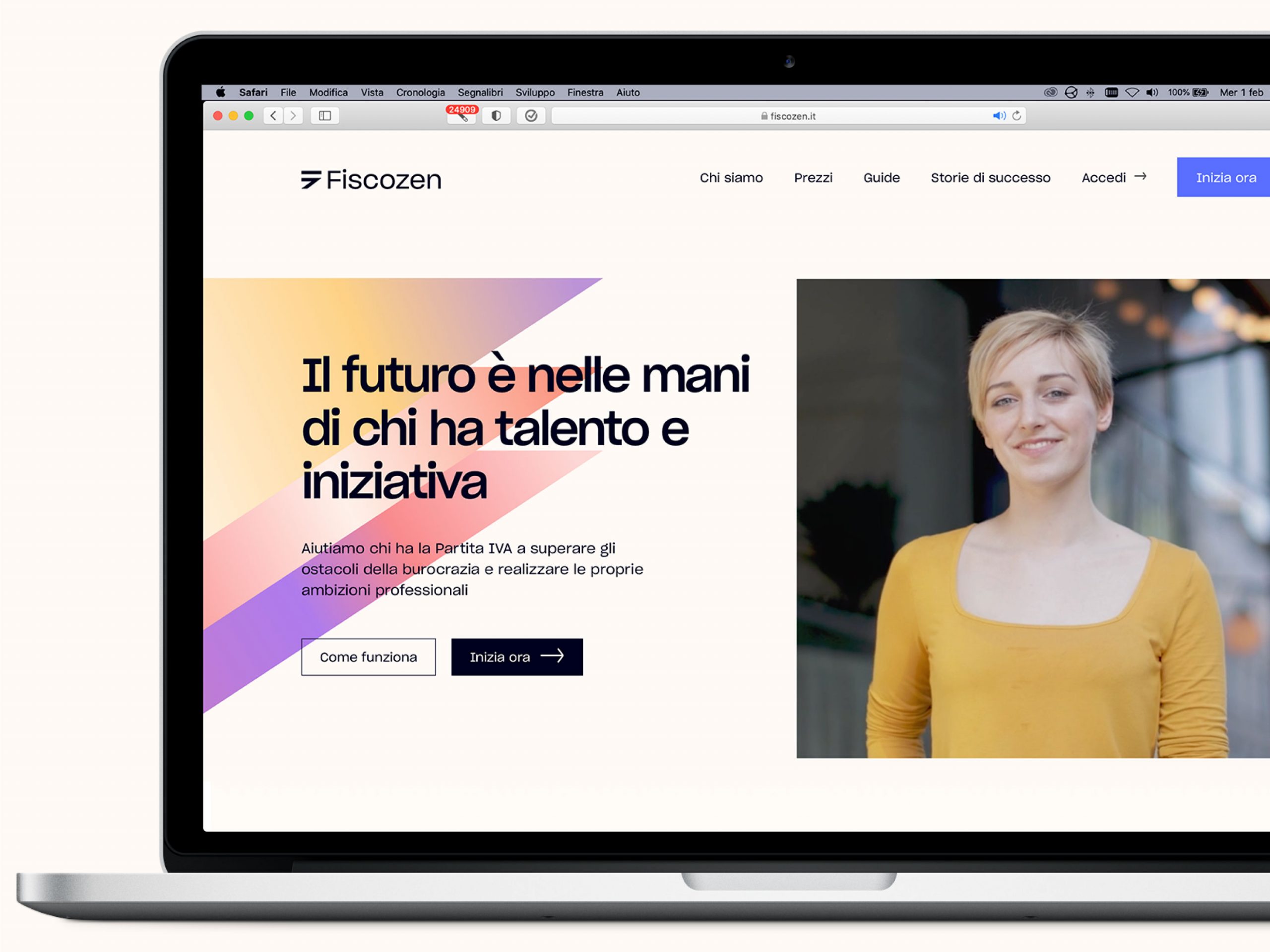
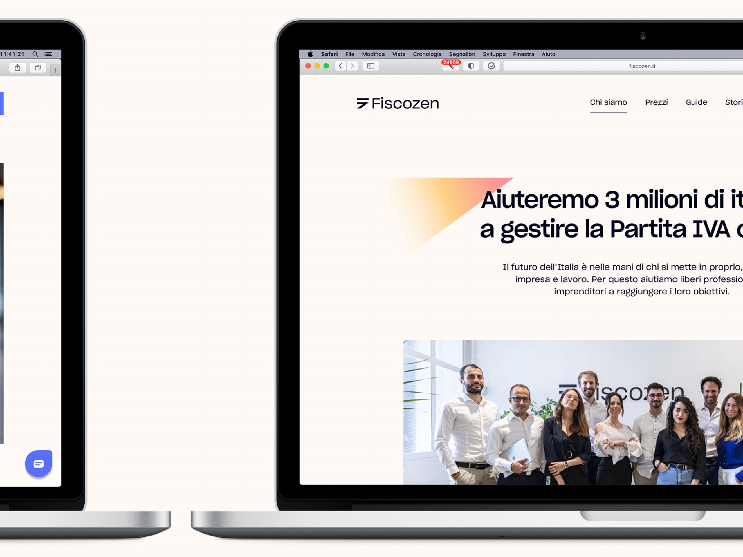
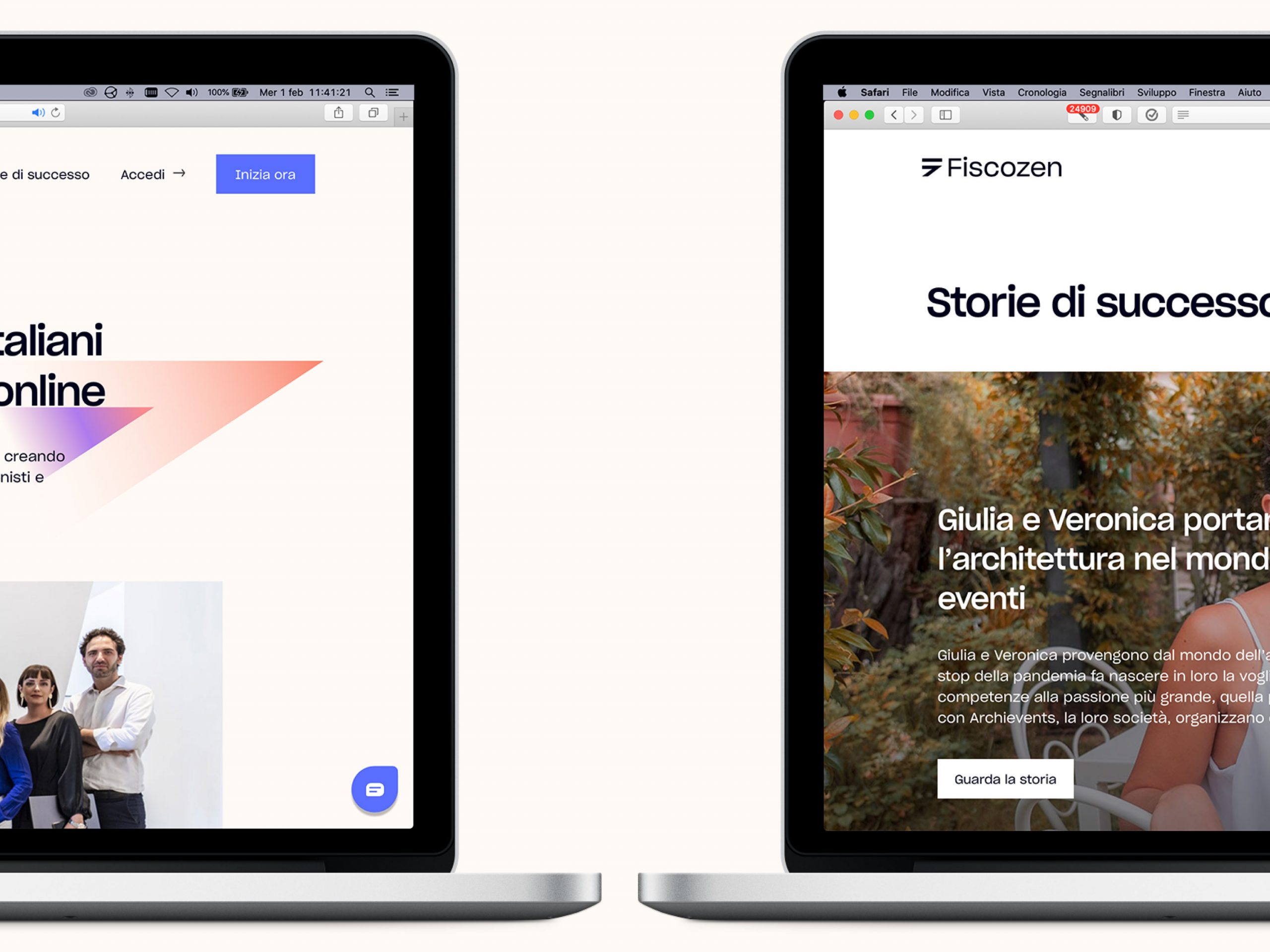
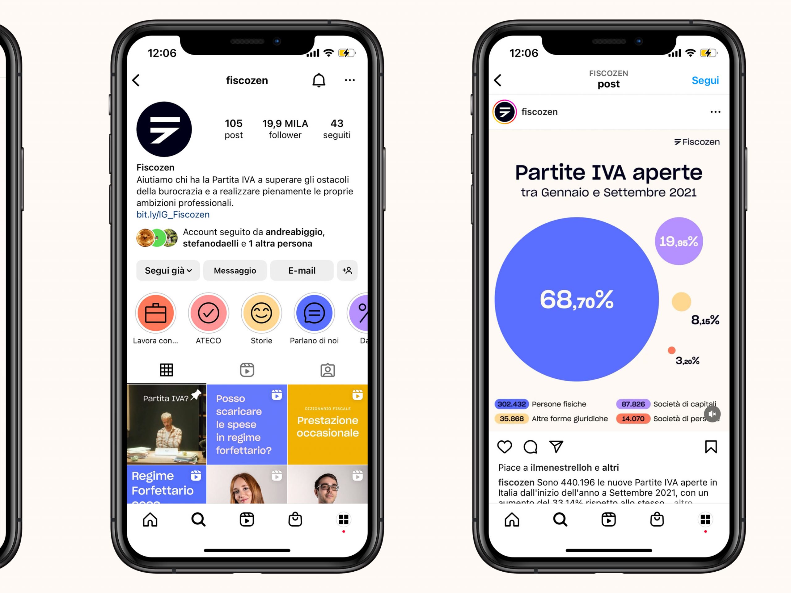
We have developed the rebranding of Fiscozen, an innovative digital accounting management service for freelance professionals. The new visual identity aims to give voice to the brand’s values, accompanying its strategic repositioning in a very crowded competitive landscape, and allowing it to take a step forward in quality, elevating its status from digital start-up to solid and well-established company.
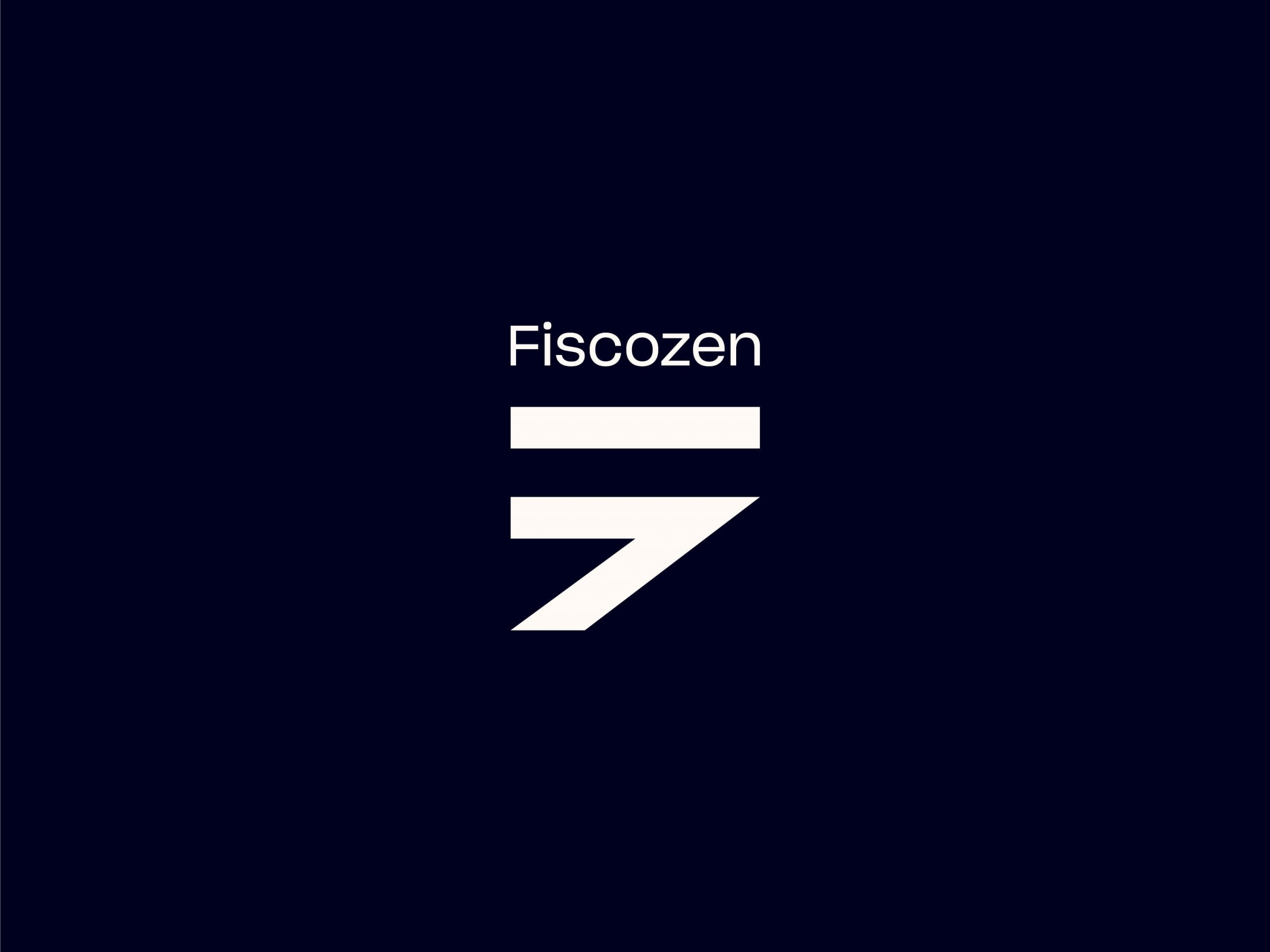
The Fiscozen symbol is an extreme synthesis of the letters F and Z, an exercise in simplicity and pragmatism that reflects the approach with which the company wants to accompany users through the labyrinthine Italian tax system. A clear approach, free of superstructures but always serious and professional.
The color palette speaks a strongly digital language and is accompanied by a photographic style that puts the person at the center, with a positive and self-assured attitude.


