Mediolanum custom typeface
A font family for the Mediolanum group

Landor Italia asked us to develop a new font family for the transformation of the Mediolanum group. We worked alongside the Landor design team to create an alphabet that perfectly integrated with the new brand identity and ensured a uniform tone of voice across all of the group’s strategic assets.
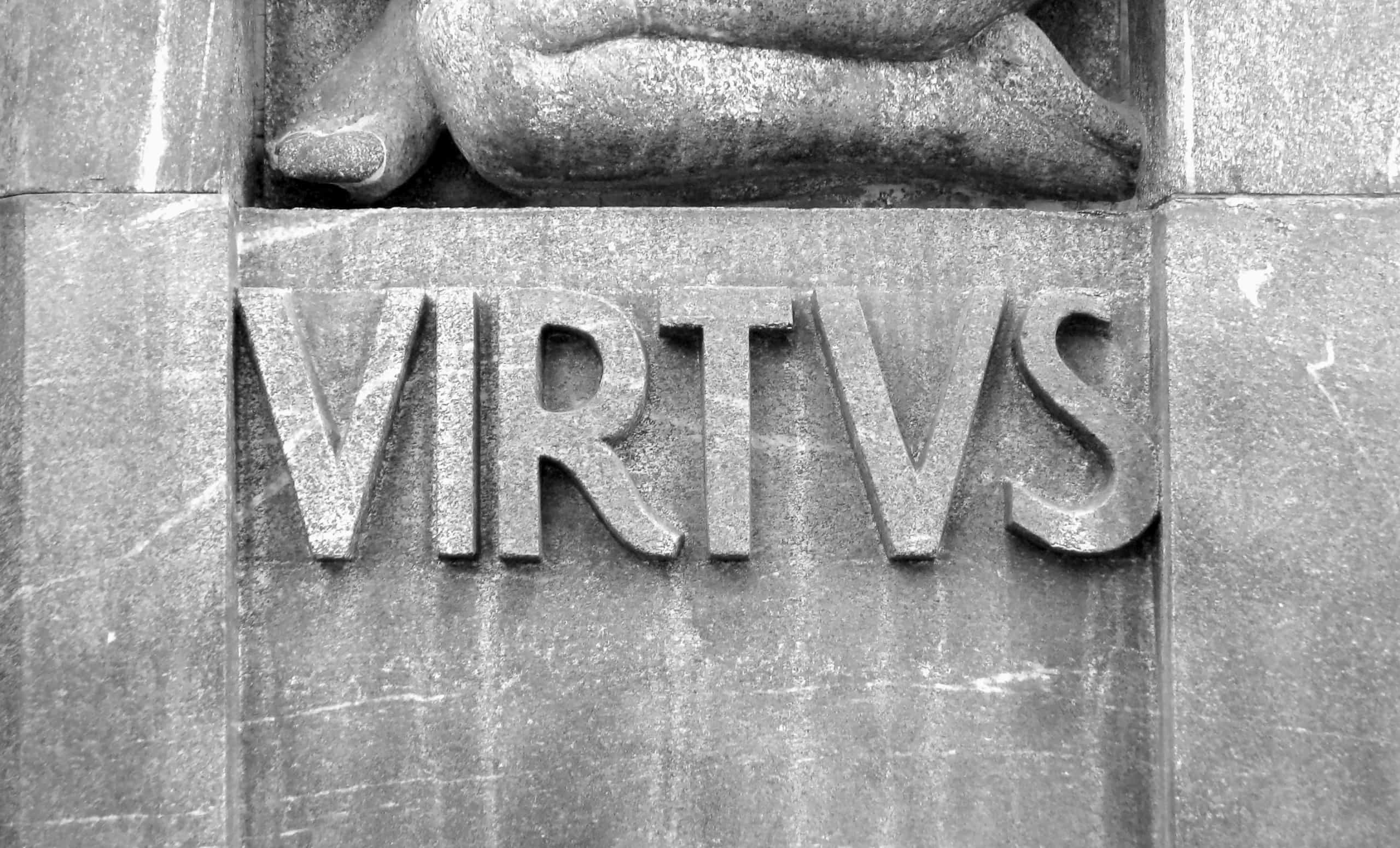
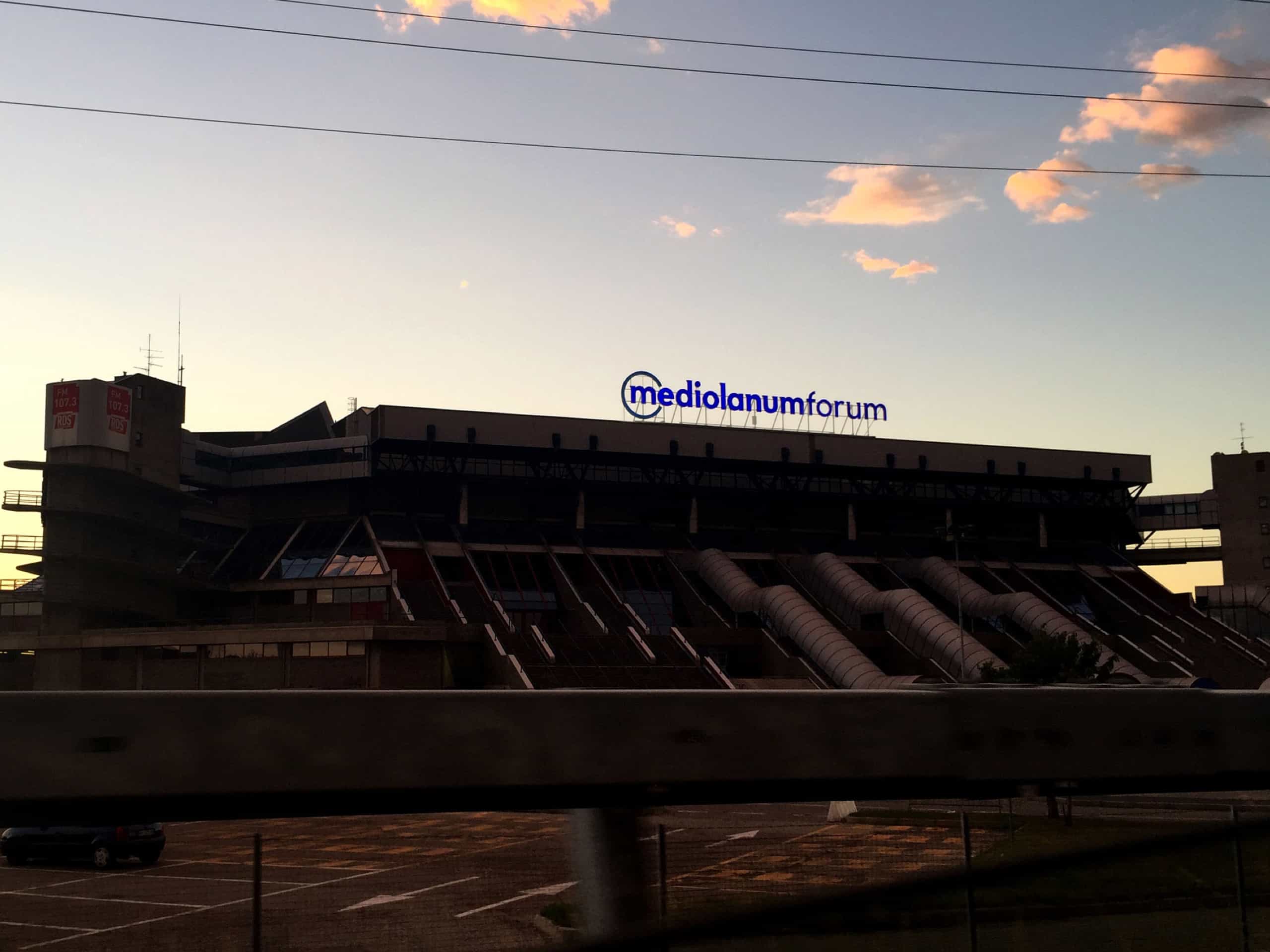
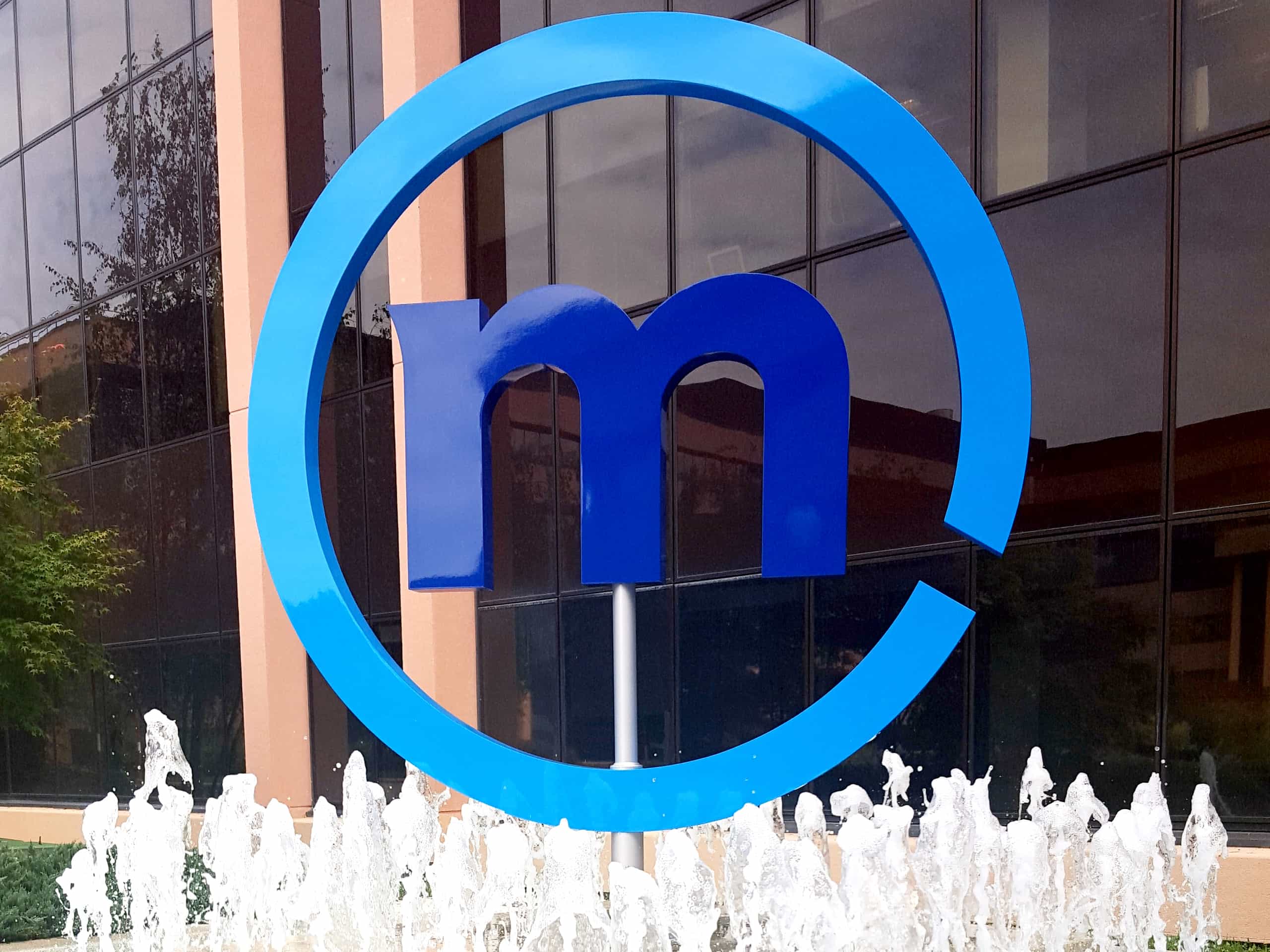
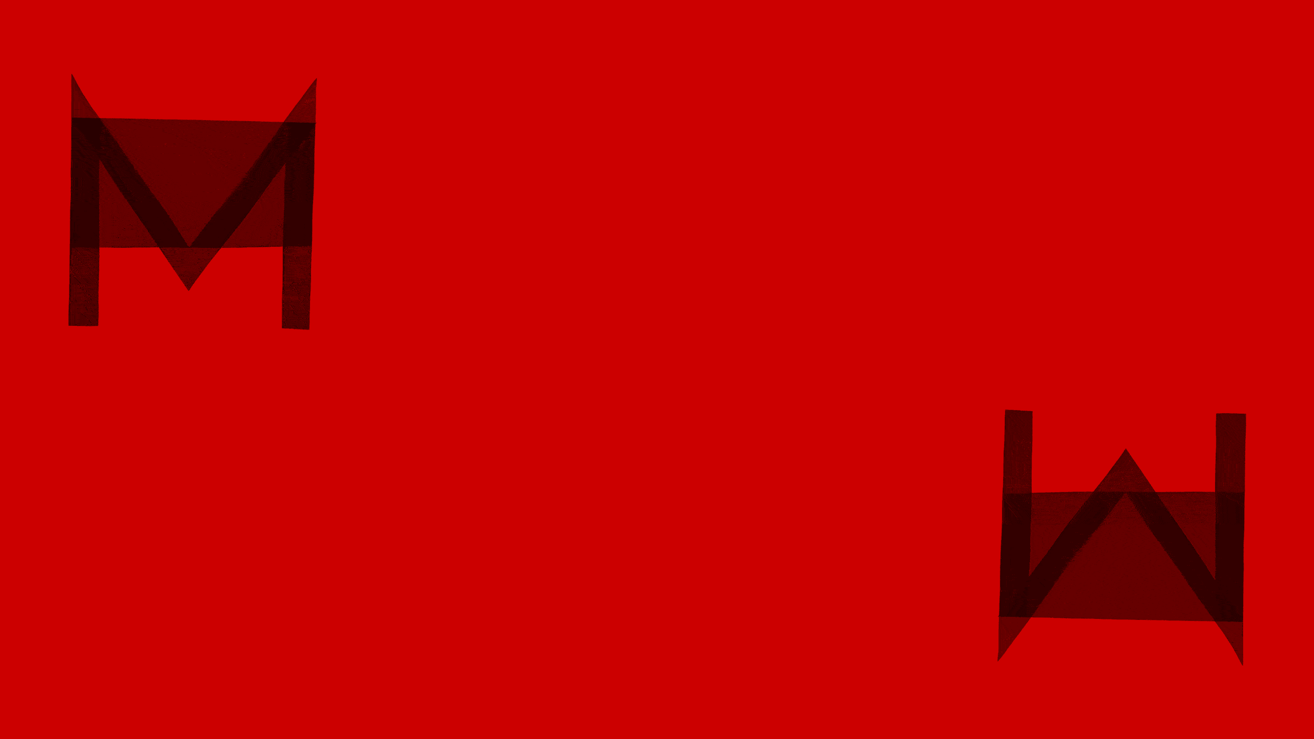
The Mediolanum Group is strongly associated with the Milan area. We wanted to bring out the distinctive characteristics of this connection, analysing current lettering trends in Milan, the geometric fonts engraved on the walls at Stazione Centrale, and the classic uppercase letters used on car number plates. We were then able to identify specific elements for the font, such as the oblique stroke used for the M and the proportions of some of the uppercase letters.
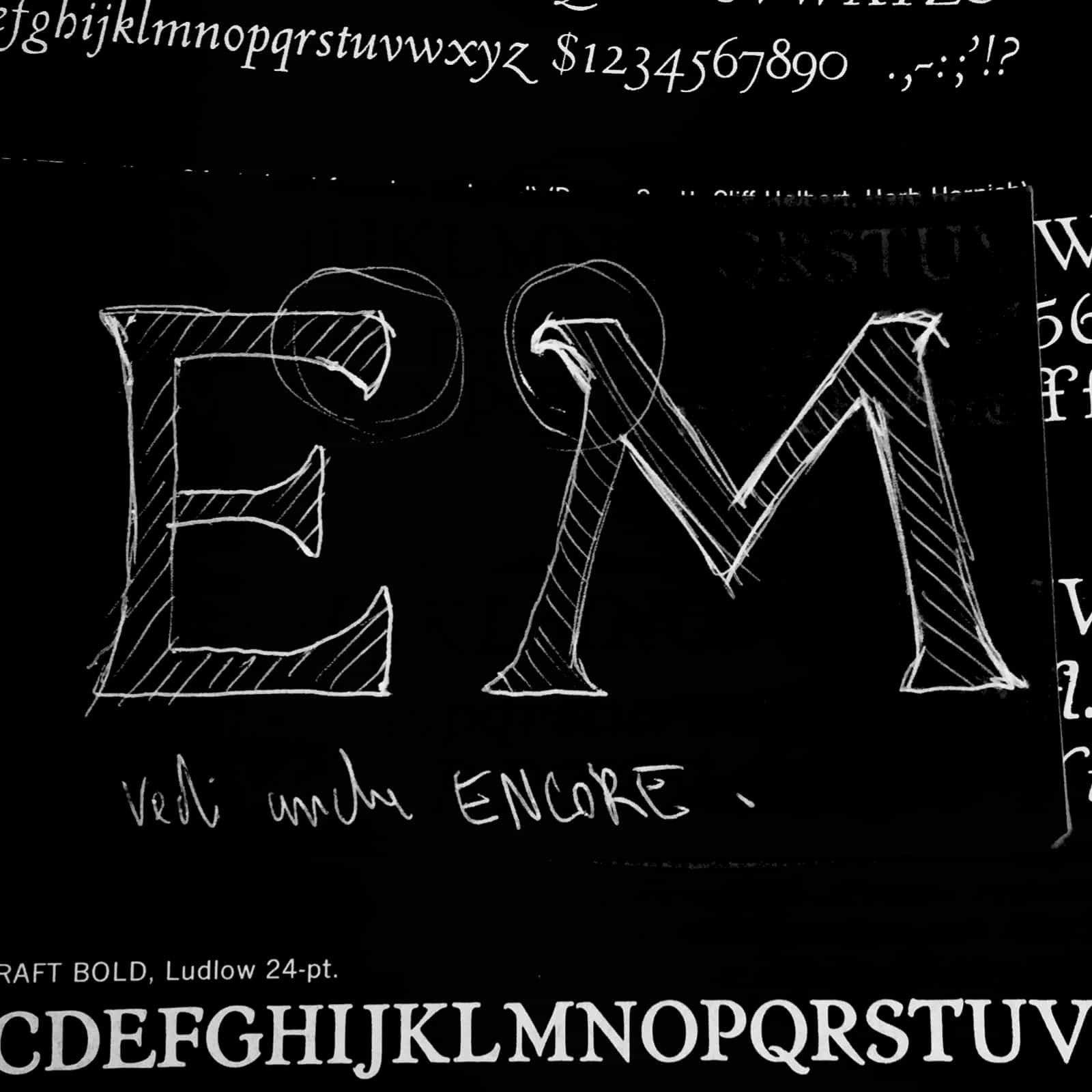
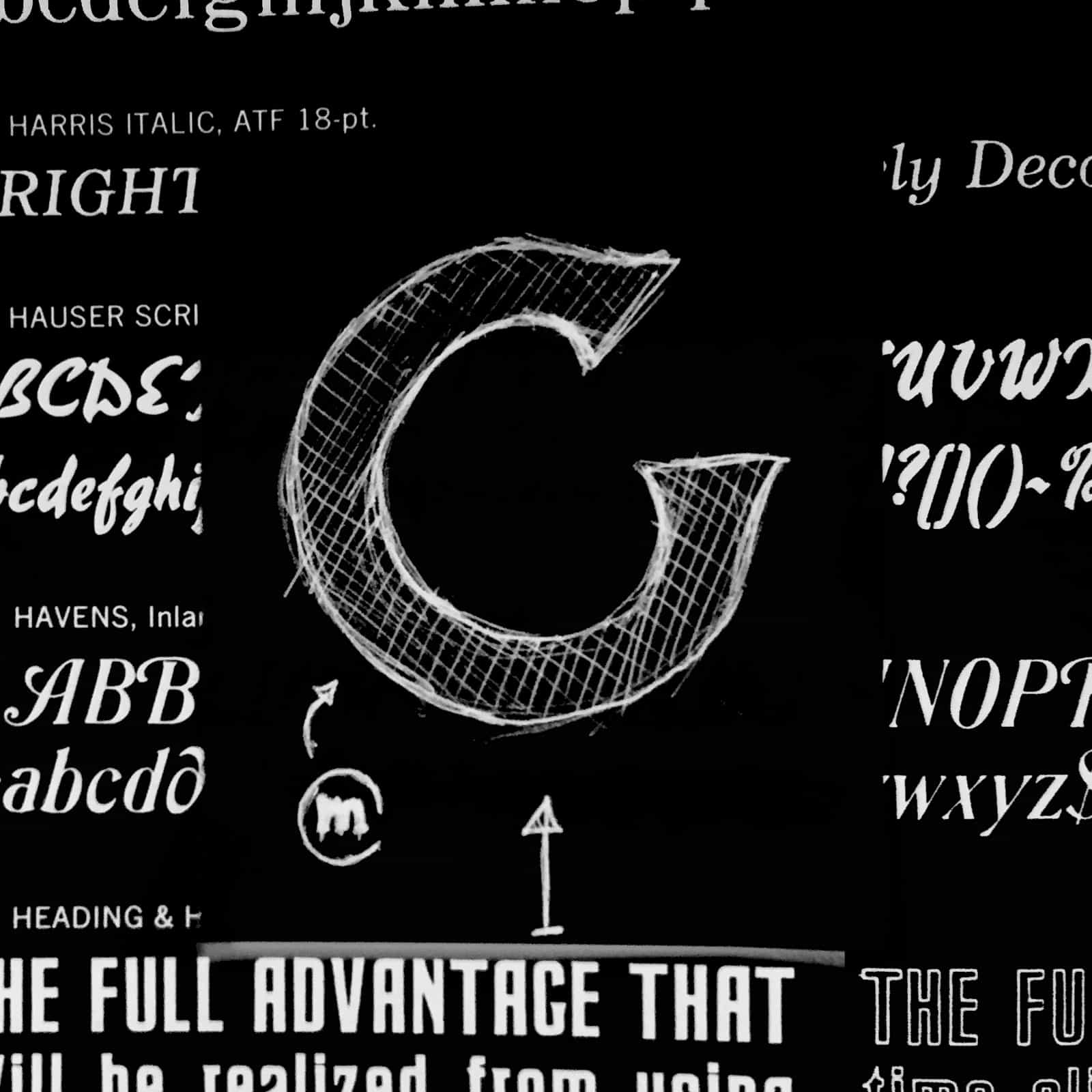
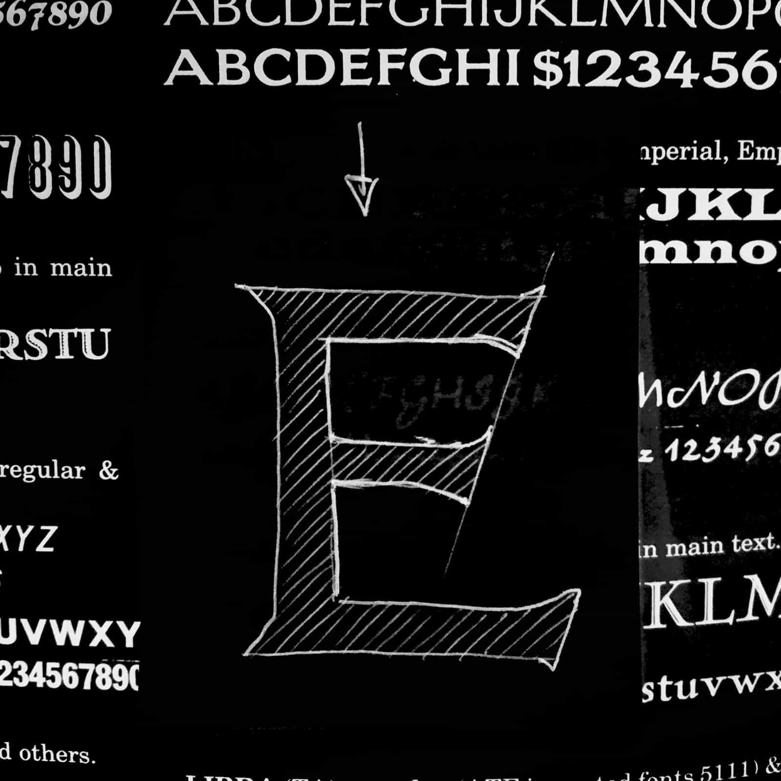
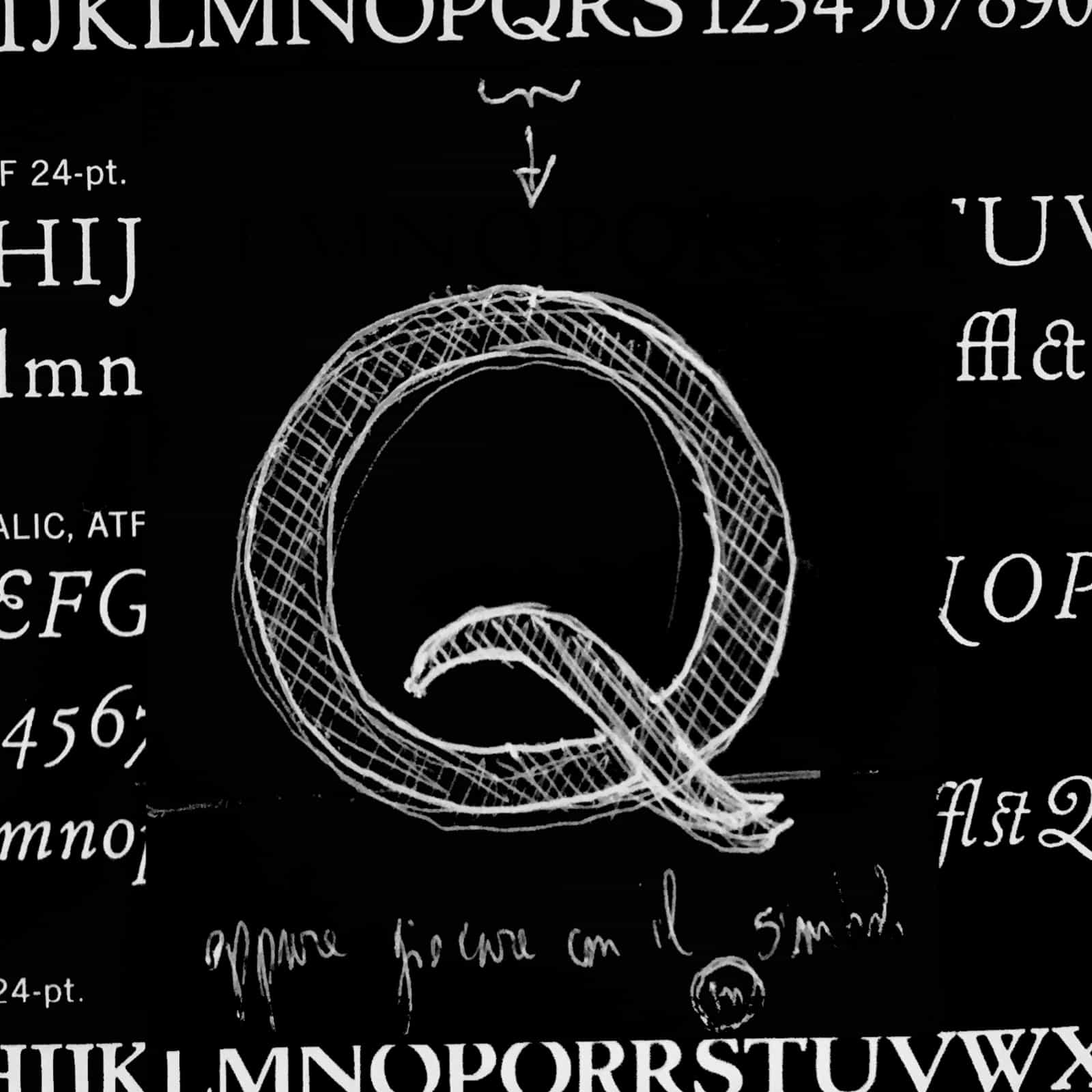
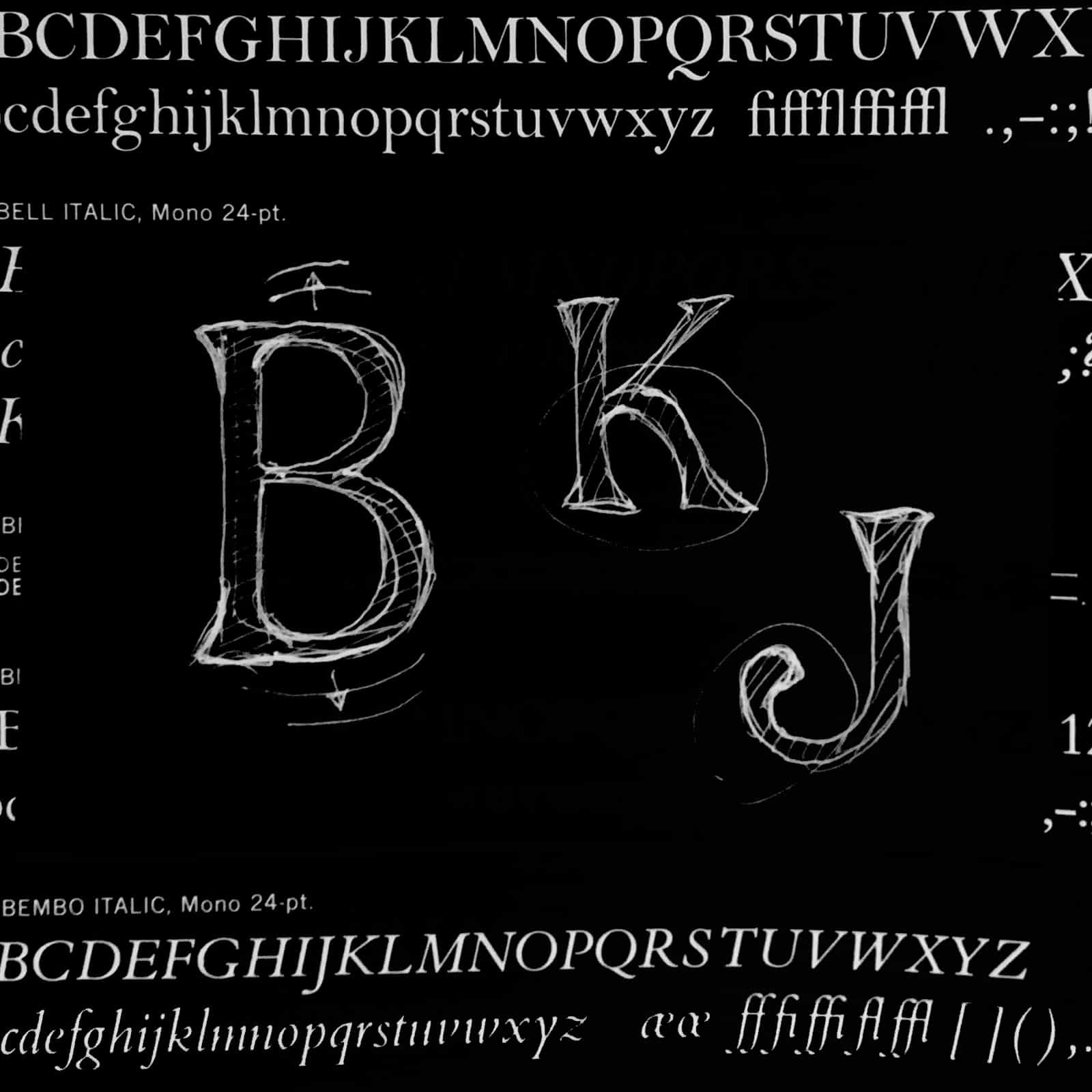
The brief demanded recognisability and versatility, which we achieved by implementing the semi-serifs chosen by Landor for the new logotype. We toned down the intense geometrical shapes to add something more to the font, inserting humanist traits to convey proximity and attentiveness to clients.

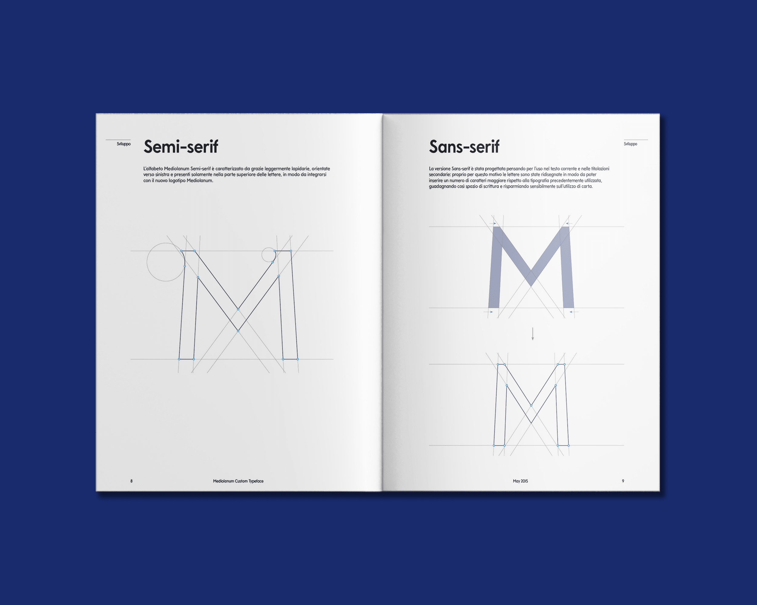
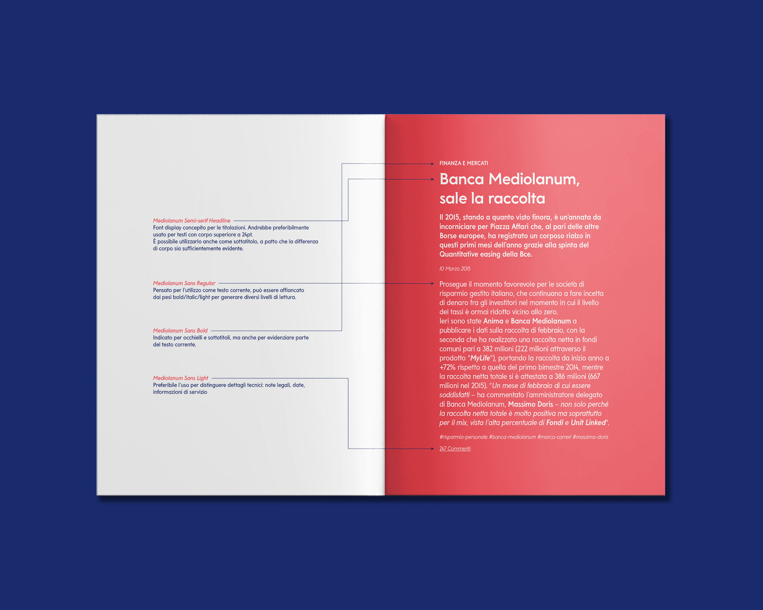
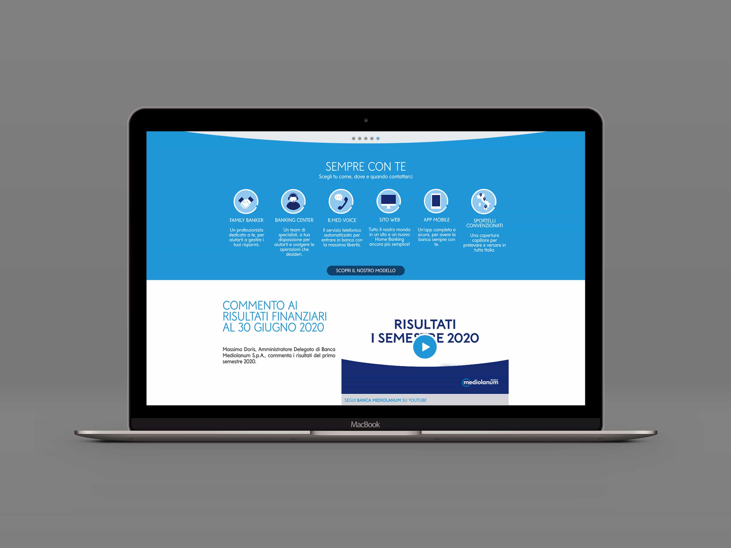
To offer maximum adaptability to the company’s countless assets, a second sans-serif family was developed to be used alone or to accompany headlines.
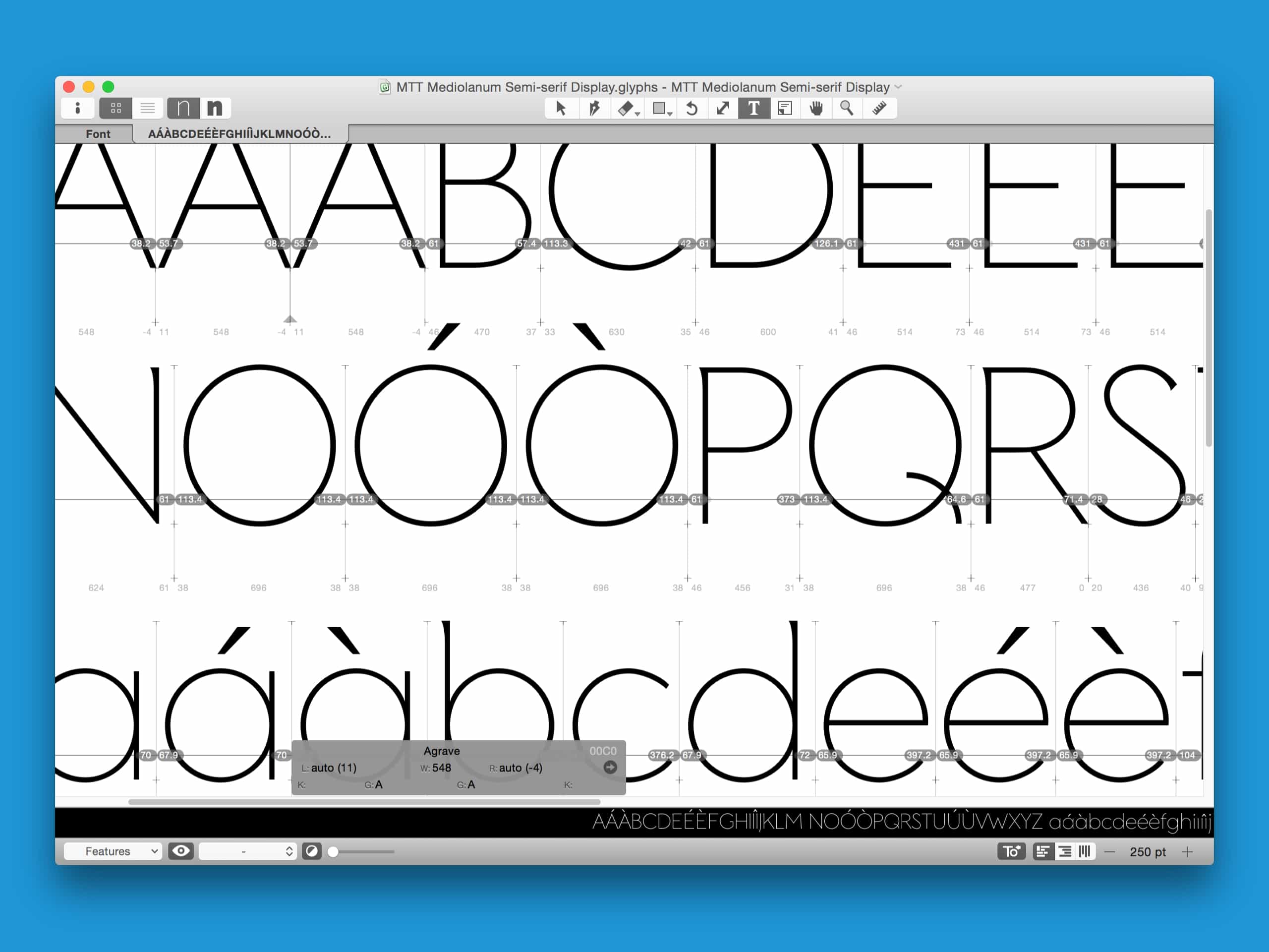
Another strength of this typeface is the compromise between legibility and volume. Thanks to its slightly narrow structure, the Mediolanum typeface can occupy minimum space if required for legal footers.