MTT Milano
A geometric font for Greater Milan
Ispirazione e Ricerca
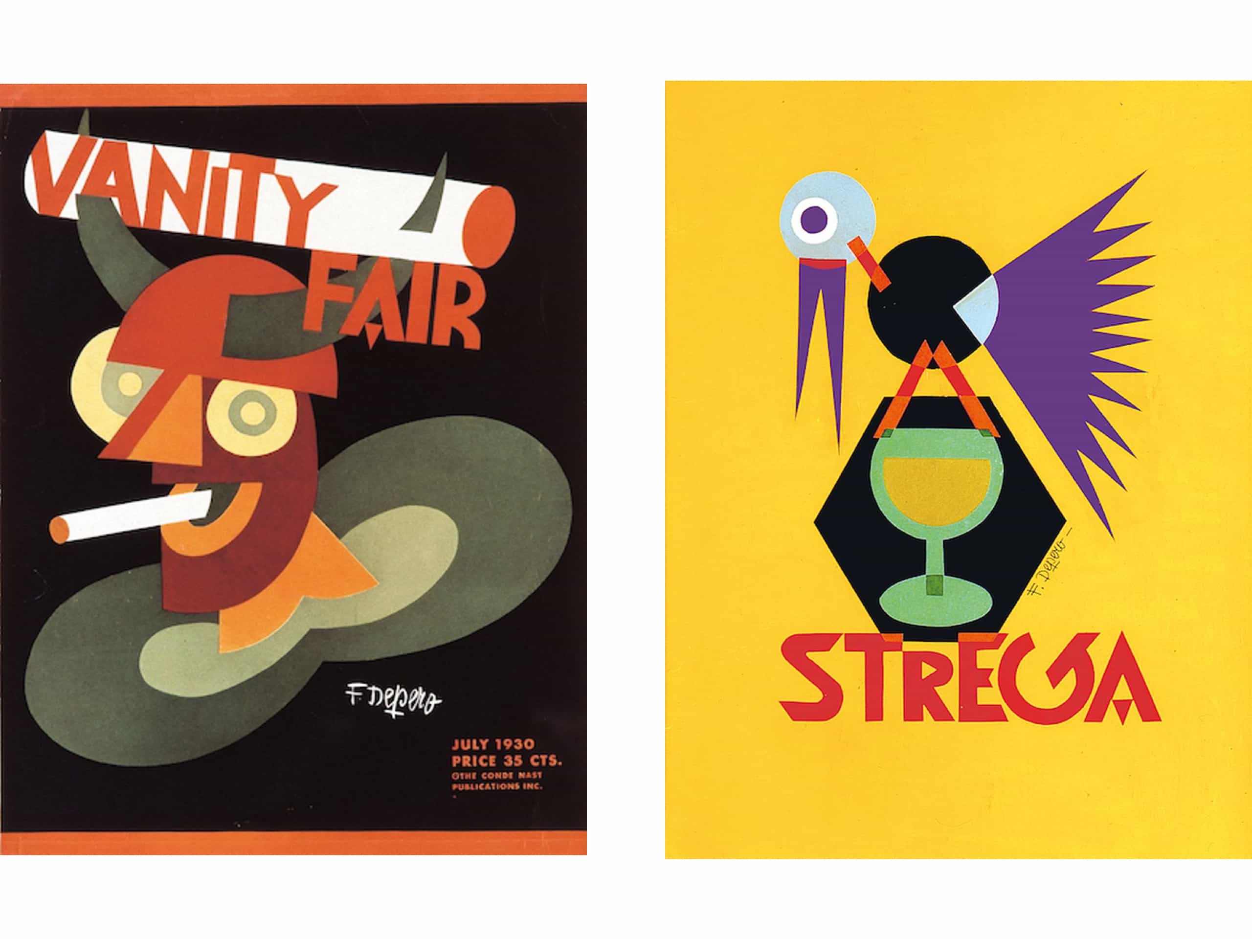
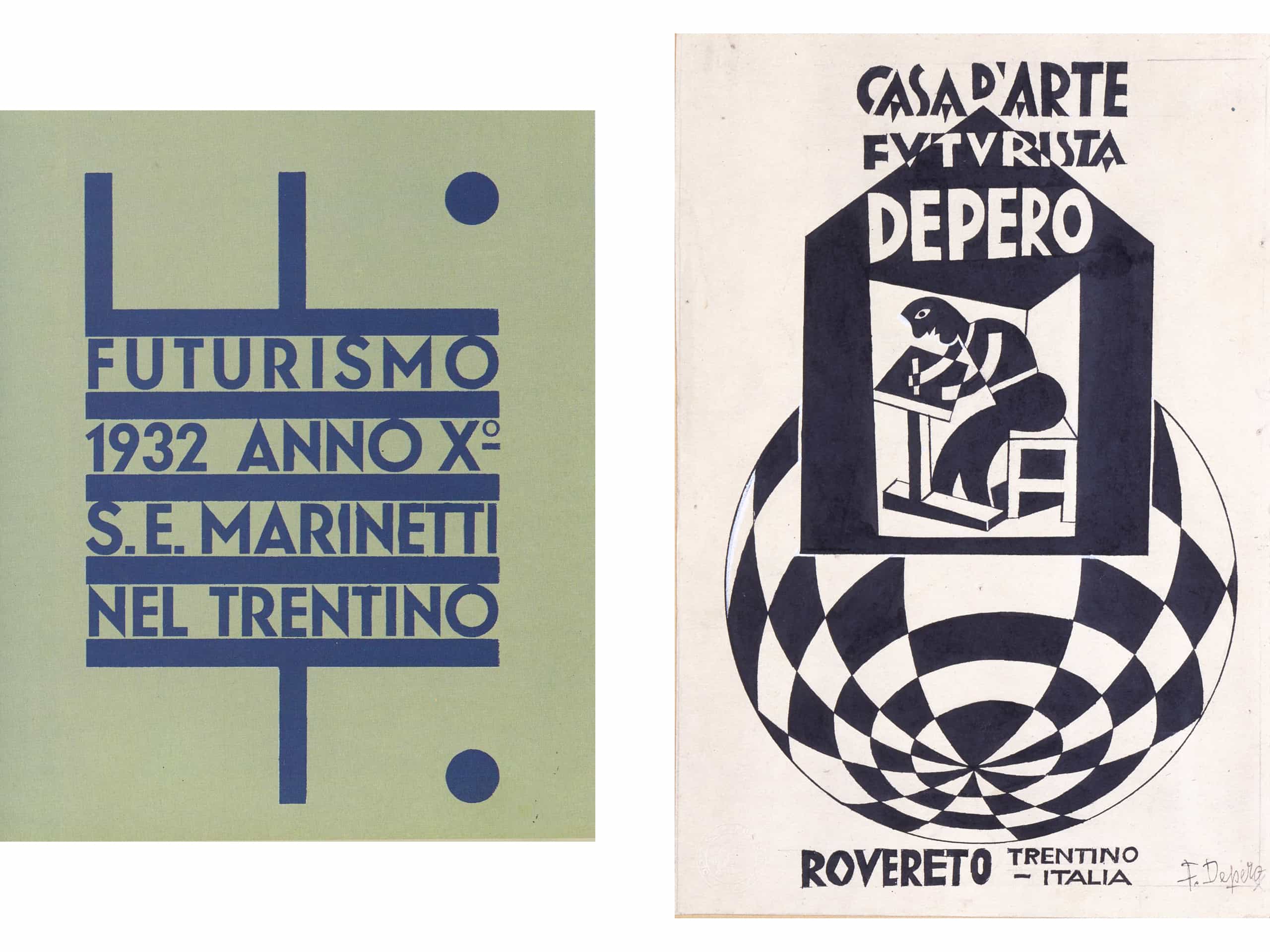
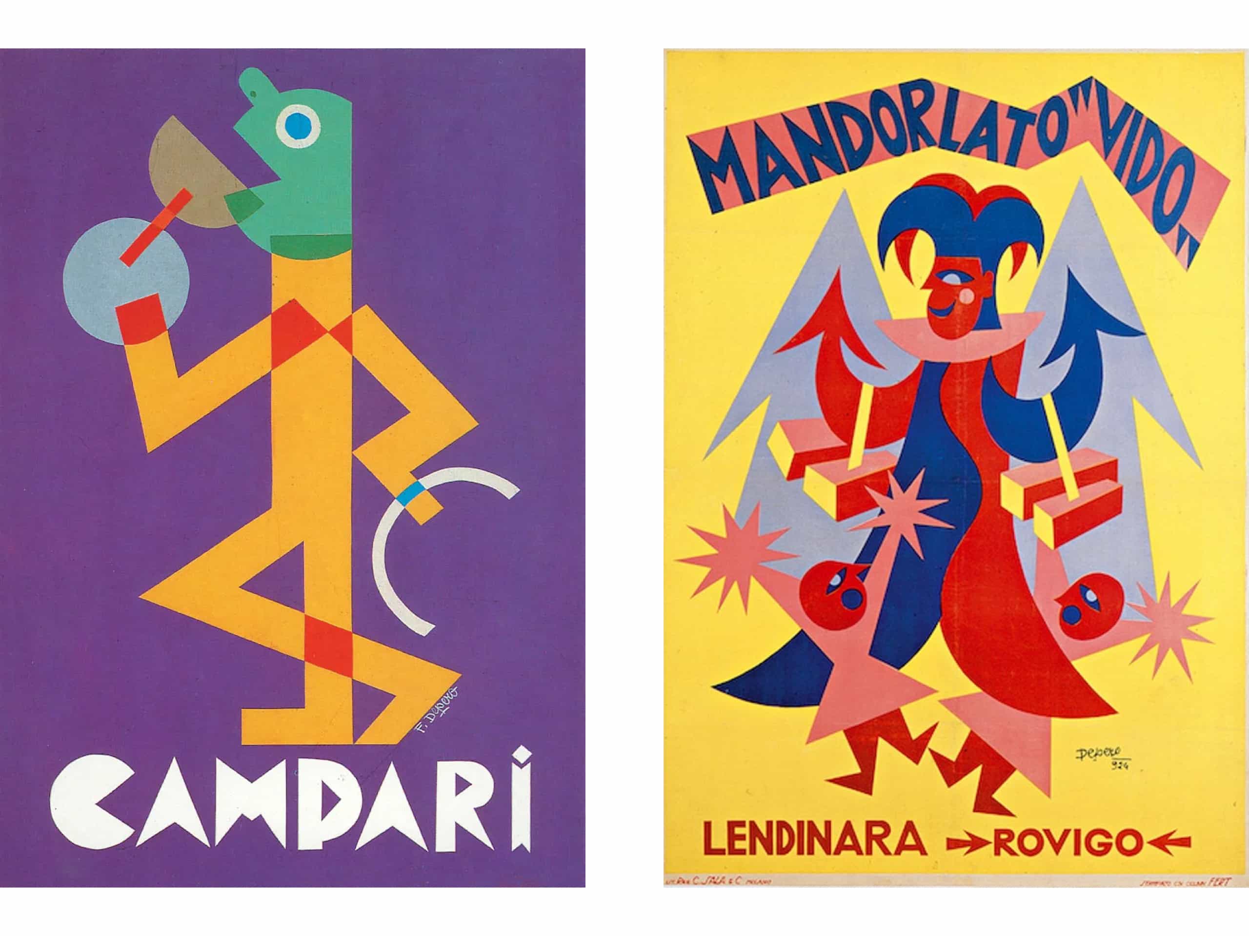
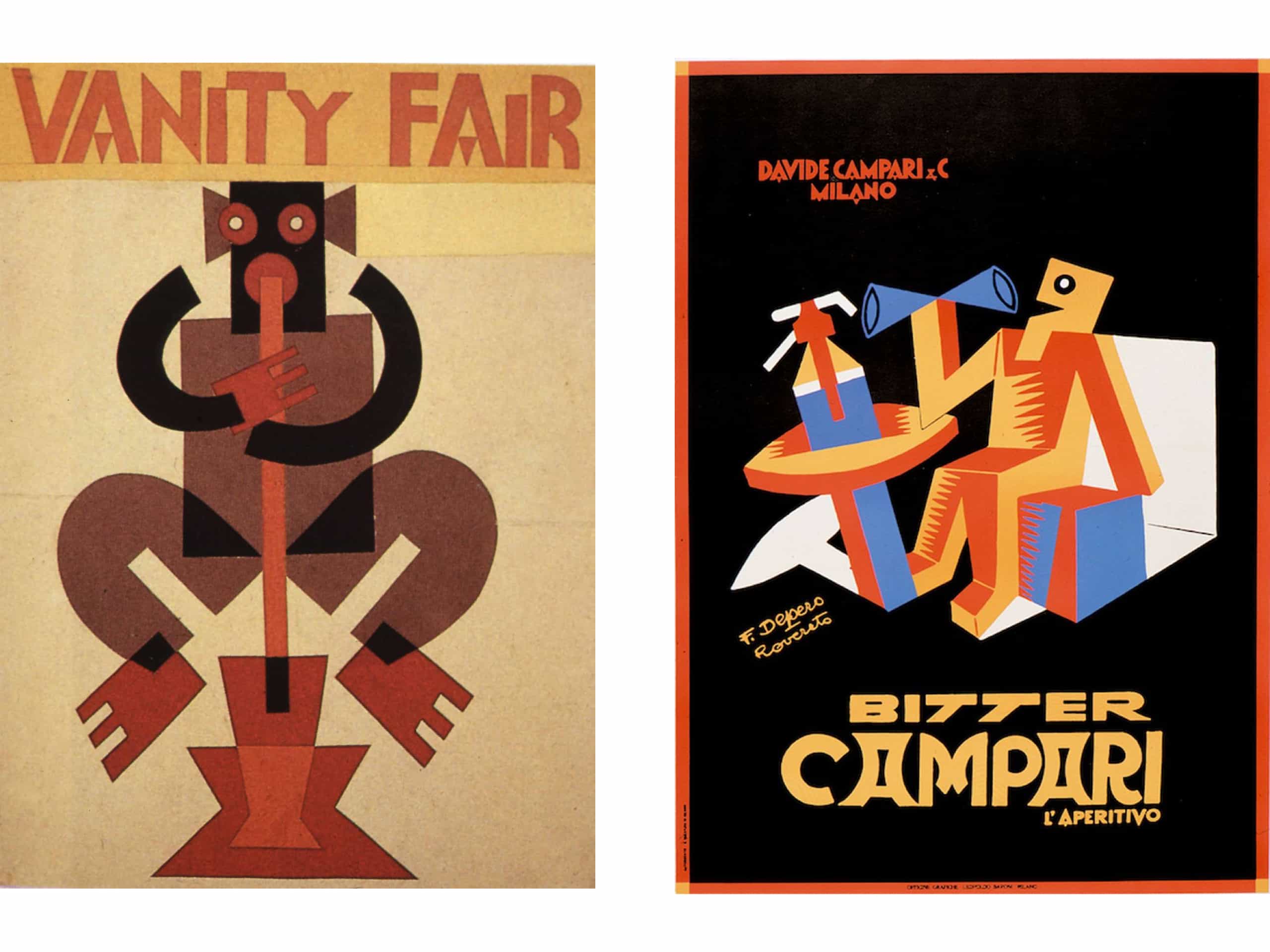
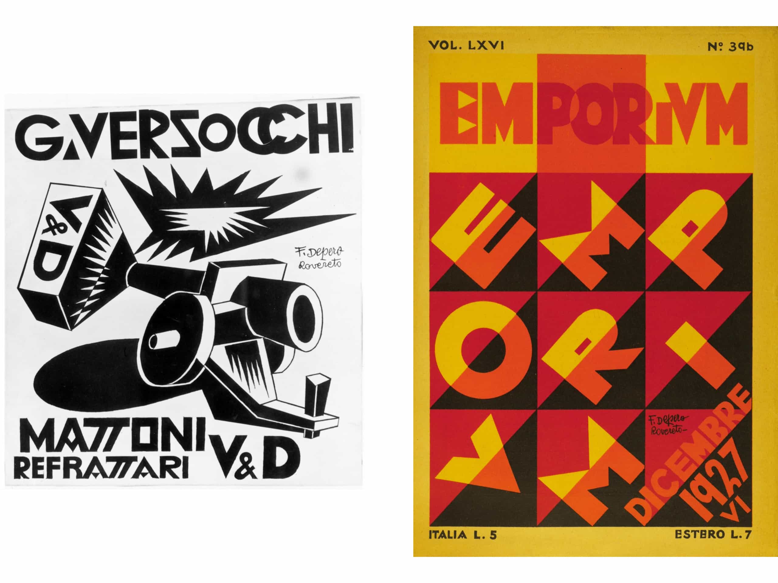
We designed MTT Milano to represent the key values of the Futurista movement, which emerged from the Lombard capital in the early 20th century.
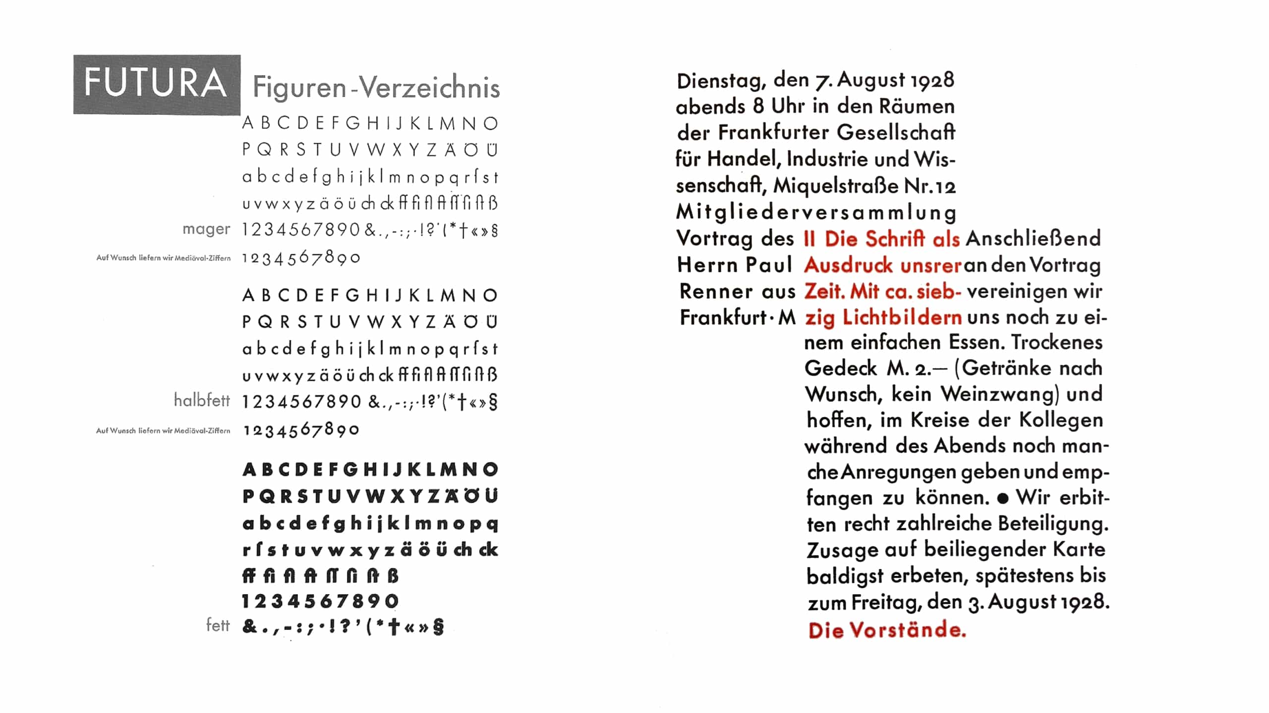
Following in-depth study of the 1920’s manifestos and the artistic and commercial work of Fortunato Depero, MTT Milano embodies the dynamism and pace of the movement, while remaining just as expressive and legible as the Futura and Avenir fonts it was influenced by.
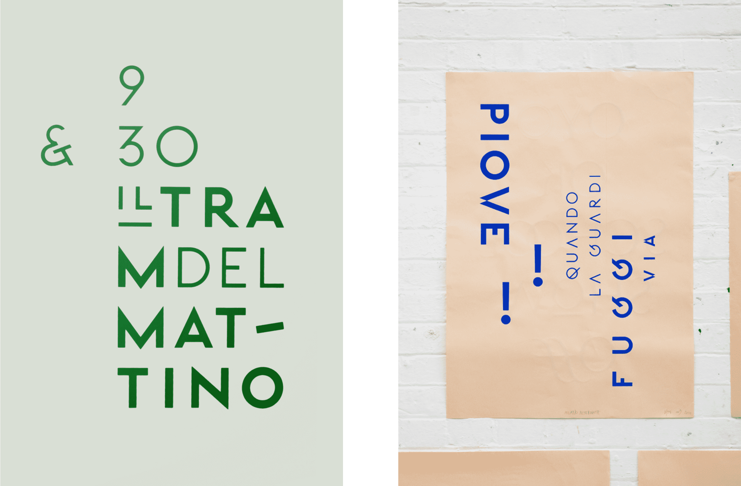
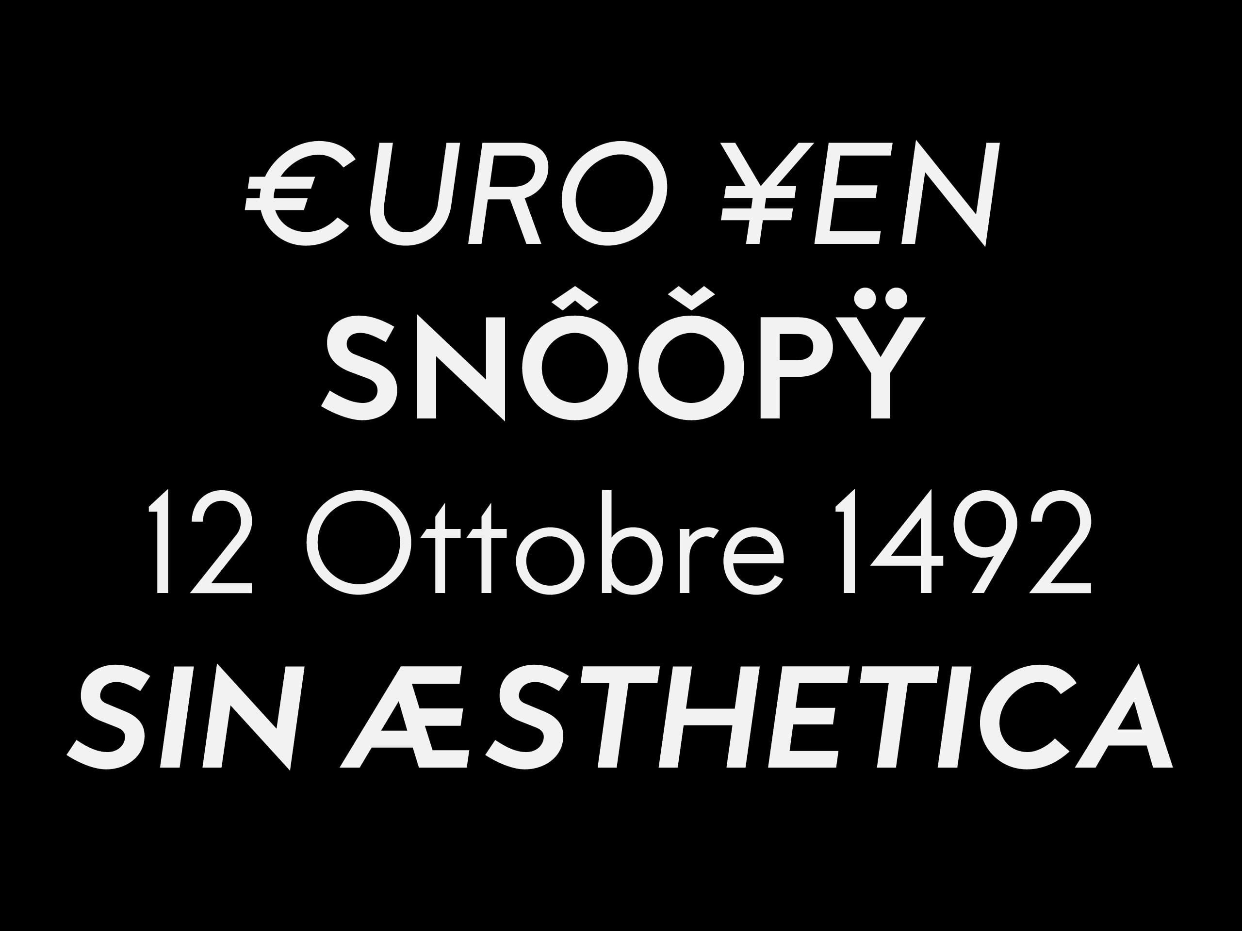
Unlike the majority of contemporary geometric fonts, we selected a more radical yet curated approach for MTT Milano that is evident in certain particularly stylised characters such as the ampersand (&) and the decision to use a double-storey lowercase A to make the text as legible as possible.
Despite a decorative letter structure, the font style more closely resembles modern geometric typefaces such as Avenir, ensuring it is as dynamic and contemporary as the city from which it takes its name.
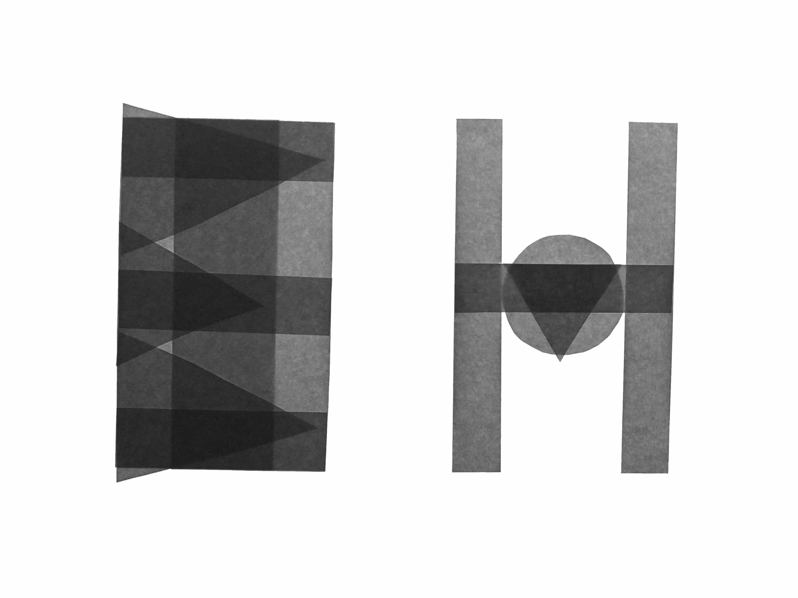
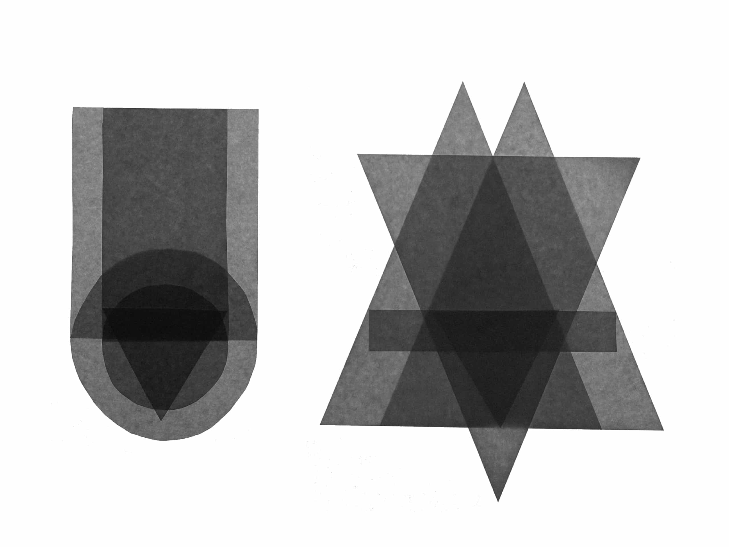
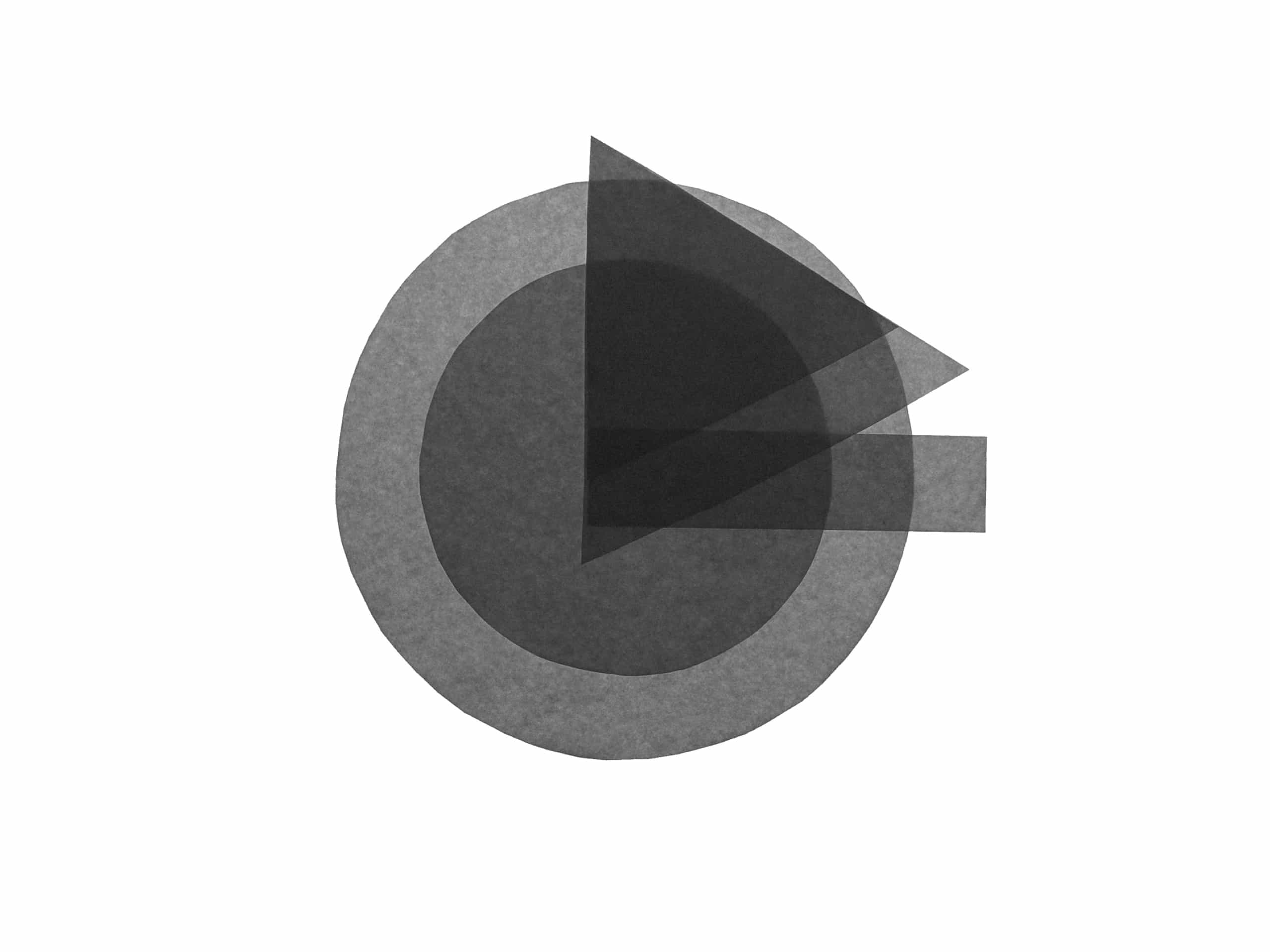
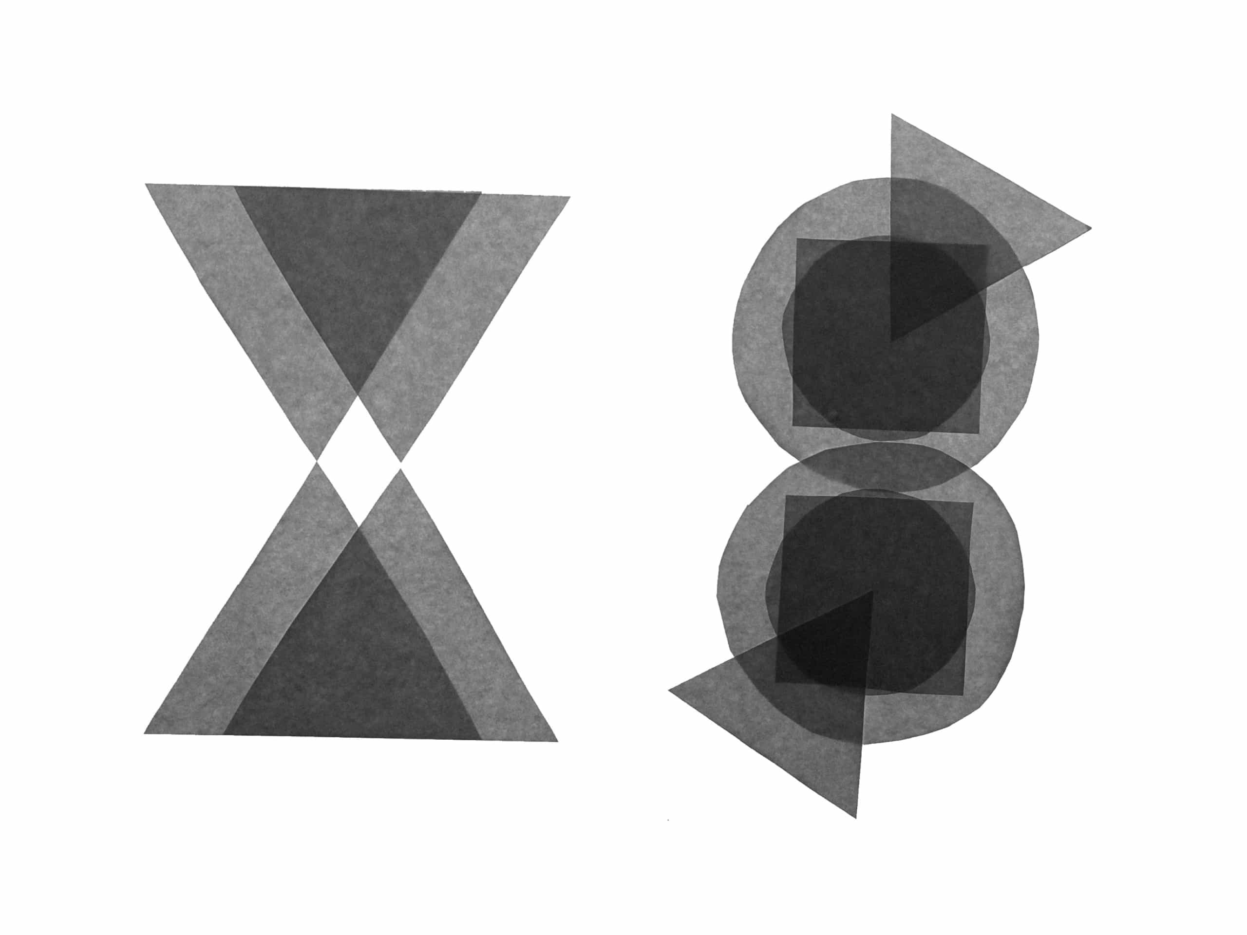
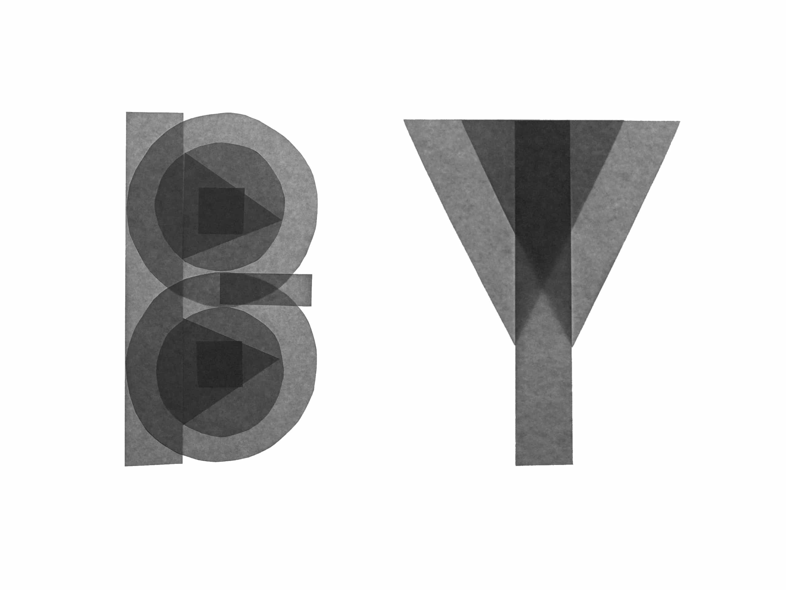
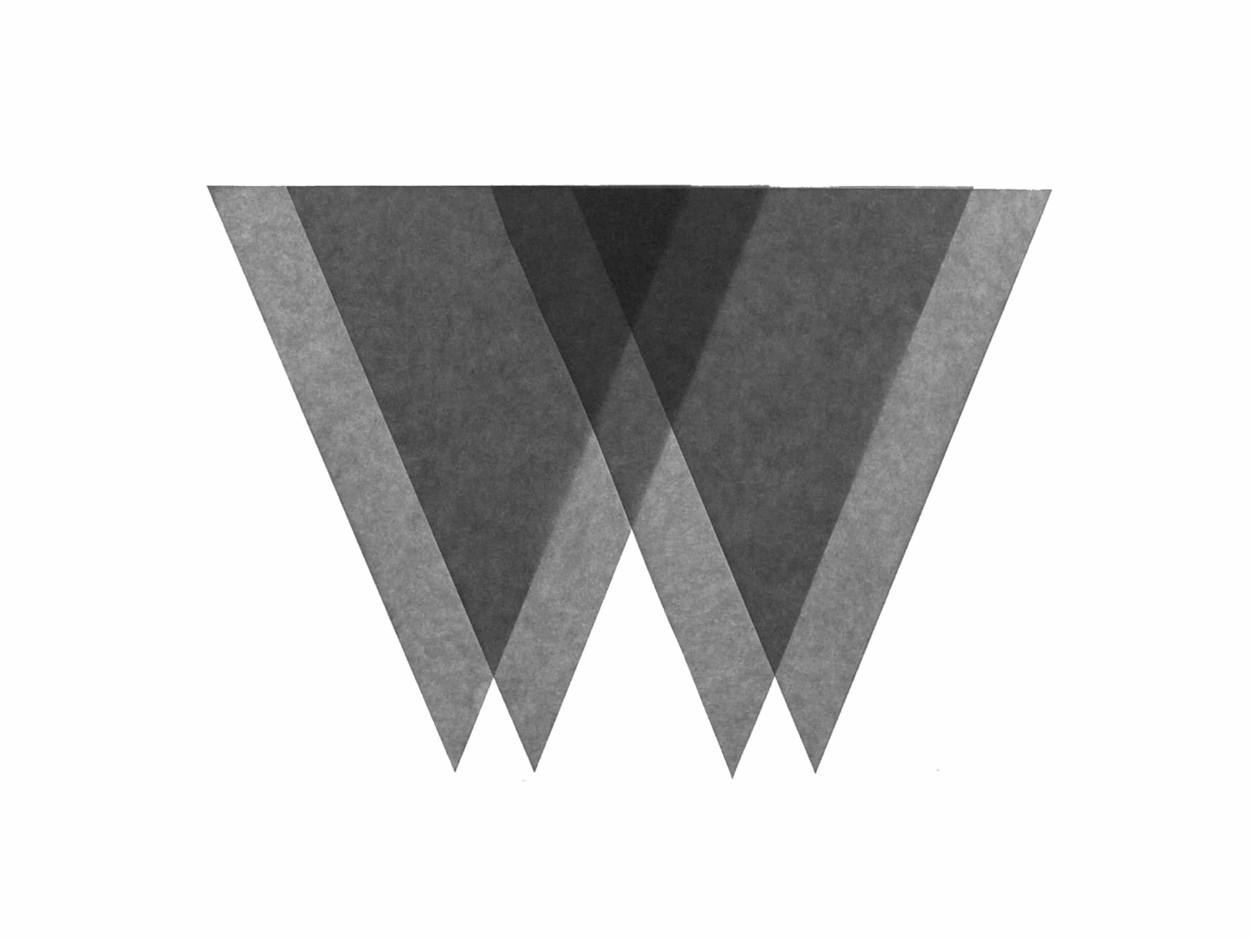
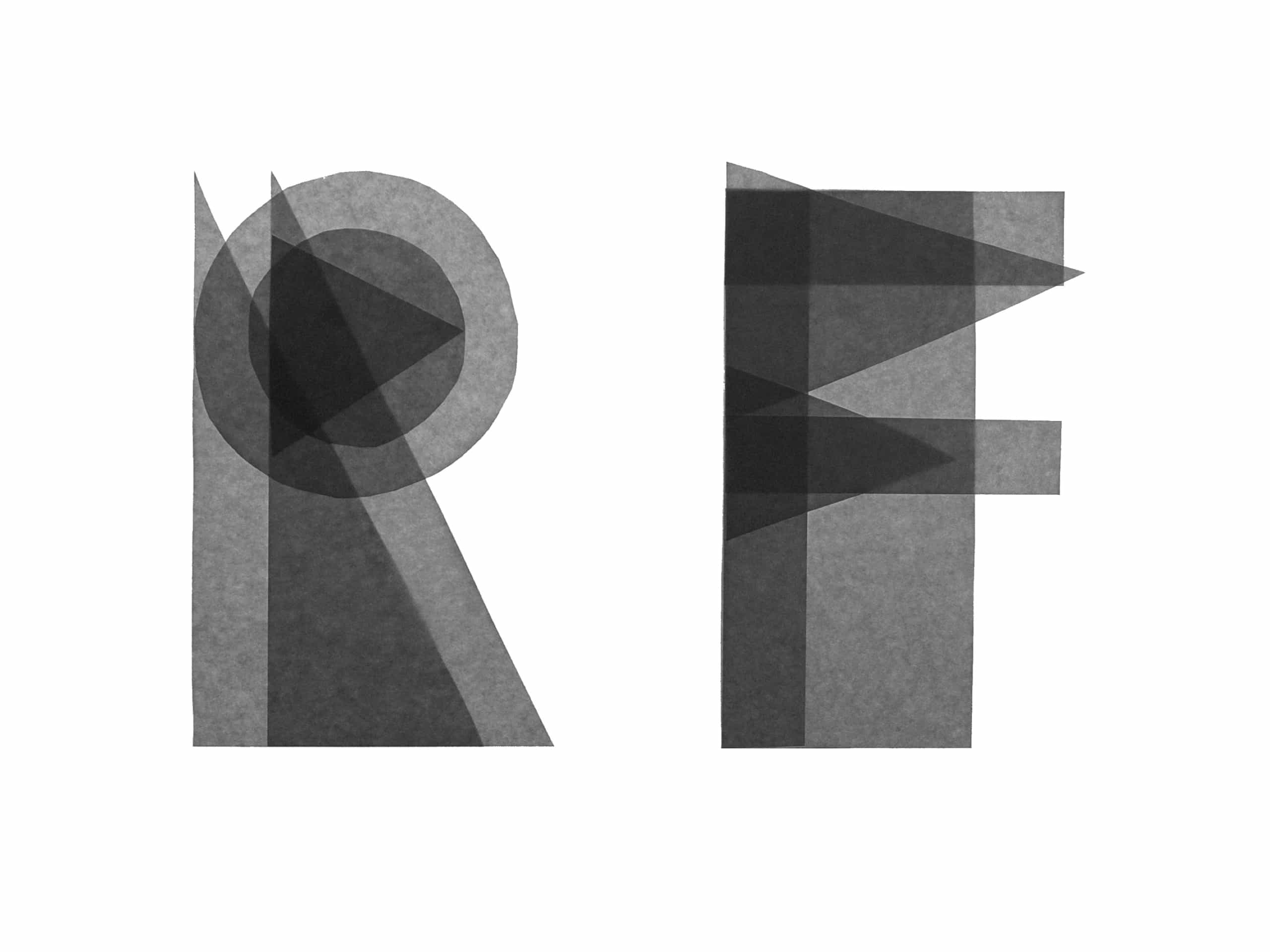
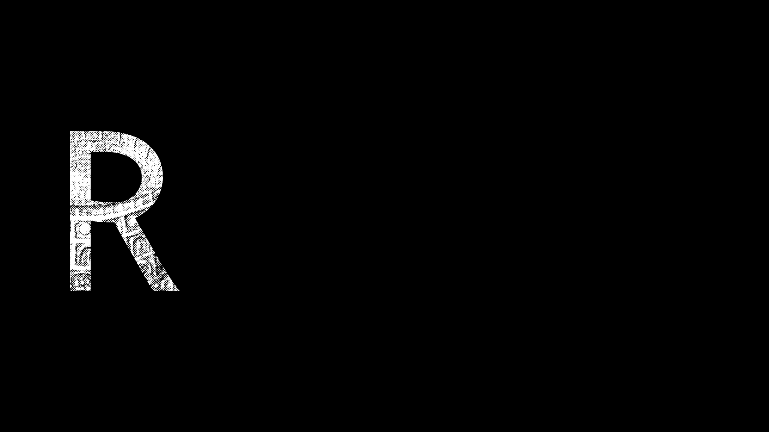
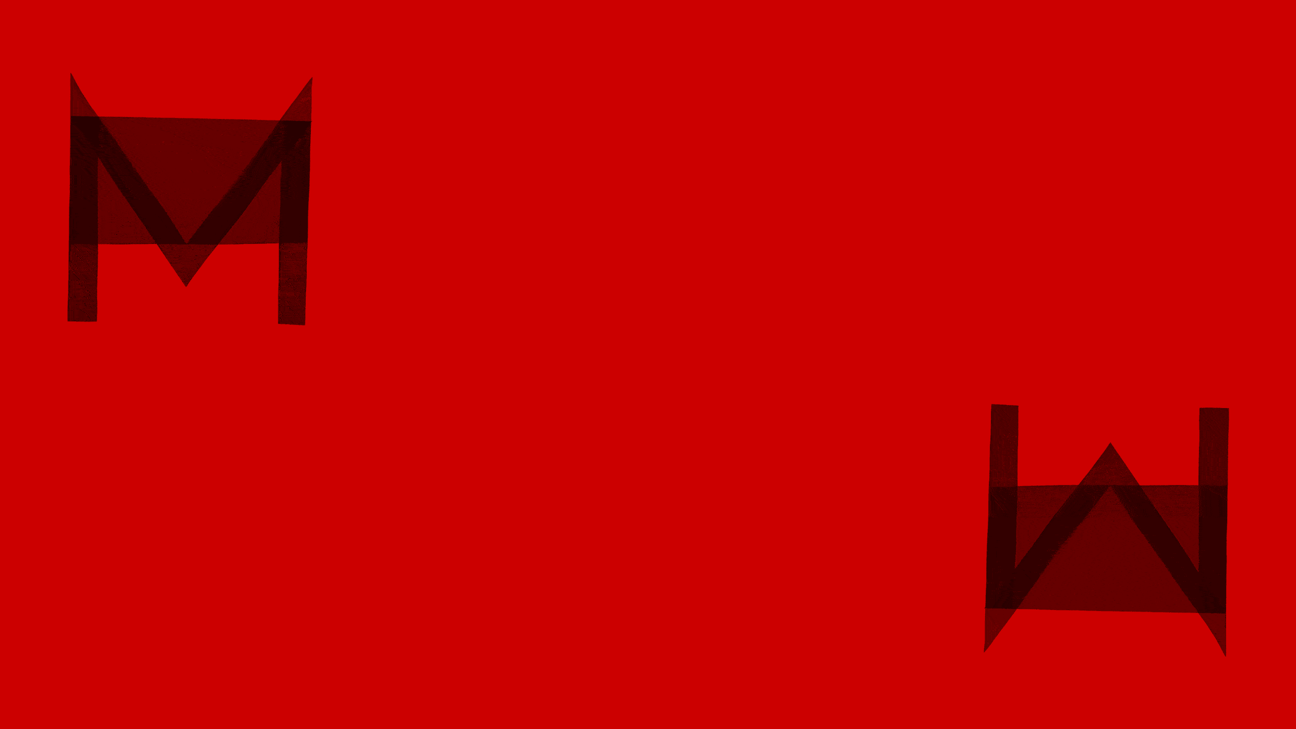
During the design phase, we carefully studied the uppercase letters, trying out new forms, new intersections, and potential new alternates. This research didn’t make it into the official font but resulted in a series of limited-edition screen prints.
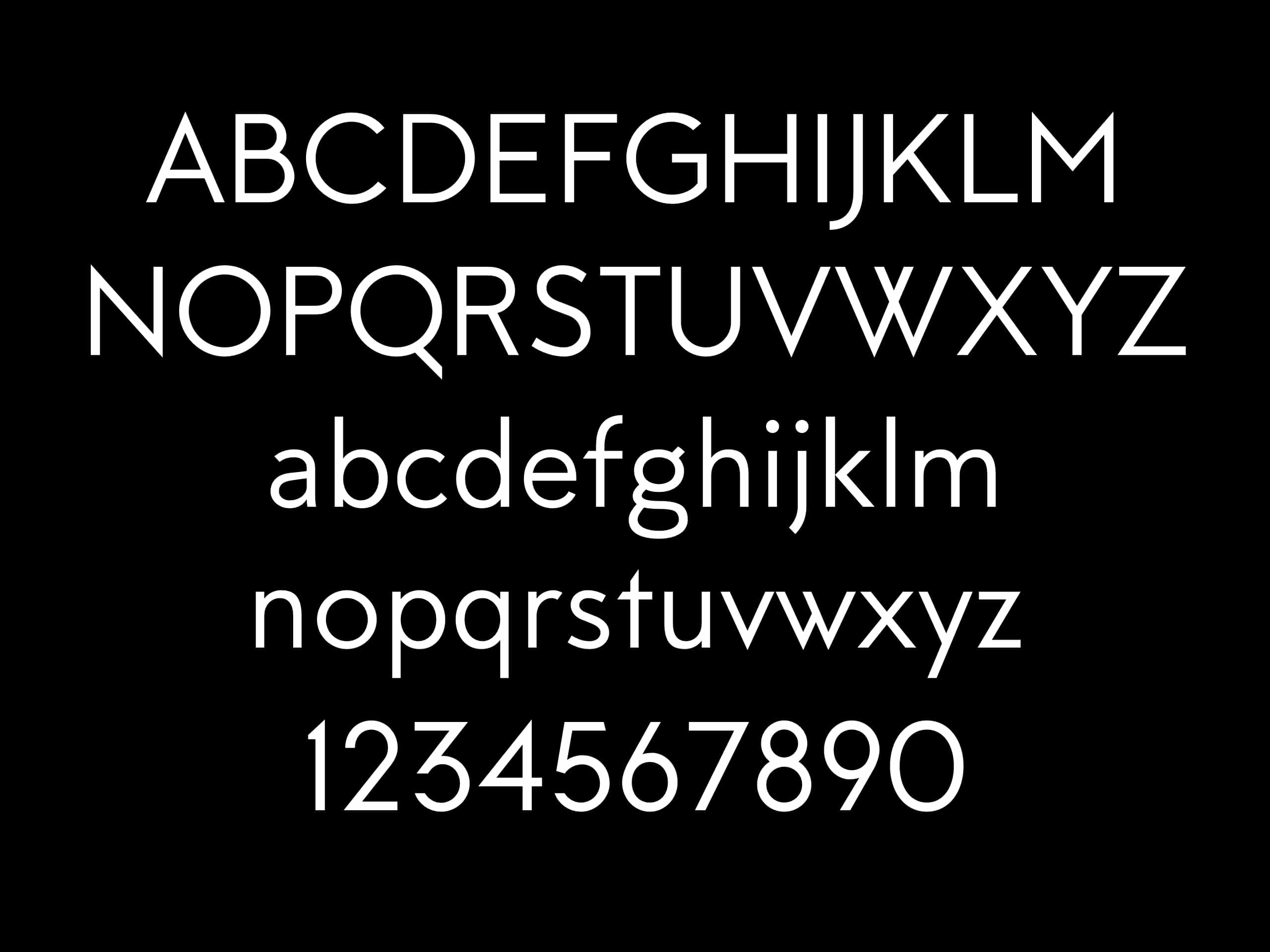
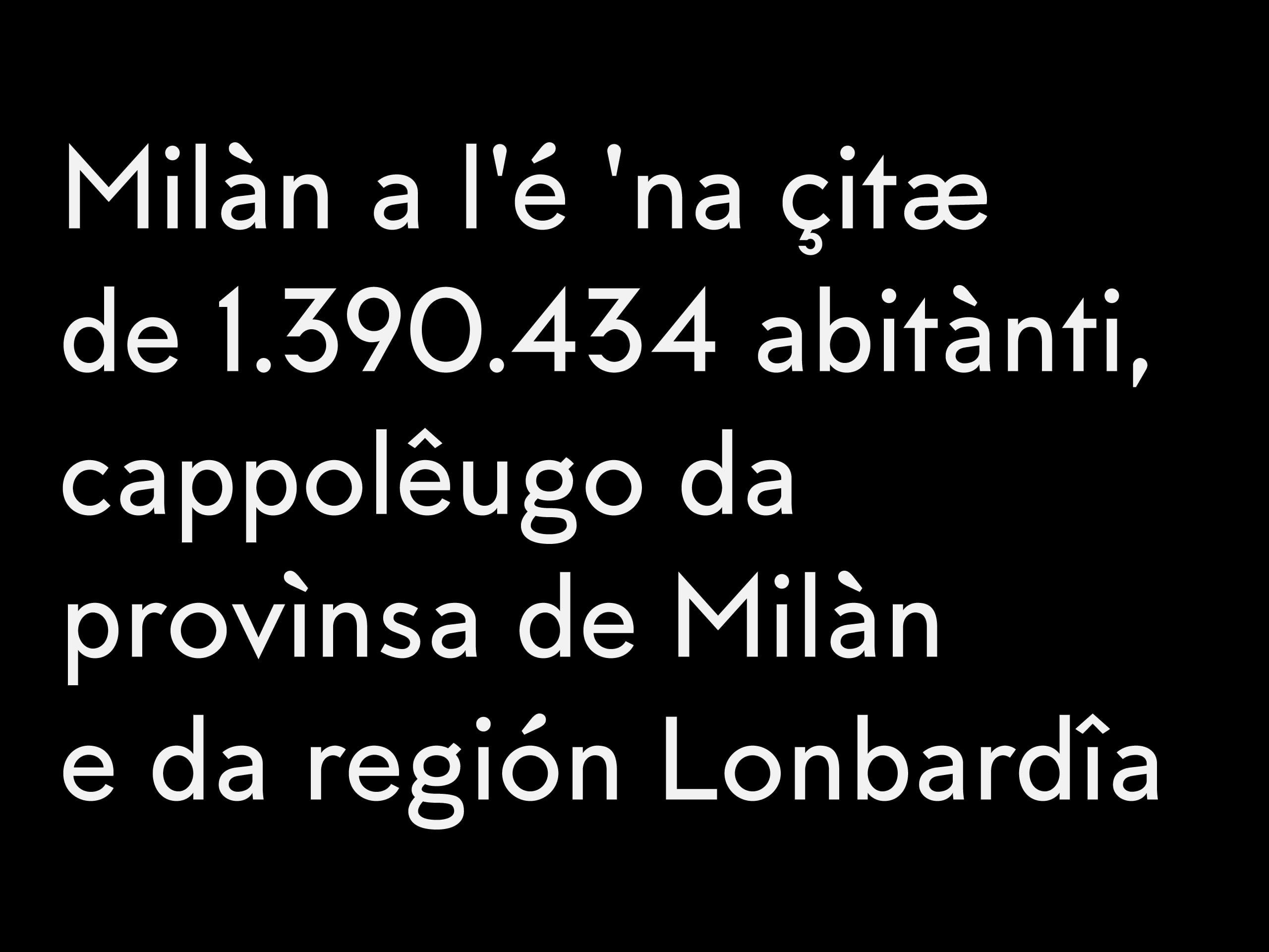
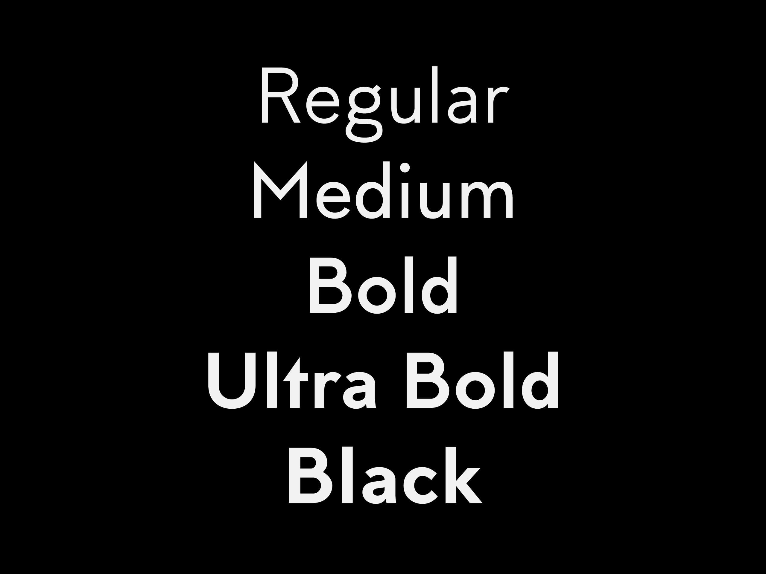
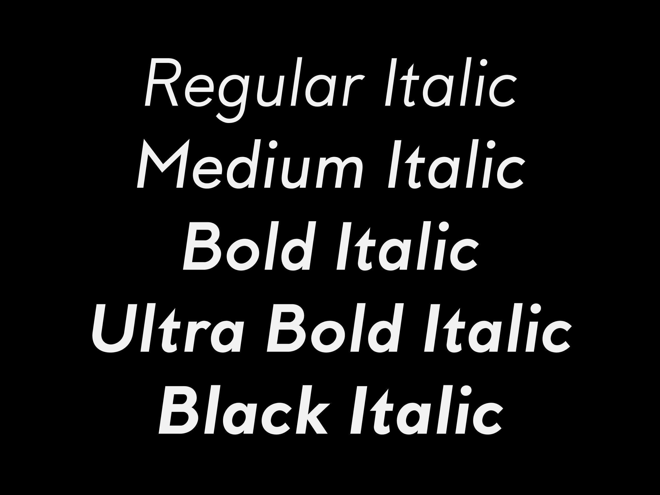
Milano is a pure play on proportions: the relationship between the x-height and the ascenders and descenders is slightly wider than most contemporary typefaces, guaranteeing an upward drive and improved elegance. While perfect legible in body text, the font’s character really emerges in medium-large sizes.