SCARPA custom typeface
Hiking through typography's trail
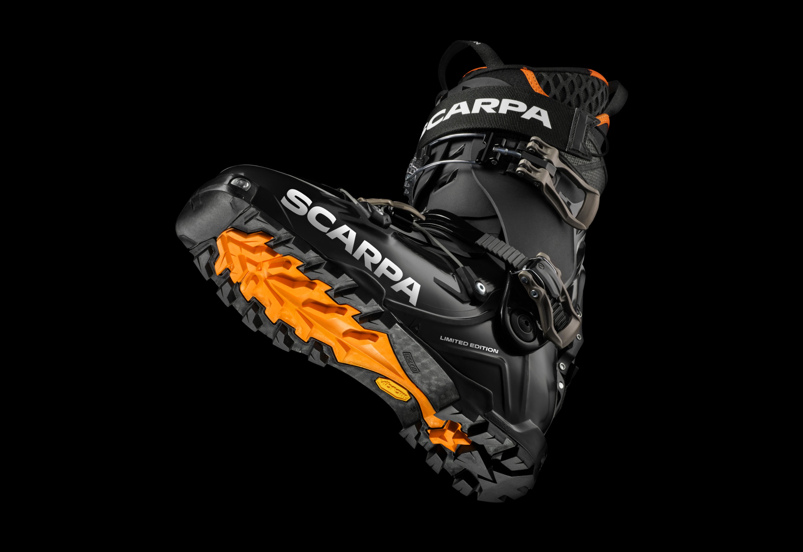
Scarpa is the leading brand in the mountaineering sector. It produces high-tech and innovative footwear, chosen by sportsmen around the world for the most challenging missions.
We were contacted by Landor Milano to create a custom typography to support the enormous strategic work carried out by the team, reinforce the brand values and create iconic and recognisable lettering.
The rebranding project, presented by Landor Milano at the Red Dot Awards, won the prize in the brands & communication design category.
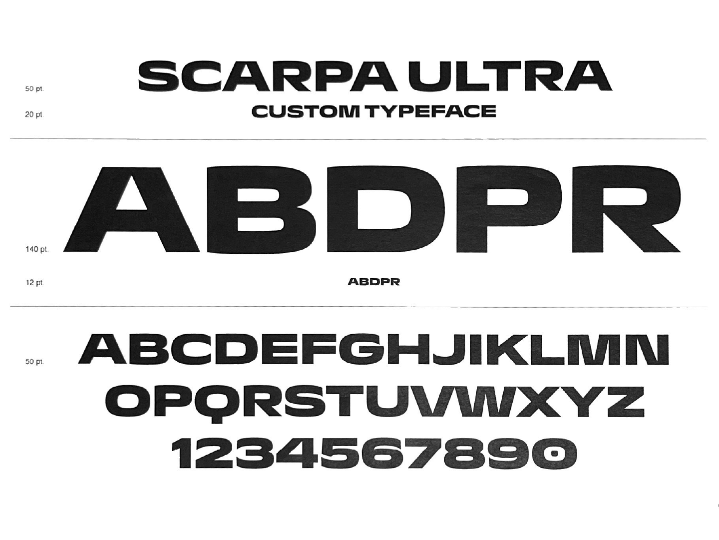
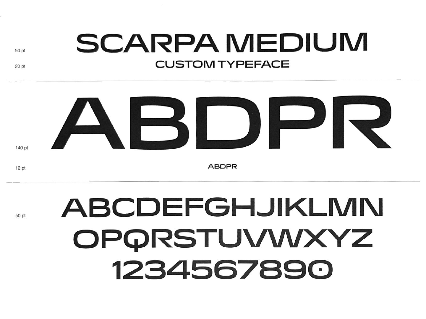


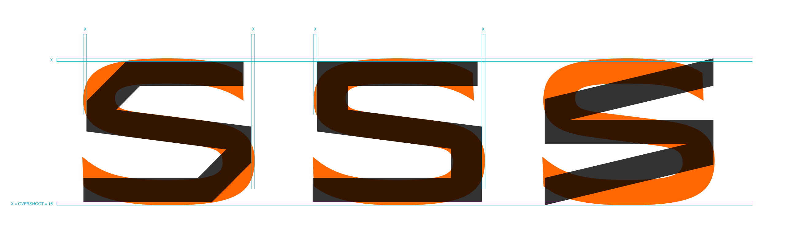
The Paranorma structure proved to be the perfect starting point thanks to its shapes capable of expressing both dynamism and solidity.
The design was modified in the apexes (A, N, V) to emphasise the idea of the peak, a central element both for the new repositioning and for those who live and face the mountains on a daily basis.
The arches, on the other hand, extend the curvature slightly, creating an overshoot that softens the outline. The alternation of this sinuosity with some extremely rational strokes such as those in the leg of the capital R creates an alternation not unlike that which can be seen on a cliff wall, where smooth and sharp parts alternate to create a single, unique pattern.
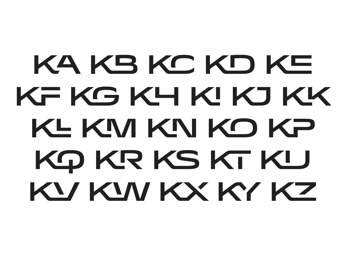

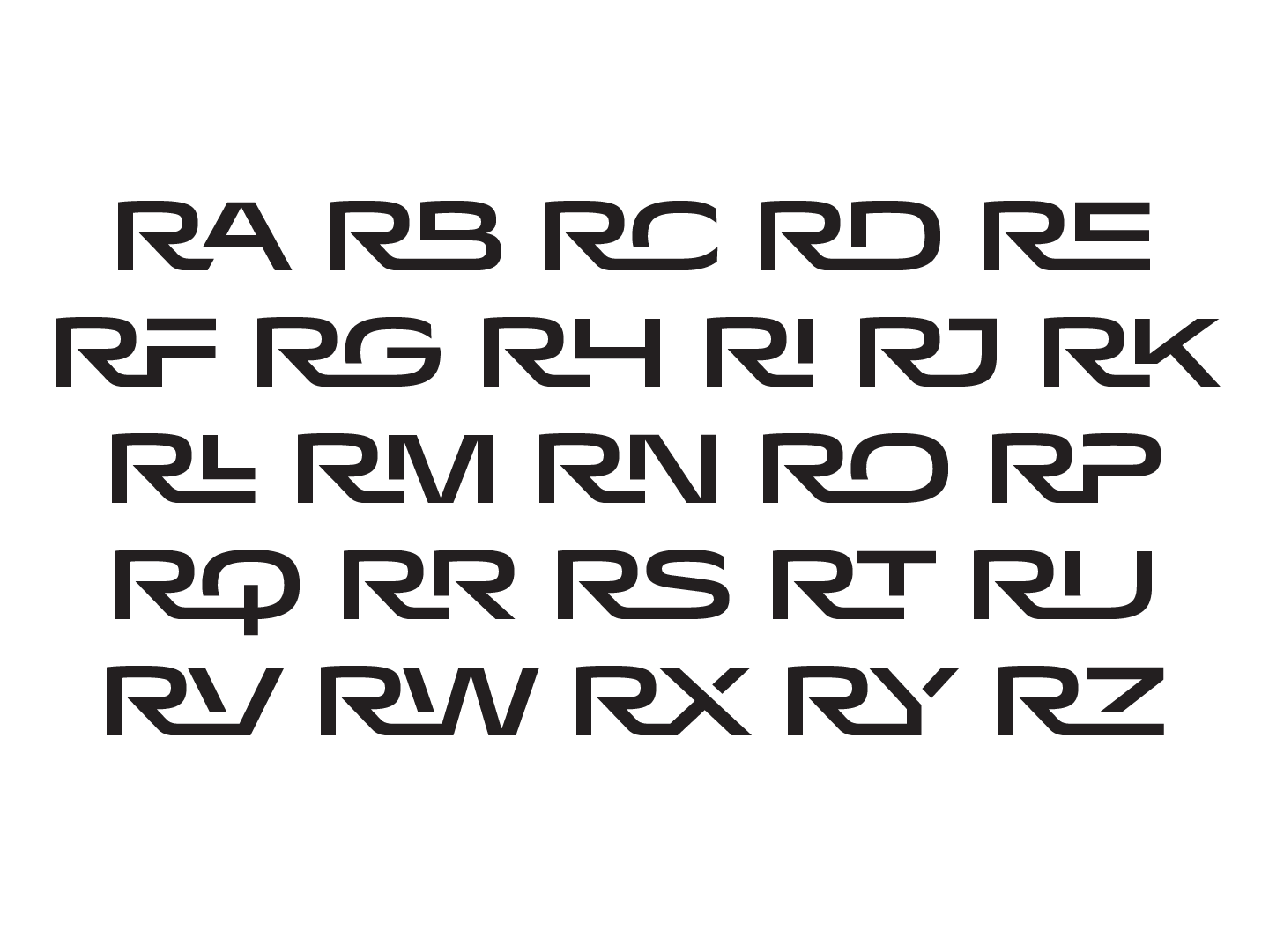

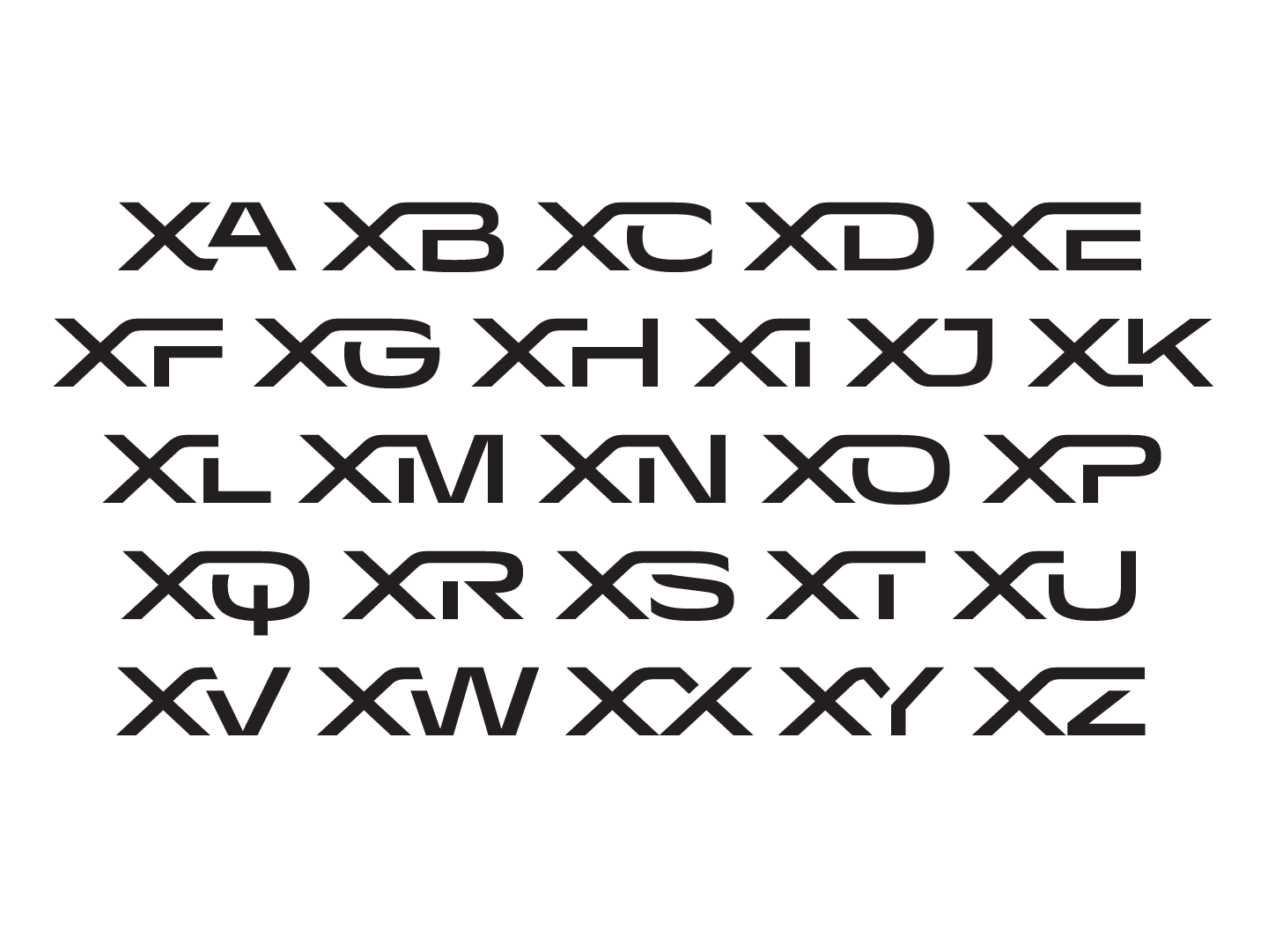
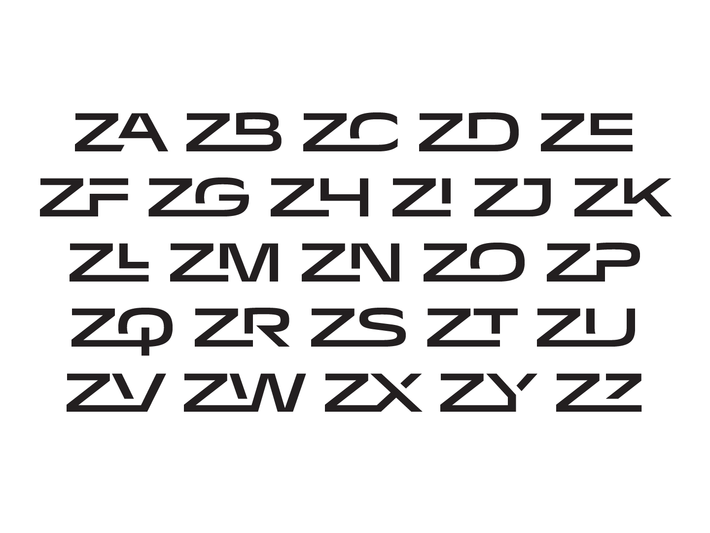
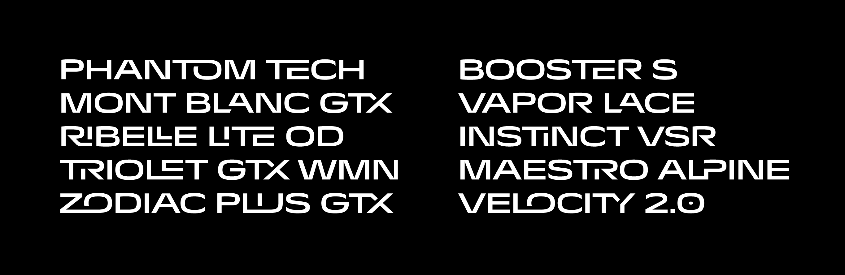
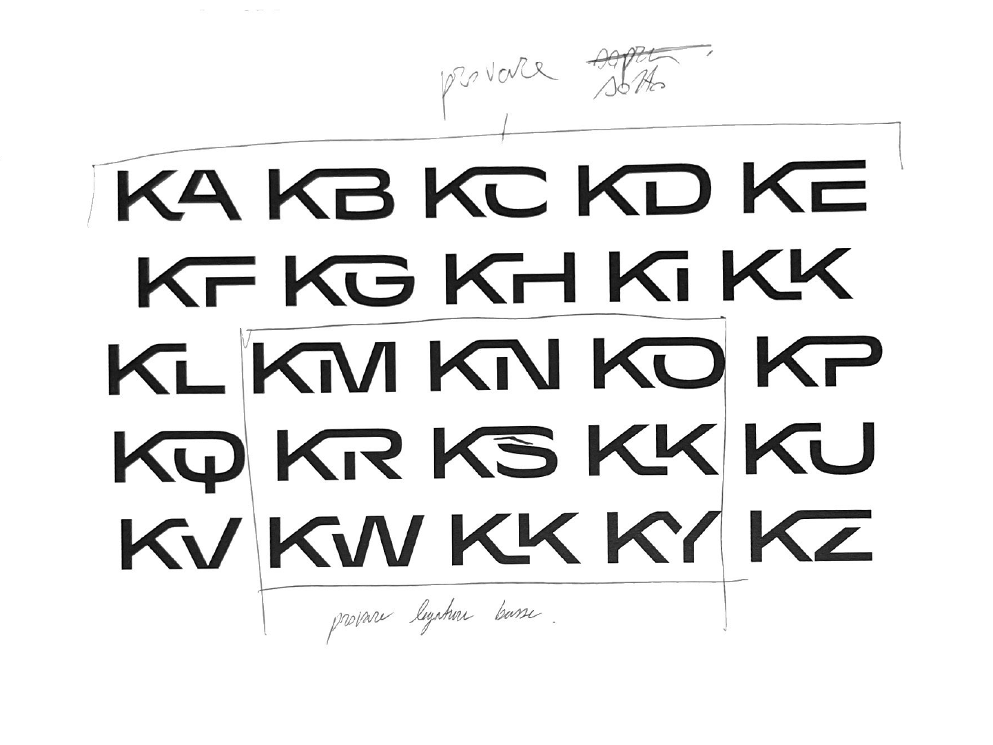
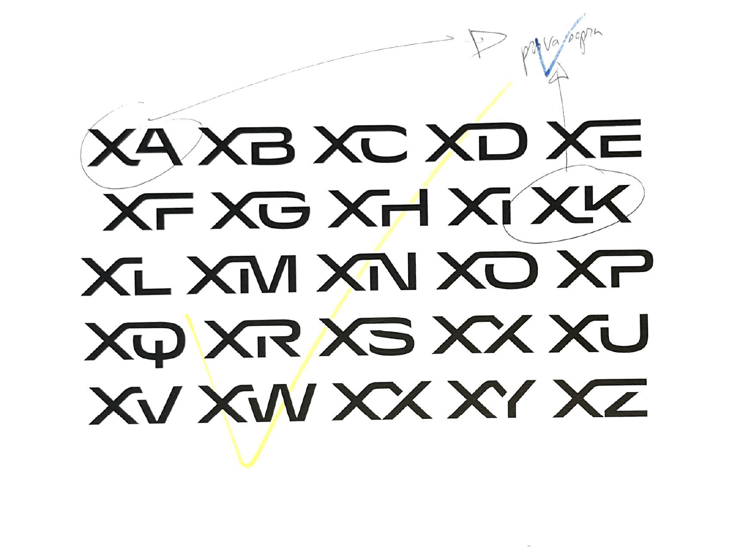
Completing the alphabet is an extensive series of ad-hoc ligatures, designed to strongly characterise product names.
Much like opening a new path during an expedition, the ligatures are structured with the idea of finding a new, unusual, direct way between the typographic elements that make up the letters, thus bringing the type design even closer to the values of the company and its activities.
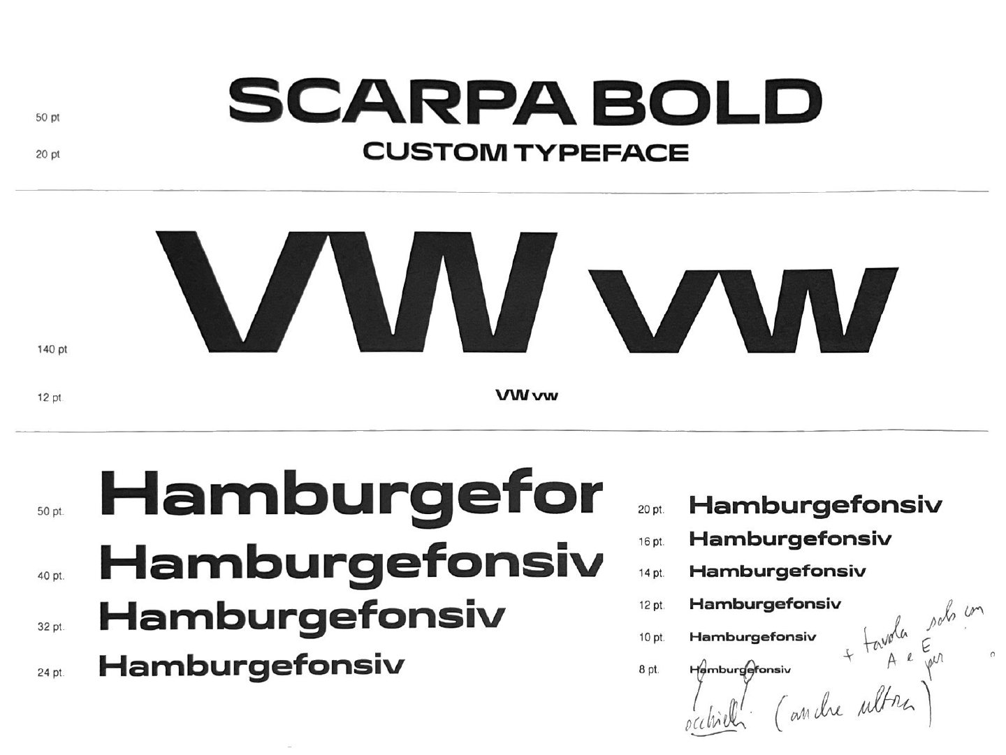
The family consists of numerous weights to be used in printed and digital assets alike, and features a variable font too, is licensed exclusively to SCARPA and is currently in use on all institutional assets.