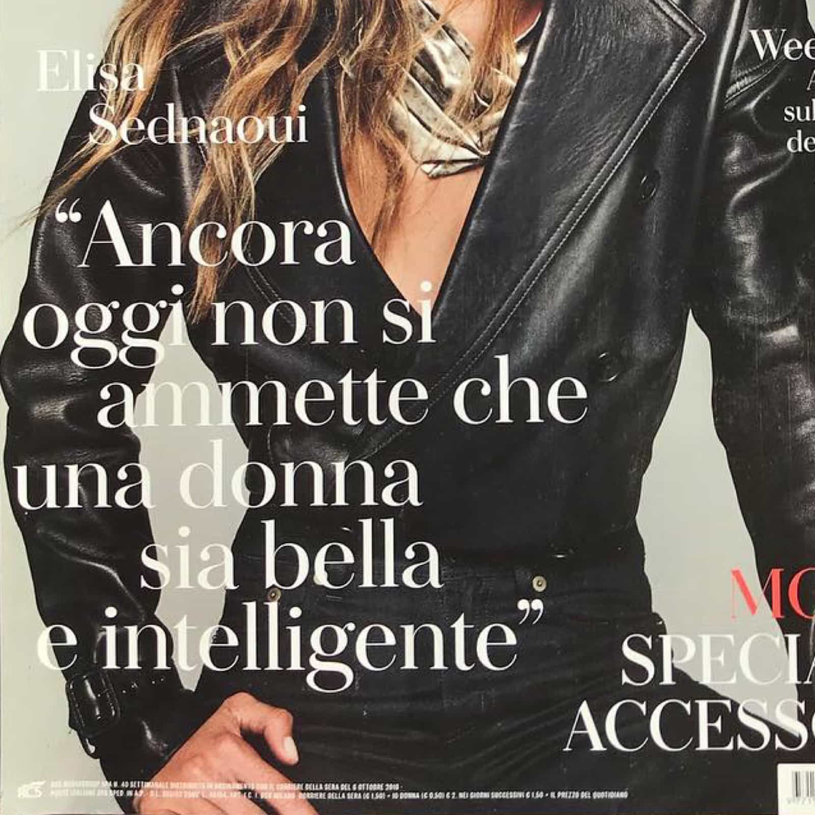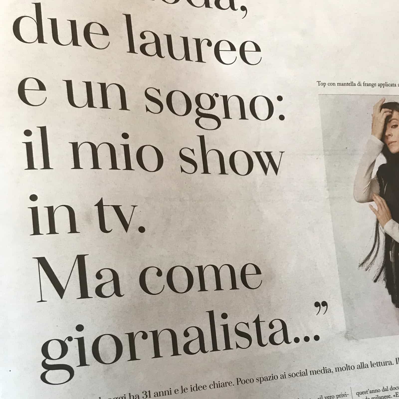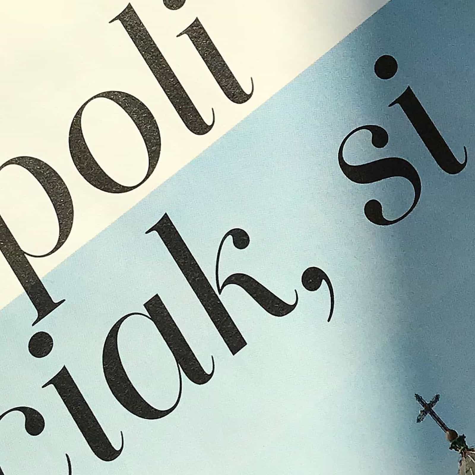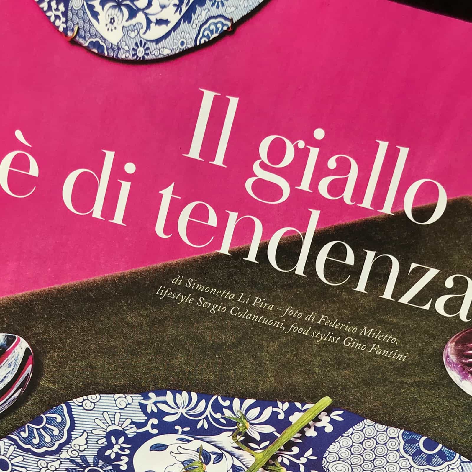
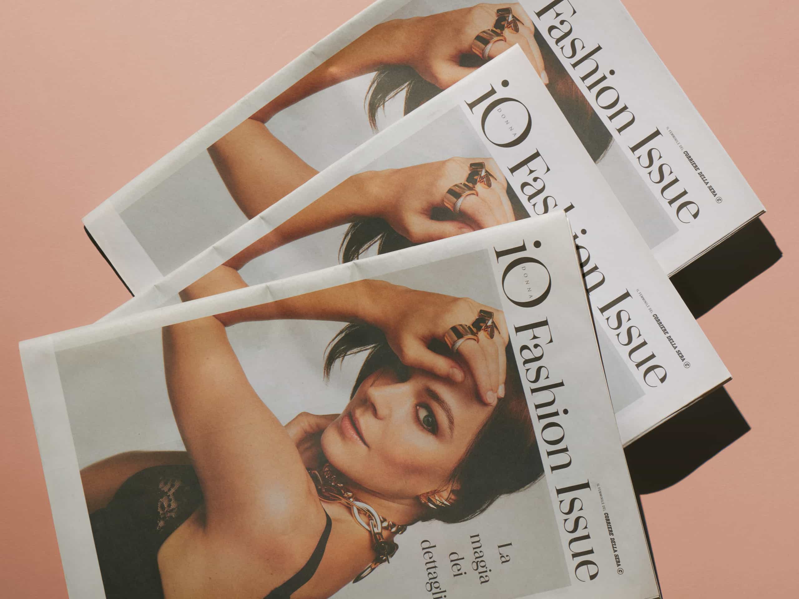
iO Donna custom typeface
A font designed ad-hoc for the RCS group women’s magazine
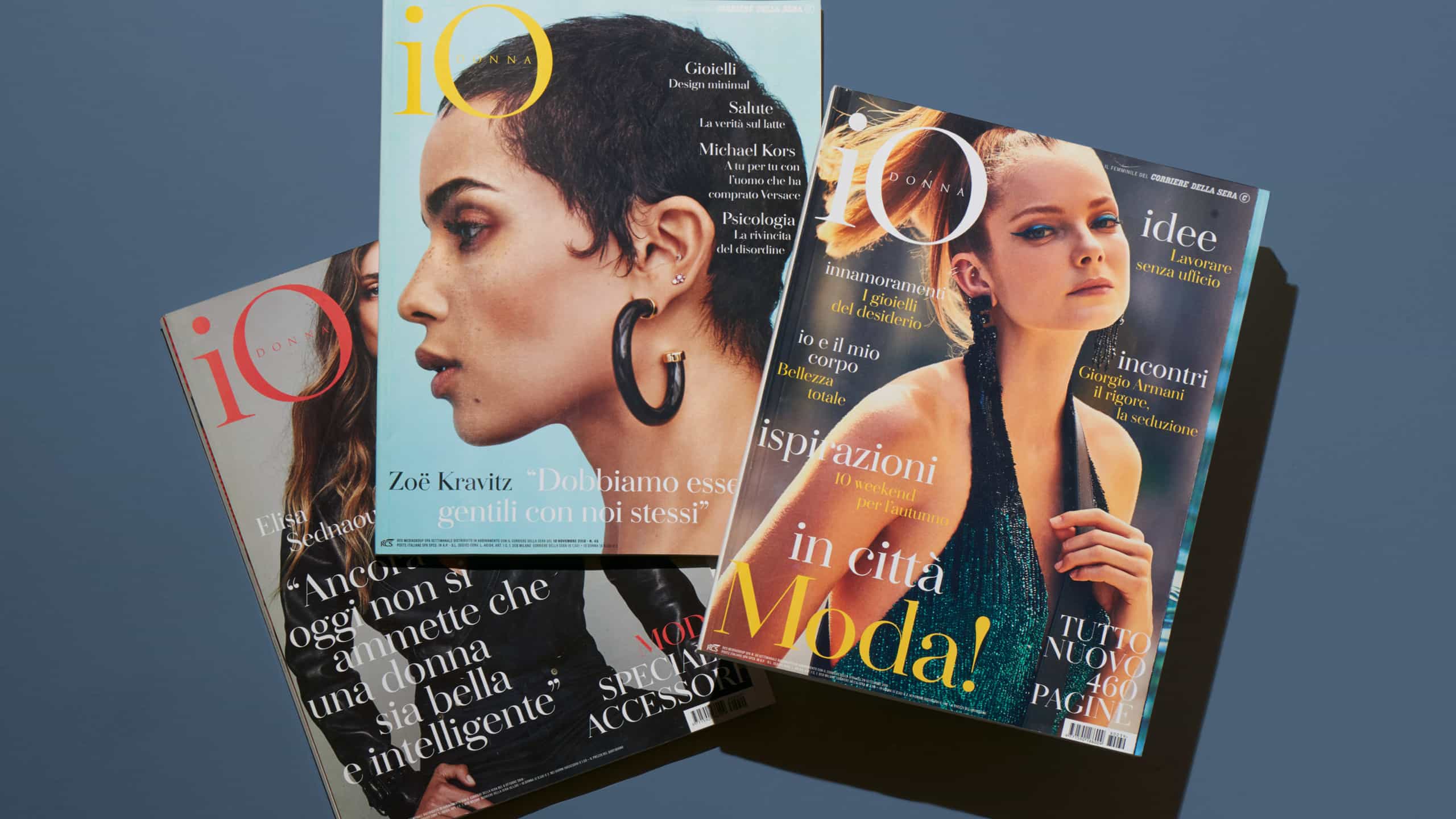
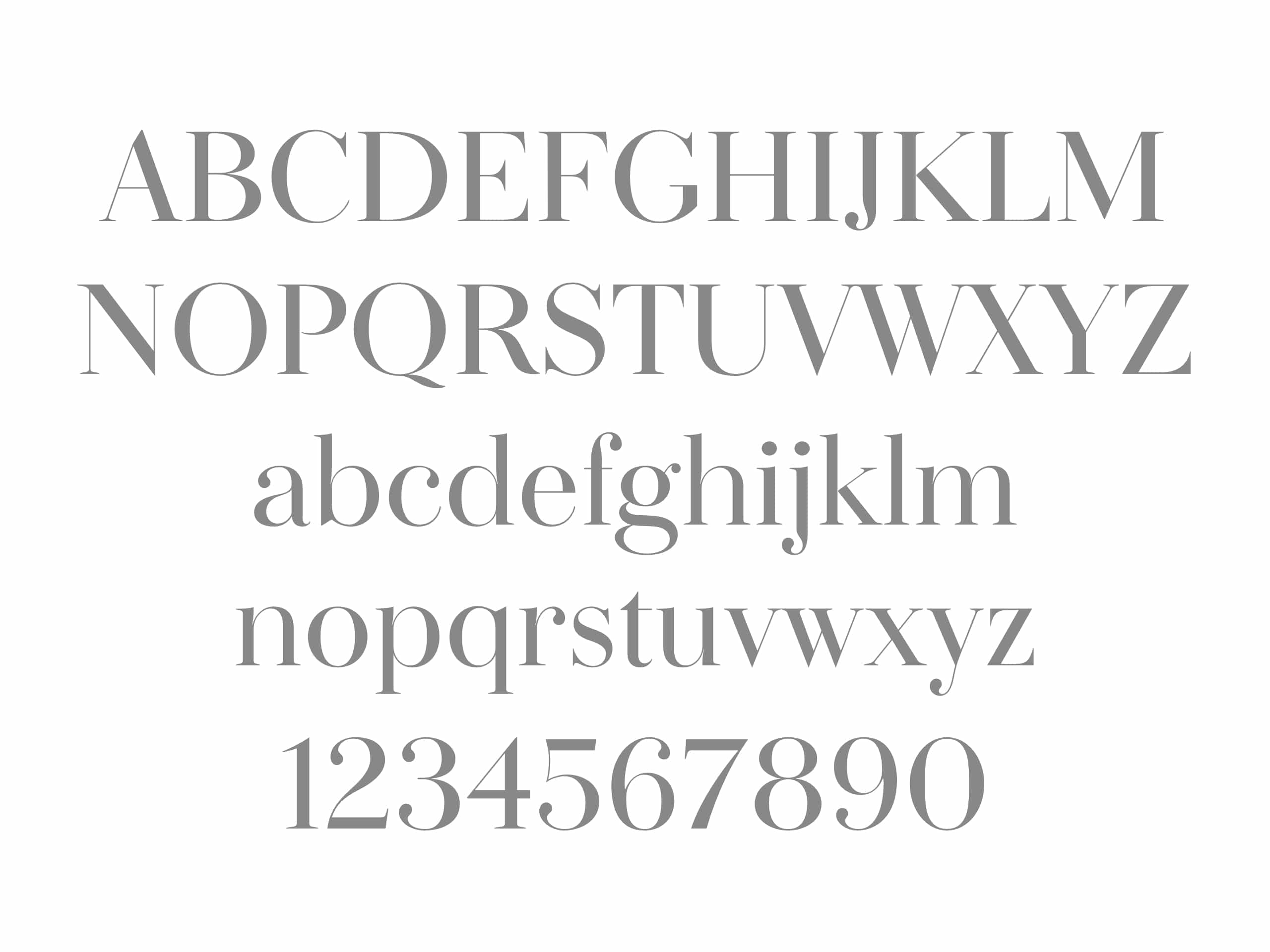
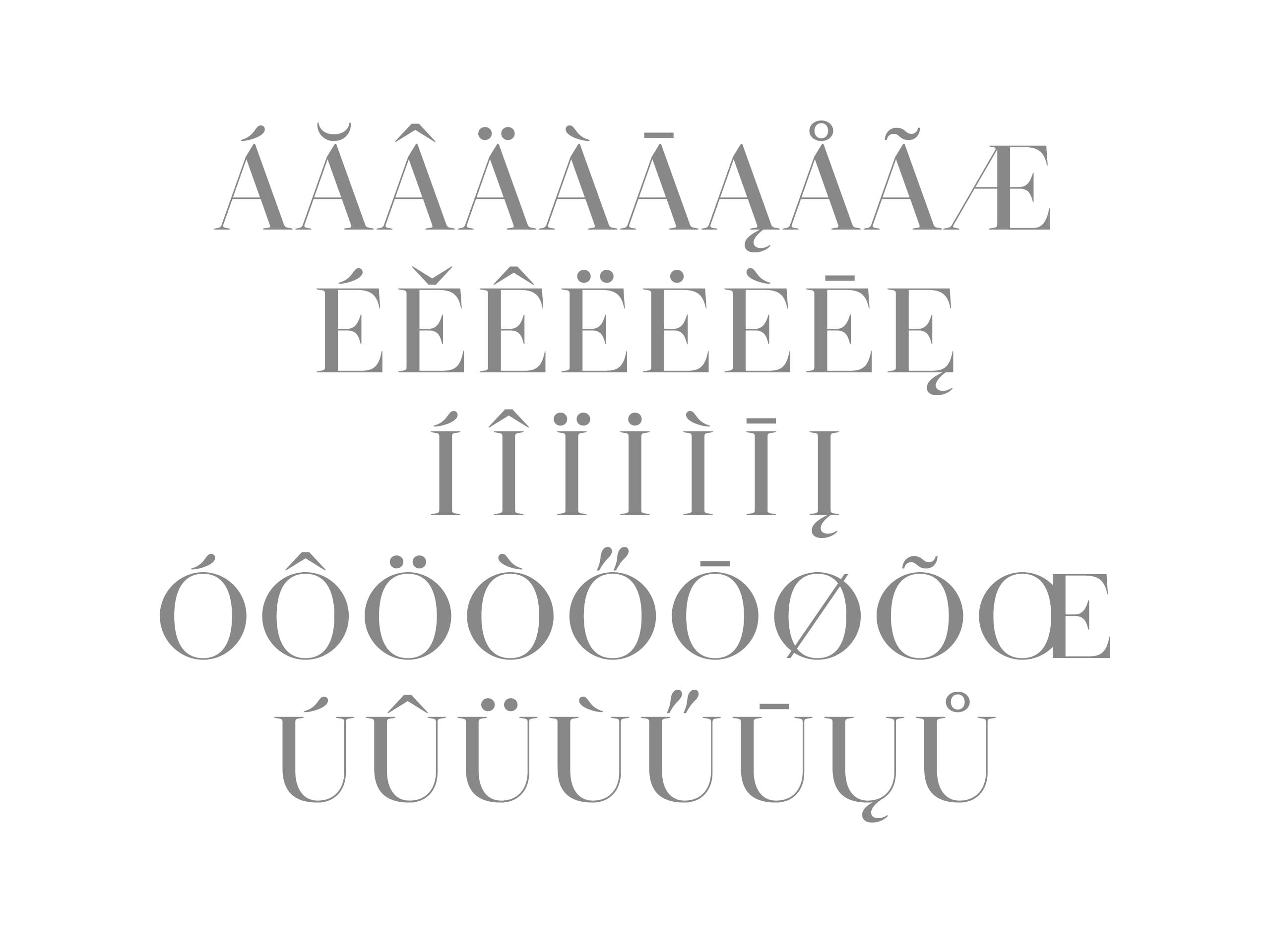
A family of characters developed in collaboration with Florian Reibisch for the restyling of IO Donna, the popular women’s magazine from Italian newspaper Corriere della Sera.
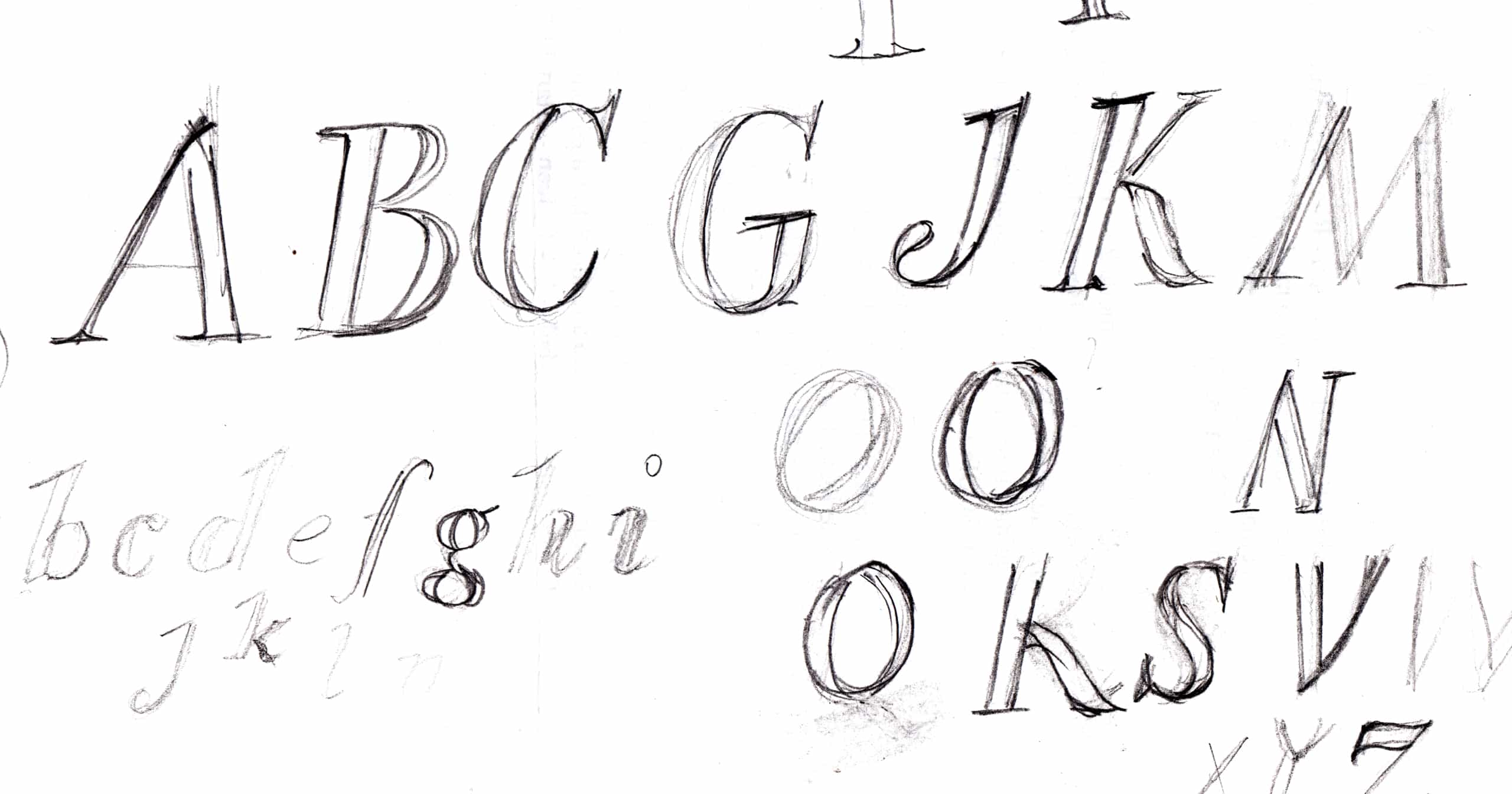
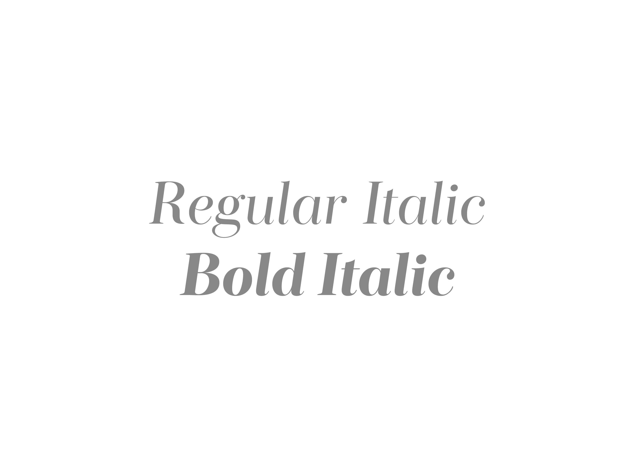
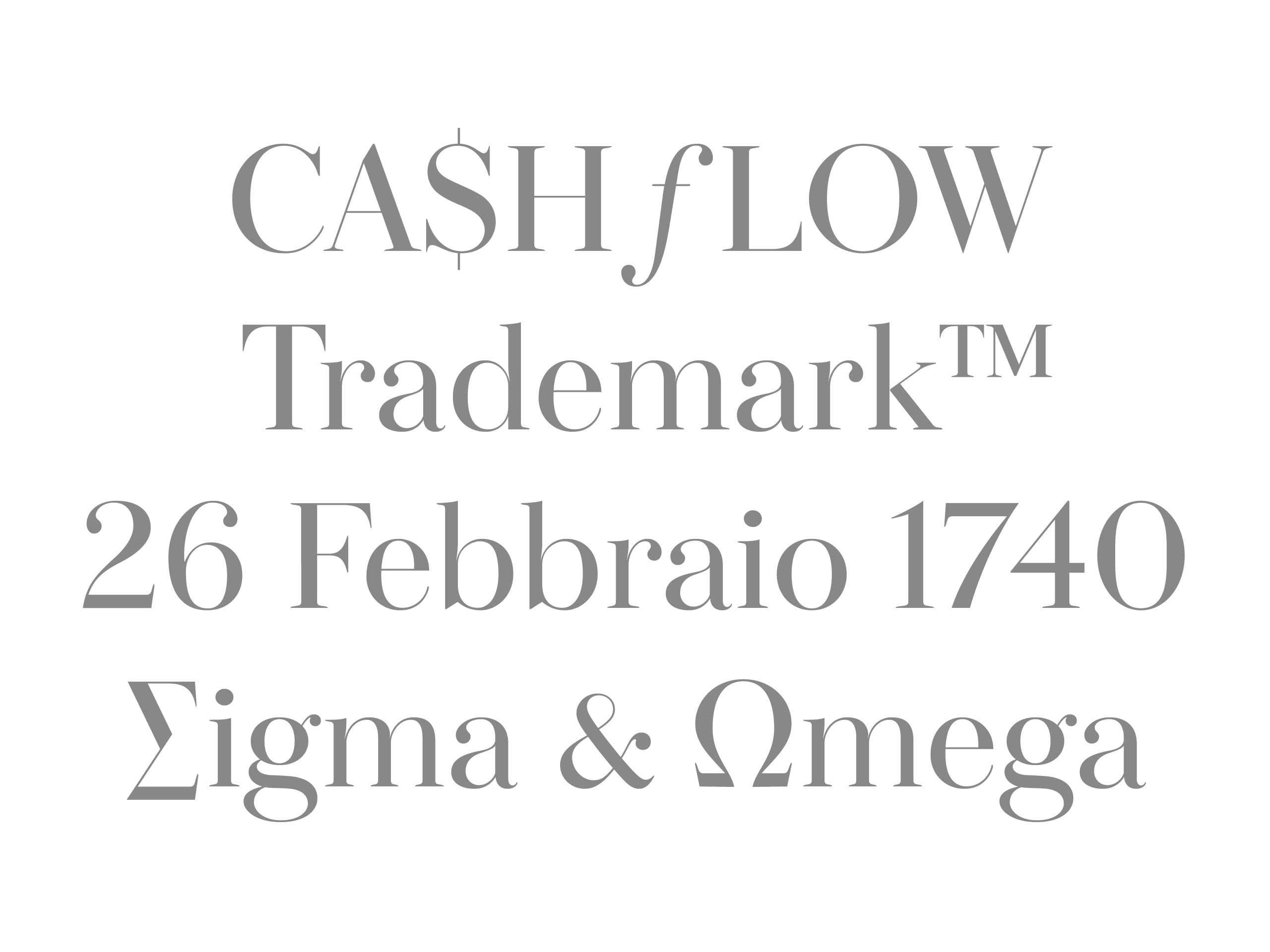
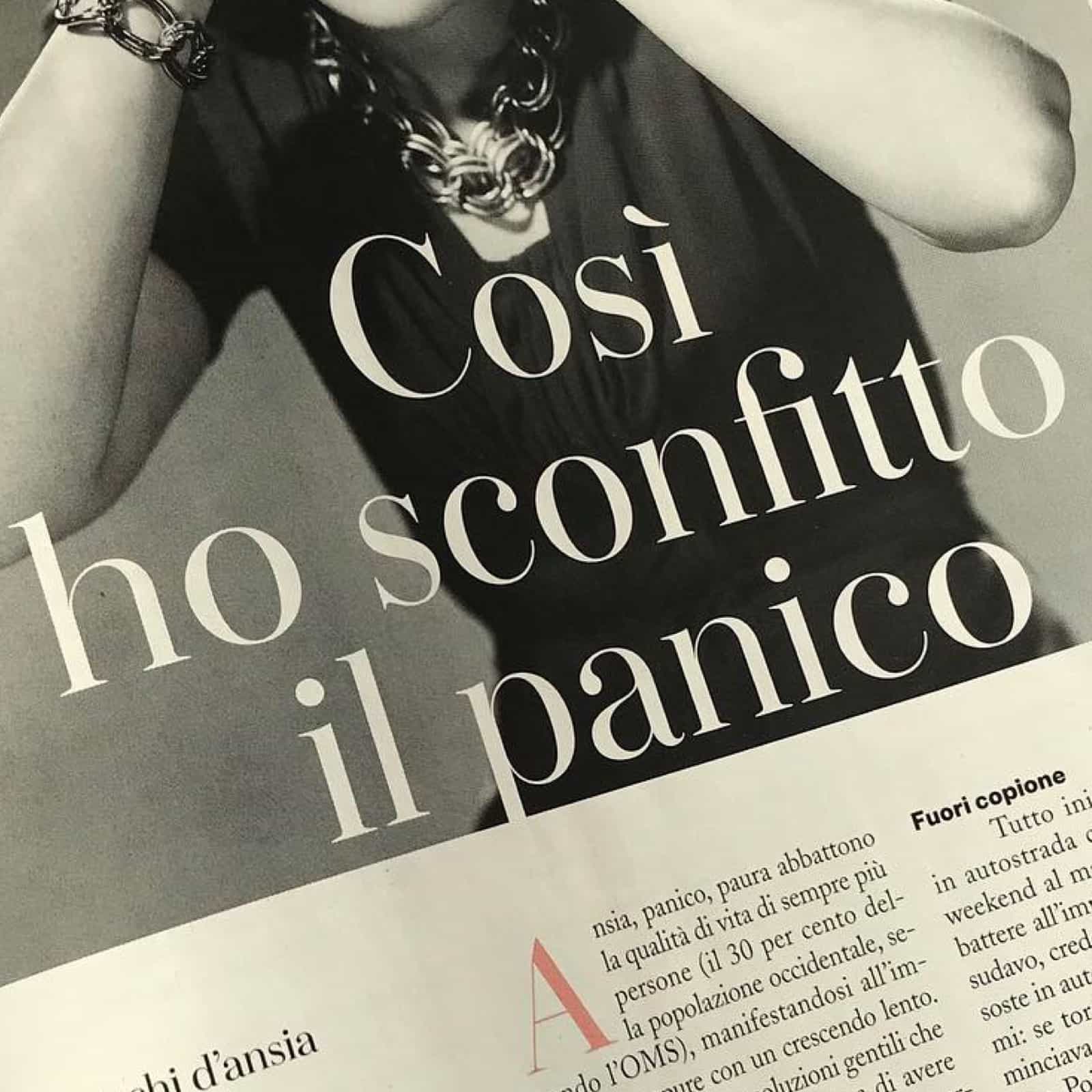
In contrast to Italian publishing, international women’s magazines have a decisive stylistic approach that reflects the complexity of the female world in contemporary society. Donna is our reinterpretation of the classical Bodoni font, typically used for IO Donna headlines. The result is a typeface that distances itself from conservative Italian publishing and brings fresh appeal to the weekly magazine.
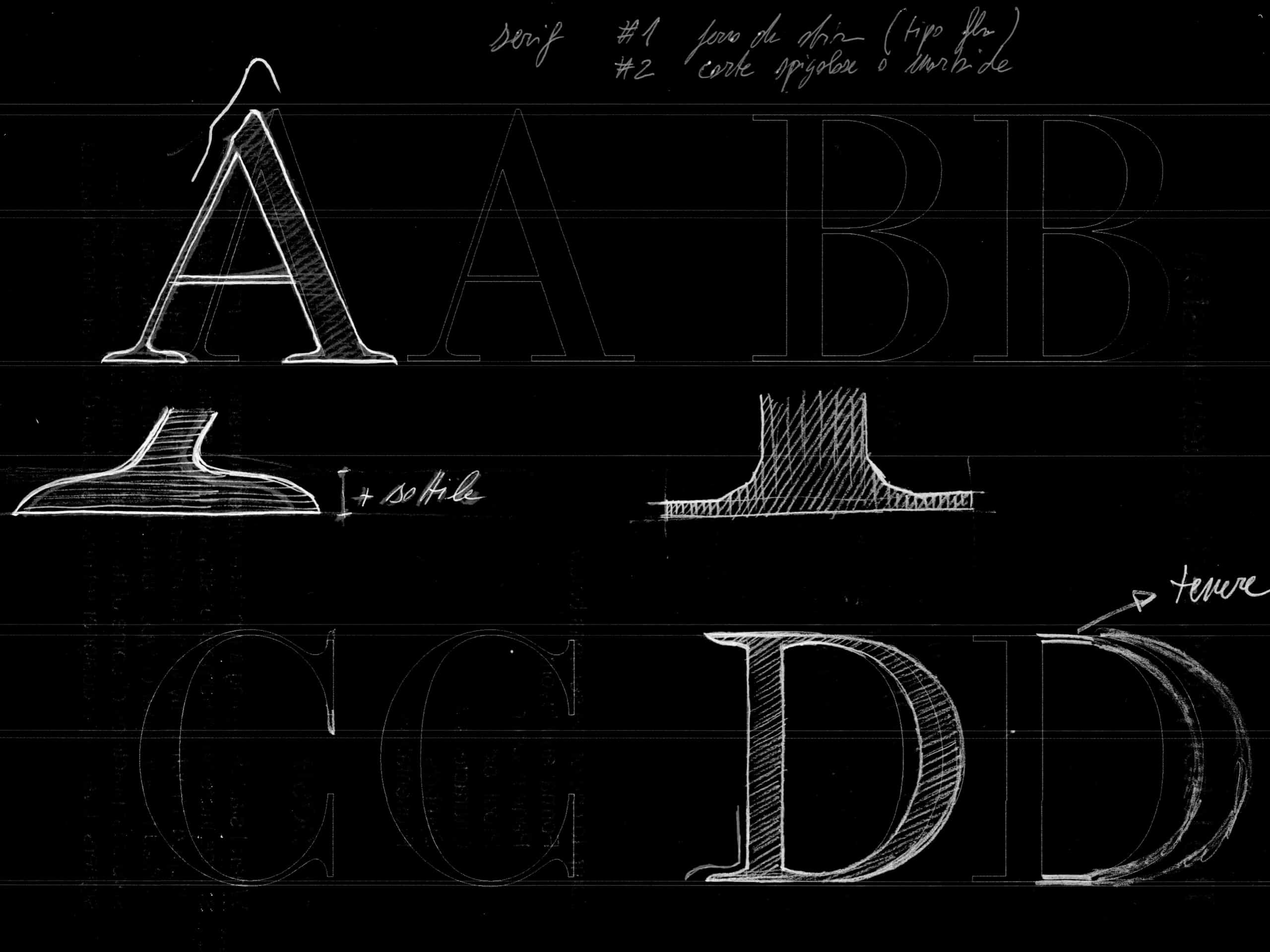
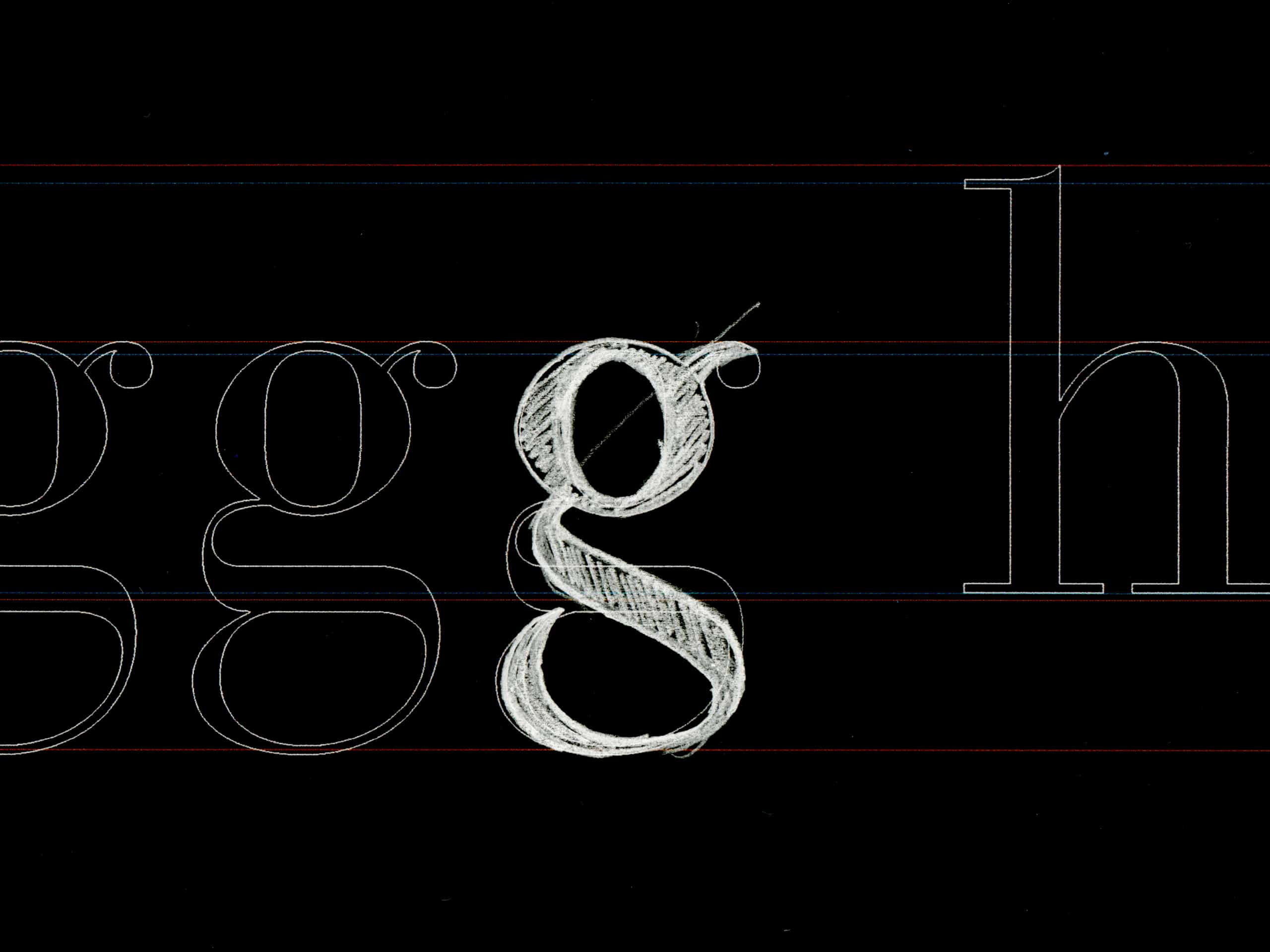
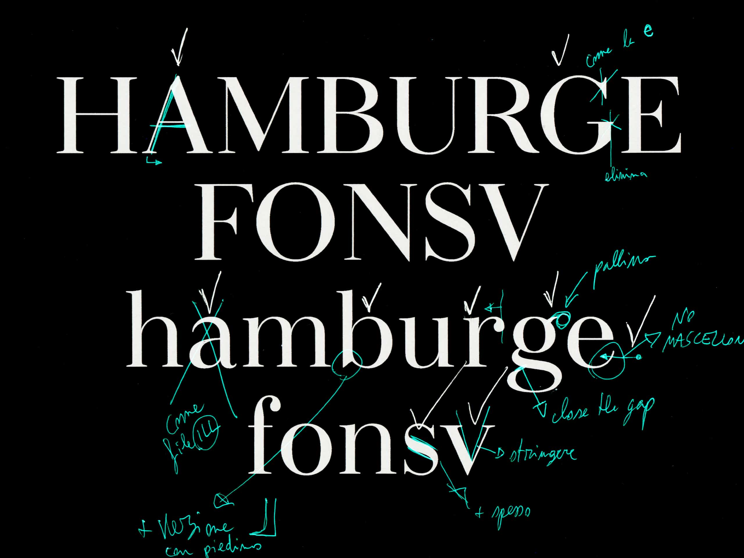
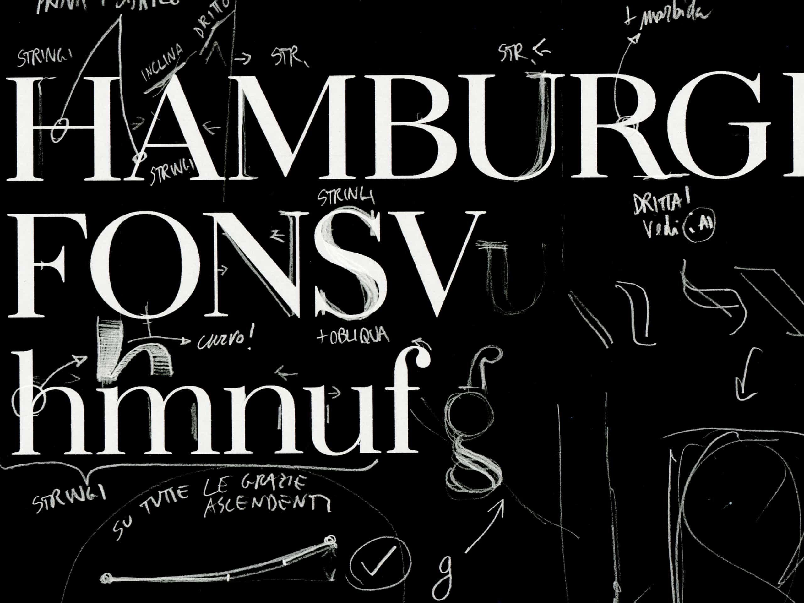
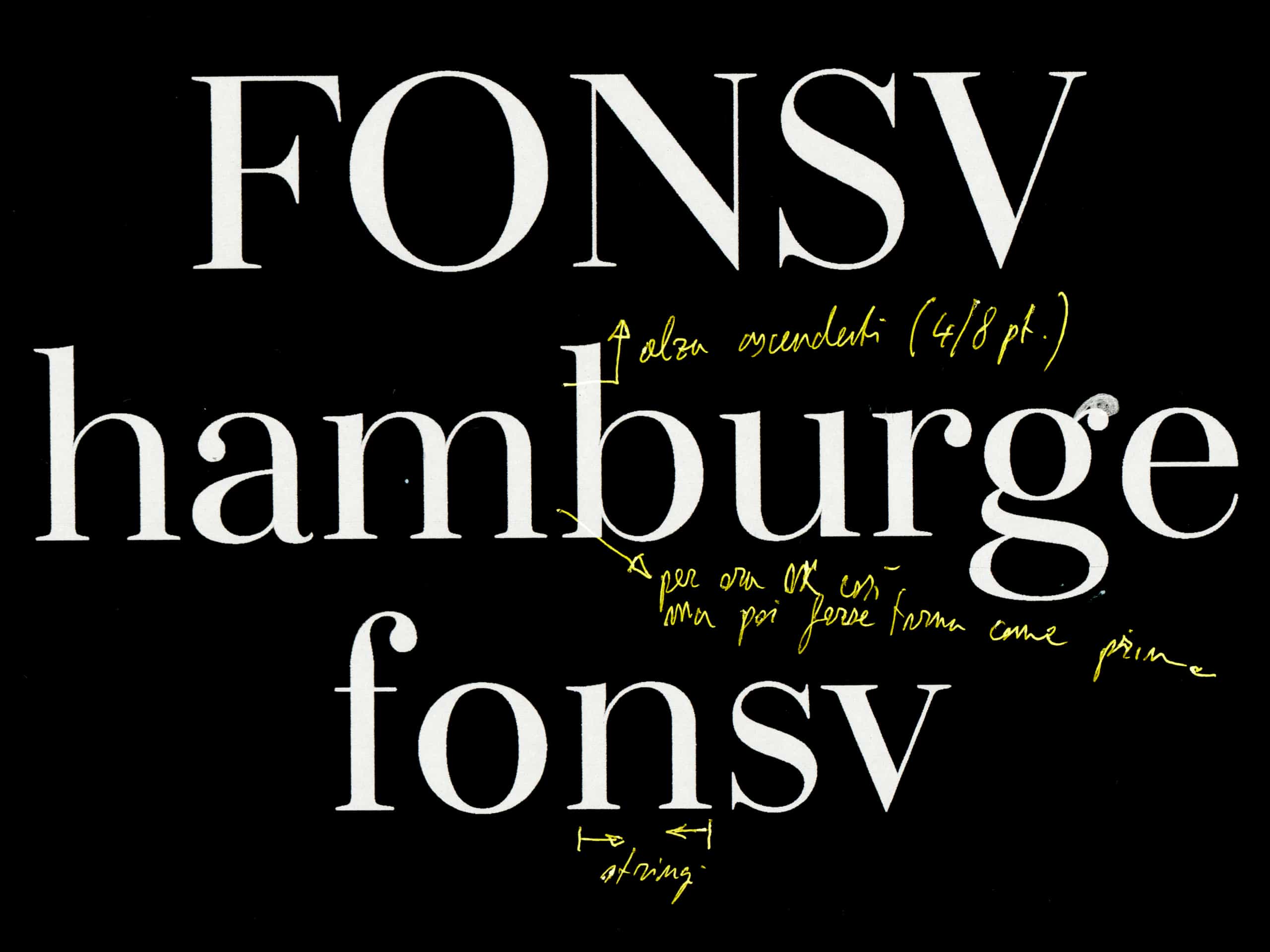
Taking inspiration from the Bodoni typeface, we decreased the contrast and further reduced the thin strokes. We worked on the serifs with the idea of avoiding a classical transitional approach and to soften the hard 90° angles of the Bodoni font. We also further rounded the curves without compromising on character.
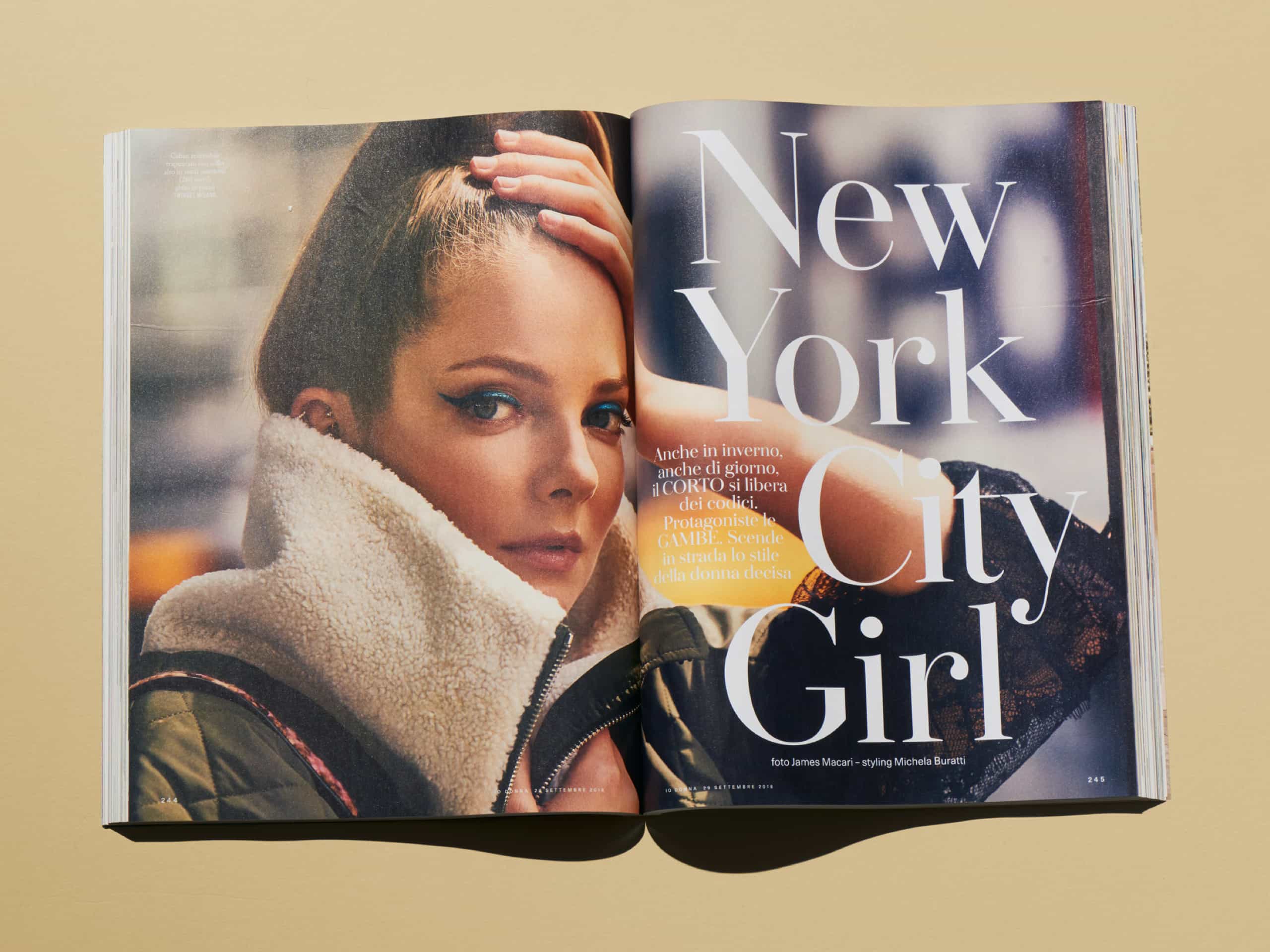
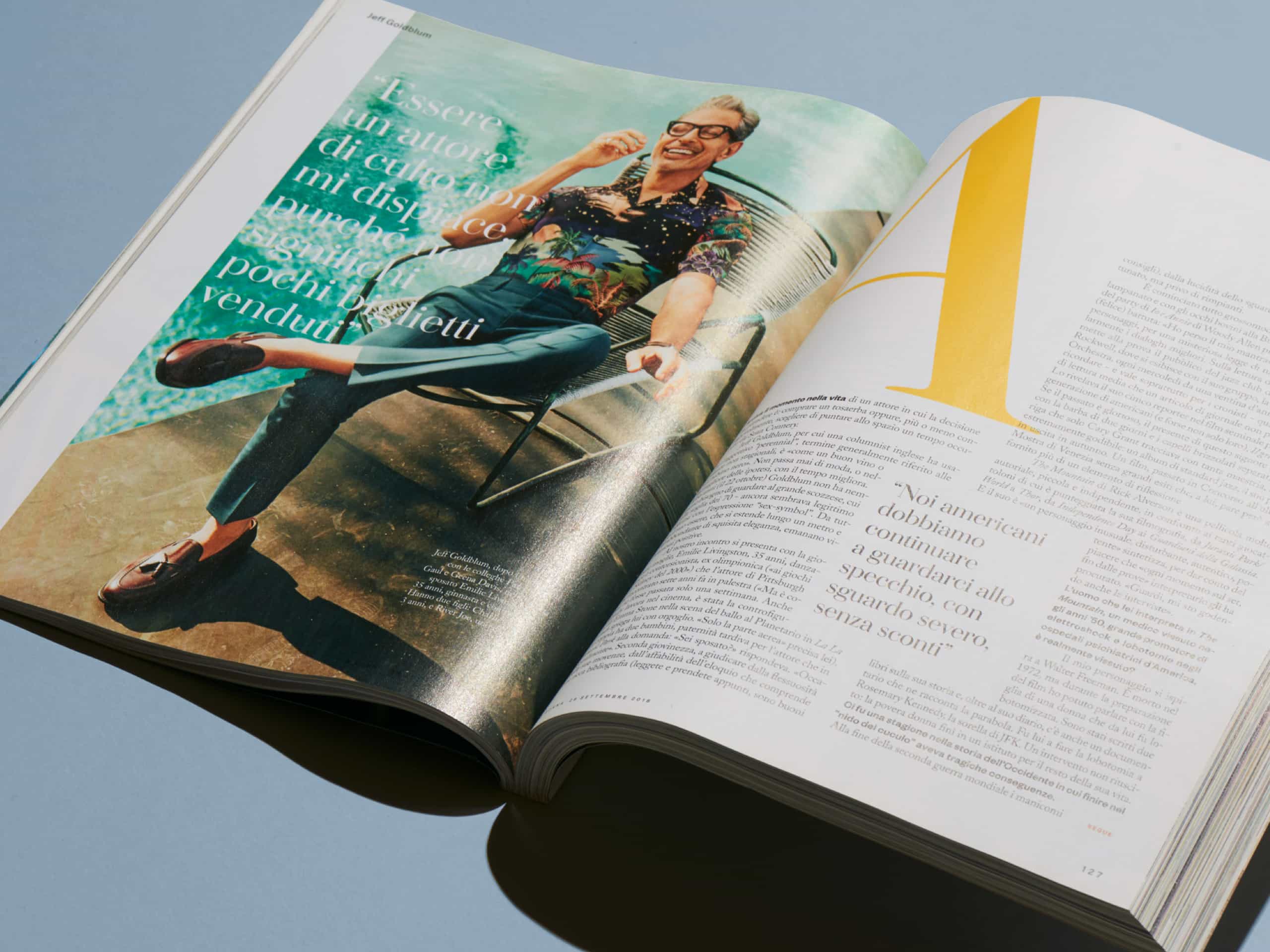
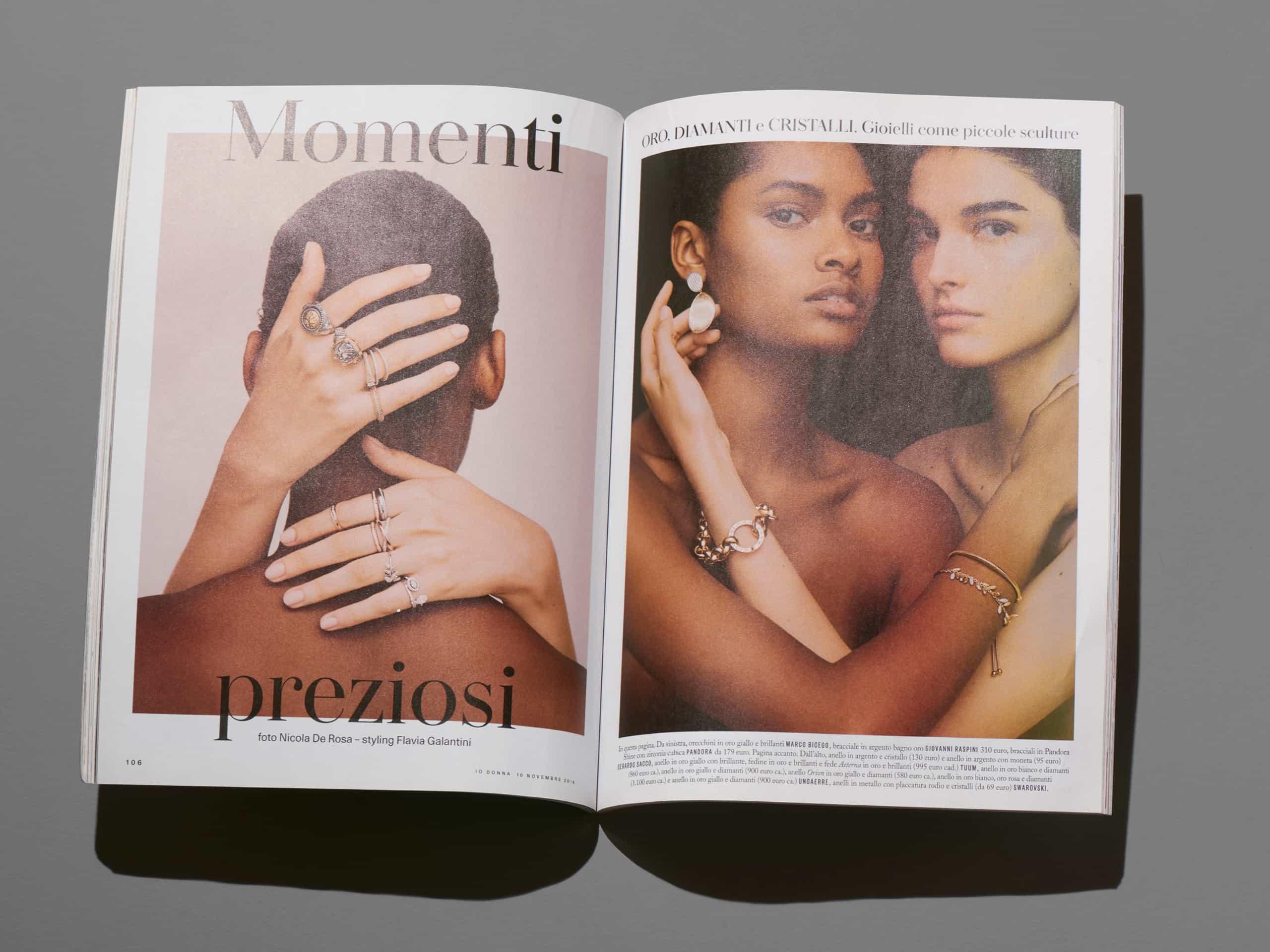
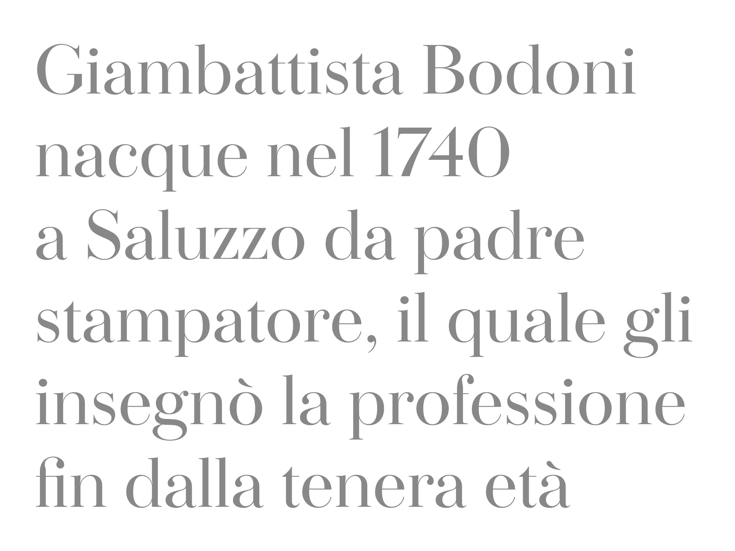
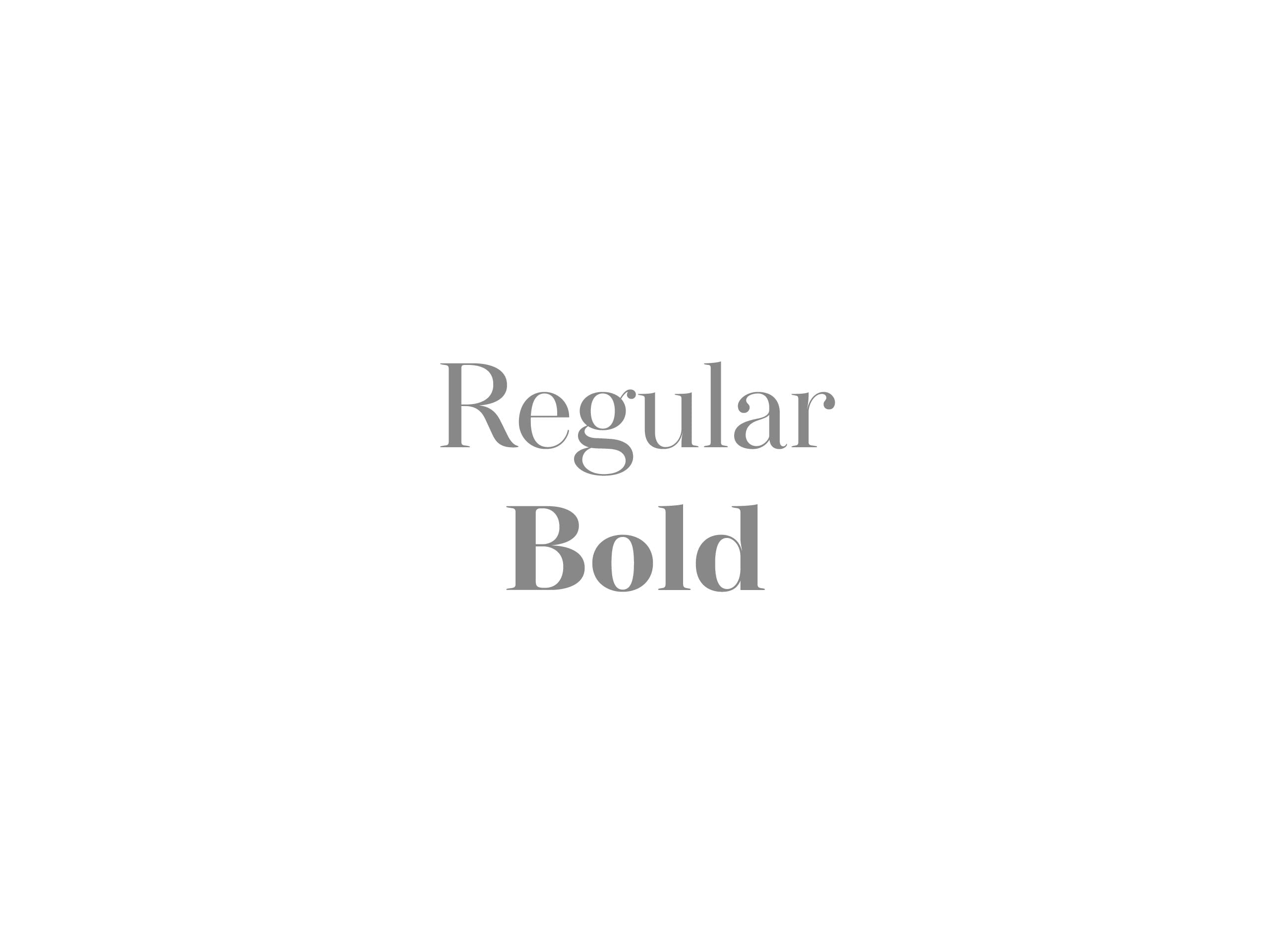
The overall result is a compromise between personality and softness, with clear characteristics that emerge when used on a large scale yet remain discreet when needed for accompanying text. This all ensures immediate recognisability and the right tone for one of Italy’s best-known weekly magazines.