Bracco
A new line of packaging for the pharma multinational
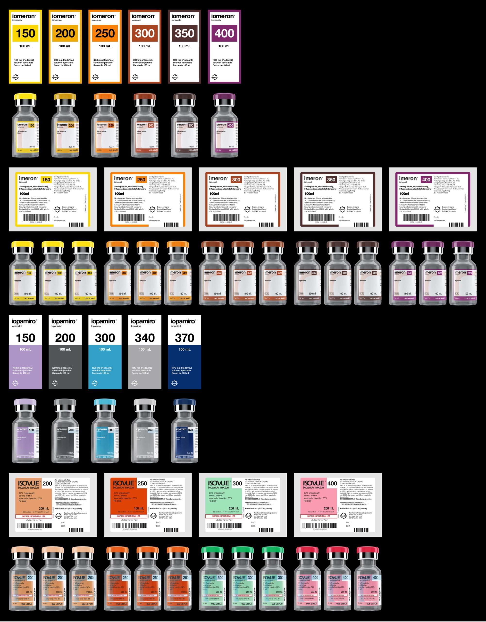
Italian pharmaceutical company Bracco requested the restyling of two of their products, each distributed across 5 continents. Iomeron and Iopamiro (Isovue in the USA) are contrast agents used in radiology. The brief was divided into two closely linked parts: ensure product differentiation while maintaining coherence and increase visibility of key information to make it easier for doctors to use.
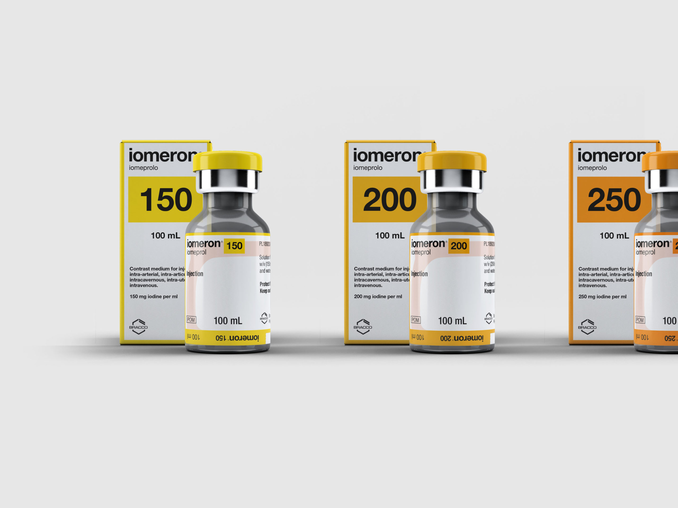

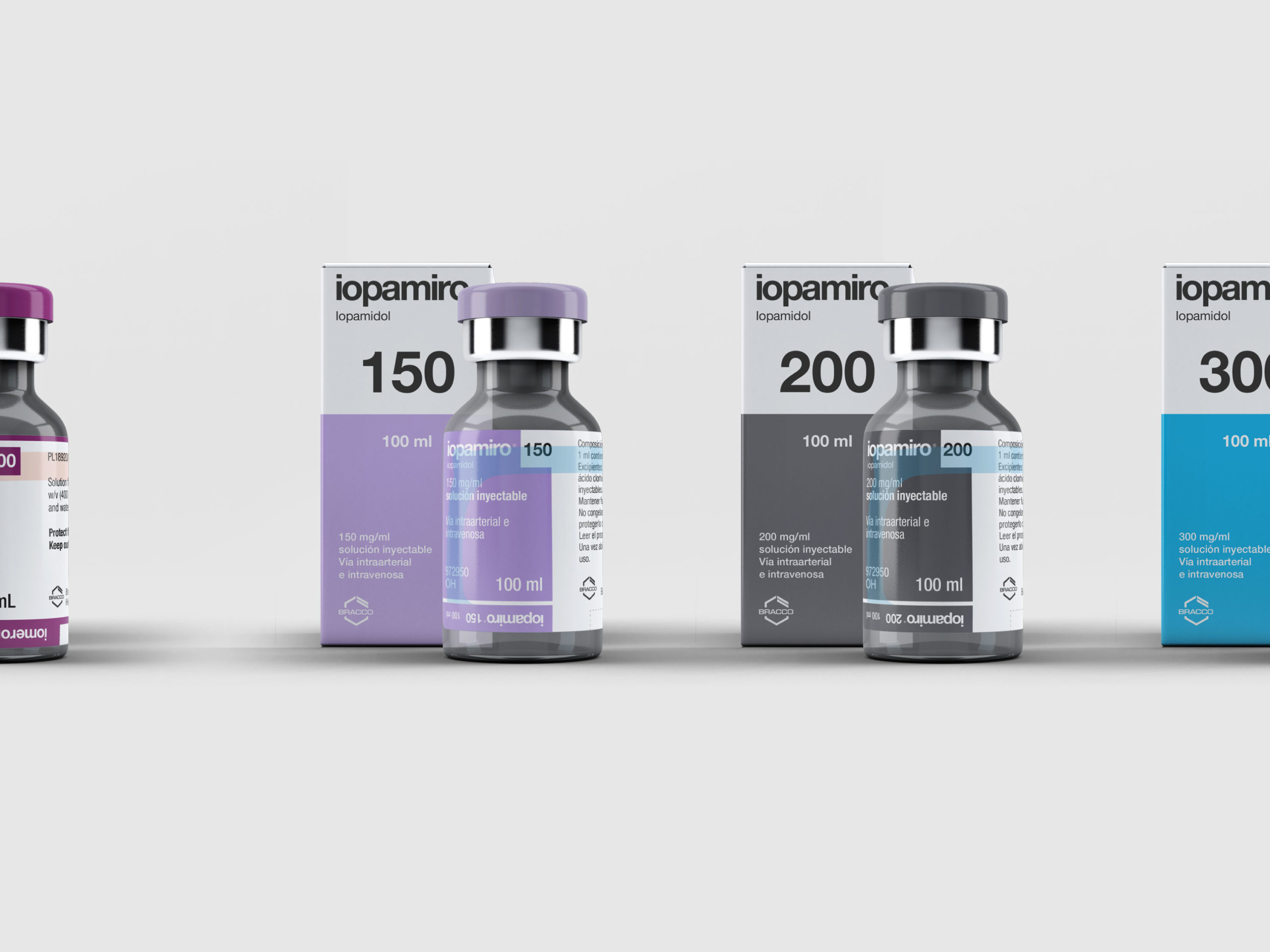
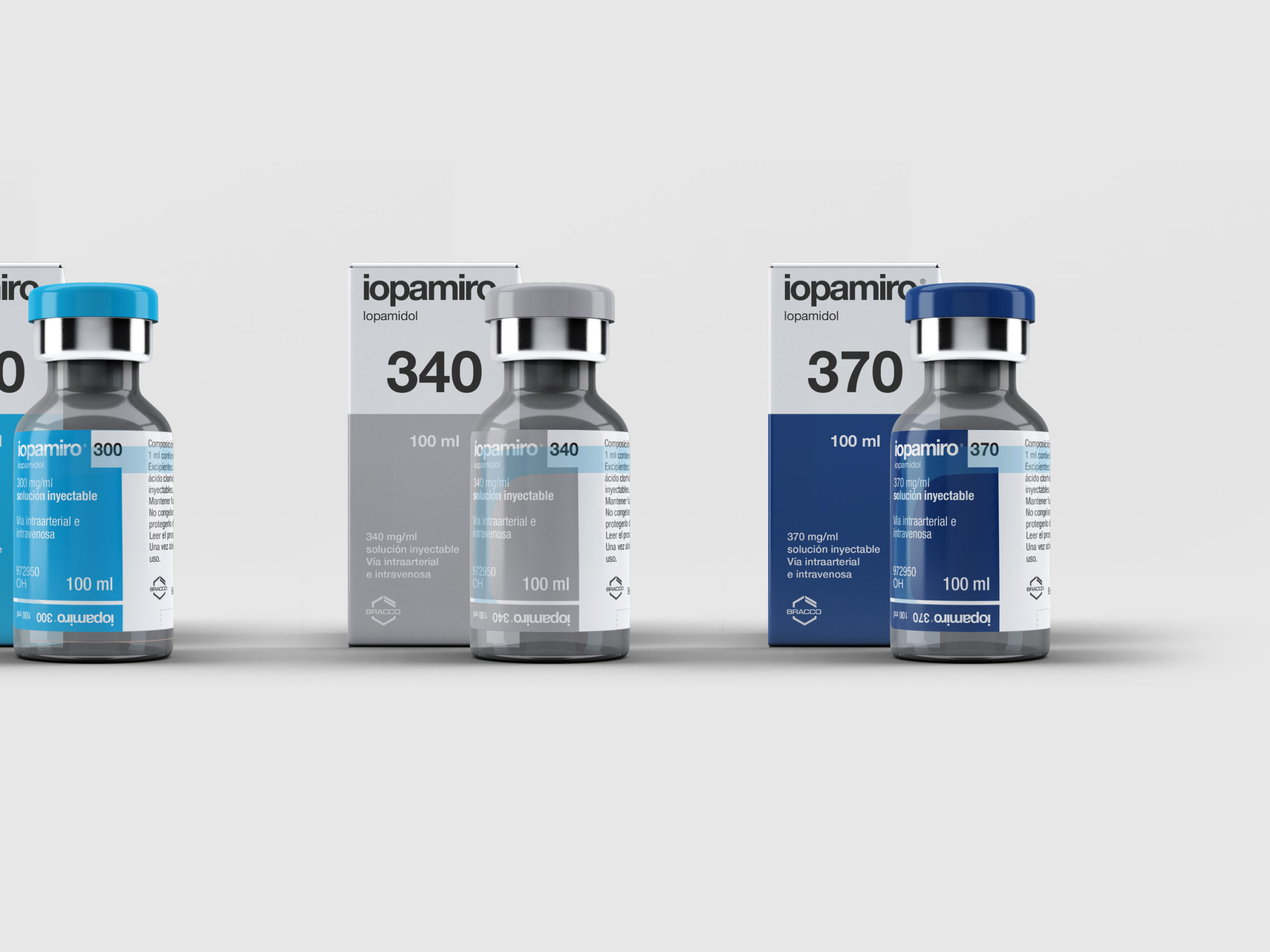
We took inspiration for the restyled Iomeron and Iopamiro packaging from various fundamental characteristics of the Bracco identity. We played on shared elements to ensure coherence between the two products: corporate typography and a visual hierarchy of information. To create a clear, intuitive, and easy to read pack, we relied on a careful selection of colours and the addition of minimal graphic details.
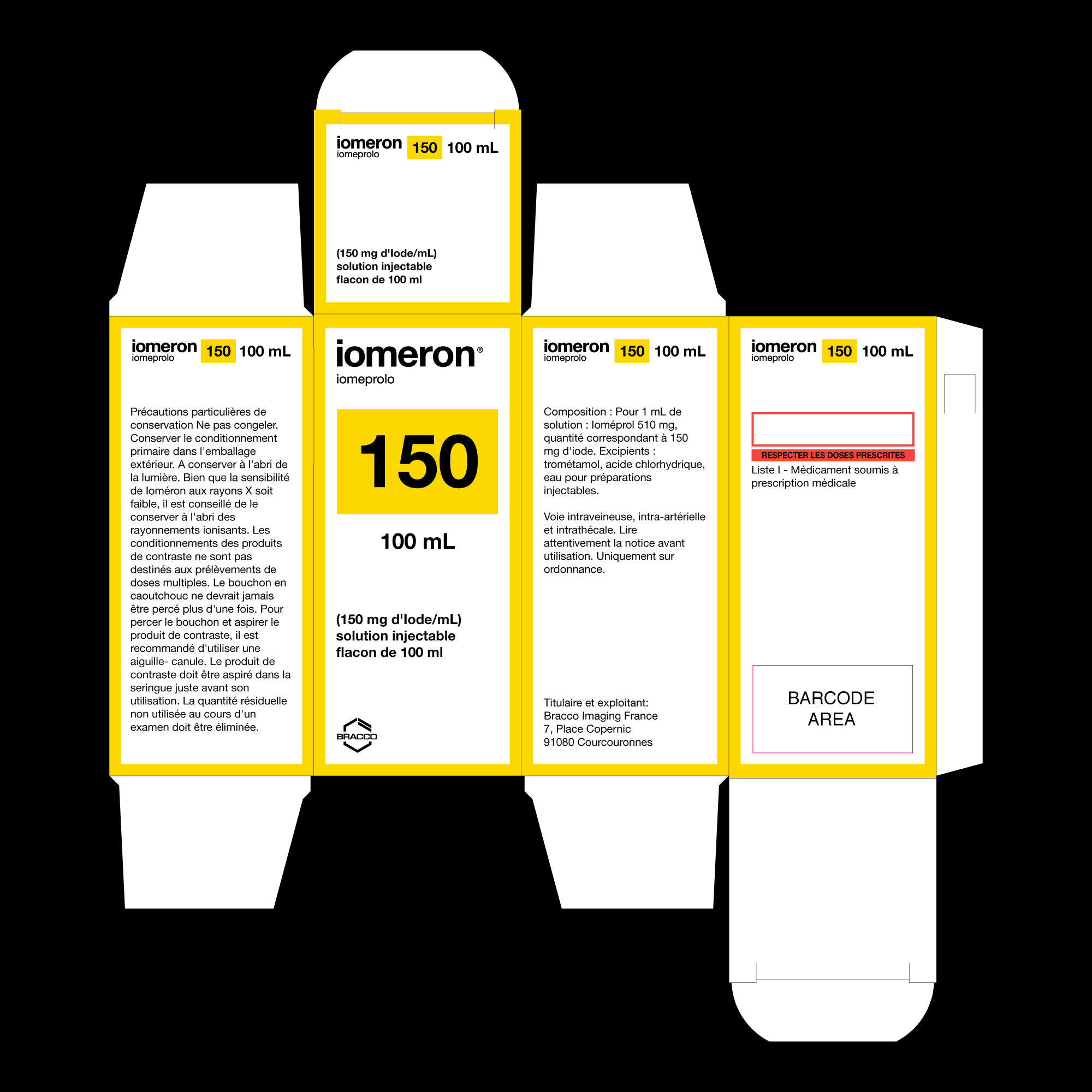

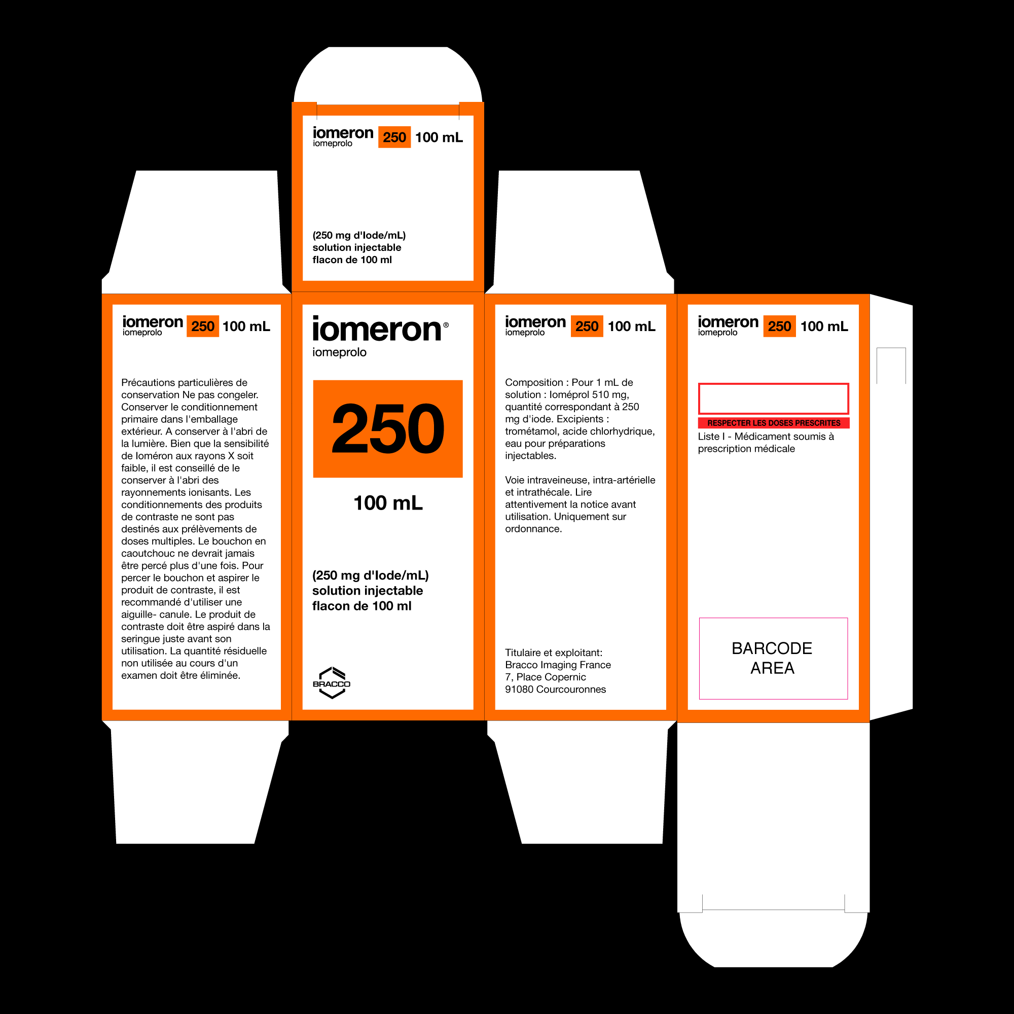

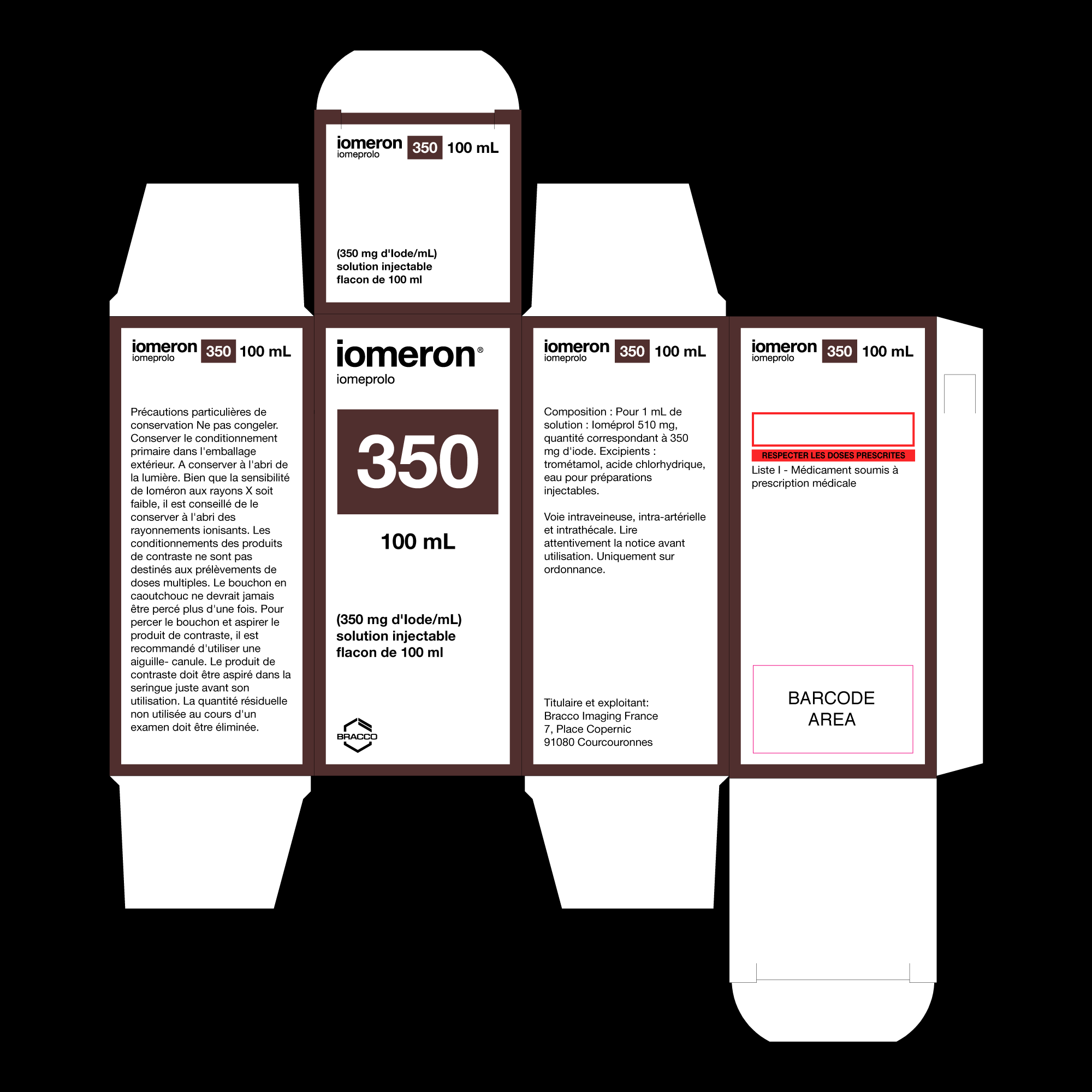
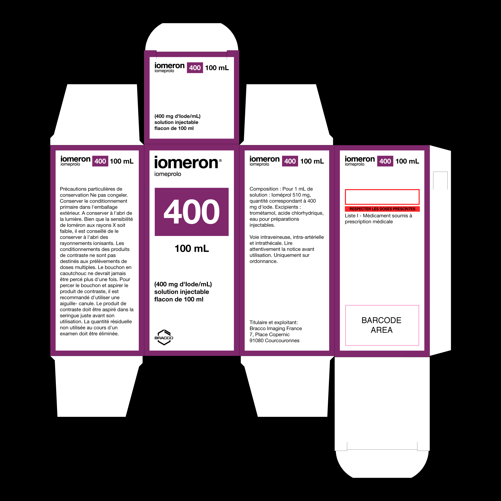
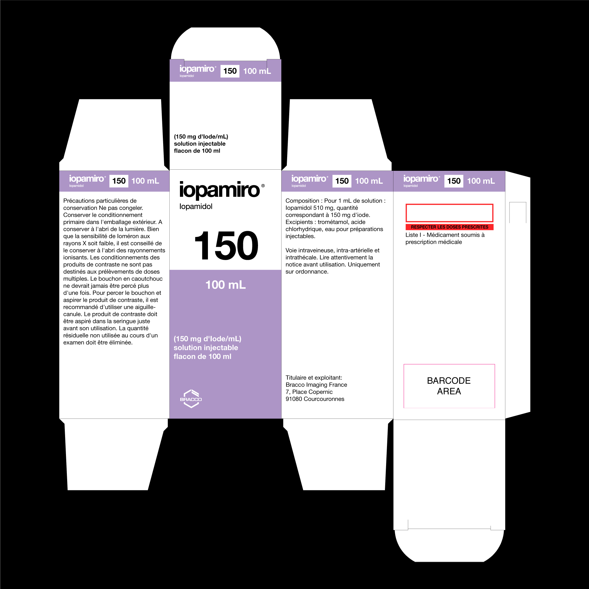
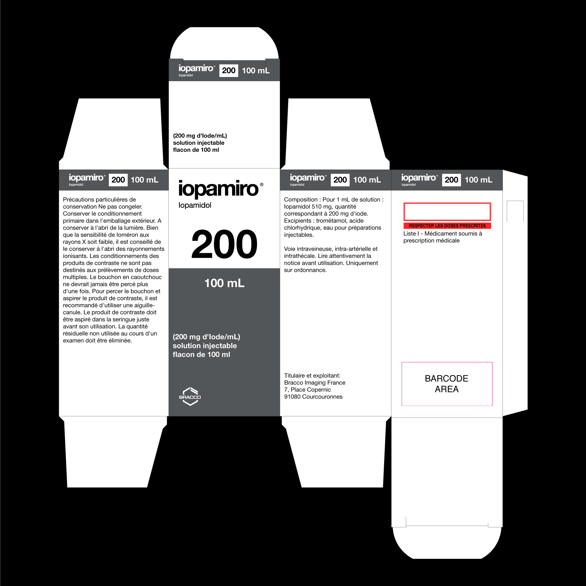

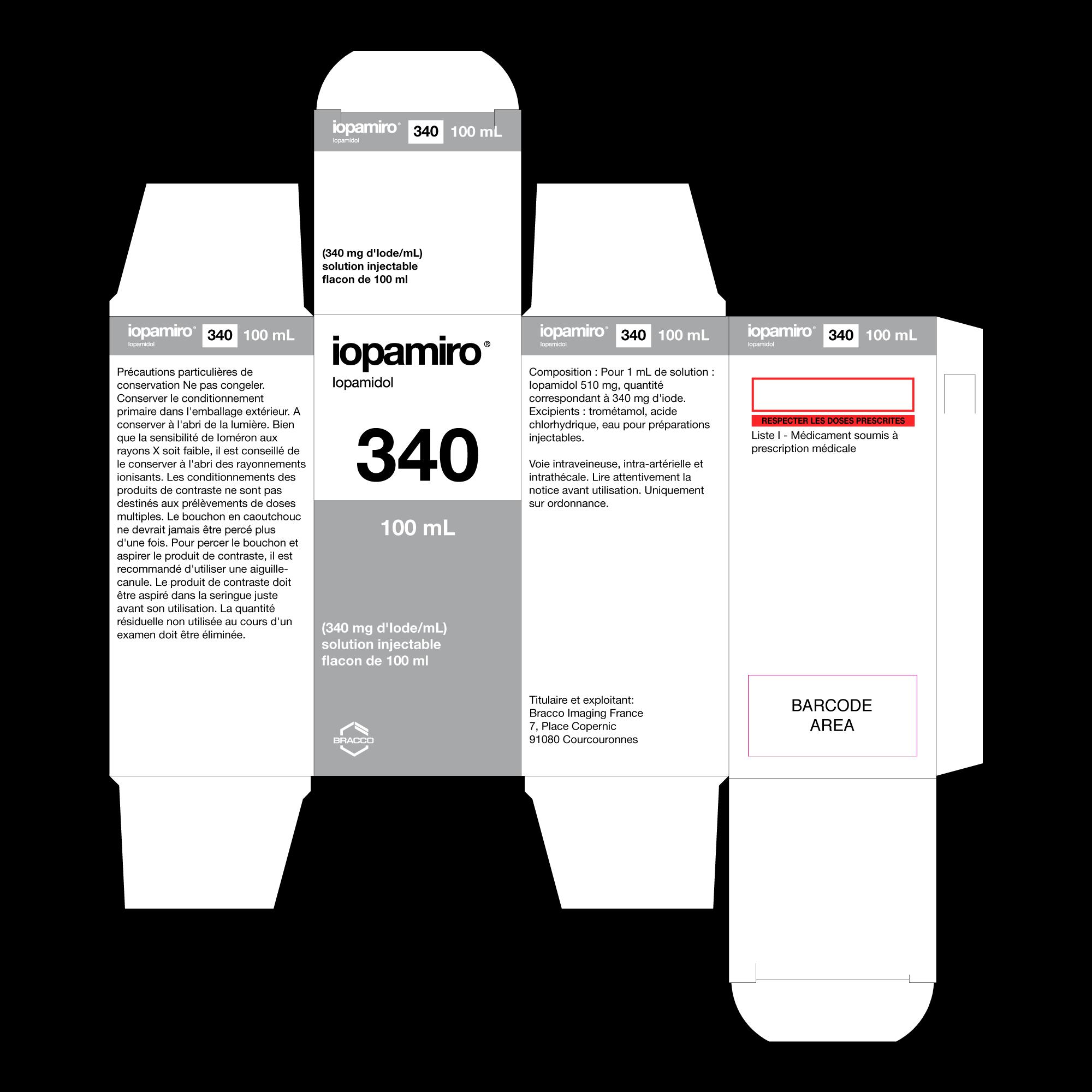
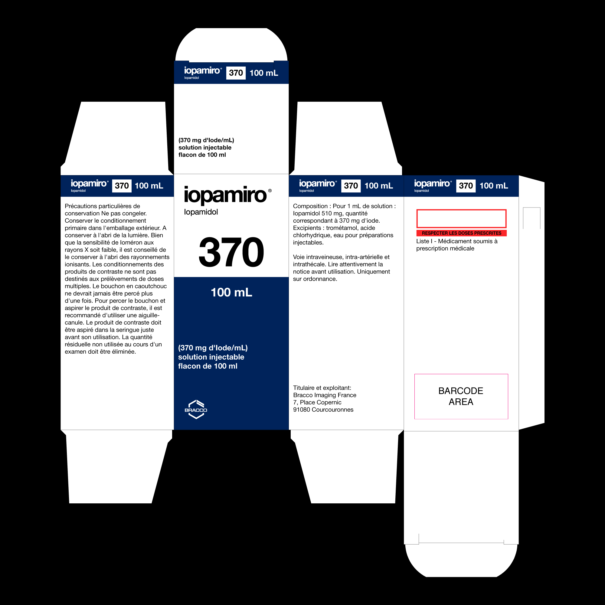
We had to tackle the initially complex task of researching and collecting all the different materials in use globally, working with an enormously varied quantity of formats. Only through an in-depth preliminary study did we arrive at the creation of the new packaging and succeed in our task of standardising the product lines across all countries.