La Bruciata
Contemporary heraldry on the Oak Trail
Azienda Agricola La Bruciata, a farm based in Carpiano, asked us to create an image that would coordinate and enhance its many activities. The farmstead is located within the Parco Agricolo Sud Milano and – in addition to its normal agricultural activities – offers a horse boarding service and the retail sale of seasonal products. The farm is also a craft brewery with its own hops.
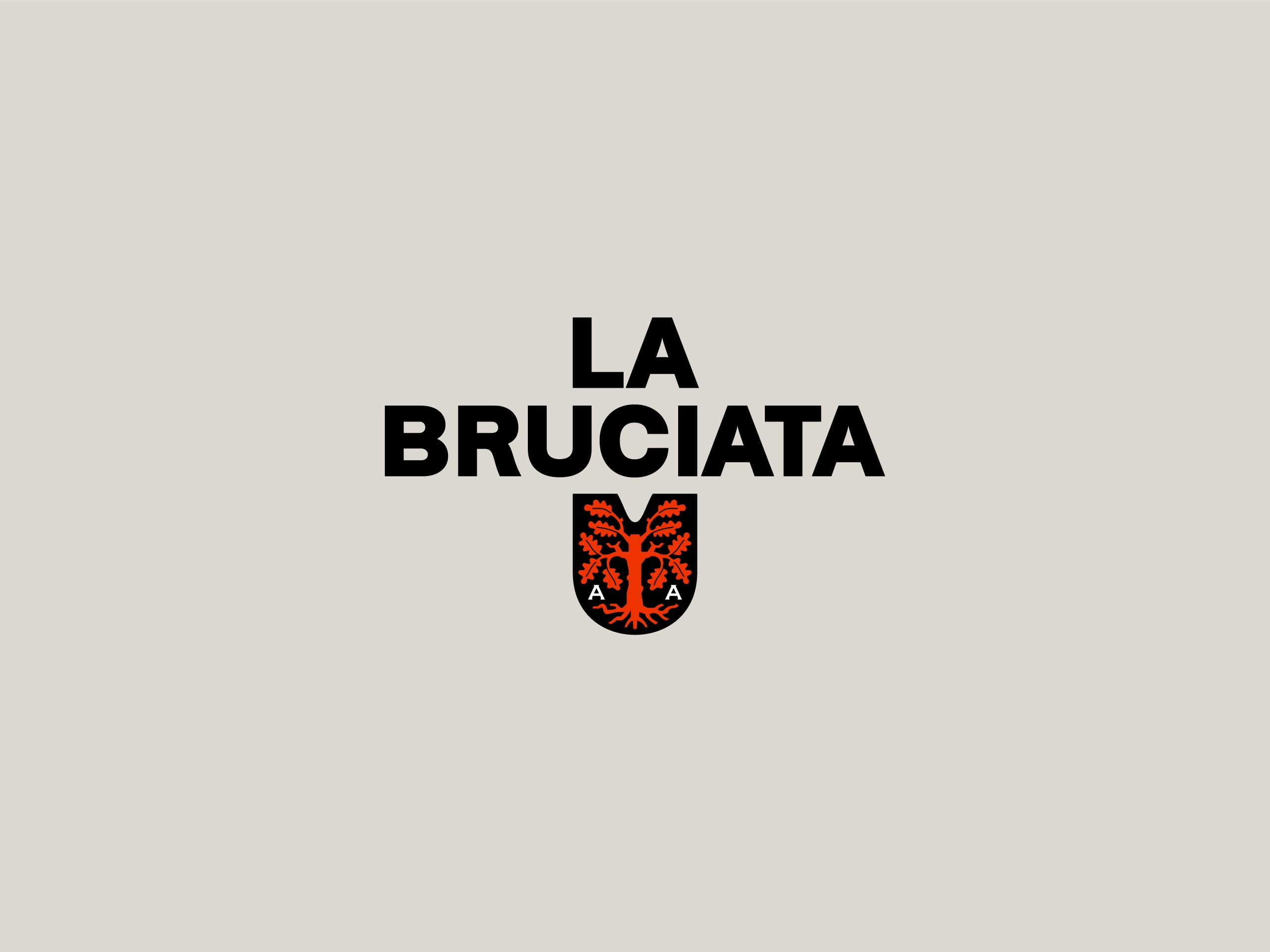
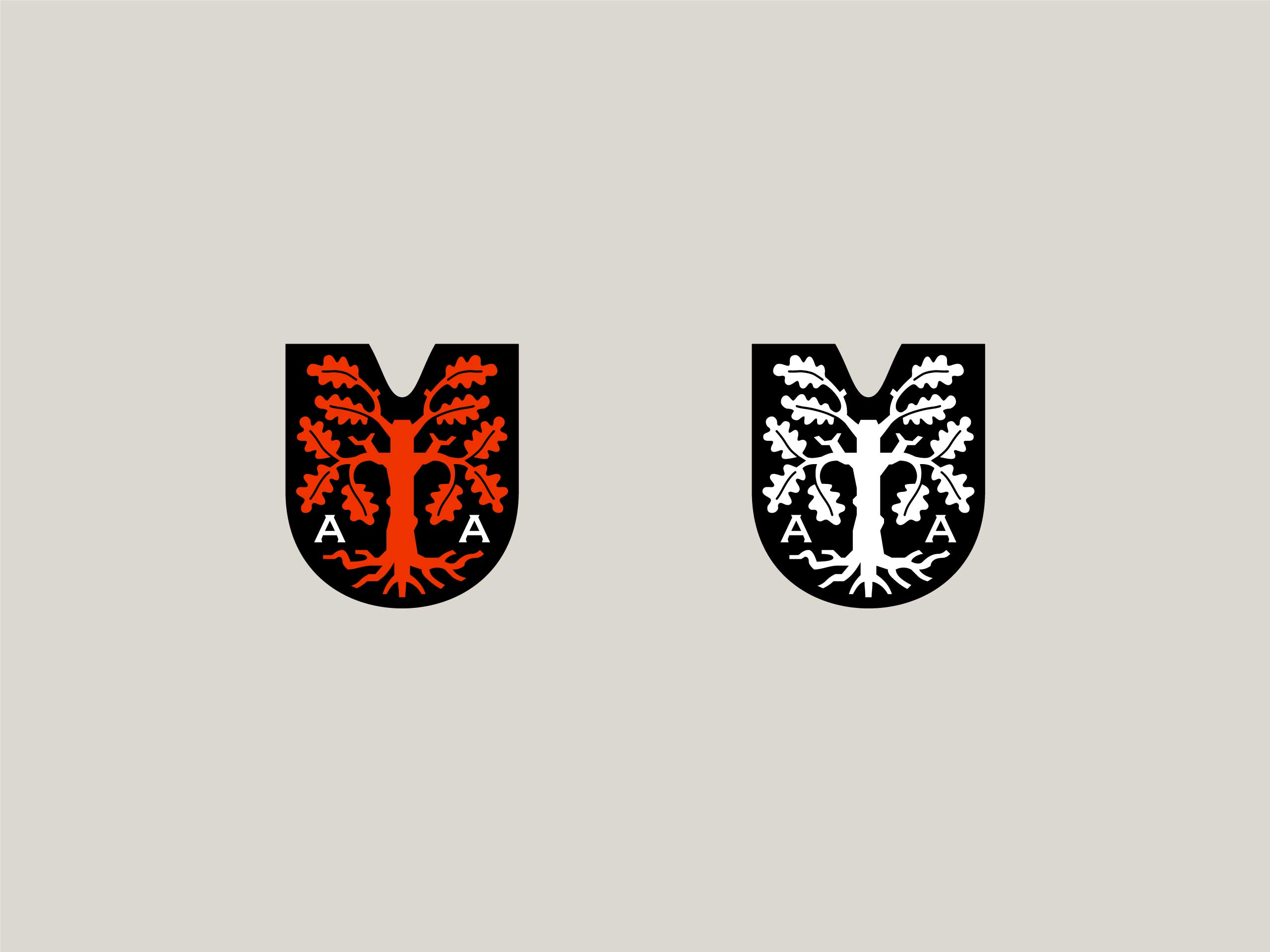
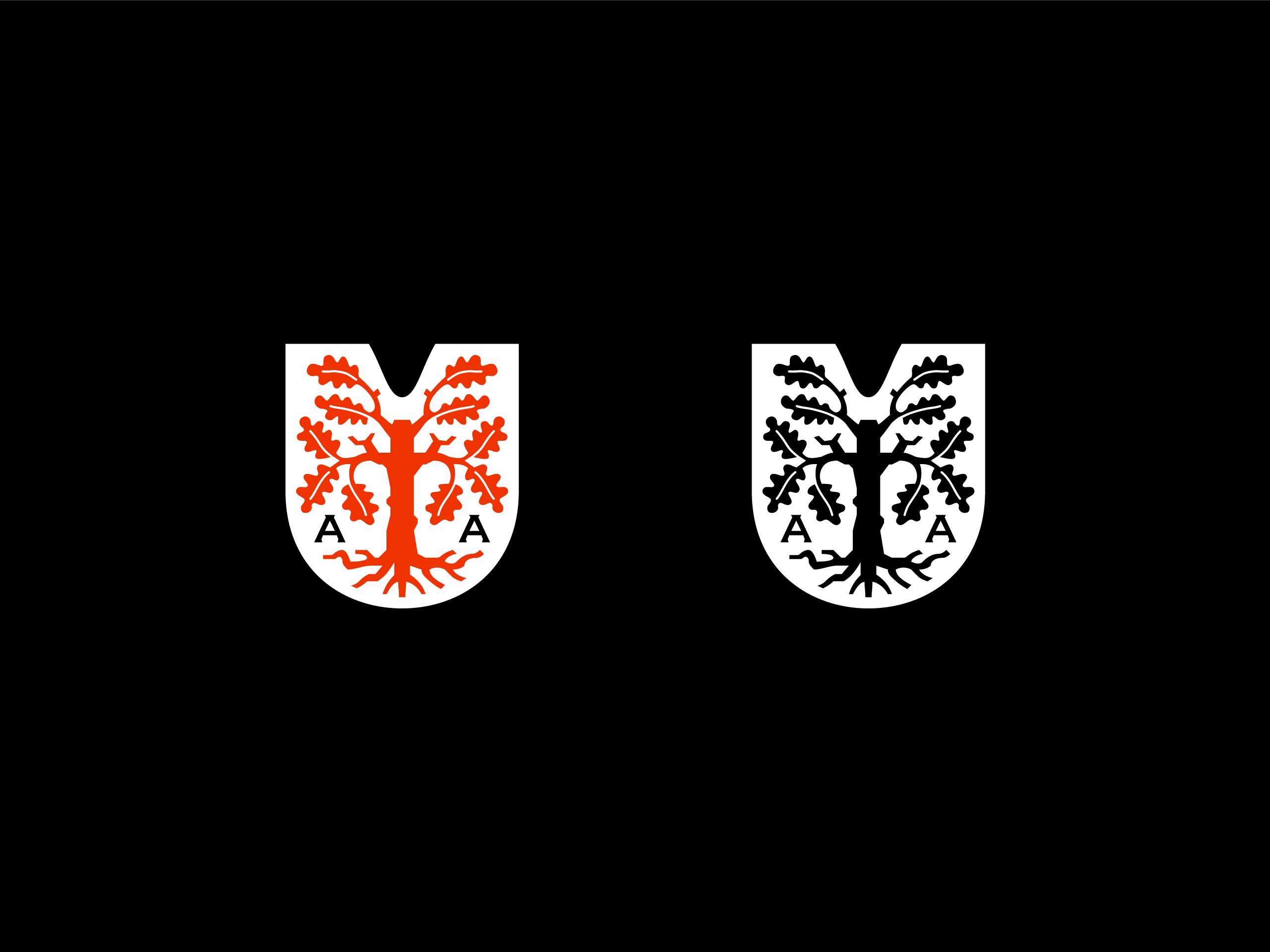
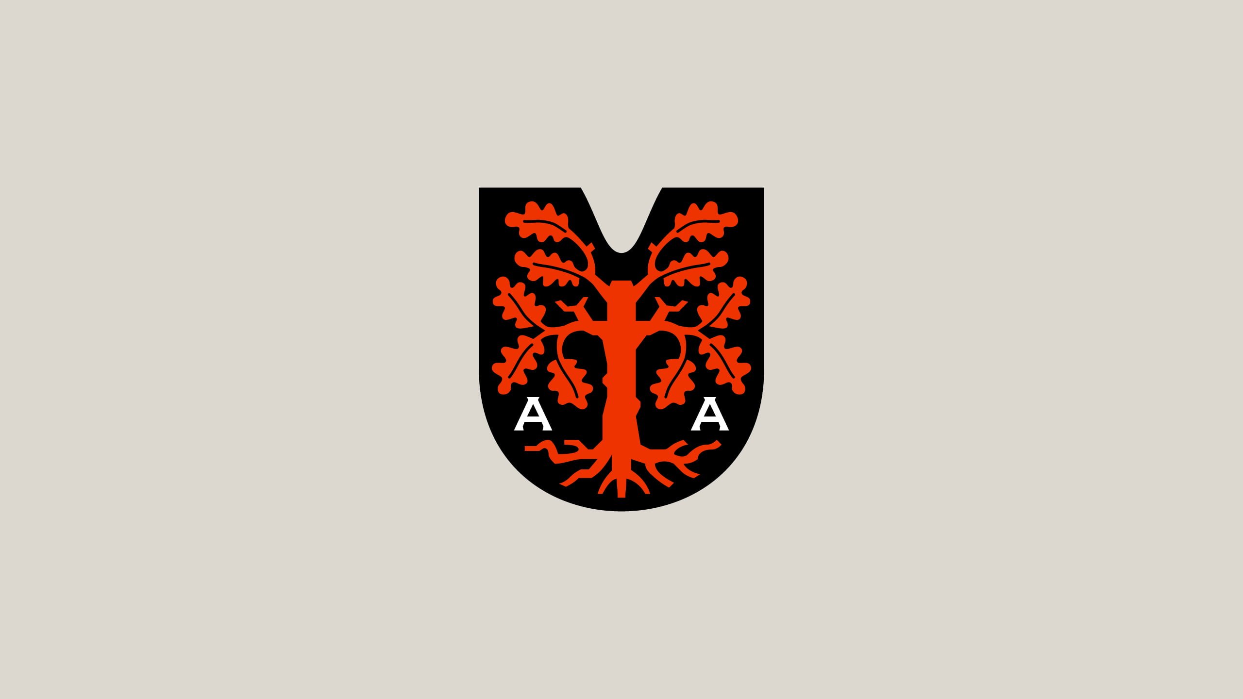
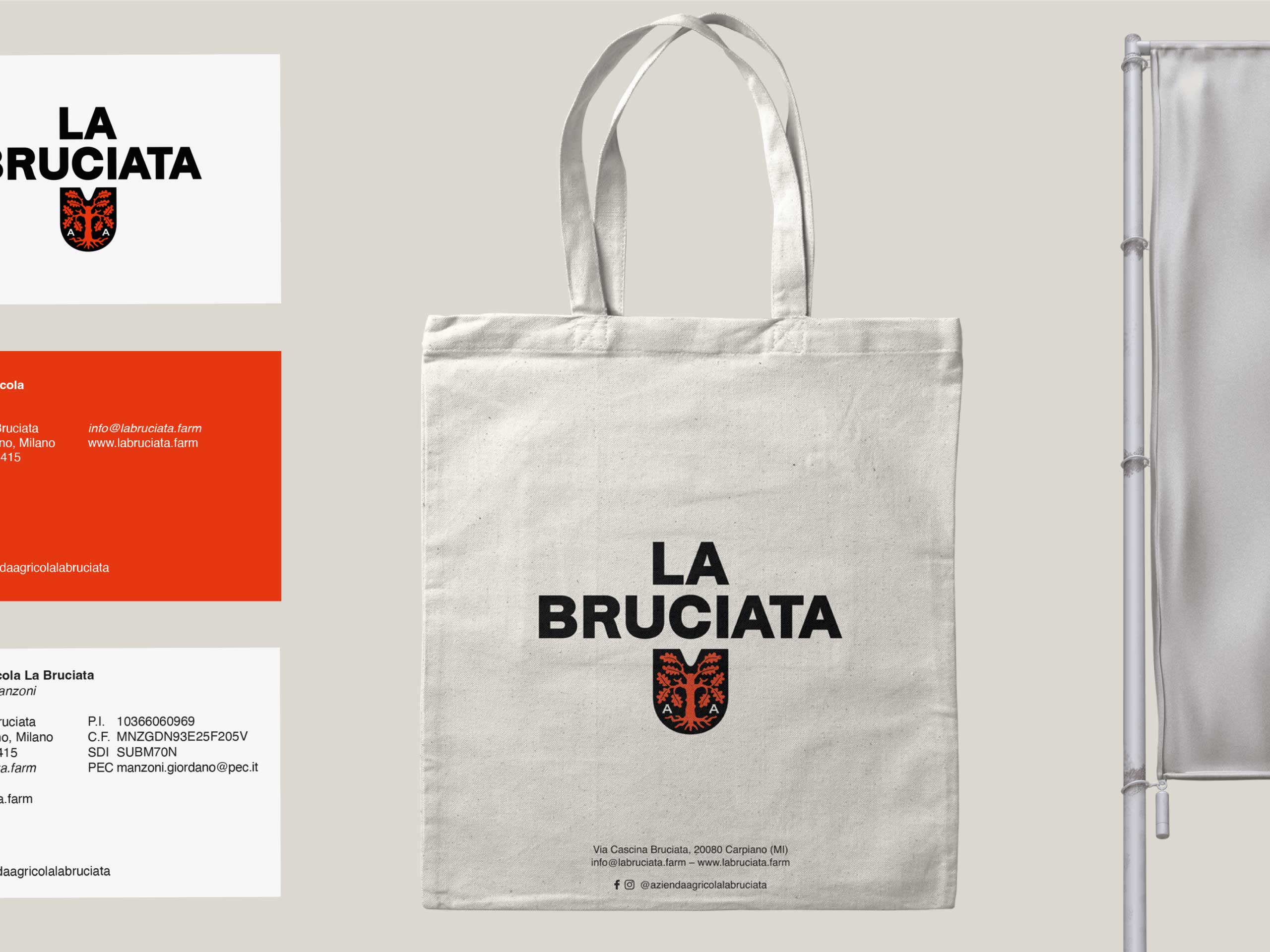
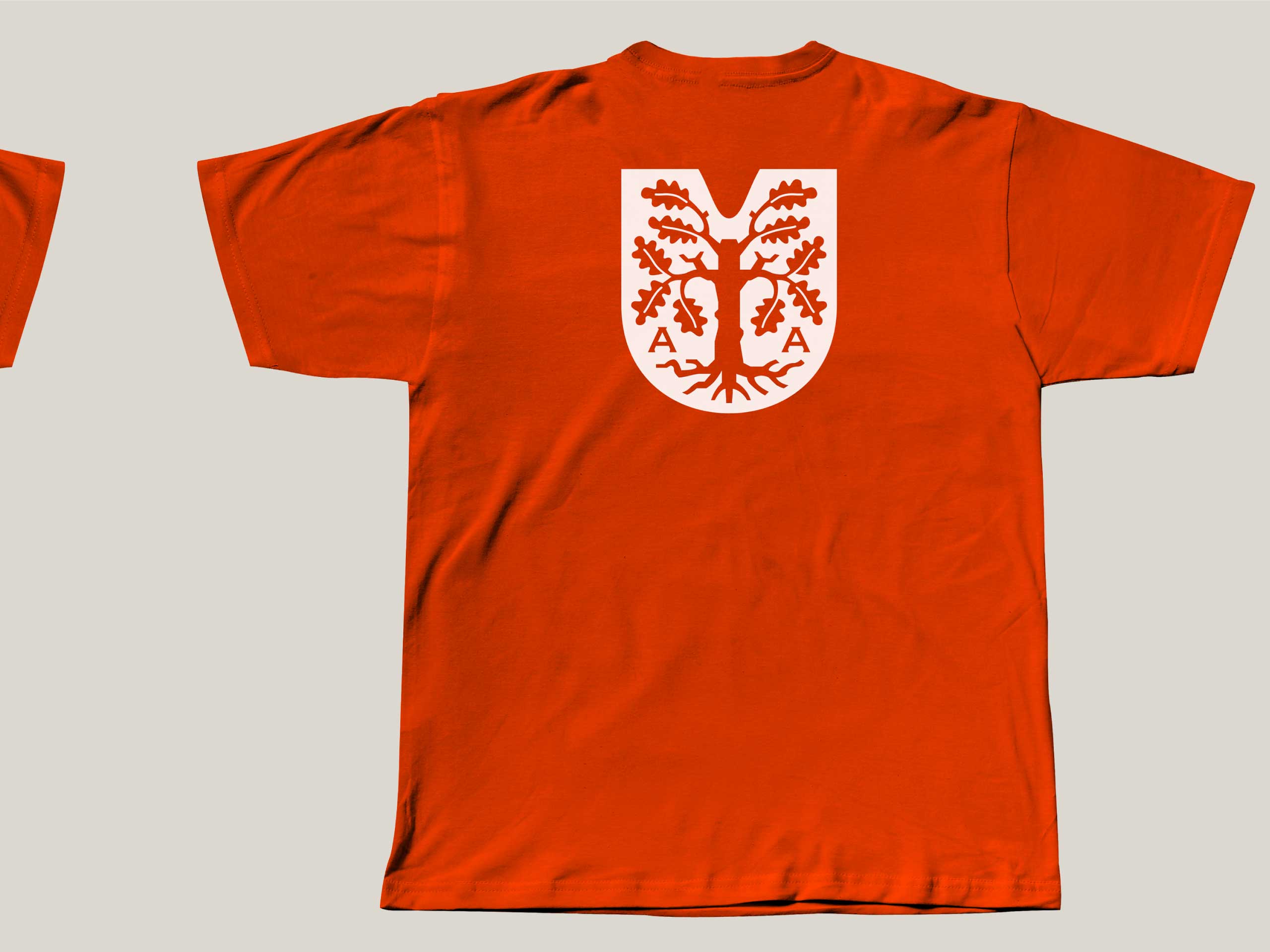
For the development of the brand identity, we started from the territory. Indeed, the farmstead stands on the famous oak path, plants that represent values such as strength, nobility, stability, knowledge and wisdom. They also have great adaptability, which makes them perfect as a symbol of a company that wants to fit into a particularly crowded competitive landscape. The first step was the development of a logo, consisting of a logotype and a symbol. For the symbol, given the historicity of the company, we chose the language of heraldry revisited in a contemporary key, both in style and application, thanks to the typography that accompanies the symbol with a decisive, modern, rational style. Finally, we inserted a reference to the industriousness and hard work of agricultural activities, modifying the shape of the classic coat of arms to recall a spade.


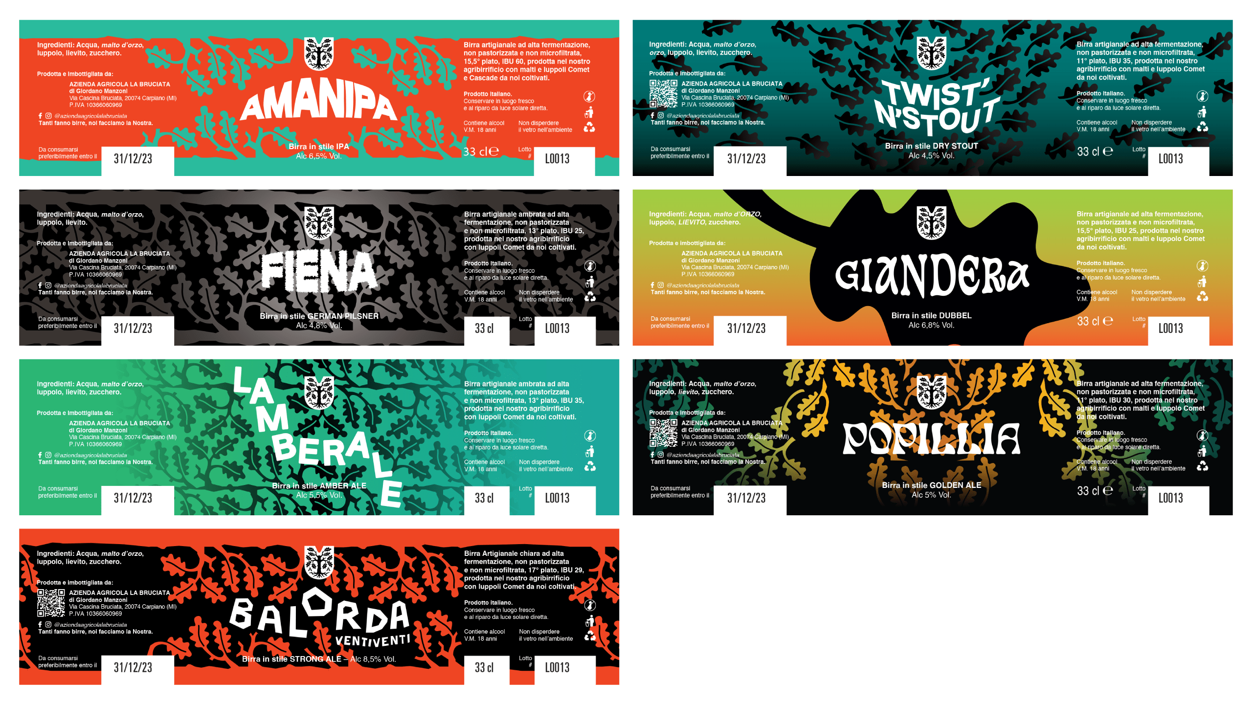
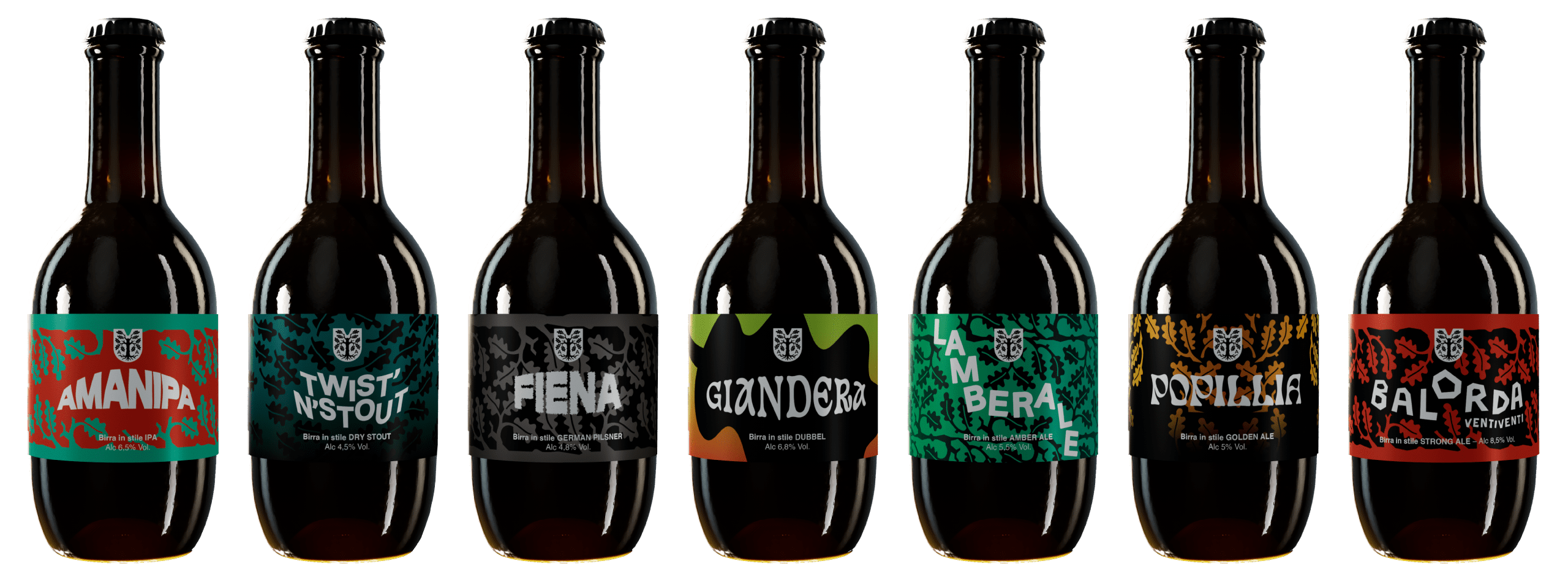
The other main activity we dealt with was the creation of a packaging line for the craft beers produced by the company. Here too, we decided to characterise the labels with the identity element chosen for the company, the oak leaf, which was used to create patterns that form the background to the labels, also differentiating them through the use of colour. To complete the label we find the farm’s coat of arms and the name of the beer, designed with different typographies, working freely, without stylistic constraints but with the sole objective of emphasising the characteristics of the product.