Monile
Packaging design for three types of traditional wine from Irpinia
We designed the packaging for MONILE, a project by oenologist Ferdinando Limone that produces special limited-edition bottles of wine made according to Irpinia’s winemaking traditions. We did so by differentiating MONILE from other local brands: a conceptual distinction that shows respect for the product and reflects the founder’s ambitions.
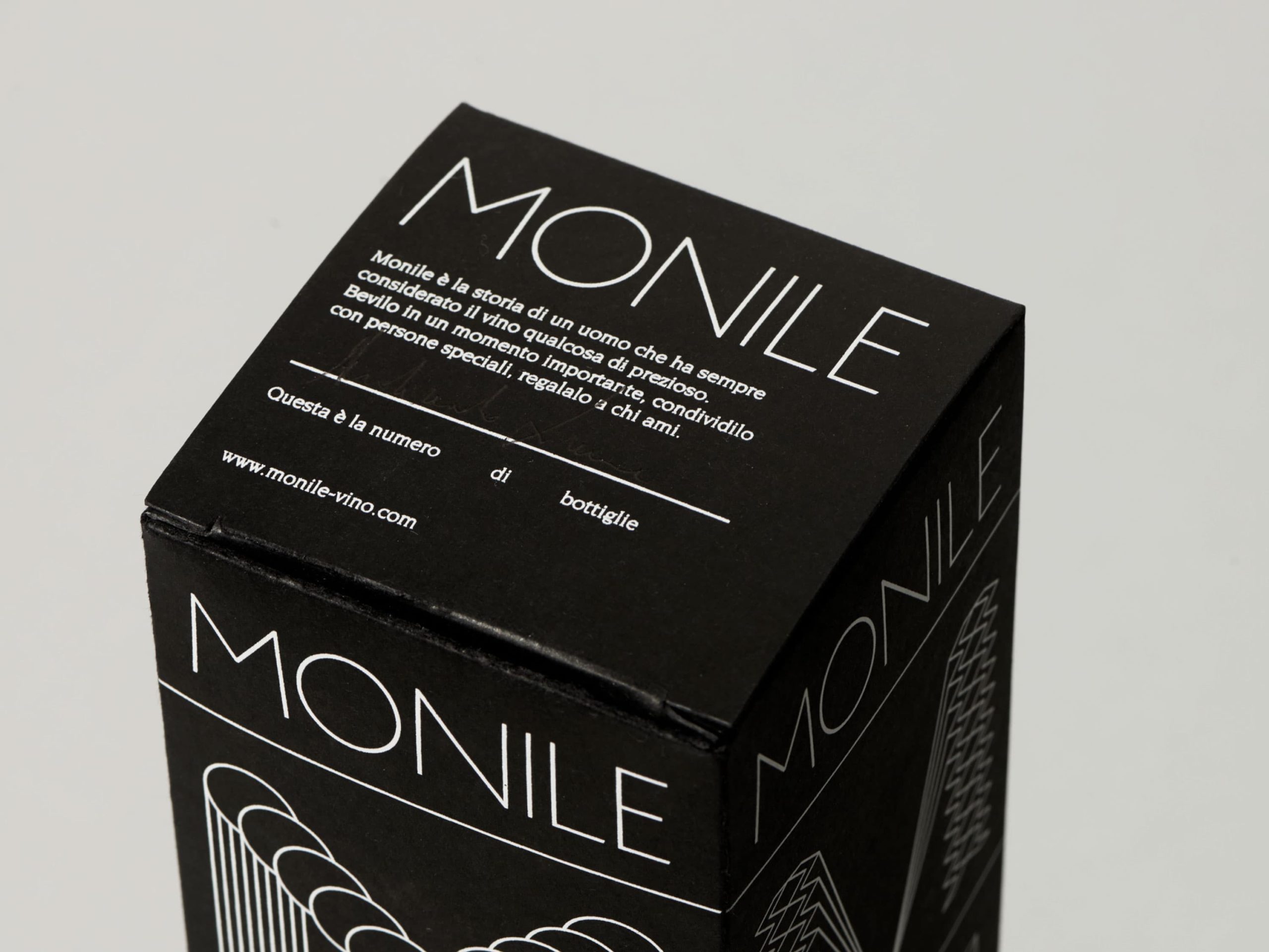
On this project, everything started from the naming process, which not only references the winemaker’s name but reinforces the quality of the wine: the Italian word MONILE means necklace and is also an anagram of the founder’s surname.
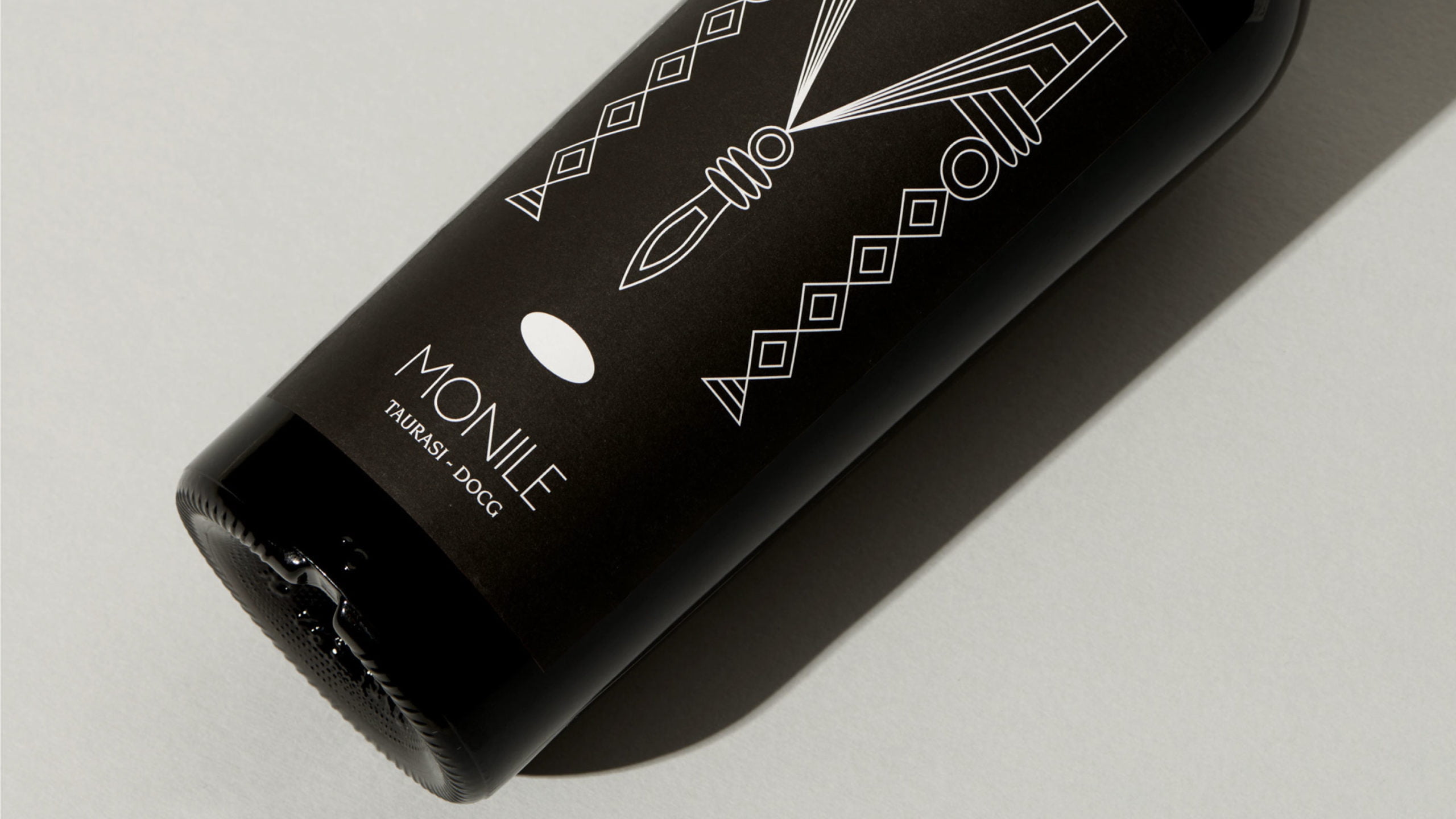
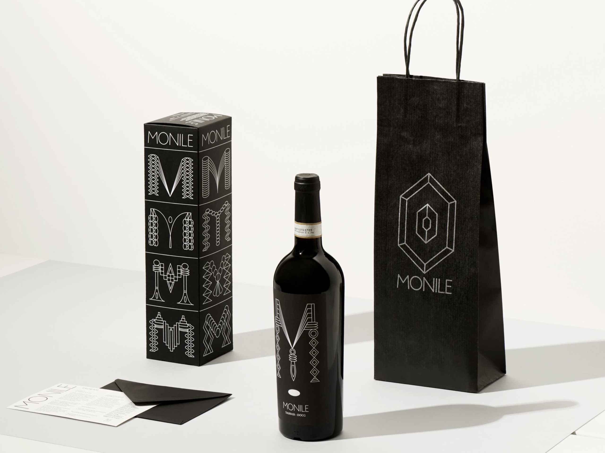
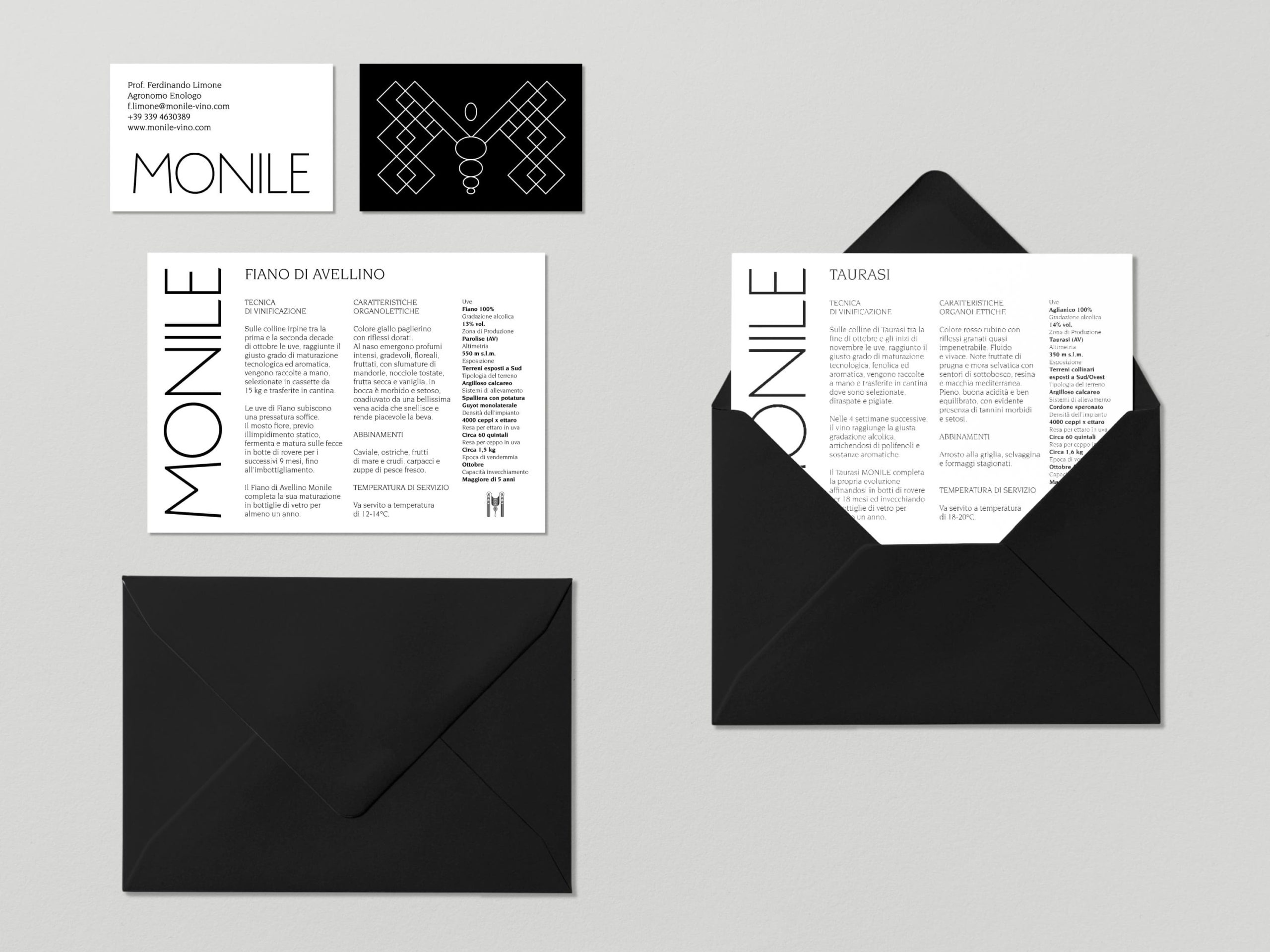
We created a packaging system for three PDO wines from Irpinia – Taurasi, Fiano and Greco – and constructed an identity based on a legible and linear logotype and the elegant contrast of black and white.
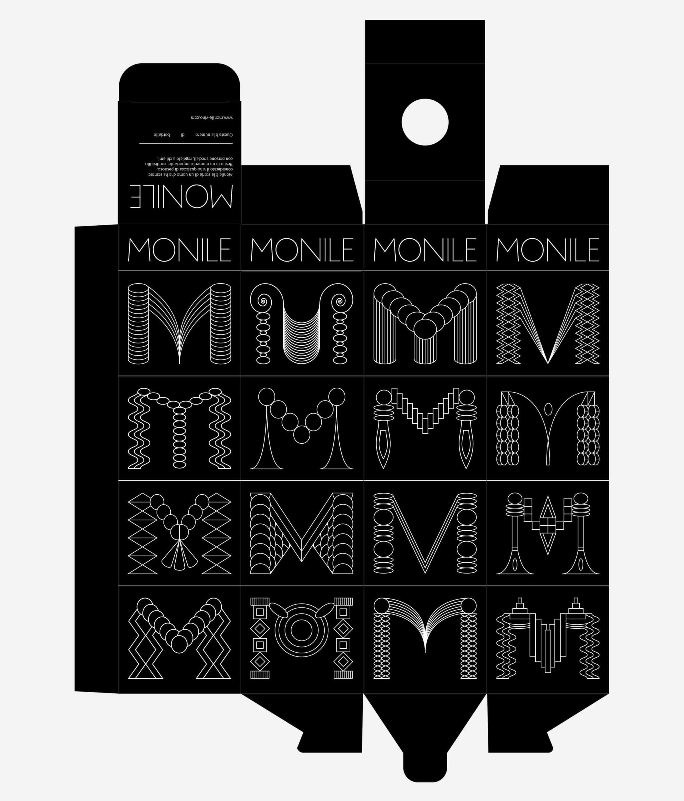
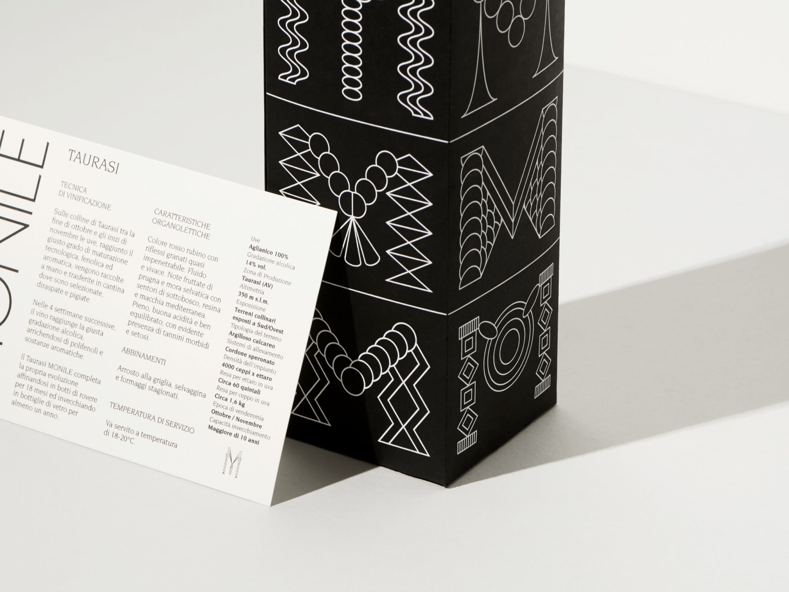
The redesign of the “Ms” was inspired by the different shapes and elements of traditional Etruscan necklaces.
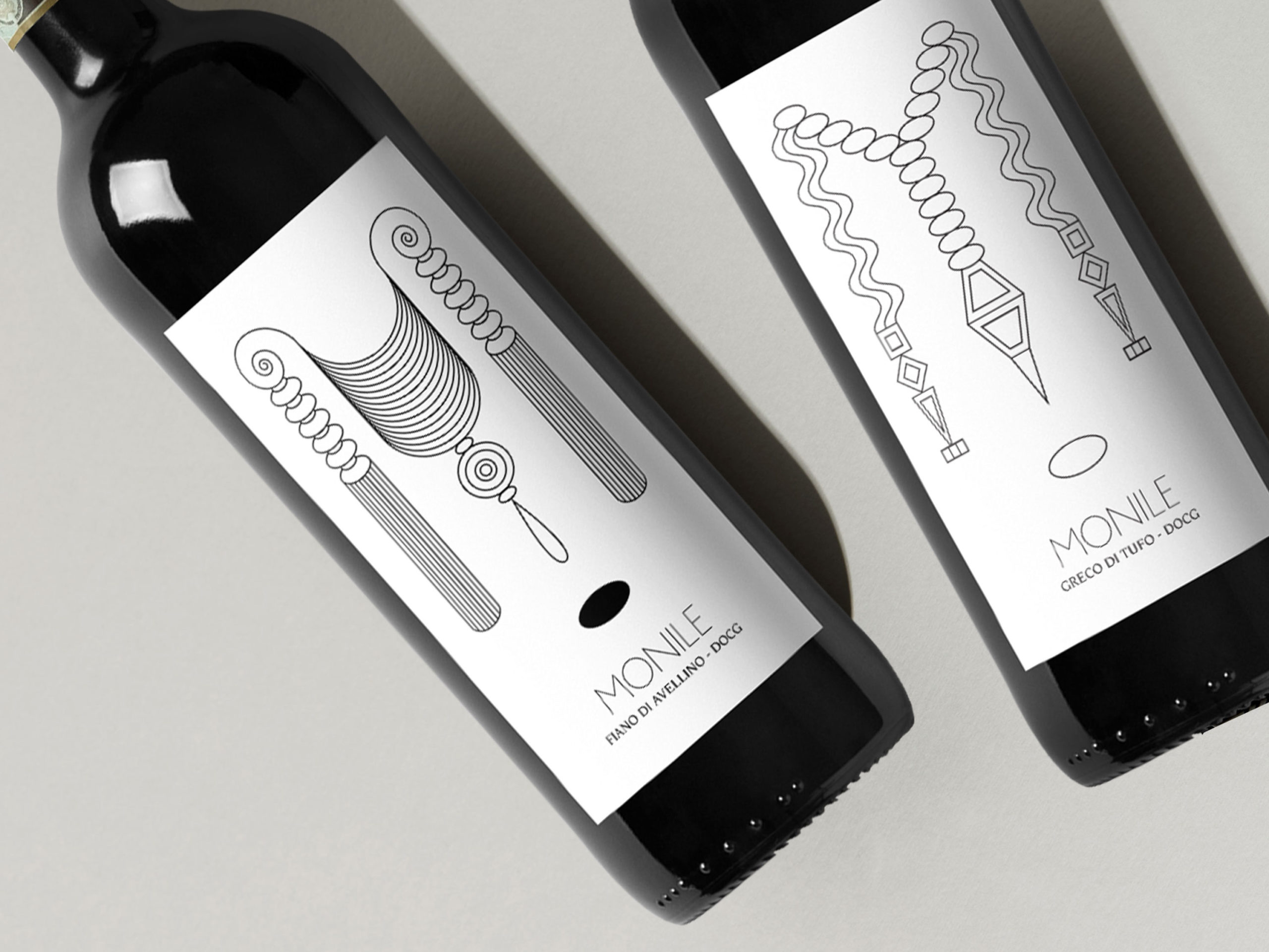

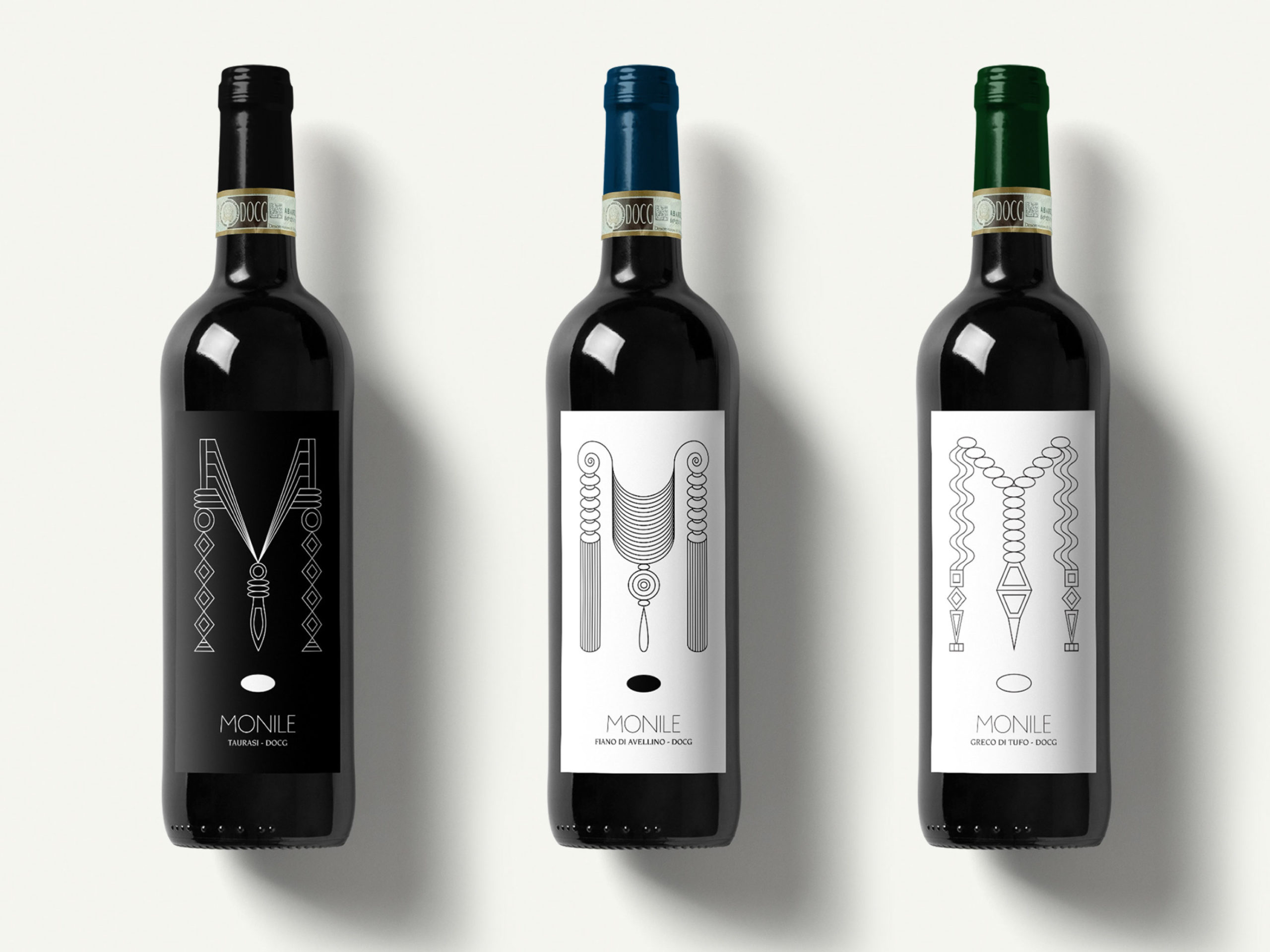
Over 50 different Ms were created with shapes inspired by historic necklaces. These shapes were exaggerated to form complex monograms that contrast with the minimal elements of the brand identity. The shapes of the monograms represent the sensory qualities of the wines.