Marka
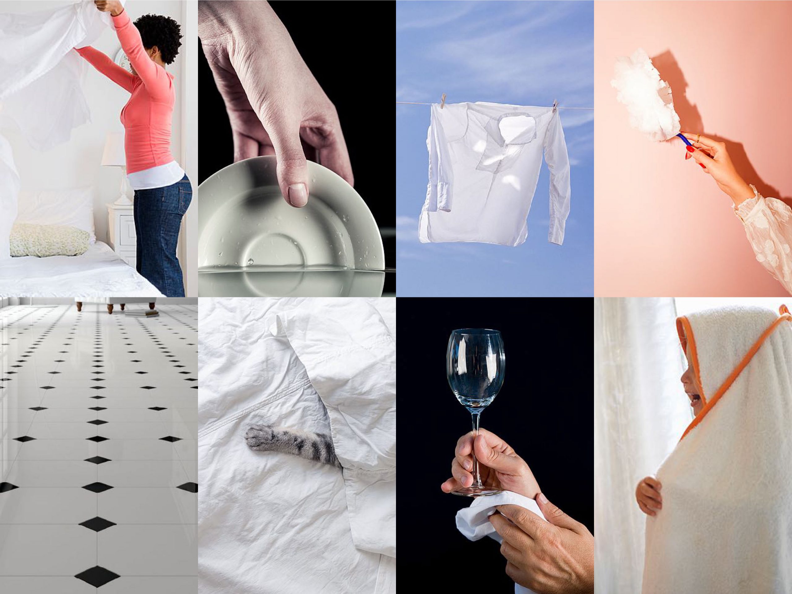
The face of professional cleaning
Together with Conic – the creative agency in charge of repositioning the brand, defining its brand strategy, identifying its core values and the brand architecture – we developed the identity of Marka, leader in the professional cleaning sector with the aim of entering the B2C market.

Starting from this analysis, we developed an image capable of expressing the commitment and strong technical vocation of MK, a group that includes the Marka brand and is a leader in the formulation of highly specific and effective products.
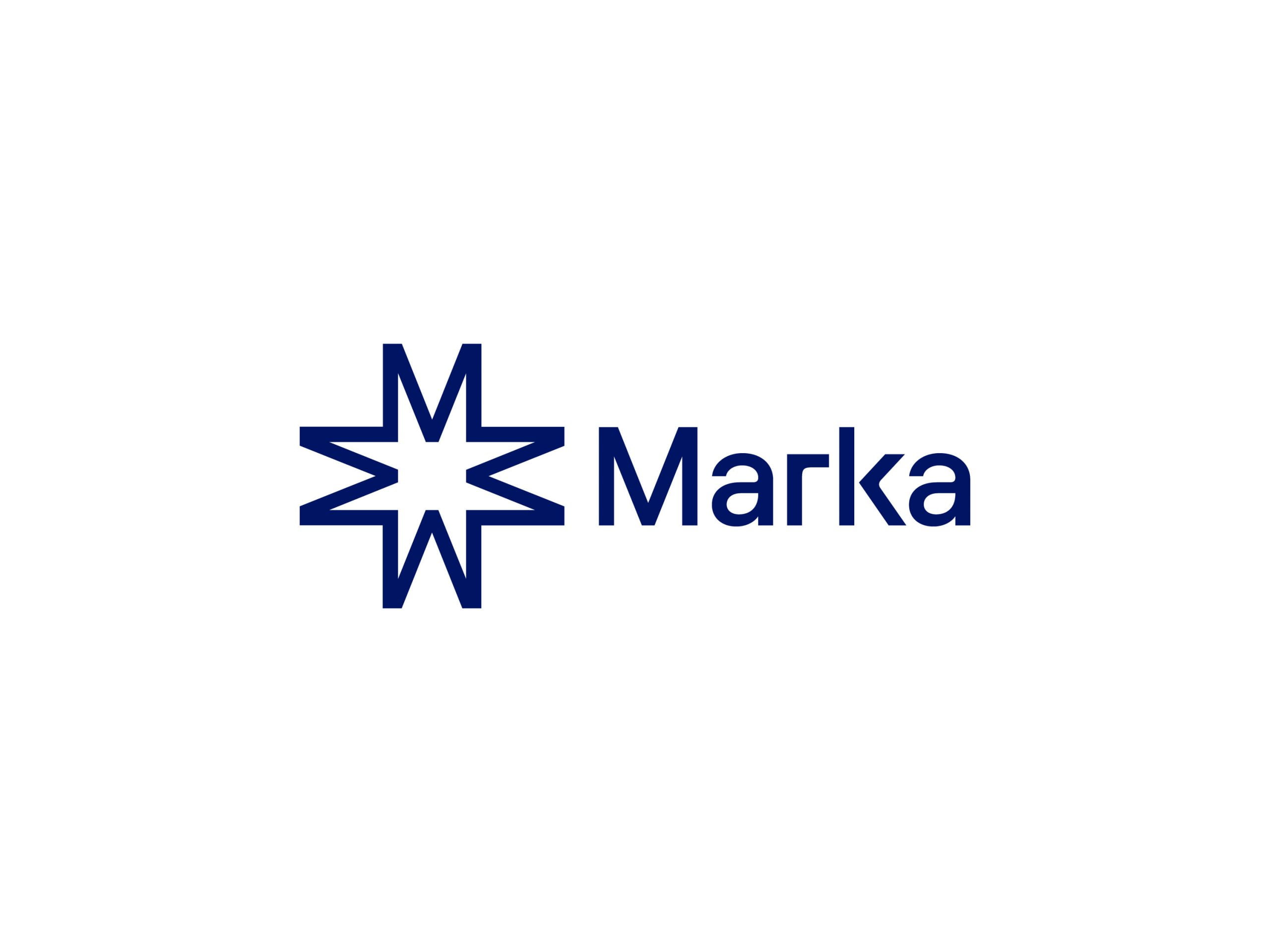
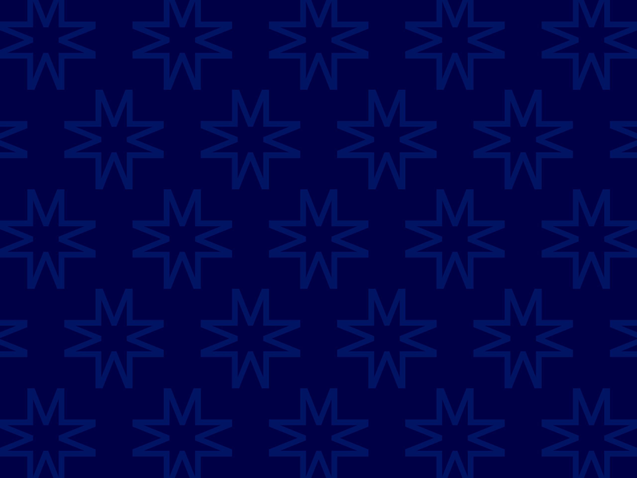
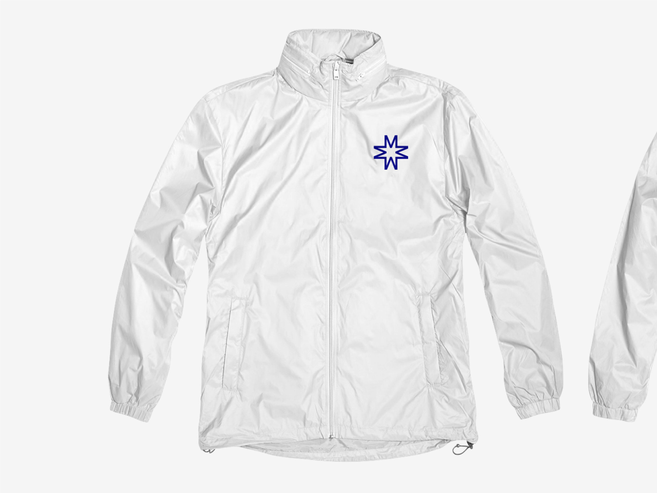
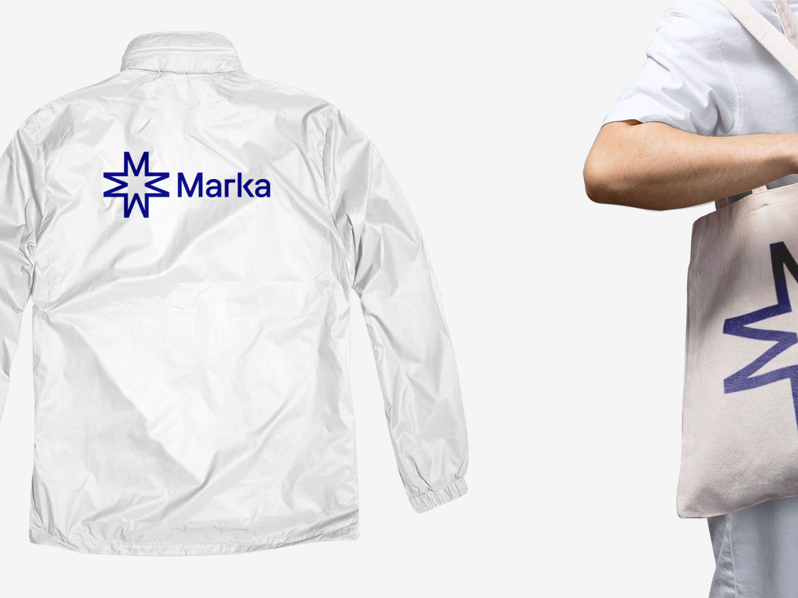
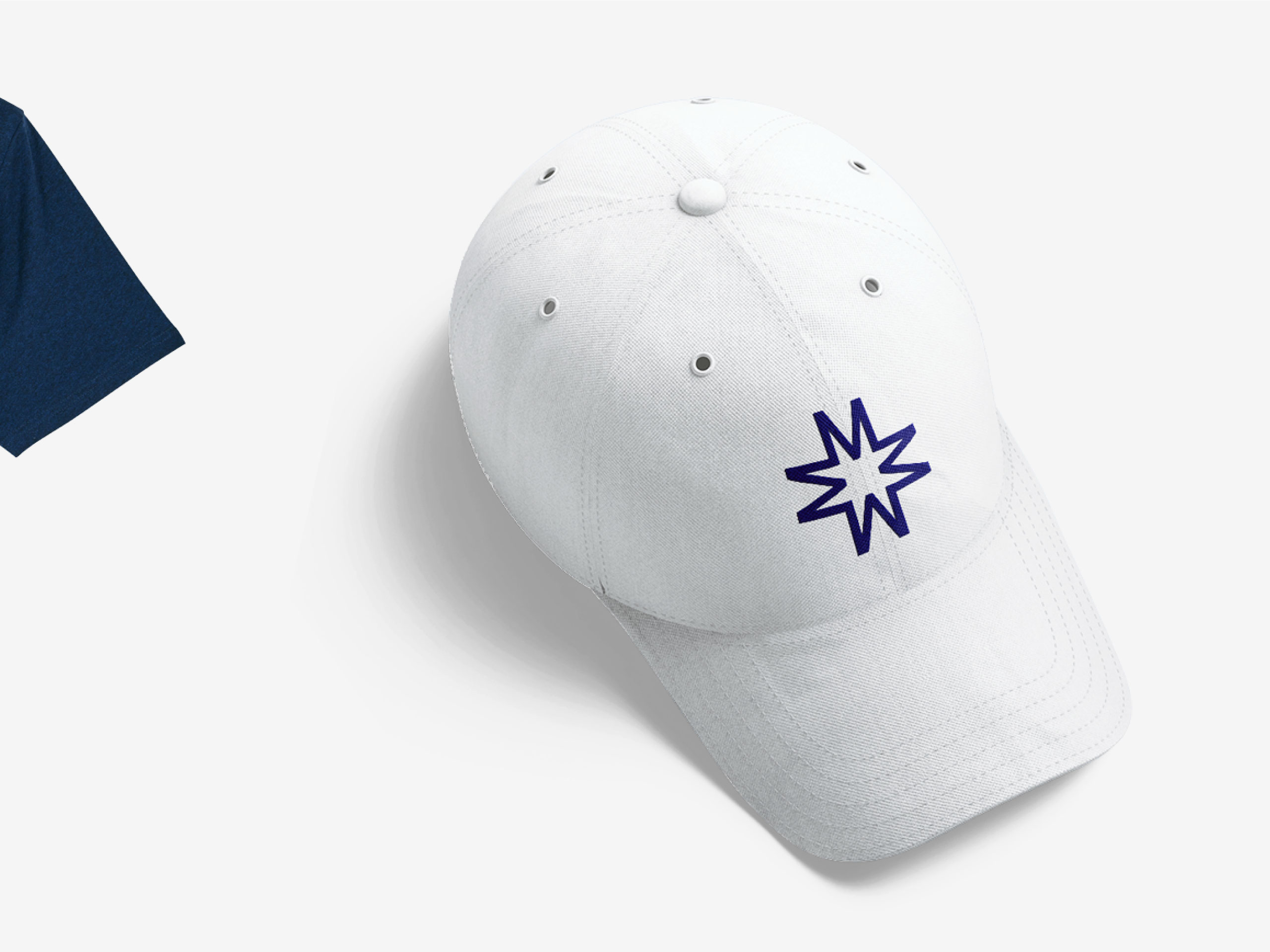
The logo is a semiotic expression of this repositioning. The pictogram recalls simple shapes: a star and a cross, an extreme synthesis of the concepts of protection, deep cleaning, and professionalism and it is created by duplicating and mirroring the M of the logotype.
The typography, constructed with alternating extremely geometric curves, sharp lines and edges, speaks of the rigor and care that Marka adopts in its business processes.
As a direct consequence, we chose Roobert by Displaay Type Foundry as corporate typeface thanks to its geometric and rational identity.
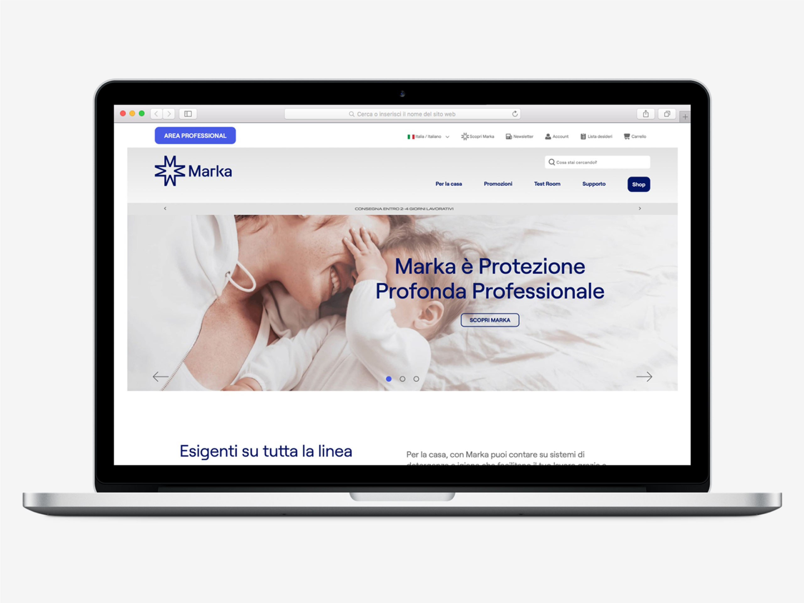
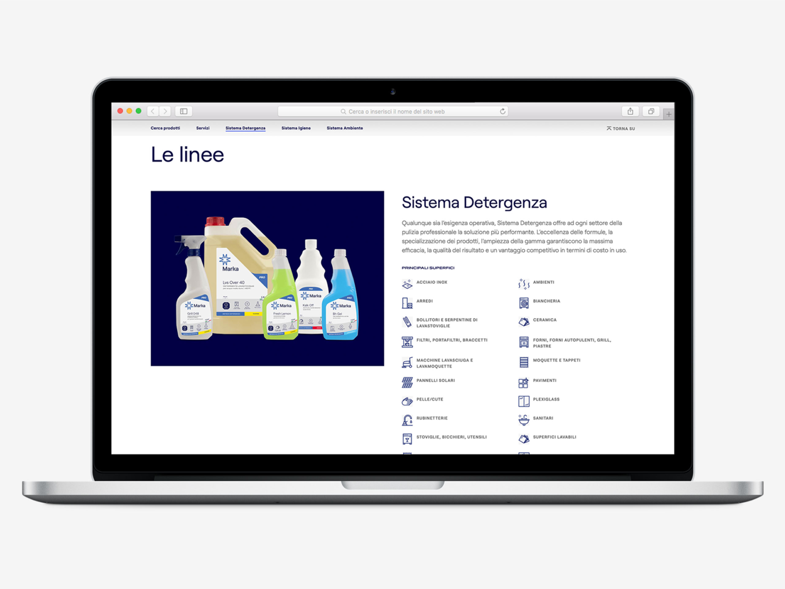
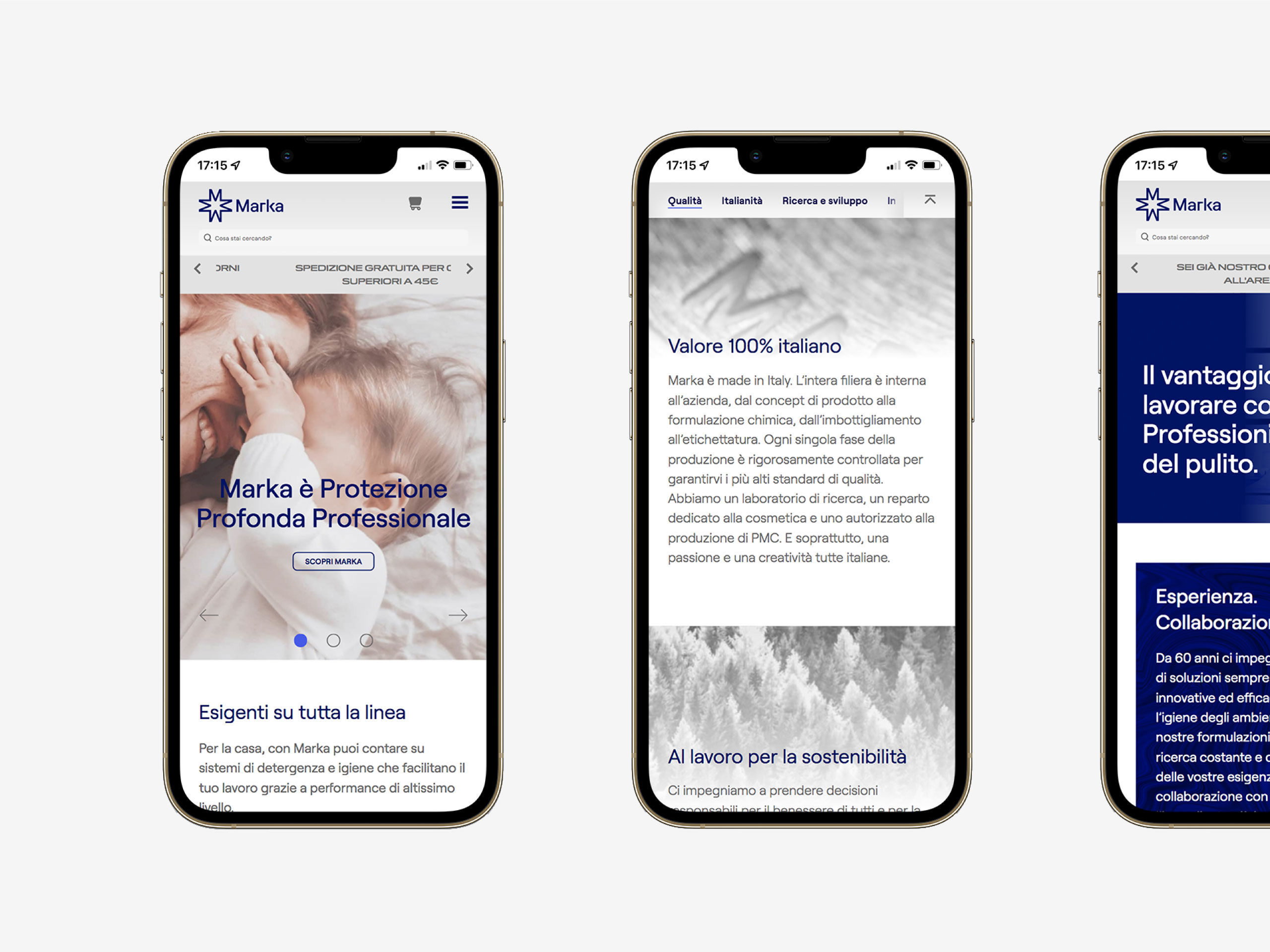
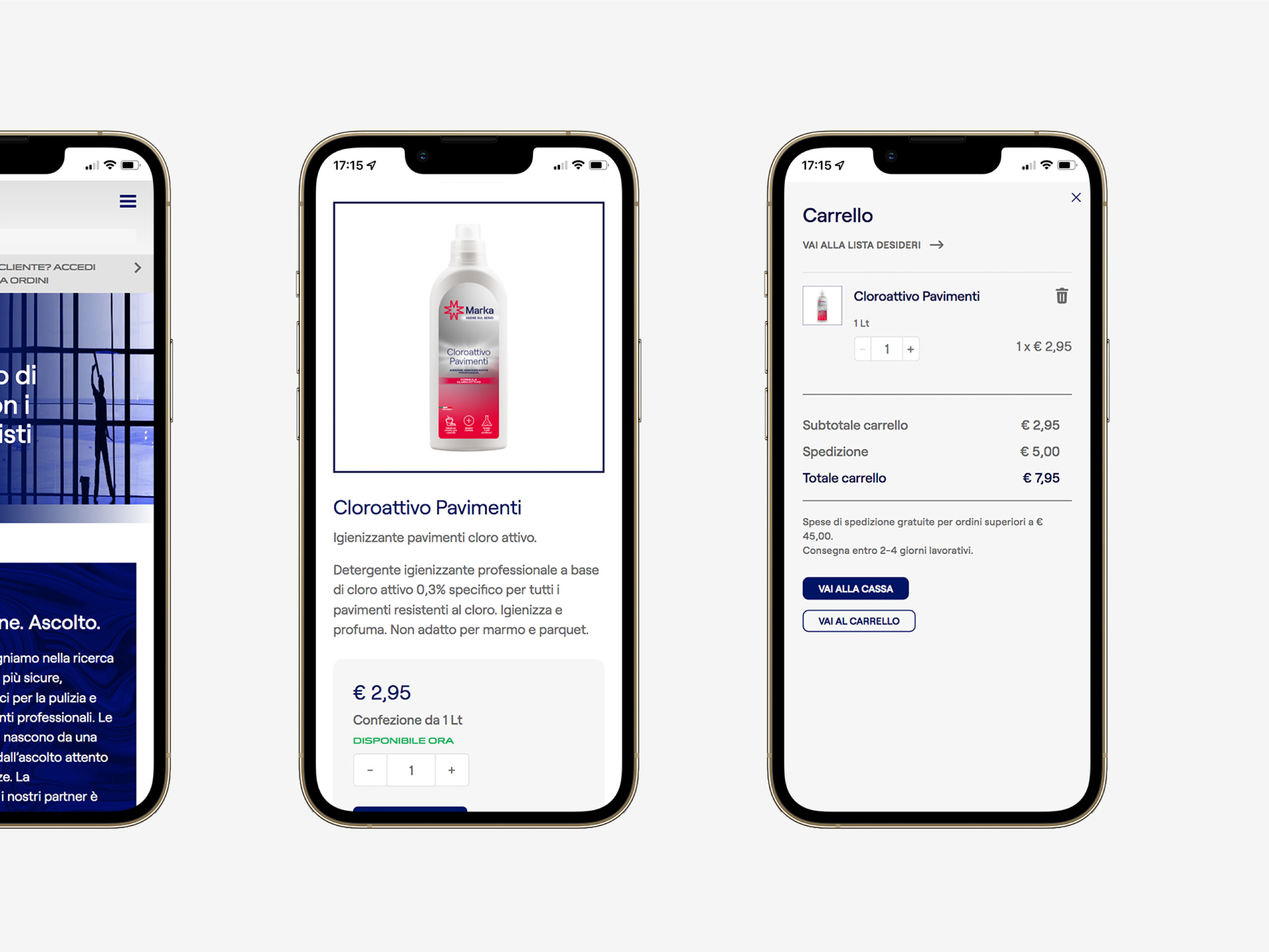
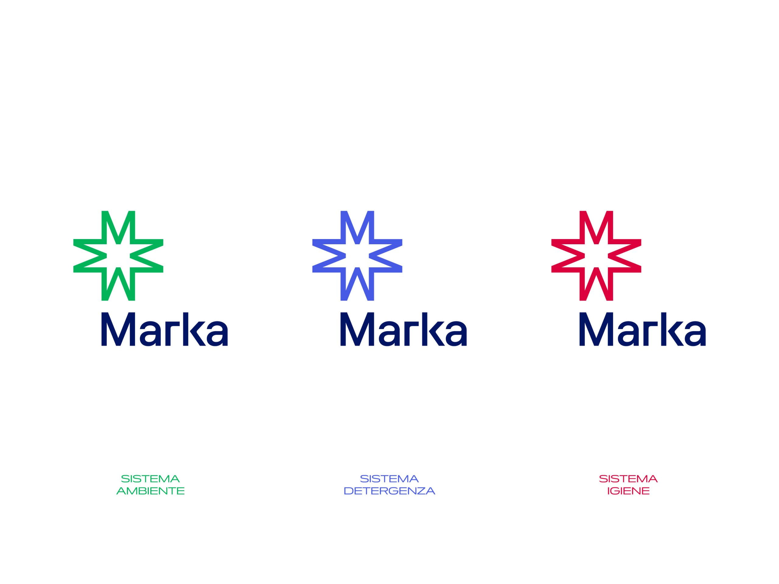
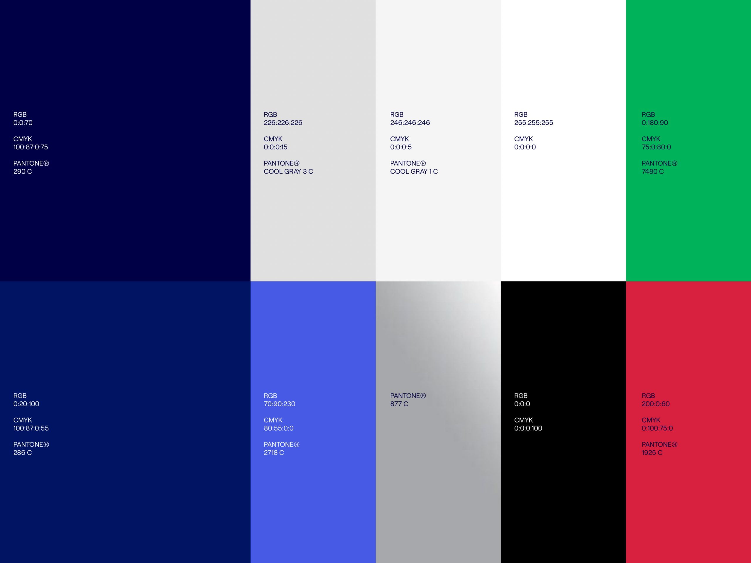
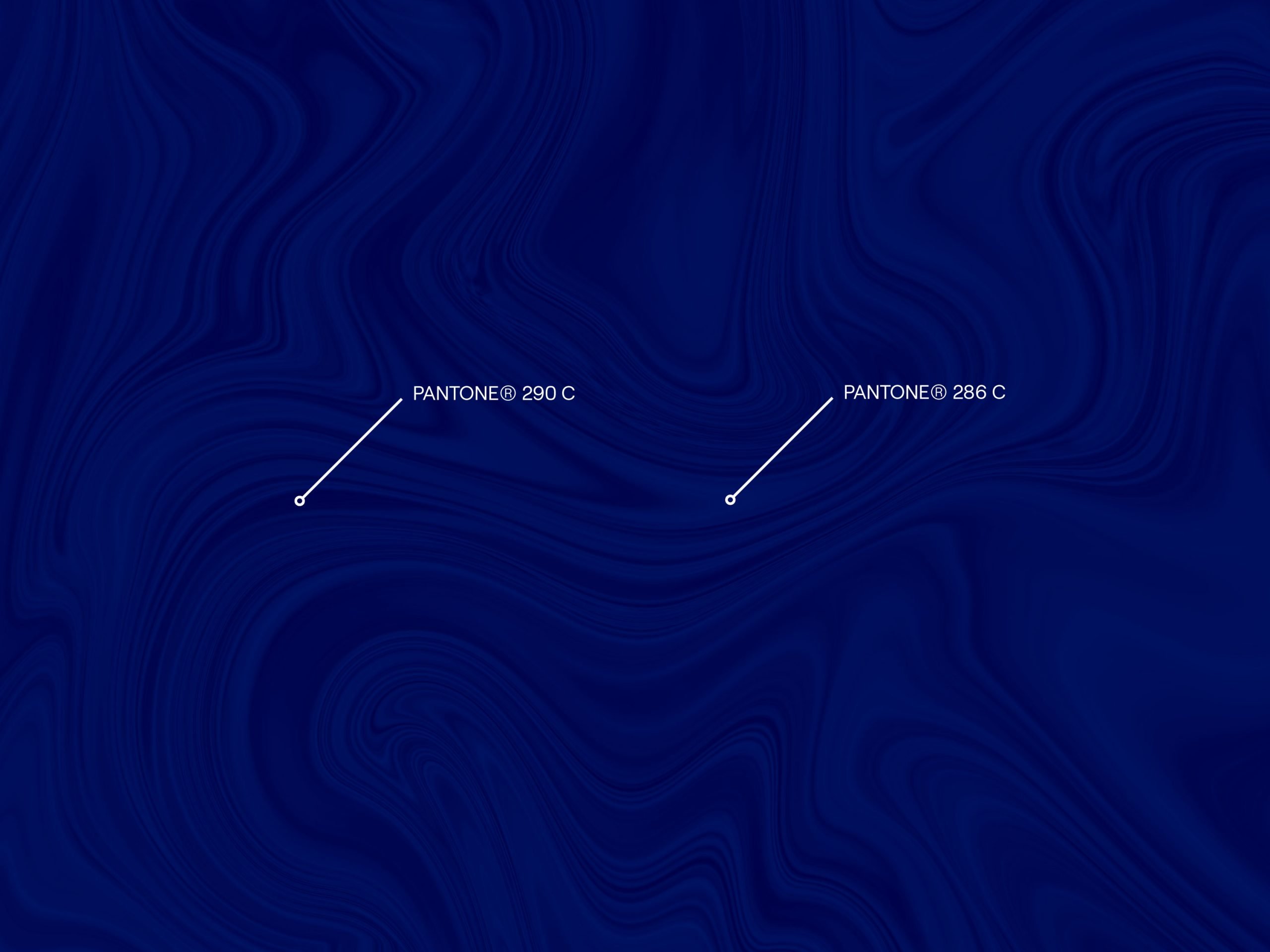
The colors are a reference to the foundational values of the brand. The institutional blue is serious, authoritative, deep. It is accompanied by milder tones such as gray and white and contrasting tones: a more electric blue and a metallic silver, to convey the brand’s strong vocation for innovation and research. The alternation of colors tells of the constant dialogue between these values within Marka. Colors different from the institutional palette define the lines for disinfection and low environmental impact products.