MTT Roma
A classic font reinvented for modern-day Rome
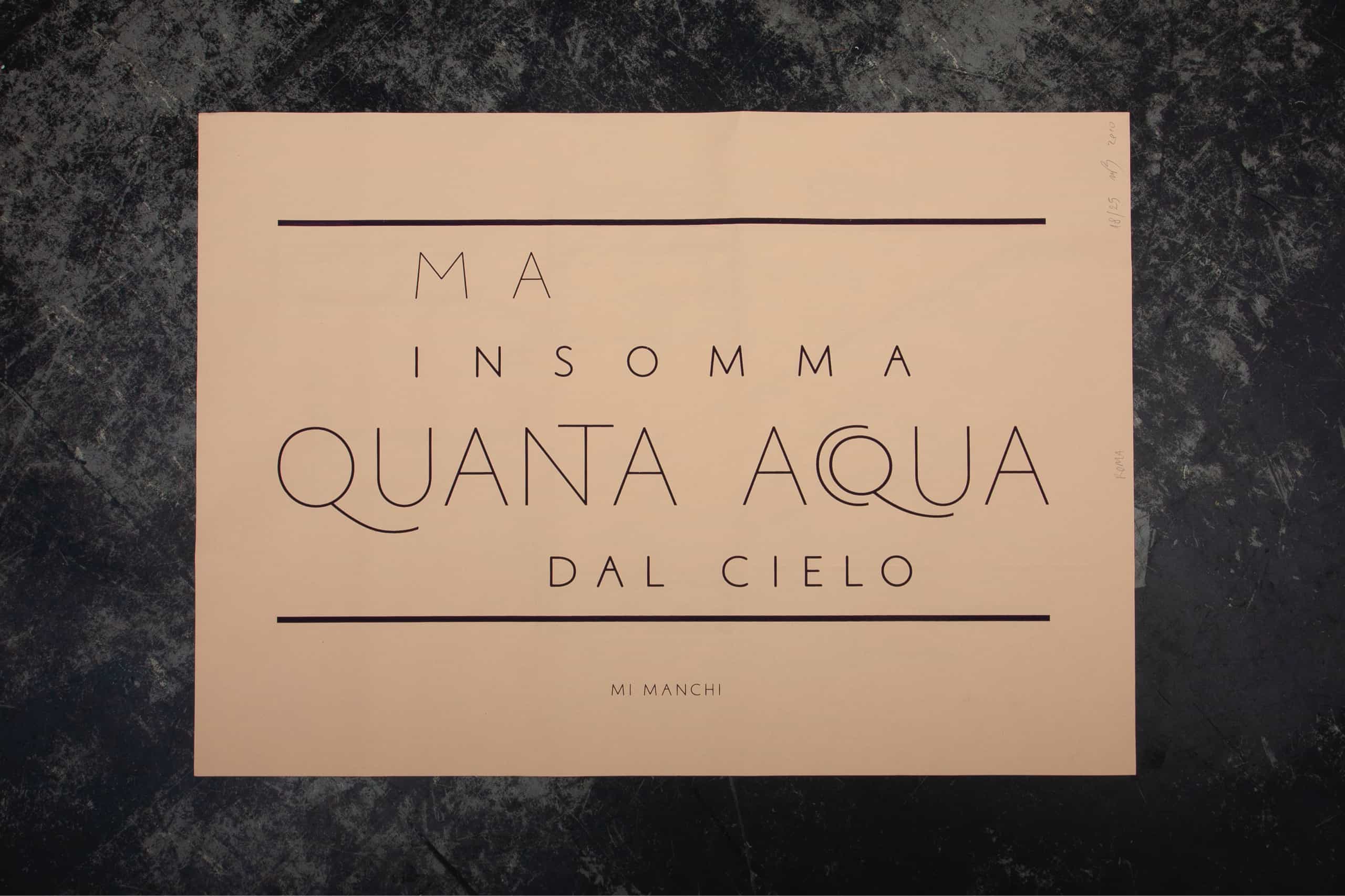
Roma is our homage to the Italian school of typography.
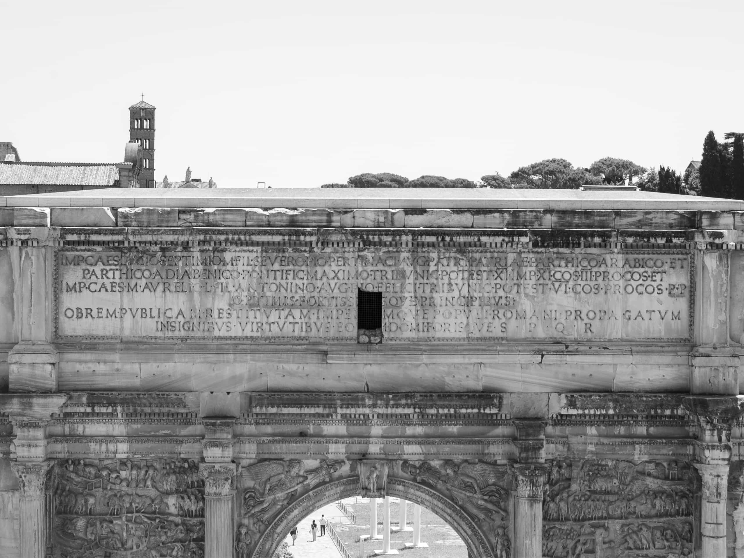
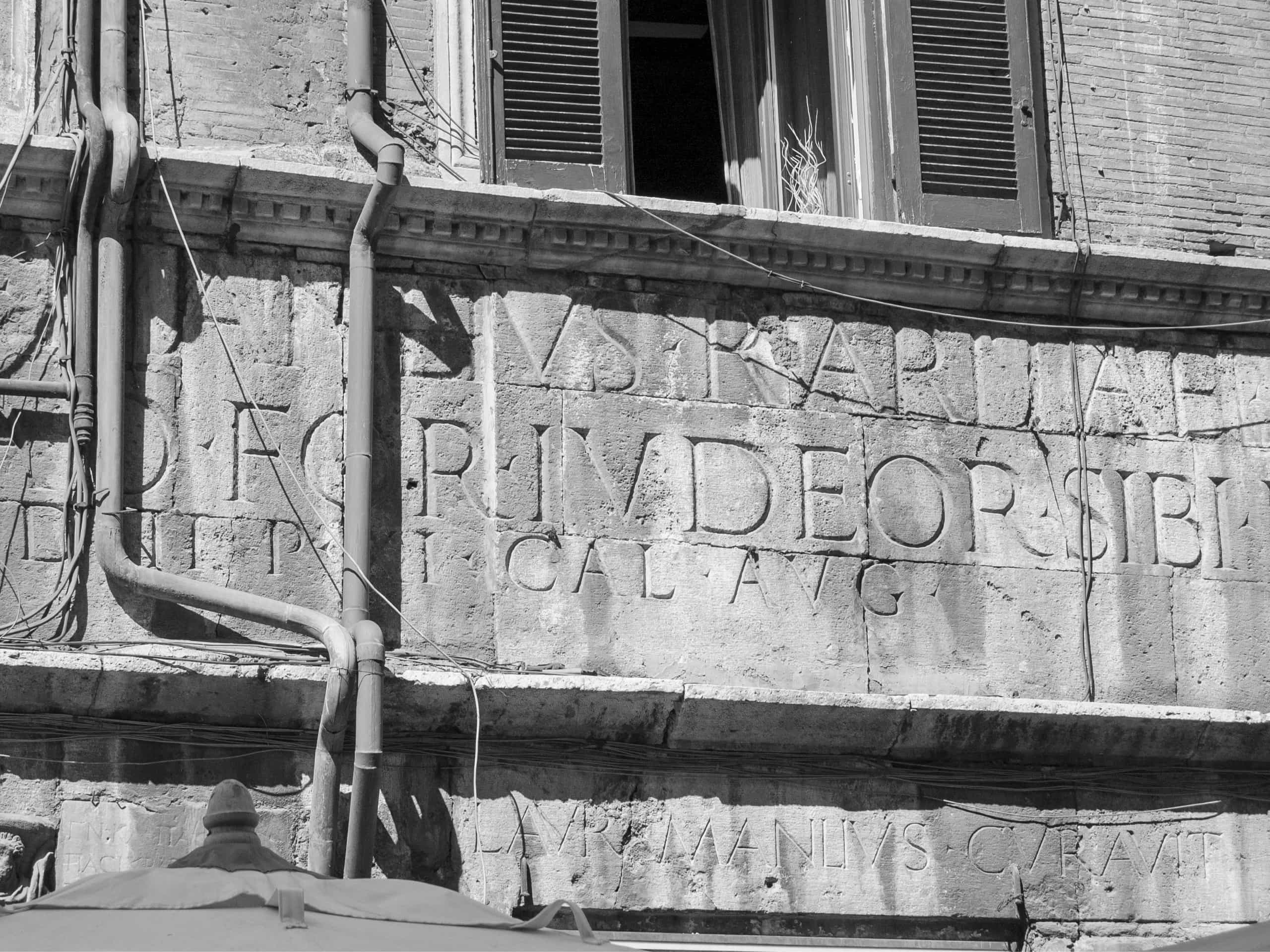
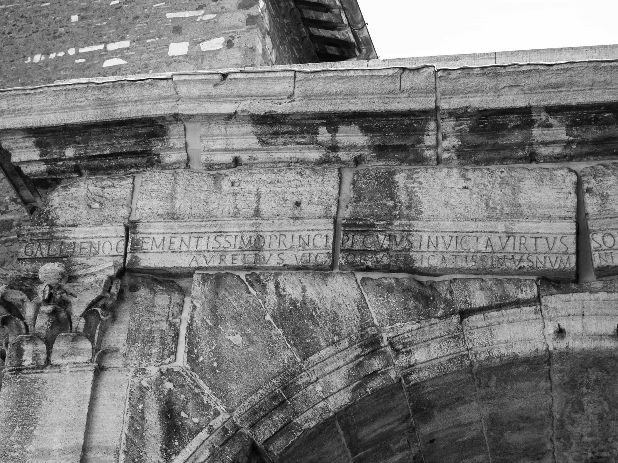
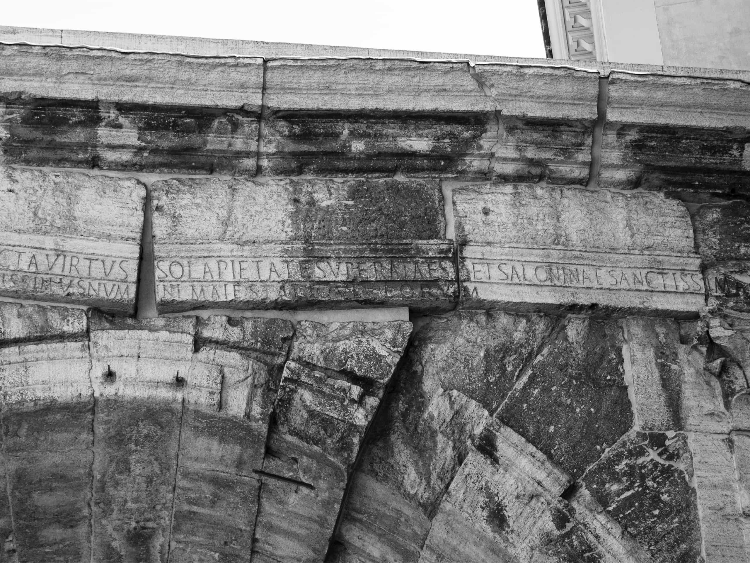
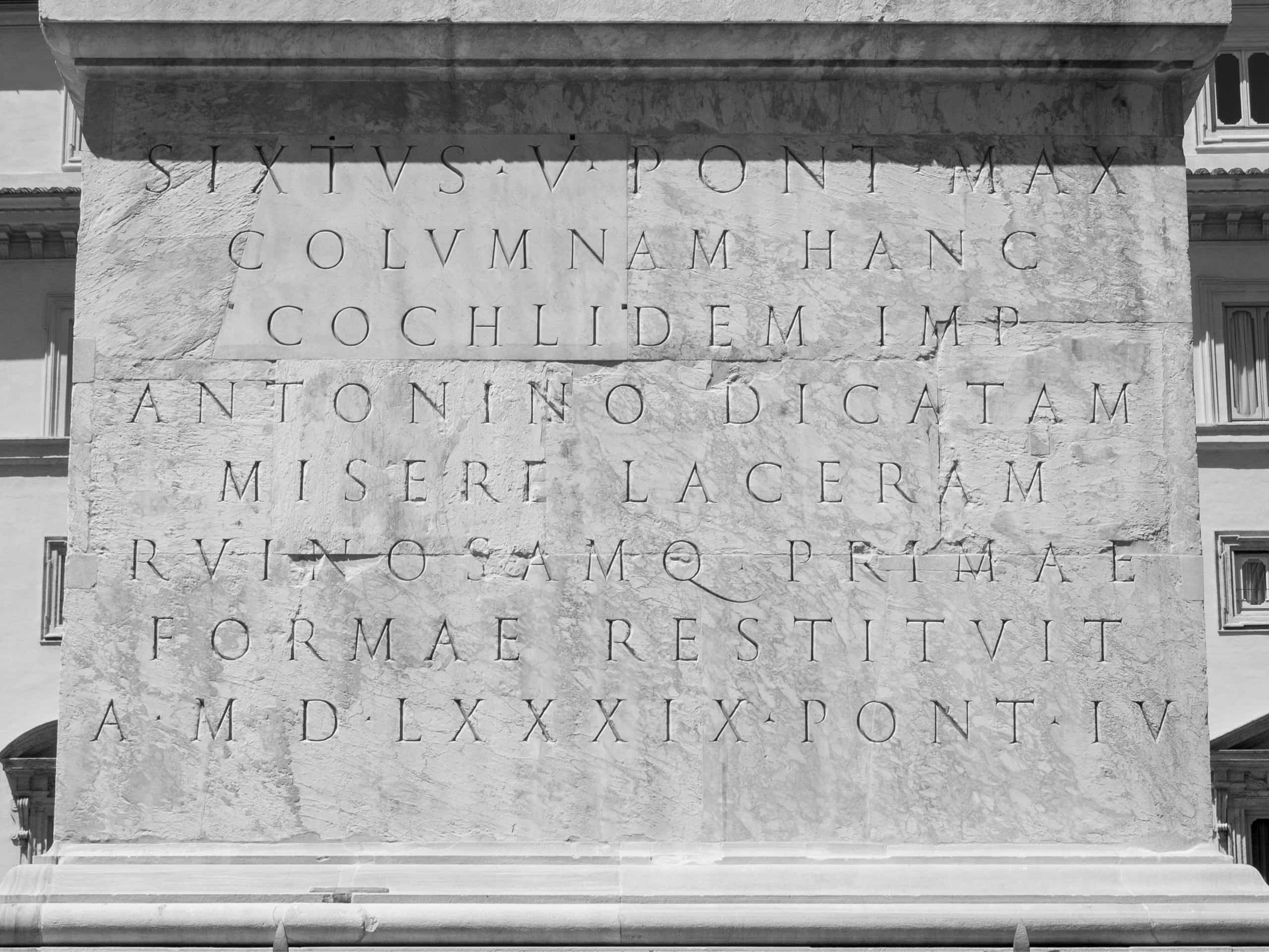
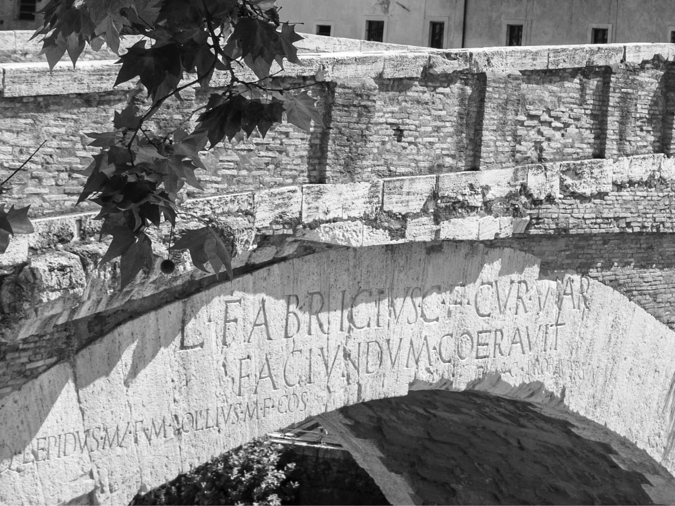
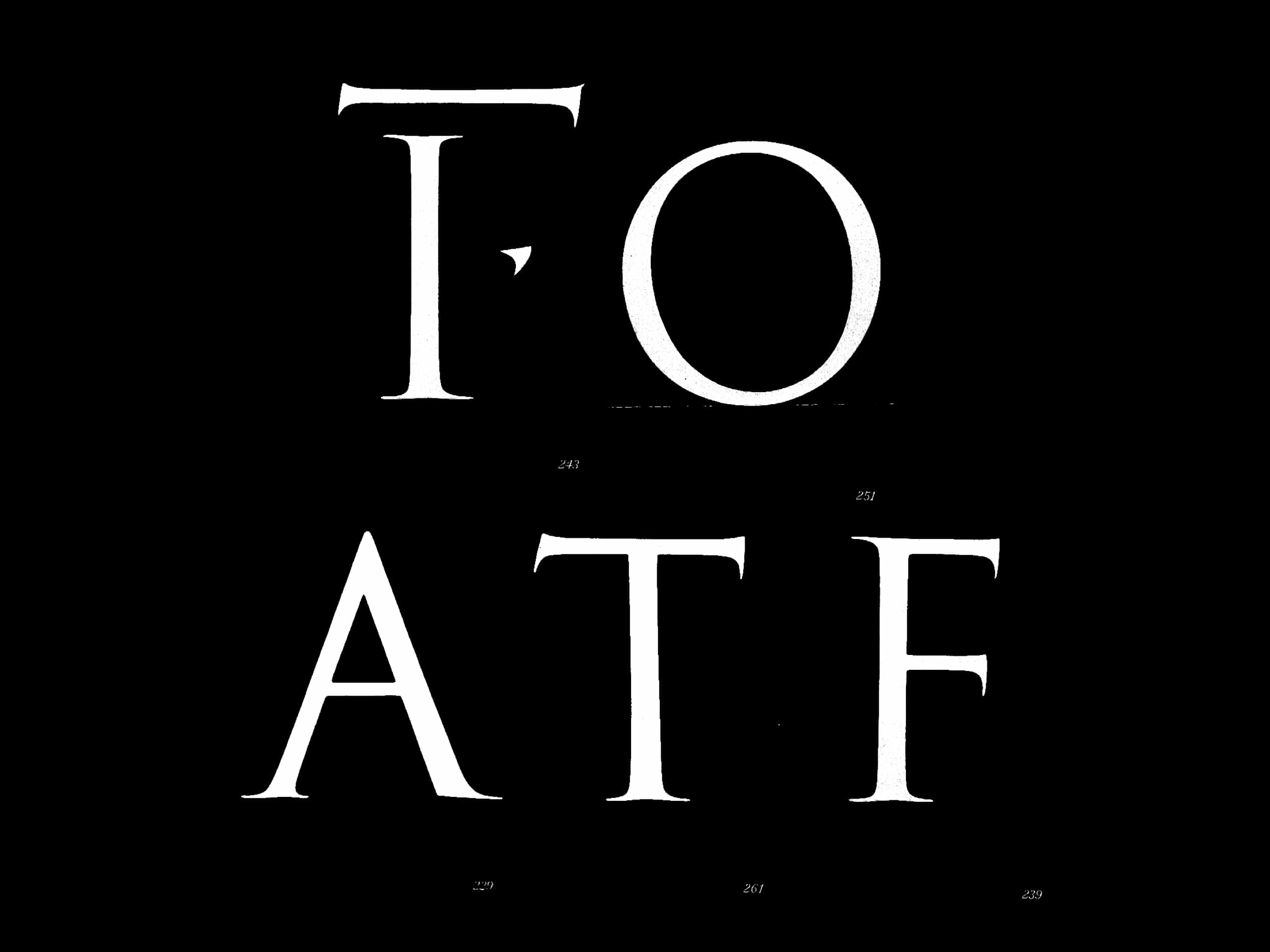
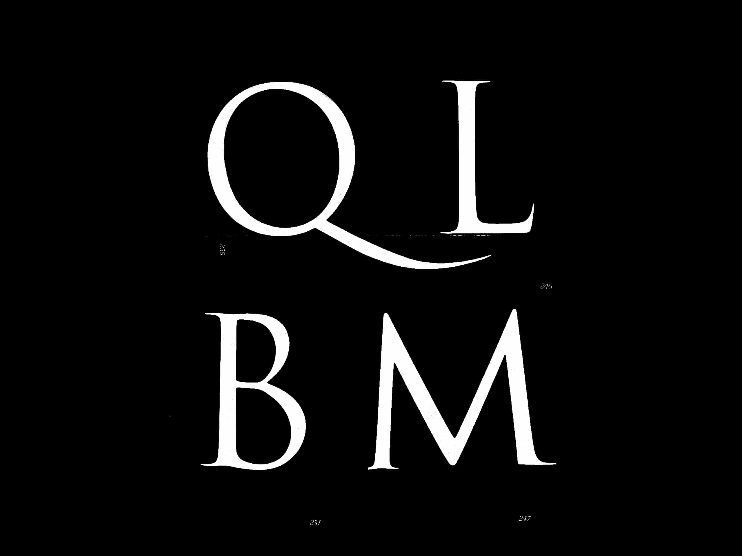
Inspired by the letters engraved on the base of Trajan’s Column, Roma is designed to convey the allure of contemporary Rome.
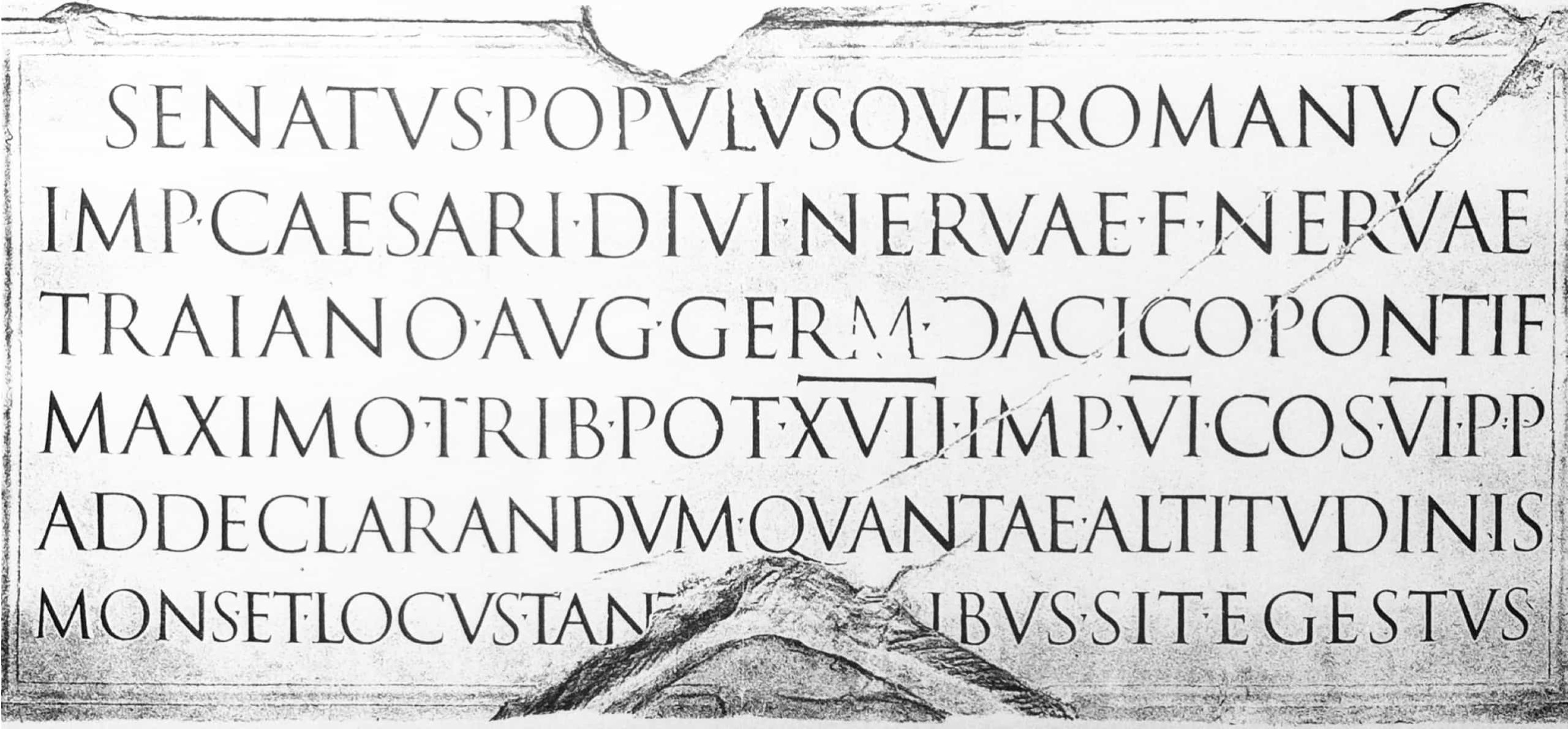
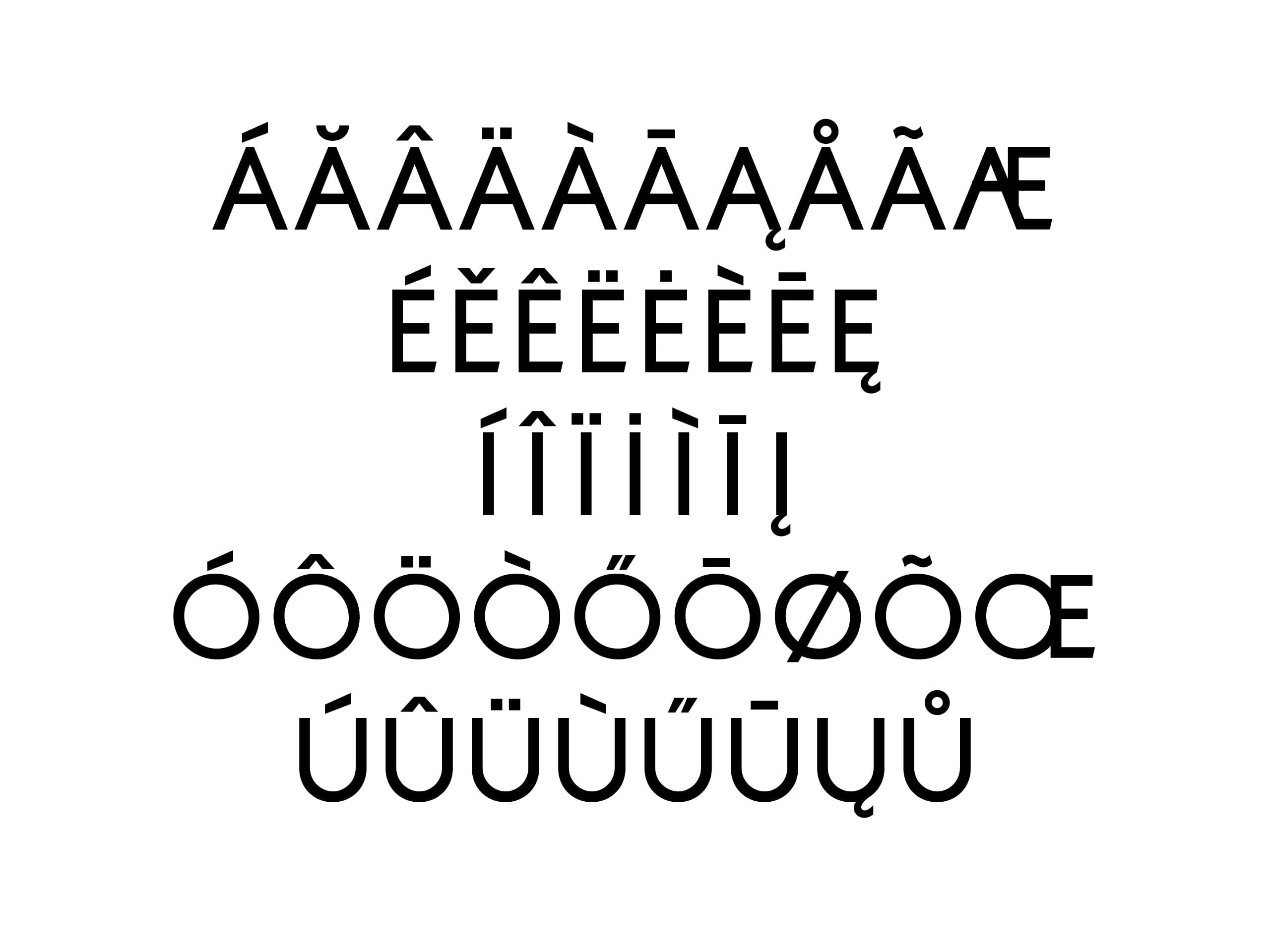
Roman square capitals were the origin of the modern uppercase Latin alphabet. Drawn onto stone with a reed quill that dictated the shading and characterised the shape of the letters, dots were often used to separate one word from the next.
1 / 6
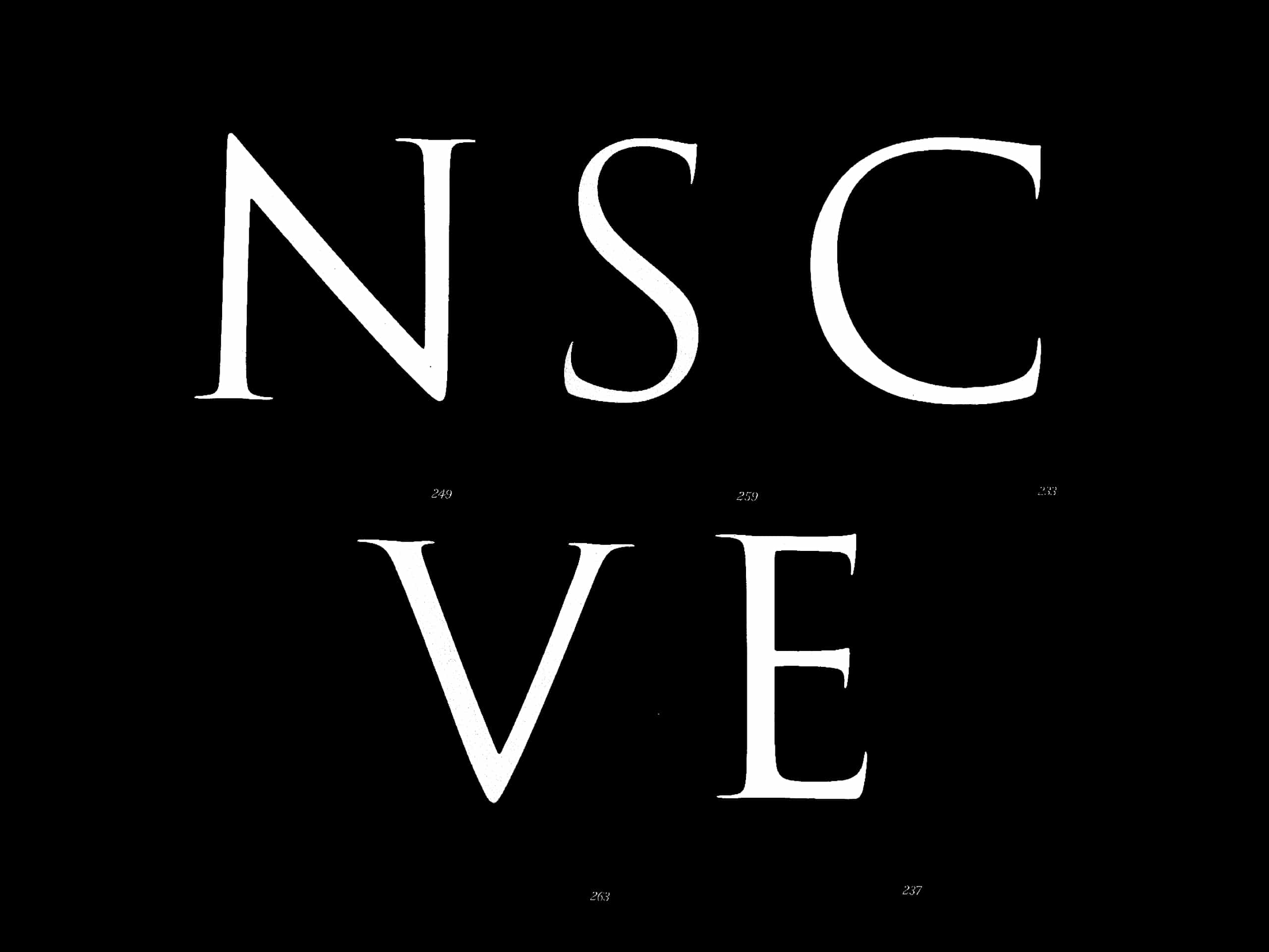
Still today, the use of the reed quill conveys a sense of perfect imperfection: the scribe would construct the curves with two separate strokes, giving the letters a harmonious, if not perfectly geometric, shape.
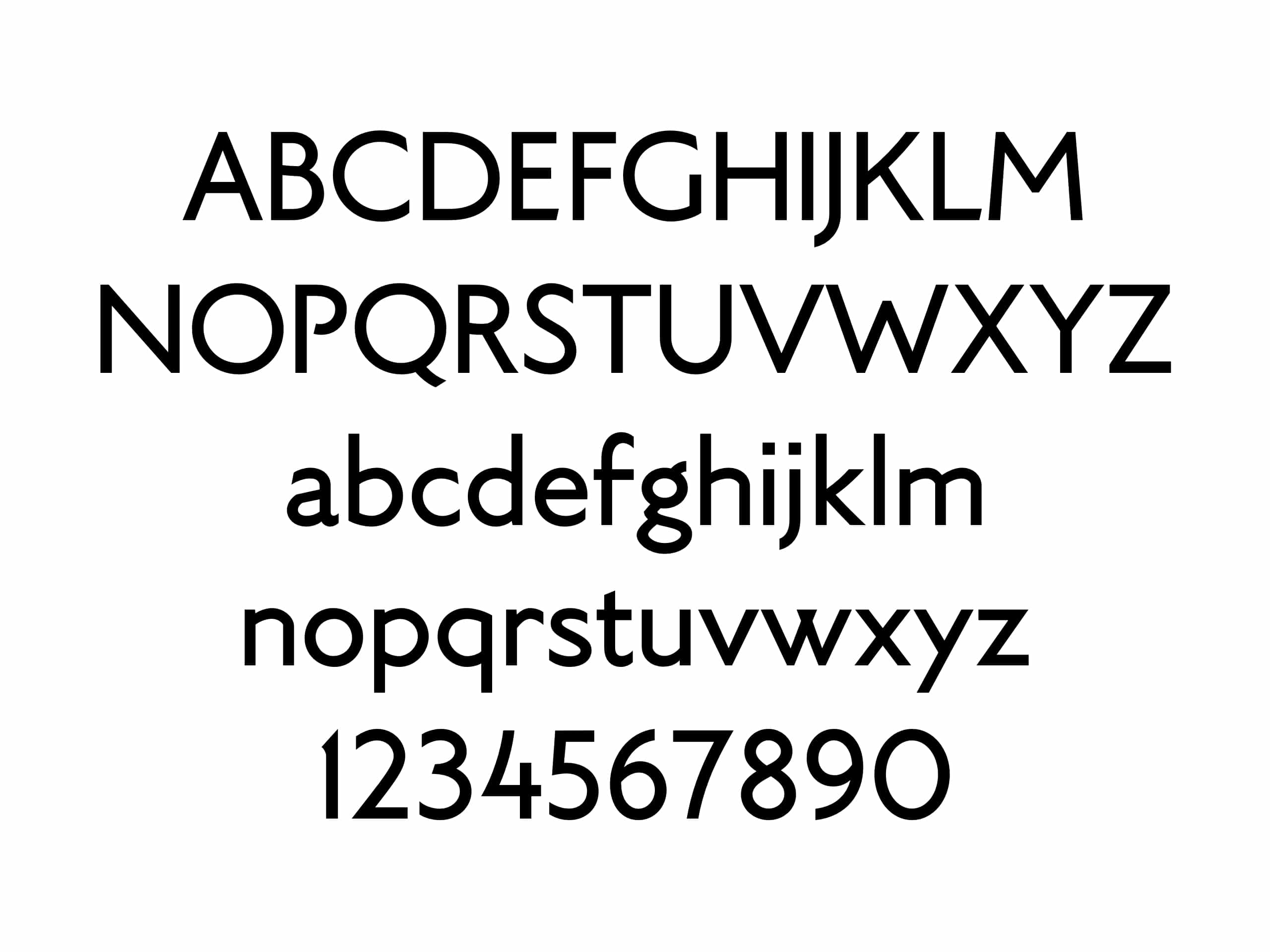
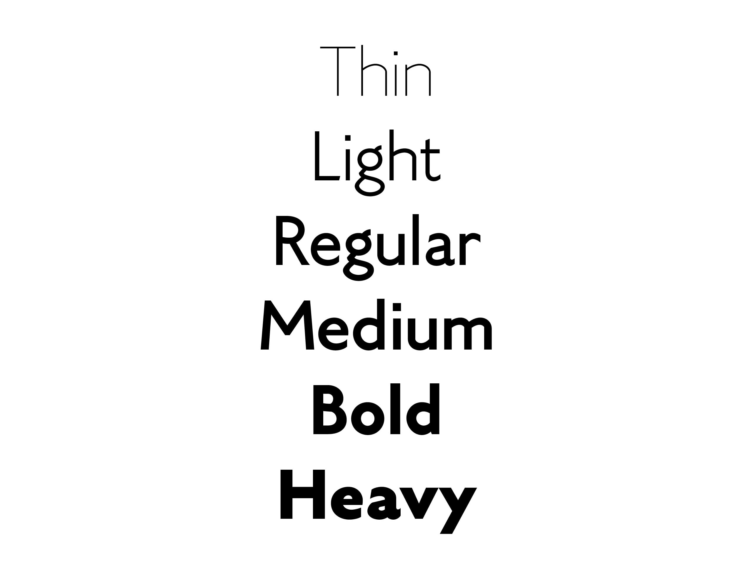
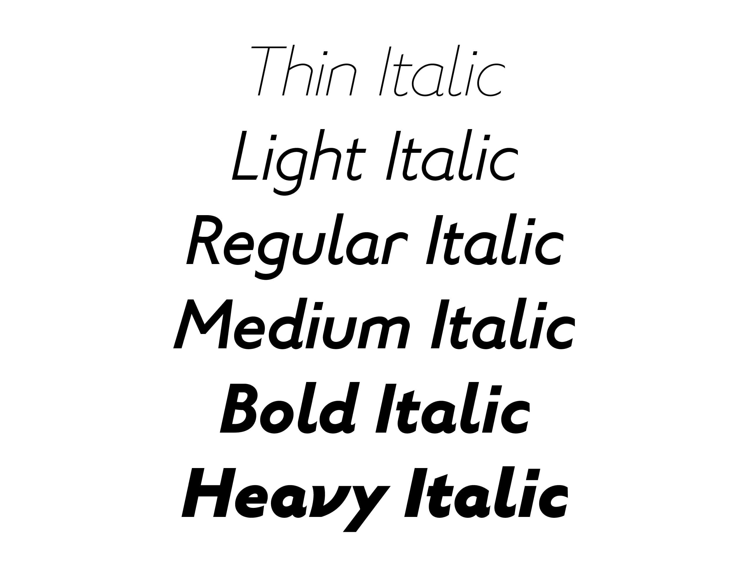
We started by reducing the shading to improve legibility of the smaller point sizes and then eliminated the serifs for improved use on digital platforms. We finally succeeded in creating a uniform rhythm for the letters by adjusting the width.

1 / 4
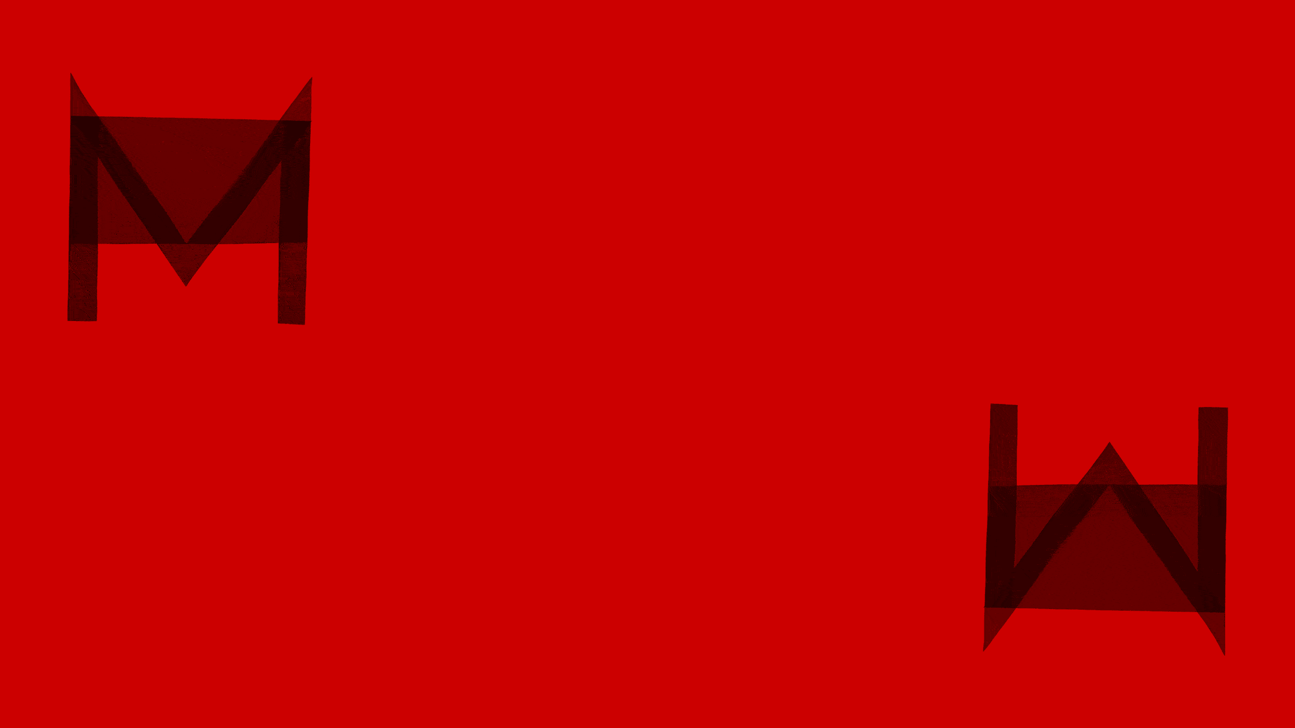
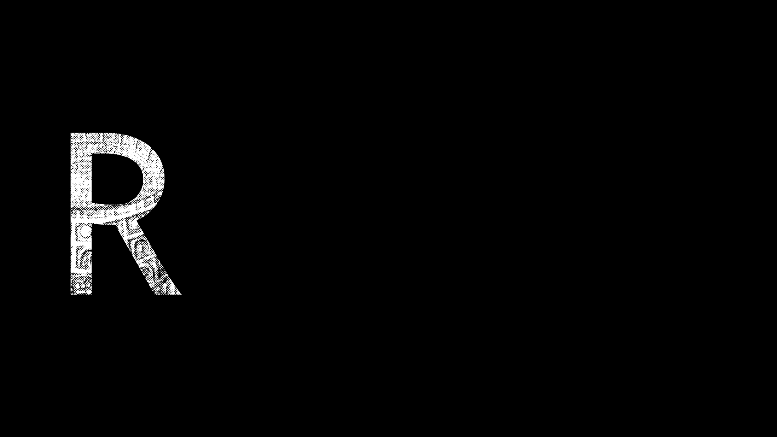
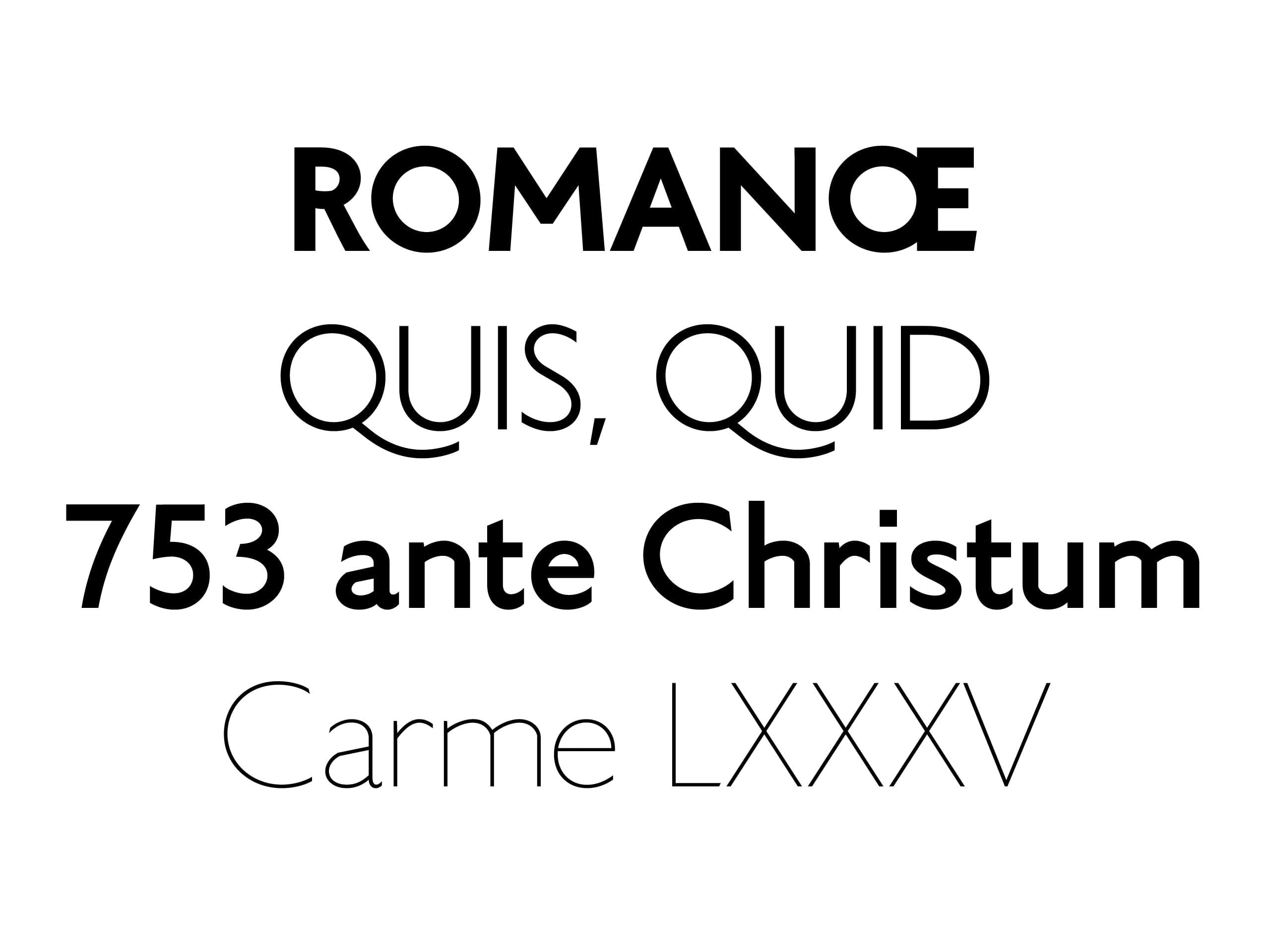
Not only did we develop a sans serif version of the letters engraved at the base of Trajan’s Column, cornerstone of the Latin alphabet, we also enhanced the lowercase letters with humanistic elements to embrace their original asymmetry, while a nod to the “broken/uneven” stroke of the reed quill was achieved with elements that break up the typeface such as interruptions in the strokes of letters such as n and h.
1 / 6