Pick Meal Up
Branding and communication for the app that wants to revolutionise the take-away sector
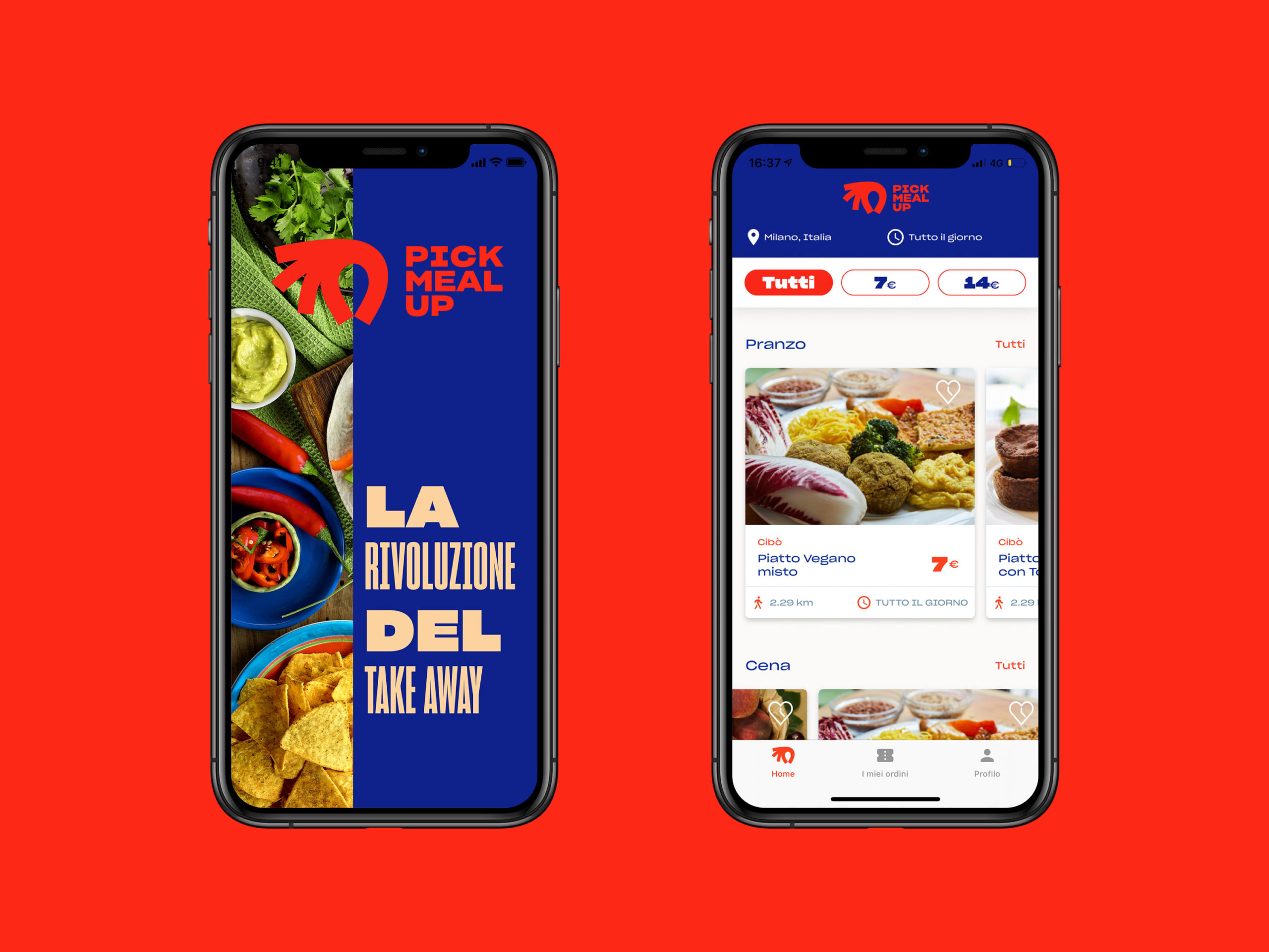
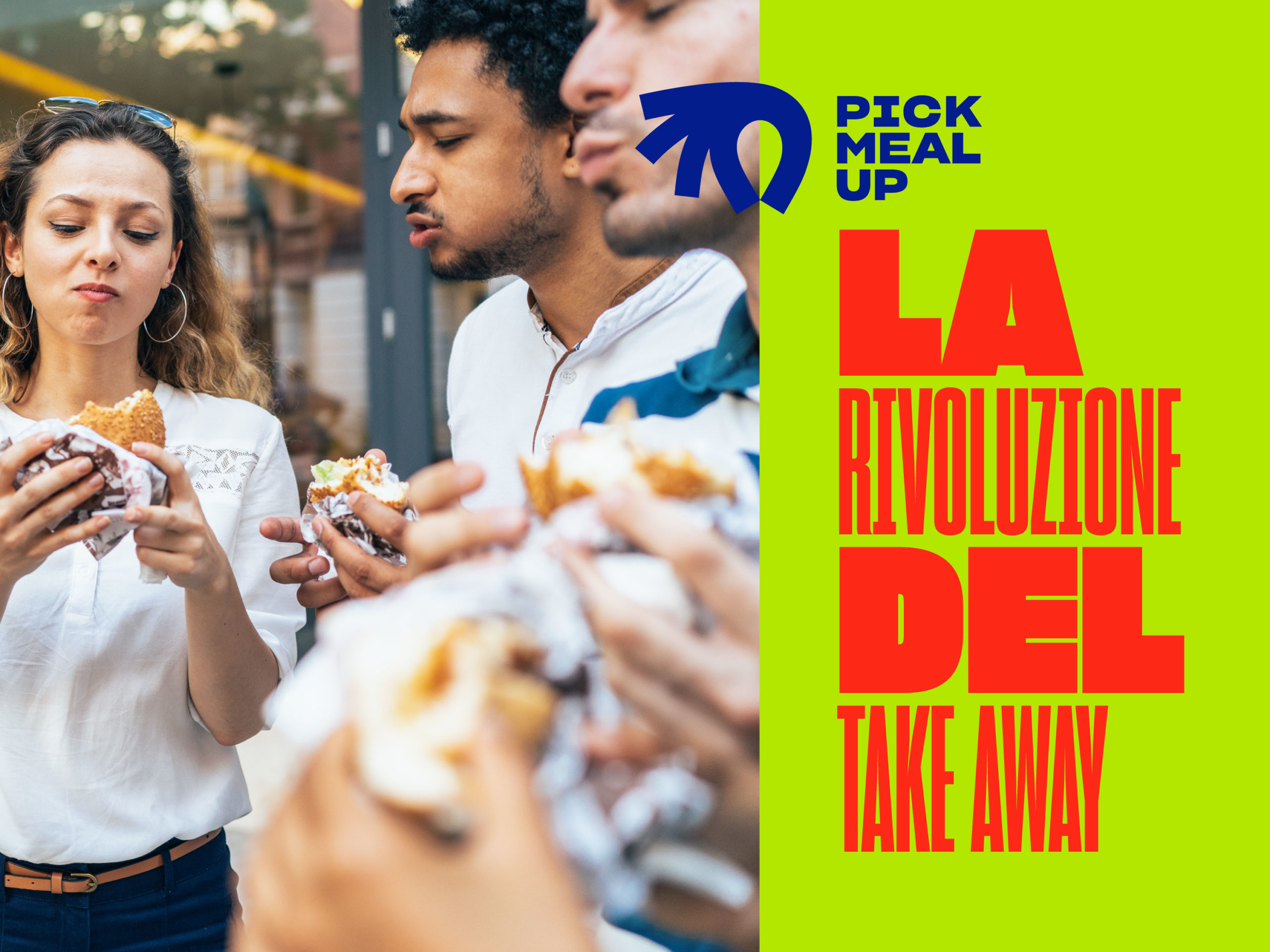
We handled the brand identity and launch for the app that aims to break down the distance between restaurants and clients looking for takeaway food. A win/win situation that helps entrepreneurs to improve their business and offer better prices, and therefore greater accessibility, to the consumer.
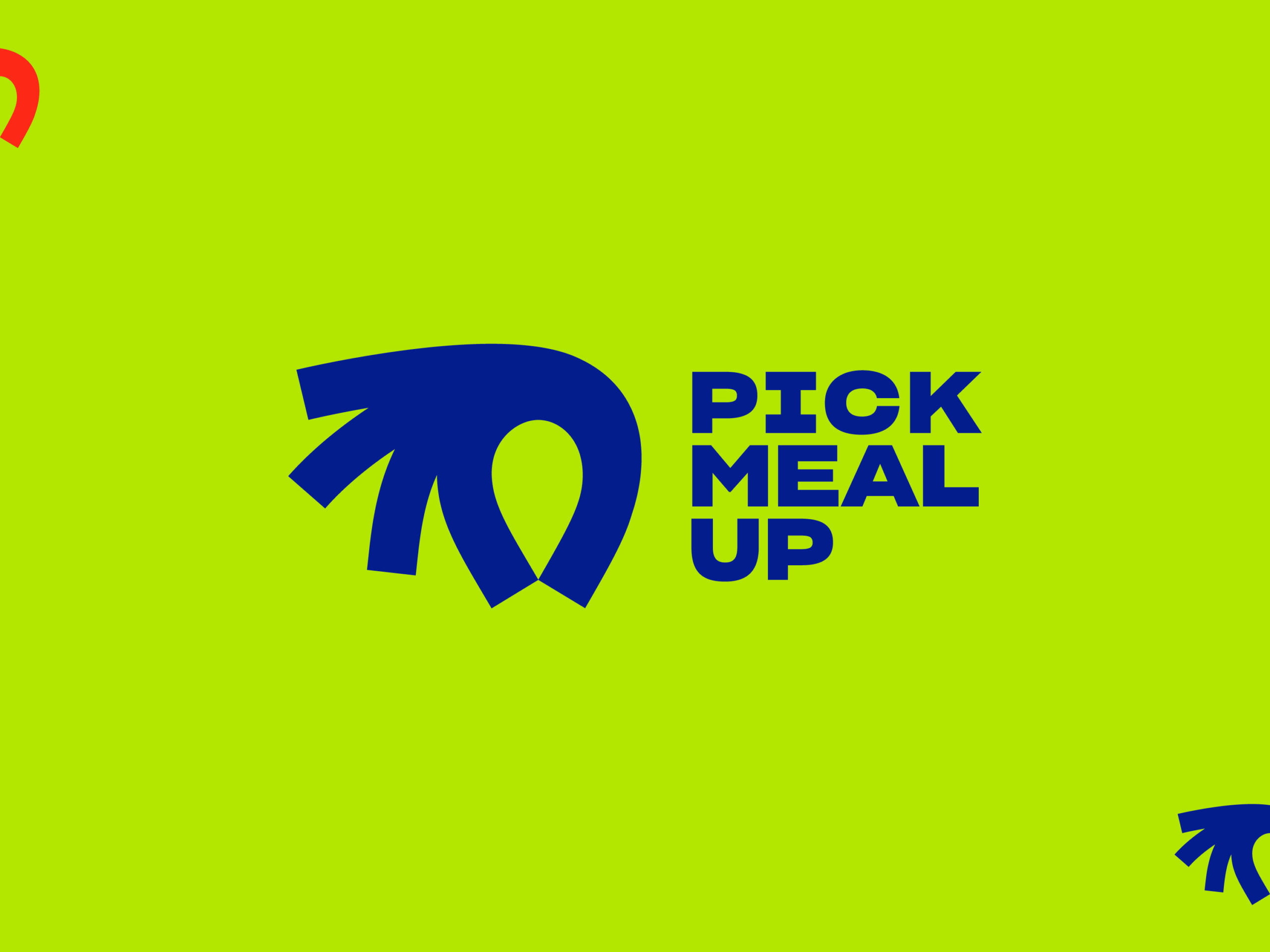
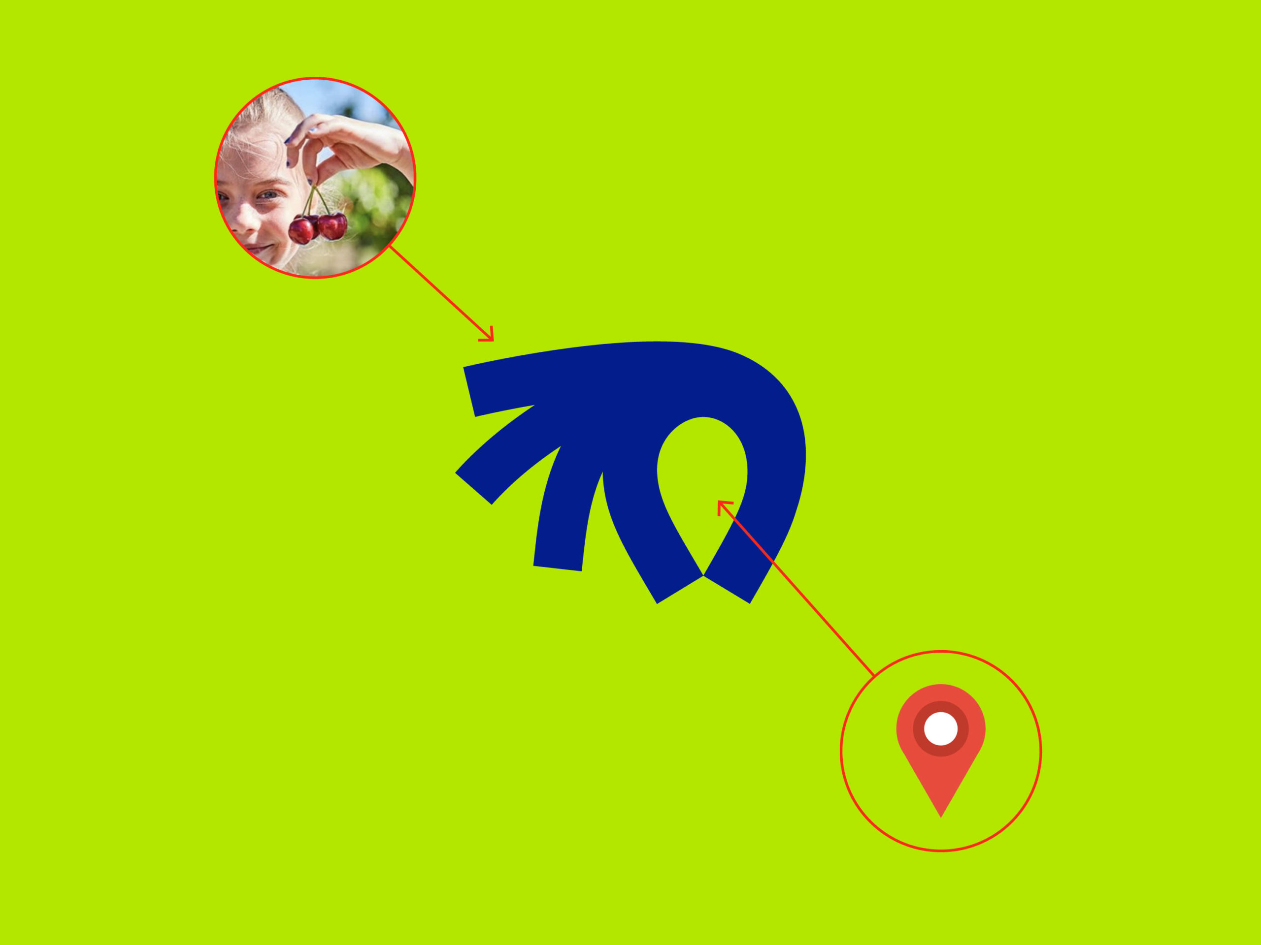
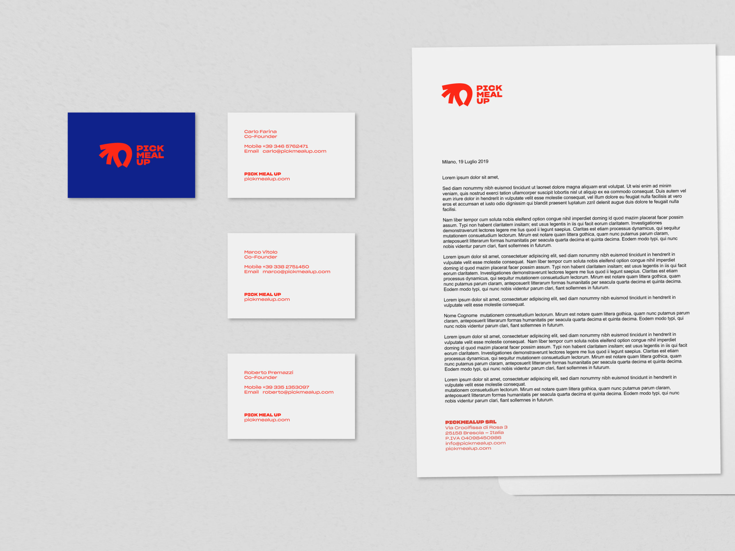
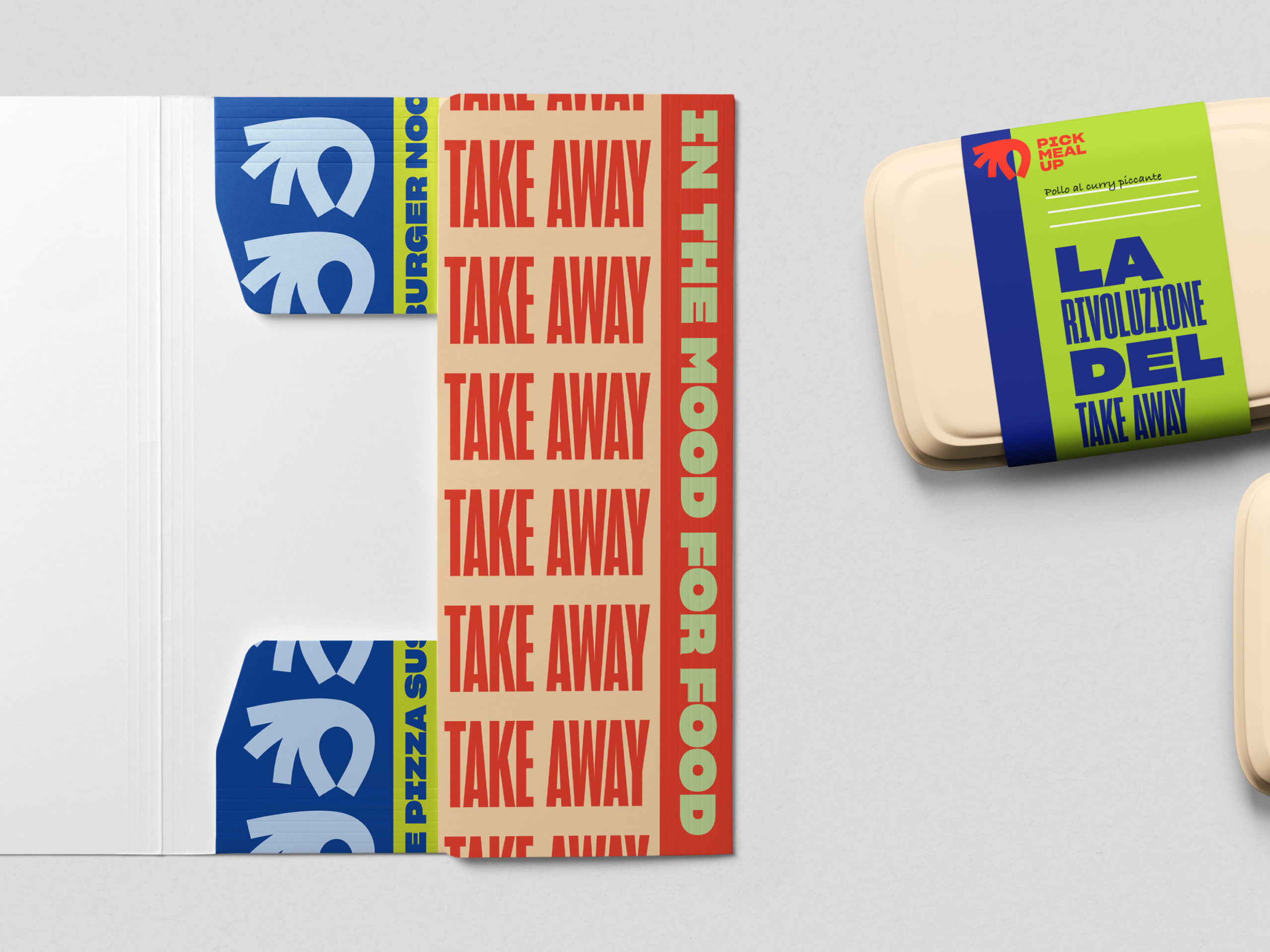
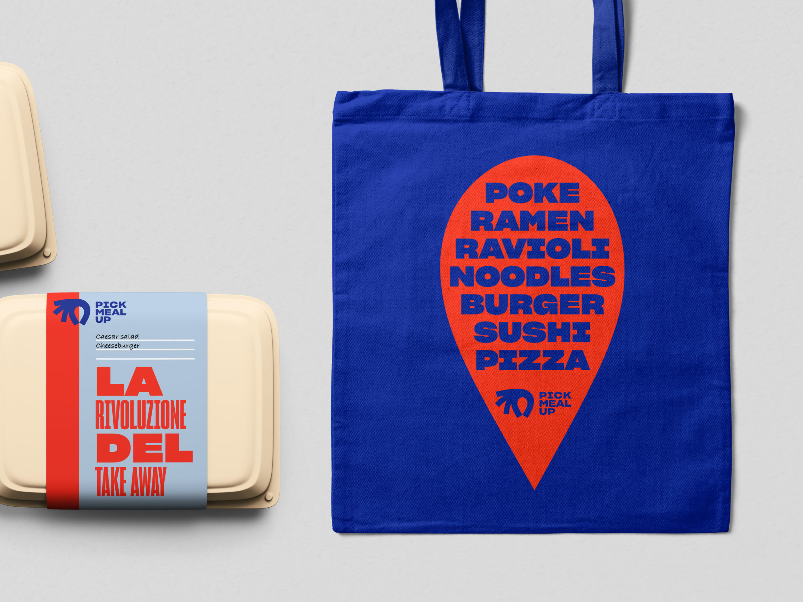
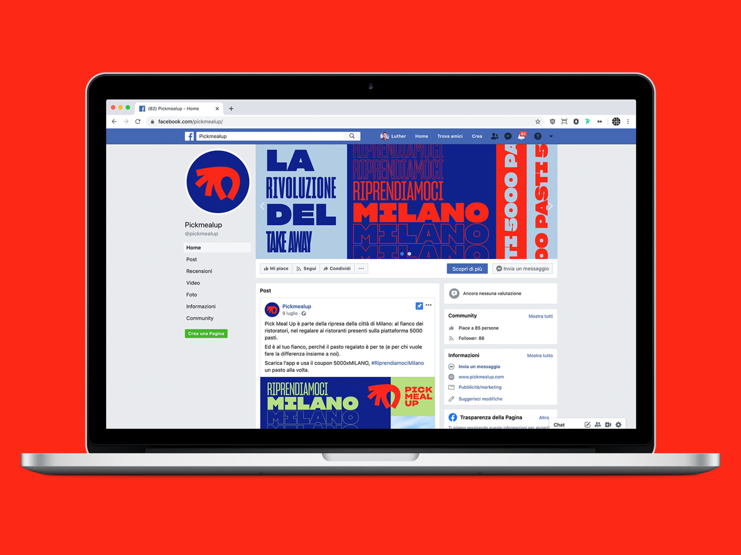
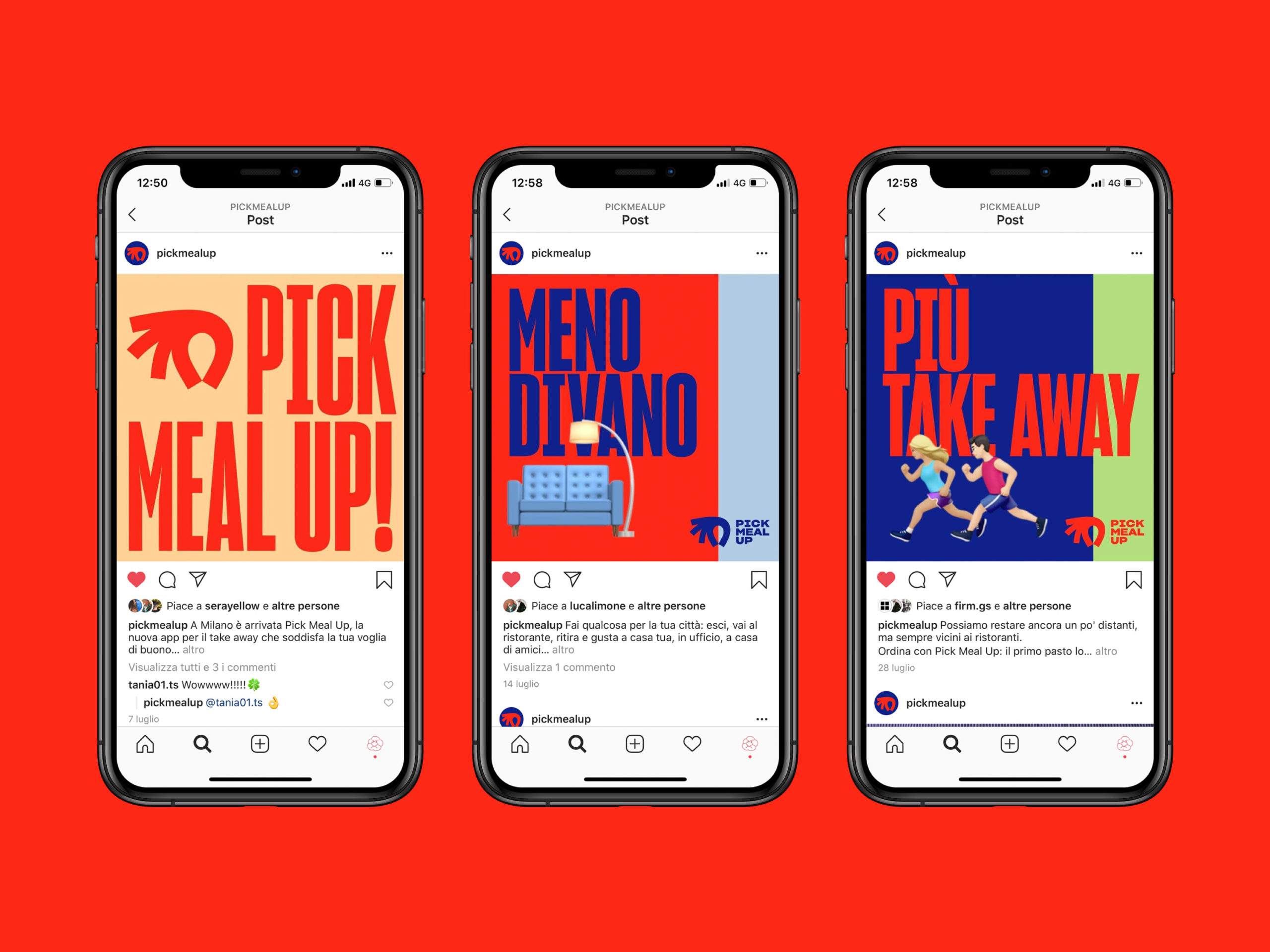
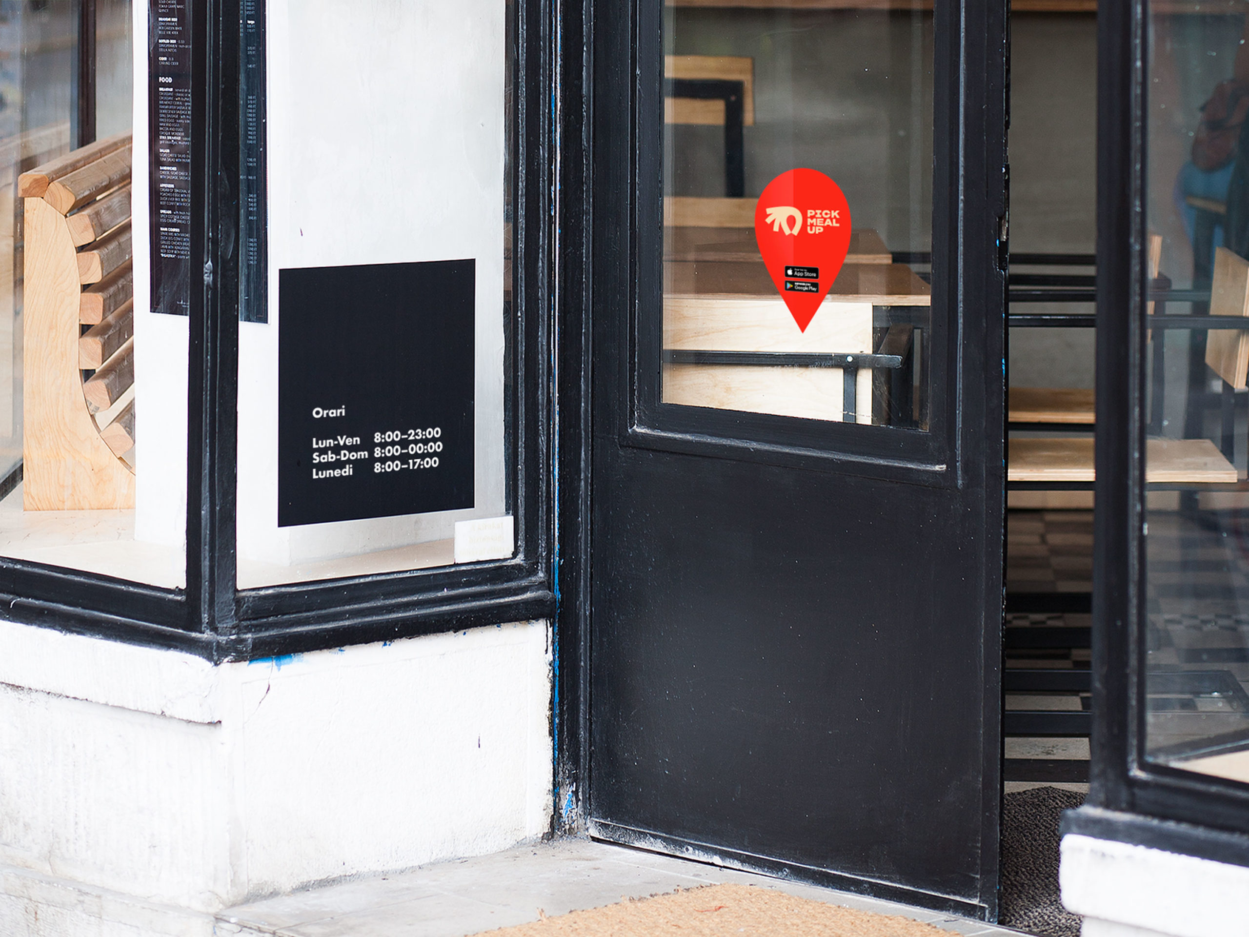
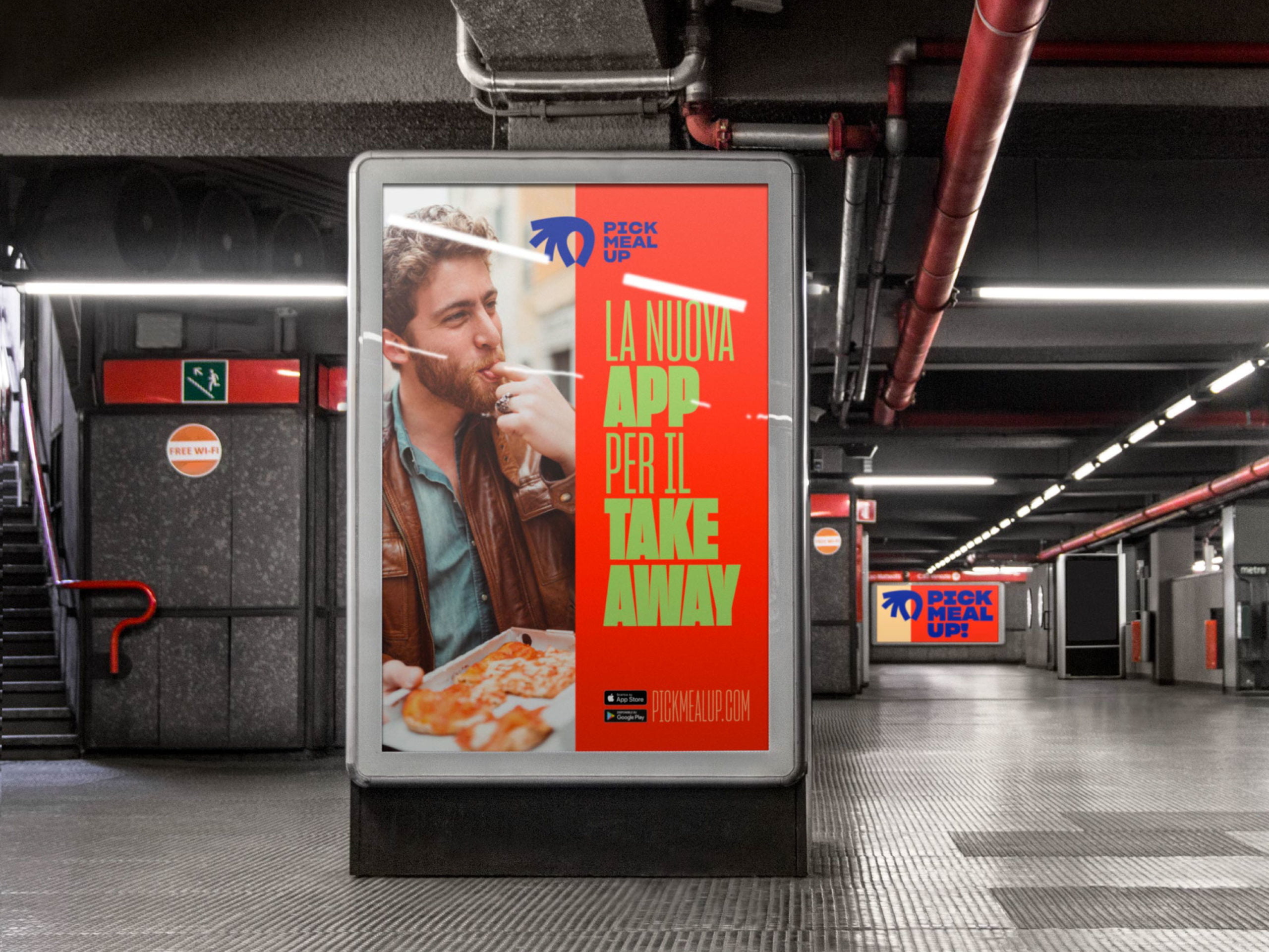
We created an expressive and contemporary symbol to tell the Pick Meal Up story, along with a powerful, impactful, and almost revolutionary typeface.
The cherry on top is a colour palette that is miles apart from the app’s competitors: an original combination that reflects both the pleasure of eating and today’s dynamic society.
We were responsible for the creative direction for this project and formed a working team that included other figures from our network: strategist Chiara Valentini, social media manager Federica Bianchi and digital marketing analyst Matteo Pigliapoco.

